
Certain paint brands can be incredibly expensive, and if you have a lot of rooms to decorate, picking a more affordable paint brand is a no brainer.
It’s no secret that I’m a huge fan of Dulux, but also Farrow and Ball shades, so over the years I not only know all of the most popular colours off the top of my head, but I know the closest Dulux dupes of Farrow and Ball colours too.
Before we get started, make sure you bookmark this post for later, it is the ultimate guide to the Dulux dupes of Farrow and Ball colours covering their most popular shades. So, let’s help you achieve that perfect F&B interior on a budget…
The Most Popular Dulux Dupes of Farrow and Ball Colours
Now, before we get stuck in, we have curated a list of the most popular Farrow and Ball colours and paired with the most relevant Dulux equivalent shades readily on the market. Some are more difficult to colour match exactly due to their specific undertones, but I have sourced the very best matches possible from the existing range of Dulux colours.
Remember, paint colours can look vastly different in rooms due to the light and orientation of the room, so always get a tester pot first, paint onto a sheet of white paper so you can move it around the room and see how the colour looks during different times of the day, and on both sunny and gloomy days.
Dulux Equivalent For Farrow and Ball Neutrals
Skimming Stone Vs Egyptian Cotton
Dulux Egyptian Cotton is a perfect close match dupe to Skimming Stone, it carries the same modern warm neutral tone delivering an elegant, sophisticated feel to a space.
This is one of the best Dulux matches, and both of these shades are among the most popular Dulux and Farrow and Ball paint shades as it’s a much warmer alternative to a standard bright white.

Elephant’s Breath Vs Bleached Lichen 2
Elephant’s Breath is considered a warm-mid grey or greige shade, there isn’t an exact Dulux match for this colour, but the closest match is Bleached Lichen 2 which is slightly more subdued and lighter in contrast.
Bleached Lichen 2 is not an off the shelf colour so you won’t find this in their paper colour charts. However, you can get this mixed up to order in places such as B&Q.
If you want a closer match, I’d recommend using the Valspar colour match service in B&Q, I have done this for a number of Farrow and Ball shades, whilst the quality isn’t the same, it’s very effective in getting a close match for a more affordable price point.

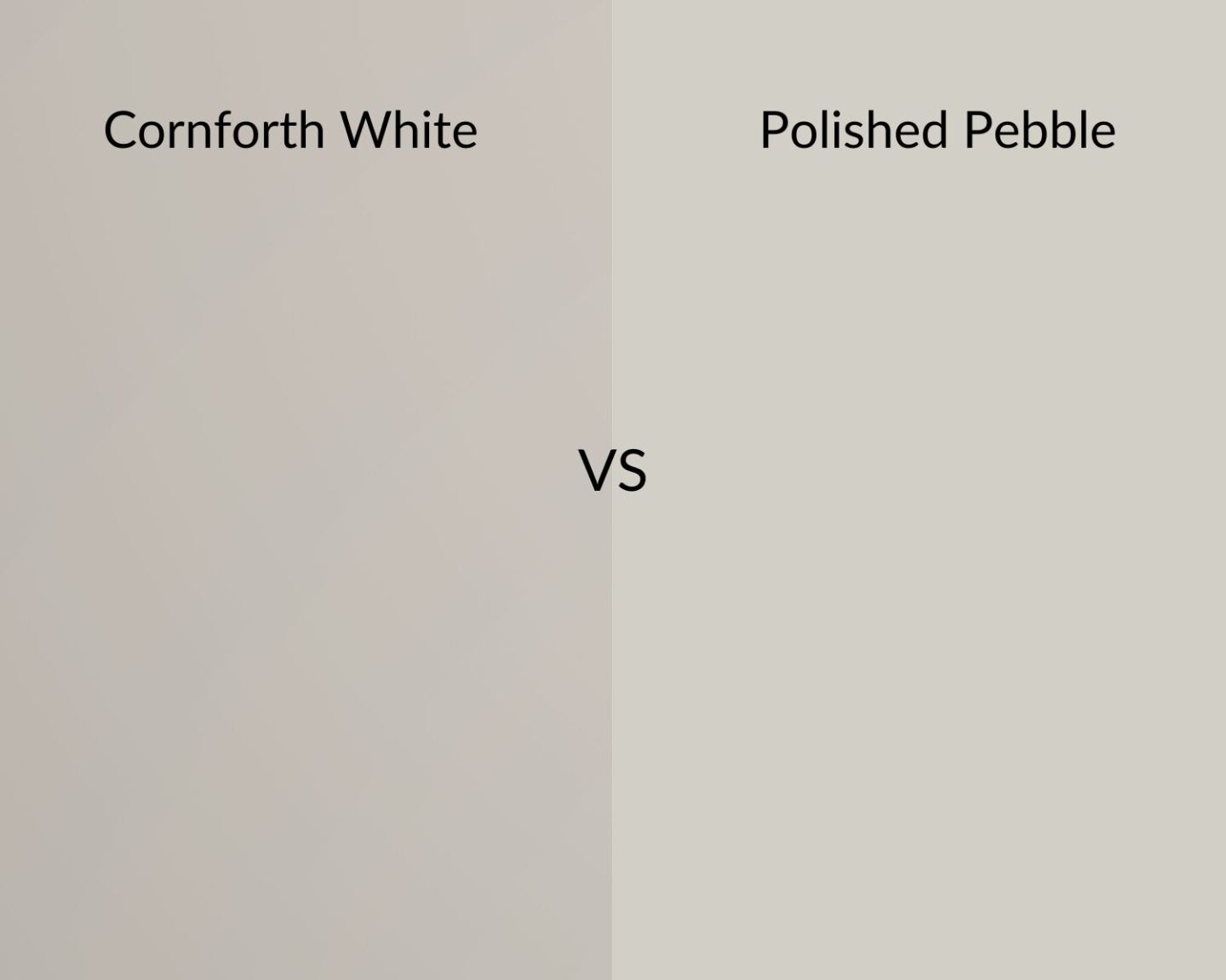
Cornforth White Vs Polished Pebble
Cornforth White is part of Farrow and Ball’s relaxed neutral shades, offering a delicate balance between a grey and beige. Its unique undertones make it difficult to find an exact match Dulux shade.
Polished Pebble is one of the closest matches, whilst it has a slightly cooler, greyer demeanour to it.
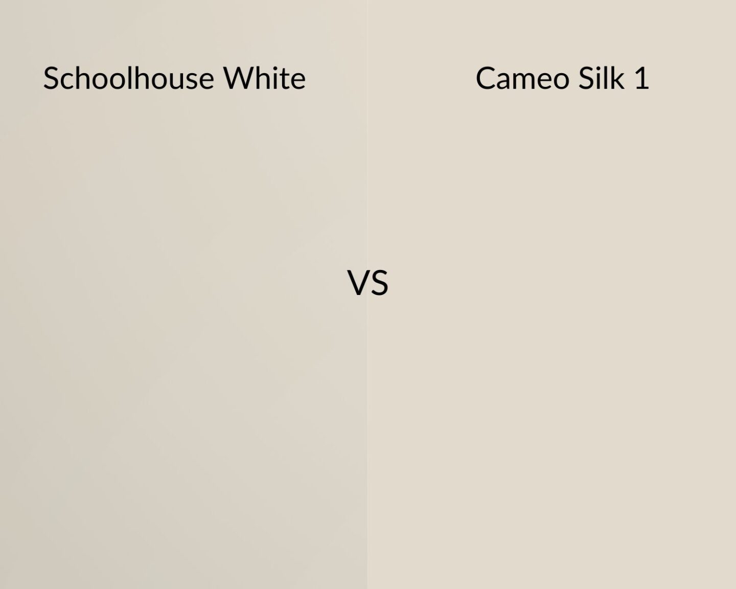
School House White Vs Cameo Silk 1
We love it when a perfect Farrow and Ball dupe comes together!
School House White is a notoriously popular timeless neutral from Farrow and Ball which is evenly balanced, bringing a warmer feel than a bog standard white shade.
Cameo Silk 1 is made up to order from Dulux and is a near perfect match.
Skylight Vs Surrendered Skies
Skylight is a pale, traditional blue which can appear grey in certain lights, and when used in larger spaces.
Dulux shades tend to be either too blue or too grey to pair beautifully with Skylight, the closest match is Surrendered Skies which has stronger grey undertones than Skylight. If you want to lean into the bluer side more, take a look at Coastal Grey by Dulux.

Ammonite Vs Dusted Moss 2
Ammonite is a warm, pale grey colour and is hugely popular in an interior, giving a similar finish to Cornflower White.
This warm greige is perfect for almost all rooms, no matter the orientation. Match it with Dusted Moss 2 by Dulux, they hold a very similar tone, be it slightly greyer in overall tone.

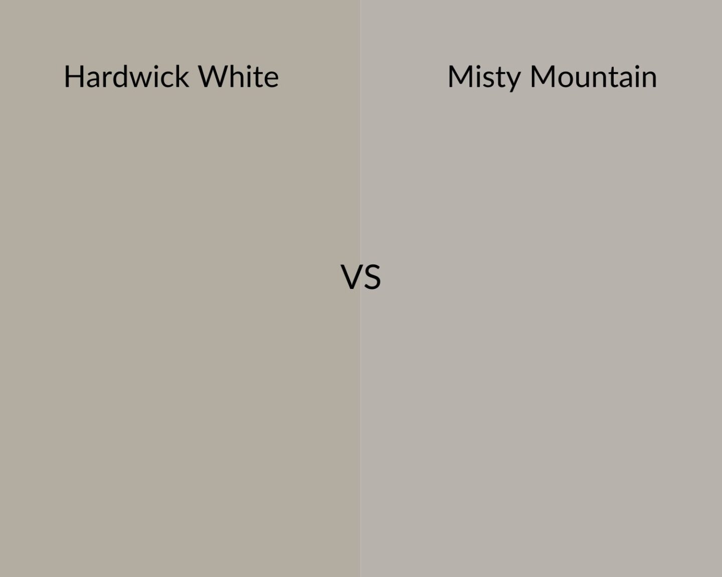
Hardwick White vs Misty Mountain
A Hardwick White Farrow and Ball dupe is one of the most requested dupes I have been getting recently, and unfortunately it’s one of the most difficult to colour match. The pigments that Farrow and Ball use are highly unique, and much harder to find a good dupe in some than others.
However, if you don’t mind leaning into grey tones, Misty Mountain is the closest match, and if you want something slightly lighter in tone then Pebble Shore is a good alternative.
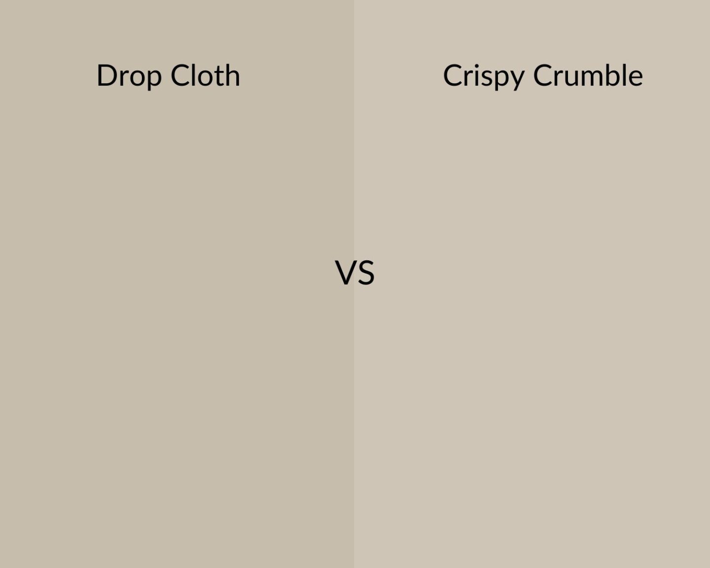
Drop Cloth Vs Crispy Crumble
Another favourite neutral of mine is Drop Cloth, and whilst Egyptian Cotton is a fairly good match, Crispy Crumble is more closely matched, although slightly lighter in overall tone.
If you’re looking for a warm neutral that’s not a cream, this meet in the middle neutral will bring warmth and definition to your interior.
Dulux Equivalent For Farrow and Ball Pinks
Calamine Vs Blush Pink
Dare I say it, but I actually prefer Blush Pink by Dulux. Calamine is named after that lotion you may remember as a child, it’s a subtle pink with a slight grey undertone.
Blush pink has a much more subdued tone which is beautiful for a neutral interior without it feeling too feminine.

Setting Plaster Vs Crumpled Linen 1
There’s something special about the look of freshly plastered walls, and you can get the look with F&B Setting Plaster which has a beautiful softness with a yellow pigment, so it’s perfect for cold North facing rooms too.
A difficult colour to match, Crumpled Linen 1 – a made to order colour by Dulux carries more of an apricot undertone, but brings a warmer, more subdued look than Setting Plaster.

Sulking Room Pink Vs Dulux Wild Mushroom 2
Perhaps one of my favourite pinks from F&B, Sulking Room pink is a sultry, rose pink shade that brings more definition than some of the other pinks in their range.
I’ve found an almost perfect match with Wild Mushroom 2 by Dulux, a slightly pinkier shade that still brings definition and modernity with it to a room. (I’ve used Sulking Room Pink in my downstairs toilet so you can see how the shade looks in a real home).

Dulux Equivalent For Farrow and Ball Dark Paint Shades
Down Pipe Vs Thunder Clouds
Where greys are considered, Down Pipe is a hugely popular shade that brings definition, but is not as overpowering as a black shade.
This dark lead grey has blue undertones which stop it from feeling overly oppressive. Thunder Clouds is an almost perfect colour match, although slightly lighter in overall tone. Grab a couple of testers in your space to see which you prefer.

Hague Blue Vs Azure Fusion 1
We love the deep blue richness of Hague Blue, known for its intensity is can appear black in certain lights (why we always recommend testing paint first!).
A difficult one to find a perfect match for, Azure Fusion 1 from Dulux is a great alternative which carries more blue undertones for a midnight blue hue.

Railings Vs Cannon Ball
We’re pretty impressed with this colour match, and a must have for a notoriously popular shade, we just love Railings.
It’s such a popular choice because it’s a softer alternative to black, yet will still bring definition to a room. Looking for a cheaper alternative to Railings? Try Cannon Ball by Dulux.

Stiffkey Blue Vs Heritage Midnight Teal
Stiffkey Blue is often described as a rich, inky blue with a slightly purple undertone. It is a dark shade of blue that can create a dramatic and luxurious atmosphere in interior spaces.
It was difficult to find a perfect match because of its undertones, but Dulux Heritage Midnight Teal is a great option if you want to embrace those teal tones a bit more.
Buy Dulux Heritage Midnight Teal

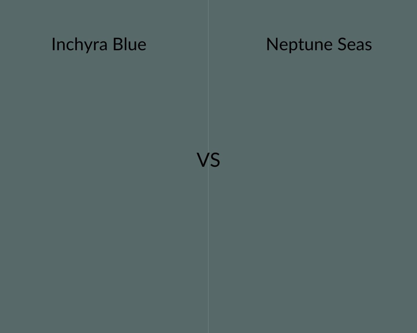
Inchyra Blue Vs
This dark blue is dramatic but can read as a grey, blue or even green, depending on the light the room is receiving. Dulux don’t tend to have many colours that offer this metamorphic quality, but Neptune Seas is a great Inchyra Blue Farrow and Ball Dupe.
This Dulux paid shade has slightly more green undertones to it but looking at them side by side and it’s actually a really good colour match, and such a beautiful shade for creating an intimate, cosy and soothing space that feels good to be in.
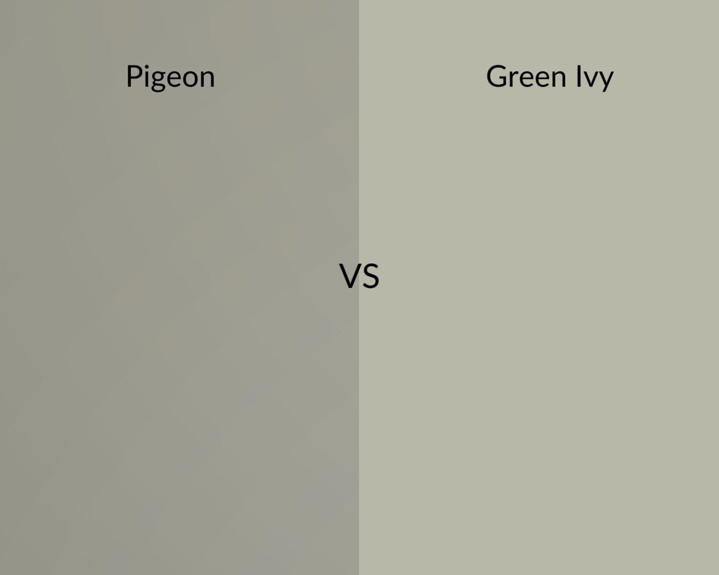
Pigeon Vs Green Ivy
Those earthy greens are a real favourite in interiors right now and Pigeon can be classed as a green and grey, which carries a softer and bluer demeanour to other grey shades.
Because of its unique blue undertones, this was a difficult one to find a Dulux dupe for. Most of the Dulux shades were either too grey, green or khaki in nature, but Green Ivy seemed like a great middle ground. It’s slighter lighter, and less grey, but we love the earthiness and subtle hue of this shade.
Not mentioned a Farrow and Ball colour you love? Leave me a comment below and I’ll suggest the perfect Dulux dupe for you!
Pin it, screenshot this to refer back to at a later date. If you scroll down to the comments you will also find so many more dupes I have added!

Thanks Nicole -so interesting!
Please do you have a non yellow match for Wimborne White?
I have a very tall hall / landings in a large Victorian House – prone to cold and lots of different aspects in the hall & landings, some quite dark.
I’ve tried so many testers in my search for the right warm, non yellow white but would so appreciate help!
– Dimity is too pink, Egyptian cotton looks dark, and Dimpse is really drab (that’s just some of the colours I’ve tried!)
Thank You
Ex.
I agree finding a non yellow based white is super difficult, as a lot of Dulux shades are! I’d say White Cotton is the best Dulux alternative – the rest of their off whites are either yellow or very pink based. Have you looked at Pointing by F&B? This has a red base to it but is more of a closer match to Wimborne White without it being yellow. Hope this helps finding your perfect shade, I know all too well how it affects Victorian houses which can notoriously be dark in certain areas! Nicole x
Thank you so much, Nicole!
Emma x
Any good greens to rival F and Bs ?
I want a feature wall green which is not too loud or too quiet. …………
I love the following F&B green shades, and I have popped their Dulux alternatives below, let me know if there’s any others you have been looking at though! Nicole x
F&B Breakfast Room > Dulux Overtly Olive (slightly more Khaki, love this shade)
F&B Green Smoke > Dulux Fresh Sage (slightly lighter in tone)
F&B Whirlybird > Dulux Willow Tree
F&B Beverly > Dulux Highland Green
Hey! Please can yo recommend a match for the duck green F&B? Thank you so much
Morning! Have a look at Dulux Highland Green 🙂
I’m looking for a match to Dimpse
Great article! What do you suggest as an alternative to Vert de Terre and Ash Grey? Thanks!
Thank you! Have a look at these; Vert de Terre – Tranquil Dawn Dulux is a great match (Tester- https://amzn.to/3TyM1Ue ), Ash Grey – Tranquil Dawn is the closest match Dulux have really, or if you want to consider something slightly darker, have a look at Dulux Overtly Olive! Nicole x
Hi there, I’m interested in F&B Teron colour. Are you able to recommend a dulux dupe please?
Also, could you recommend a lighter colour to compliment teron? I’m thinking skimming stone or other?
Good morning, have a look at Overtly Olive by Dulux which is the closest match, something a bit lighter have a look at Fresh Artichoke, worth getting a sample first to test in your space. It’s a really versatile colour, so will look great with most warm neutrals, off-whites. Skimming stone definitely will, Egyptian Cotton by Dulux is a near perfect match for that shade. Nicole x
Hi. I am looking for an alternative to Cromarty. I am looking for a lighter green/grey for my hallway. Thanks
Hi Katie, I actually colour matched this one for my own home with the Valspar colour match service in B&Q which looked super accurate. The closest off the shelf Dulux match would be something like Nordic Spa, I would recommend a tester pot as it does look different in different lights; https://amzn.to/47LuBr4 Nicole x
Thank you
Hello could you kindly suggest an alternative to Farrow and Ball Old White please ? Thanks so much
Have a look at Crispy Crumble and Sandy Steps, these aren’t off the shelf Dulux colours but they look like the best matches, hope that helps! Nicole x
Good morning, the closest match I can find is Egyptian Cotton, although slightly lighter than Old White. Some shades can be quite difficult to match as F&B’s pigments are so strong. For something a tad darker, have a look at Nutmeg White 🙂
Thanks Nicole that is very helpful . Thanks for replying to me .
Kind regards
Deb .
Good afternoon Nicole,
Could you advise on the best Dulux Diamond paint shades to match Farrow & Ball colours: School House White, Shadow White, Shaded White and Drop Cloth please? I’m looking to have a graded look-light colour on the ceiling, mid colour on the walls and darkest shade on the woodwork. I’m looking at a Dulux match for one of the F&B colours- Green Ground/Cooking Apple Green or Vert de Terre for my kitchen cupboards. Sorry it’s a big ask but being a wheelchair user it’s not easy to get out.
Thanks so much. Janet
Good morning Janet, no problem at all. I’m not overly familiar with the Dulux Diamond range as it’s slightly more limited, but I have had a look and I would say the closest matches for Dulux paint are; Vert De Terre and Cooking Apple Green – Putting Green Dulux, Green Ground – Spring Meadow Dulux.
Matches for Farrow and Ball School House White – Almond White Dulux, Shaded White and Drop Cloth – Egyptian Cotton Dulux.
These are the closest matches, some are very hard to match as F&B use such strong pigments so I would still recommend getting testers online beforehand to see how they look in the space, hope that helps! Nicole x
Thank you Nicole that is very helpful.
Many thanks,
Janet
I wondered if you had a match for Dimpse?
Polished Pebble Dulux is a pretty good match for Dimpse 🙂
Thanks, what about blackened? I just can’t decide…. I’m trying to get something neutral to go with Clarissa Hulse serendipity Rainbow Mural
I bought F&B Preference Red for my lounge. I thought my decorator would be thrilled to be working with such good paint. He told me that decorators hate F&B. It does not cover well! He said Dulux or Valspar are much better and more hard wearing. So thank you so much for this. It’s really useful 🙂
This is so interesting that decorators say this!! You’re so welcome, thanks for reading 🙂
Hi do you have a duly match or similar for f& b blackened? Thanks carolyn
Hi Carolyn, Polished Pebble Dulux is a pretty good match for Blackened 🙂 Nicole x
Hi there. I’m looking to paint a little cloakroom area in my utility. I was looking at the castle grey in the F&B but struggling to find a dulux alternative. I’m looking for a greeny grey that would go with pebble colour kitchen units. Please could you advise.
Morning Jo, have a look at these Dulux shades all with a green/grey undertone to them – Green Glade, Antique Map and Tranquil Dawn, they don’t have the same green tone as Castle Grey but are the closest matches I could find, hope that helps! Nicole
Hi Nicola, I’m looking for a match for oval room and borrowed light.
Thanks Sarah 😁
Morning Sarah, for oval room blue looks at Blue Reflection, slightly more green in tone though and Borrowed Light try Blueberry White, more blue toned though. Quite difficult to get matches of these ones. Worth considering Valspar colour match service if you want a closer match 🙂 Thanks, Nicole
Hi Nicole, do you have a Dulux alternative to F&B Hardwick White? Thanks so much!
Morning Hayley, have a look at Misty Mountain (more of a grey undertone) and Pebble Shore, similar undertones to Hardwick White but lighter in overall tone 🙂 Nicole x
Thanks so much for taking the time to reply Nicole, appreciate it! x
Hi Nicole, do you have a Dulux alternative to F&B purbeck stone ? Thank you !
Morning Tina, have a look at Misty Mountain 🙂
Hi Nicola
Could you advise which Dulux cololur is closest to Ball Green please?
I have also colour swatched Fresh Anchovy from Dulux, but its a bit too light.
Thanks you
Emma
Hi Emma, Crushed Aloe looks like the closest match to Ball Green: https://tidd.ly/47ZBRkK hope that helps! Nicole x
Hi Nicola,
Do you know of an alternative to F&B’s Brinjal and Cinder Rose?
Many thanks
Morning! Brinjal is a really unique shade by F&B so nothing matches closely at all, I’d recommend getting this one colour matched by Johnson’s or in B&Q for a similar match, Pink Prose is a good match; https://tidd.ly/4ejQsZN thanks, Nicole x
Hi Nicola,
Can you tell me what an alternative is to F&B Lichen please? It looks like it might be overtly olive, but wondering if it’s too grey. Thank you.
Morning
Please can you tell me an alternative to F&B Lichen please? Thank you.
Hi Clare, Overtly Olive is a gorgeous colour, but slightly darker with a brown undertone. For something more green, bamboo stem is a lovely alternative; https://tidd.ly/3OtgxeJ Nicole x
Hi, I’m a little confused over which Dulux colour is a dupe for Cornforth White as you state in the paragraph sub title Pebble Shore as the vs option but then mention Polished Pebble. Presume it’s definitely Polished Pebble? Thank you for this article and information- totally invaluable x
Ah so sorry for the confusion and typo, it definitely is polished pebble! Will update now, thank you x
Hi
This article has been incredibly useful. Thank you
I have dulux goose down in sitting room and wondering about F &B light blue in hall way. Is there a dulux color match for light blue and would this work with the goose down in an adjacent room?
Hi Faith, that’s great to hear! Yes, they’ve both got similar cool undertones so they work well together. Coastal Blue has more of a blue undertone from Dulux, the closest match from Dulux I can find is Weathered Glass which is a colour that needs to be mixed online or in-store, it may look more grey in certain lights though, so it would be worth grabbing a tester first; https://tidd.ly/3OUuFxI
Hello,
Do you have a Duluth alternative for F&B Strong White?
thanks
Kelly
Hi Kelly, slightly lighter in overall tone but the closest match by Dulux is Cliff Walk; https://tidd.ly/4a6Kc7t 🙂
Hi there, thanks so much for this. do you have a dulux match for F&B Hay? or for Dorset Cream
Hi Julia, Love Hay – the closest match is Wild Primrose which is less dusty than Hay; https://tidd.ly/40n0ju4 OR Vanilla Sundae: https://tidd.ly/3Cb1SC2 – the rest of their shades are either too yellow or orange to match to Dorset Cream, Nicole x
Thanks so so much Nicola. What do you think of the wild wonder Dulux colour. It’s obviously slightly different but do you think it would be nice?
Hi
I’m looking at painting my living room under the picture rail with farrow and ball string no 8,would you know of anything similar please
Thanks in advance x
Morning! The closest match I can find is Cotton Cream; https://tidd.ly/3PNj0RB if you want a slightly darker undertone, look at Barley White 🙂 https://tidd.ly/40t0J0P
Hi
What colours would be a close match to F&B Selvedge please?
Morning, the closest match is Pebble Drift 2, although slightly bluer in overall tone, it is one of their to mix colours; https://tidd.ly/40QT4Li
Hello Nicole. I’m looking for a match for F&B Stirabout. It’s for a kitchen. Any ideas would be welcome. Thank you.
Morning Annabel, have a look at Almond White and Natural Calico 🙂
Hi, is there please a Dulux dupe for F&B’s French Grey? Looking for a colour to go in my kitchen that’ll be mainly white when completed …
Morning, French Gray is quite a unique shade so difficult to get a perfect match, the closest match is Tranquil Dawn but it has more of a blue undertone to it; https://tidd.ly/4htAQ7w
Hi Nicole,
Any Dulux dupe shades for F&B Calamine & Peignoir. Many thanks 😊
Hi Chrissy, of course! These are the closest matches I can find for you;
Calamine – Satin Bow: https://tidd.ly/42hVQdb
Peignoir – Love Note – https://tidd.ly/4jtdMaL
These are fairly good matches actually! Thanks, Nicole
Hi
Could you possibly recommend a colour match for Mouse’s back?
Thank you
Hi, this is quite a unique shade and not any great perfect matches. But for a lighter hue with more of a grey tone, have a look at Ancient Artefact, for something that’s a tad darker than Mouse’s Back have a look at intense truffle; https://tidd.ly/3QTSDKr Thanks, Nicole
Hi Nicole, what would you recommend as alternatives to Studio Green and Off White please?Thanks!
Morning! The closest match to Studio Green, have a look at Heathland, the neutrals are a little bit harder with Dulux as they tend to do very yellow based whites (not grey-green tones), however have a look at Gardenia and Natural Calico, hope that helps!
Thank you so much Nicole! Have just painted our office in overtly olive based on some of your earlier advice and love it!
You’re so welcome, bet it looks gorgeous! xx
Hi Nicole – you are extremelly helpful, thank you very much.
My question is about finishes, what would be the Dulux equivalent to Estate Eggshell?
Gracias!
Morning, Yes, eggshell ideally for all woodwork and easycare emulsion for the walls 🙂 Nicole x
Hi Nicole,
Really interesting article. I am looking for a match for the All White by F&B and I am really struggling to find a match. I am looking for a white white, just not brilliant white if that make sense. What would you recommend as an equivalent? Thank you!
Morning Sonia, you may be best getting this one colour matched to get the closest match because as you say most other brands just have their bog standard brilliant white. Have a look at Frosted Dawn and Moon Shimmer by Dulux though as they’re close to a pure white but have a slight undertone to them, thanks! Nicole x
Broccoli brown please?
Is this from the base of the broccoli stalk, or after the top has started to rot?
Hi Nicole
Please would you suggest Dulux alternatives to Farrow and Balls Card Room Green and Green Smoke ?
Many thanks
Sandra