
Skimming Stone is one of Farrow and Ball’s most popular contemporary neutrals, it’s versatile and the perfect trade off for a bright white that’s warm and comforting.
Due to its versatility it pairs well with a range of colours, with other earthy colours such as greens, greys and creams working beautifully together. It also works well with more audacious shades such as blacks, blues and reds.
If you’re looking for the perfect pairings in your interior, and not quite sure what colours to pair with this popular paint shade, this post explores all of the best combinations and what colours go with Skimming Stone for a cohesive and well styled interior.
Is Skimming Stone Grey or Beige?
Farrow and Ball’s Skimming Stone is a warm grey colour with subtle beige undertones.
It is often described as a soft, calming colour that works well in both modern and traditional interiors. Because of its undertones, Skimming Stone can be considered as a greyish-beige colour. It’s a colour that virtually works well in any space, no matter the orientation.
The colour can also look and feel different depending on the lighting and where the room faces, so always purchase a tester pot beforehand.

Skimming Stone Colour Scheme – What Colours Go With Skimming Stone?
Neutral Combinations
Skimming Stone has beige and grey undertones, and pairing with similar tonal and neutral combinations creates a beautiful and soft Skimming Stone colour scheme.
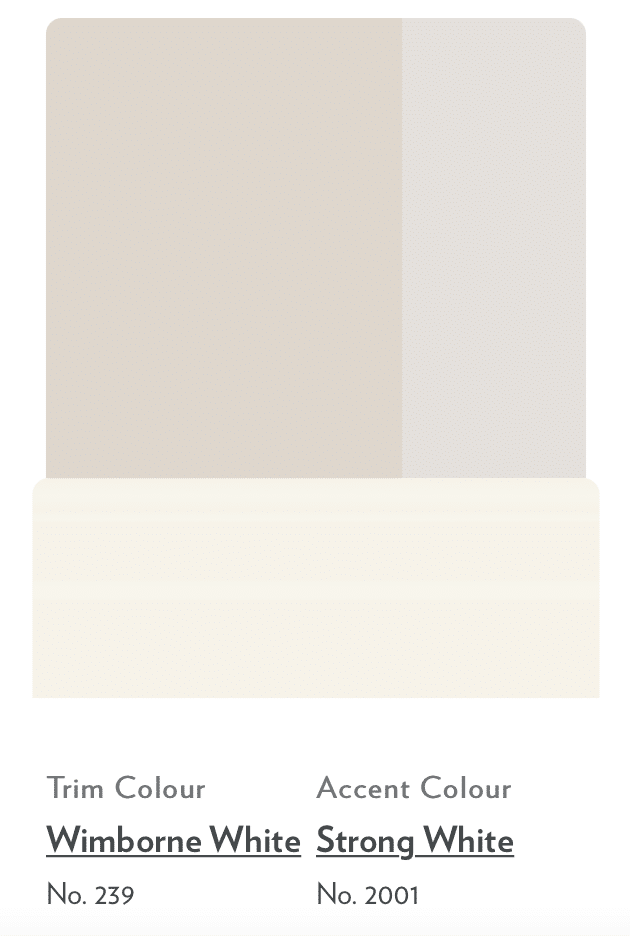
If you’re looking to use Skimming Stone on the walls, F&B suggest using Wimborne White on areas such as skirting boards and architraves, and Strong White as an accent colour.
Through my design experience, I personally prefer to carry through the wall colour you use on the skirtings too, especially in small spaces as it instantly draws the eye up.
If you start using different colours on the skirtings to what you do on the walls it can cause instant chaos as you’re trying to take in the different colours as you enter a room.
I think choosing one colour also helps with cohesion and flow in the room if it’s a narrow space. A bright white can feel like a knee jerk reaction on your woodwork if you’re looking for a different shade, whilst this approach is fine, it’s not the most modern way to paint woodwork these days.
When choosing a colour for the skirting vs walls, I always go for a paint colour that is at least two shades darker than the walls. This provides definition, grounds the room and adds a beautiful depth to the space. A few shades I love pairing on woodwork with Skimming Stone on the walls are Dove Tale and Elephant’s Breath, I also like shades with a slight green undertone for a greige look, such as Vitty Green.
I would take the same colour on the skirtings onto the architraves and doors too so you have a cohesive flow through the space. The only occasion I wouldn’t paint the skirtings a different colour is if I am using Skimming Stone on just half wall panelling.
Defining Accent Combination
When you’re using a neutral in an interior like Skimming Stone you should always work to introduce a darker shade into your colour scheme.
Using a darker accent colour like F&B London Clay will add a defining colour to the room which will help to frame and ground the space.
If you’re looking to achieve this with paint, there’s plenty of other ways this can be achieved with different paint colours, Railings is a popular choice or you could opt for a standard matte black paint. You might want to use a colour like this on your stair treads or bannister. Other than that, I would only introduce a darker shade through decor and textiles.

Warm, Colourful Combinations
Neutral combinations are one of the most popular Skimming Stone colour schemes, but incorporating some warmer shades into the mix can create an inviting and welcoming space.
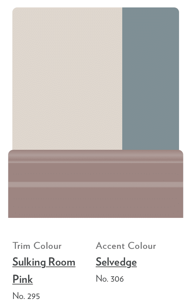
Sulking Room Pink is a classic shade that brings a bit more definition than a dusty pink, and it works in a range of different settings.
If you want to play on the grey undertones of Skimming Stone, Selvedge is a great choice which has a denim, blue, grey look to it depending on the light in the room.
Skimming Stone & Black
If you want to create a transitional interior, a black accent will go a long way in pulling an interior together and bringing that all important defining detail to a room.
It contrasts beautifully with Skimming Stone for a touch of modernity. A few simple details like a lamp, radiator or door hardware is all you need.
If you’re decorating a hallway you might want to go for a traditional look and introduce a black onto your banister. Railings is a popular choice and has more body than a standard black shade.
You’ll then want to incorporate another colour into the equation for some depth and colour in the space.
Like this look below? Pair with a standard bright white like F&B All White or Dulux Brilliant White on the ceiling to get a similar look like this.

Skimming Stone & Bright White
Crisp white half wall panelling like this creates a fresh, modern look when paired with Skimming Stone on the upper half. This creates a timeless look that works well in any room. Use a white such as All White to recreate this look.
With Skimming Stone a continuation after the panelling, it helps to draw the eye up as you enter the room too.
Add a black accent in a few well placed areas for a defining look, such as on photo frames, side tables and interior hardware accessories like sockets and switches.
Typically, your darker shade should go on the bottom of the wall, this is a preference thing, but ideally your darker shade on the bottom grounds the room, whilst the lighter shade on top draws the eye up.

Skimming Stone & Terracotta
Bright, bold accent colours, such as spicy terracotta create a powerful pop of colour when paired with Skimming Stone. This works particularly well in smaller spaces and in a few well placed areas.
As demonstrated here, a pop of this colour on some scatter cushions on a sofa is a simple, yet effective way to introduce a contrast with Skimming Stone. You can then update your accent colour if you so wish as the seasons change.
Another area I love adding a punchy colour to is on stair treads in a hallway. An unexpected area that instantly gives you visual interest as you step into a hallway. Red Earth and Picture Gallery Red are two of my favourite terracotta shades for this type of design.

Skimming Stone & Green
Be it forest green for some added definition or a soft touch of sage green, green makes for a perfect pairing of Skimming Stone, creating a really earthy, neutral interior. Try Green Smoke for a similar look to the bedroom shown below.
Use green as an accent colour within the space with furnishings, textiles such as cushions and throws or decorative accessories.
If you don’t want to go all in, a really simple way to introduce green is with fake or real plants.

Skimming Stone & Grey
Skimming Stone is naturally a warm grey/beige with grey undertones so layering with other shades of grey within an interior will build depth and texture.
Opt for a darker grey for a defining edge, and do layer with differing shades of grey for further visual interest. This creates a really neutral, yet warm and exciting interior, a perfect example of how you can still have a grey, warm and cosy living room when using Skimming Stone.

Skimming Stone & Hardwick White
Looking for the perfect contemporary grey to use with Skimming Stone? Take note from the below bedroom which used Hardwick White on the panelling, and Skimming Stone across the rest of the walls and ceiling.
A grounding, earthy neutral that is a great alternative to a black.

Skimming Stone & Dead Salmon
The right shade of pink can feel sultry and sophisticated and that is definitely true of a pink such as Dead Salmon. It’s one of my personal favourites and its moody tone is balanced beautifully by Skimming Stone.
A great combo for a particularly sunny south facing room.

Lean Into Skimming Stone
For a cottagecore inspired living space, Skimming Stone is warm, cosy and inviting. Pair with muted shades across your furniture and textiles and introduce a few well placed black accents for some definition.
In this living room below they have opted for white on the ceiling and skirting, but opting for a colour drenched approach can make the room feel even cosier.

What Is the Dupe of Farrow and Ball Skimming Stone?
Dulux Egyptian Cotton is a perfect close match dupe to Skimming Stone, it carries the same modern warm neutral tone delivering an elegant, sophisticated feel to a space.
As you can see, it’s a near perfect match. Always grab a tester pot before committing as the shades can look different in different lights.
I am a Farrow and Ball lover and having decorated multiple rooms with Dulux and Egyptian, the Farrow and Ball quality is far superior, the paint is thicker and you need less coats. Whilst the perception is that Dulux is cheaper, they probably work out at a similar cost when you factor in the amount required for decent coverage.
Looking for some other alternatives for Farrow and Ball shades? Take a look at our entire post on Dulux alternatives for Farrow and Ball paint shades.

In summary, here are some of the best colours to use with Skimming Stone;
- Creams & whites
- Browns
- Dark green – sage green
- Navy Blue
- Black
- Grey
- Mustard yellow
- Terracotta and reds
- Pink
Whether you choose a neutral Skimming Stone colour scheme or opt for something a little bit bolder and warmer, this versatile colour is a real winner in an interior, a perfect balancing colour that’s a perfect replacement for magnolia and bright white, yet it comes into its own when paired with other colours.
Once you have decided on a few colours for your scheme, get a tester pot for each one. Please don’t start painting without this stage, it’s so important as paint looks so different in other peoples houses due to the light those rooms receive.
Then I want you to paint A4 sheets of paper with the paint. This will allow you to see how they pair together in your setting (if choosing woodwork colours too) and you can then easily move the testers around the space to see how they perform in the darkest, and lightest places.
There is so many more recommendations and ideas for colour pairings in the comments below, if you are looking for any specific Farrow and Ball colour advice please leave a comment below, you can also attach an image of the space which helps with visualisation. I cannot reply to individual emails, but the comments section allows new visitors to see my recommendations too and I am very active here!
Lovely.
I am painting my little kitchen Skimming Stone.
It is a very old cottage.
My shelves are painted the same colour.
(I don’t like fitted kitchens)
I use an old dumbwaiter to stack my blue and white plates etc.
What would you suggest as a paint colour?
I have used pointing for the kitchen doors leading to the pantry and the stairs.
No skirting boards . The cottage is too old pre 1600.
Would you still paint the doors skimming stone?
Thank you.
Hi Elizabeth, thanks for your comment, your cottage sounds gorgeous! I’d personally say paint it in the skimming stone too as it will create that cohesive flow through the space, which is called ‘colour drenching;, it creates a really enveloped feel in a space and sounds like it would suit your cottage beautifully. If it’s a small space, introducing additional colours can make a space feel smaller. However, if it’s a very large space, you can get away with introducing a new colour to the doors. Hope that helps and let me know if you need any further advice, Nicole x
Hi there I have just had my old kitchen units sprayed in ammonite but not sure what colours to put on my walls and between wall and base units. Would love some advice. Pat
Hi Pat, thanks for your comment! You can go two ways with this, keep a neutral colour scheme and introduce a grey, sage green or blush pink colouring, or lean into the darker side for more of a contrast with a darker green or navy blue. I have some more examples of these colours in situ with ammonite here; https://www.sleek-chic.co.uk/2023/07/ammonite-or-cornforth-white.html hope this helps, Nicole x
hi
we are painting our kitchen cupboards skimming stone – the wooden paneling between the oak worktop and upper cupboards is also skimming stone. we have a black range cooker and hood. We also have some olive green tiles near sink.
What colour would you go advise for the cooker smash back – we are going glass with a colour? It is an Edwardian house with the ref and black floor tiles.
thanks
Good morning, thanks for your comment! Sounds gorgeous – I would personally lean towards, a similar green on your splashback as that on your green tiles as you don’t want to be introducing too many other colours here as everything will fight for attention, if you do this you’ll create a more cohesive feel that looks intentional. If you are open to other splashback options, I would lean towards something like a white semi sheen herringbone style tile. If you need anymore advice, please send a photo across to me on email as it helps for me to visually see and recommend to hello@sleek-chic.co.uk thanks! Nicole x
Hi Nicole,
Looking for some advice. I have a north facing galley kitchen, the cupboards are painted railings. Wall colour is currently strong white but I want something warmer. What would you suggest? The worktops are tiles are like a stone colour. Thanks in advance,
Hi Elyse, thanks for your comment. I would go for something like Joa’s white, Oxford Stone or White tie they all have yellow undertones but will bring much more warmth than strong white which has a cool grey undertone to it. Hope that helps! Nicole x
Hi Nicole,
We’re painting our kitchen cupboards skimming stone. The splash back tiles are currently beige and the worktops are black. What colour would you recommend we paint the walls please. Would skimming stone all over be too much? Thank you 😊
Hi Michelle, thanks for your comment! Sounds gorgeous, I just love Skimming Stone! I’d definitely go for a different colour on the walls so you have a bit of interest, it could end up feeling flat with the same colour all over. If you want to still keep it neutral I would go for something like F&B Wevet, All White or Strong White (all slightly different in tone so do recommend a tester pot first) so you have a bit of contrast, it will draw the eye up but keep an airy, light kitchen space. Hope that helps! Nicole x
Thank you Nicole, I appreciate your reply. I will certainly look at those colours. Can I ask how you feel Elephants Breath would work on the walls with Wimborne white on skirtings and architraves? I’m determined to have pitch black doors
Love love Pitch Black for an accent, so this will look fab on your doors. Elephants Breath will definitely work, if you have a smaller space I would keep the skirtings the same colour as it will lengthen the walls and avoid it feeling like a band of colour in the middle, if not, then totally go for Wimborne White! Nicole x
Personally I like mouses back, although changing the living room from James white before Christmas, as my mother has decided she doesn’t like it anymore, is going to be a chore this month.
Whilst the rest of the house is clunch, luna and all white , the same colours don’t work with the different light in the living room. It’s a choice between skimming stone and stirabout, I didn’t think it would be so difficult to choose between white/grey and white/beige; is there an article with pictures for the stir about?
Yes, Mouses Back is a lovely shade, although a bit darker in nature. I don’t currently have an article on Stirabout, but it can be difficult as the colours can look very similar albeit with a slightly different pigment. Stirabout feels slightly pinkier in practise, I’d recommend getting a tester of each and painting onto two sheets of white paper and then taking around the room so you can see how it looks in different lights.
Interestingly mother and I have been out today to purchase the Parnham vase , before seeing the article. It will look nice with green Christmas eucalyptus and red berry foliage, although I can’t help thinking how lifelessly bland the photo of the half white walls look. Reminds me of being a child in the 90’s where everybody had cream carpet and a spare living room nobody ever wanted to sit in because it was cold and sterile, with a kind of sickly cream and pale green chintz combination, leaded light windows and the old style ercole sofas which had carved backs that looked like church furniture. Although I wish the matching rocking chair hadn’t on gone on the bonfire during the divorce, as I’d spent 4 hours recovering it, as it was my fave spot. Although I still like the Gothic look of a wooden floor, white walls and painted black furniture; accompanied the Parnham with the wrought iron black candlesticks and ceramic scented bells for Christmas. I suppose next is what to do with the decs, as they’re looking slightly tired too.
We live in a newish build (18 years old) which is currently all painted pure white all over with a few pops of colour such as dark green panelling in the kitchen (which is white handless gloss) and orla Kieley stem wallpaper (in blue/mustard/beige) on a feature wall in the lounge. Thinking of changing to skimming stone throughout downstairs but slightly worried this will look a bit dull. Thinking white trimmings. Would love your thoughts? Thanks
Thanks for your comment! Love skimming stone, perfect for a warm modern neutral and it’s got more character than a standard pure white. I would avoid white skirtings & architraves as it can look like a band of colour in the middle. Instead, paint the door a different colour – such as a sage green for example, it will add warmth and colour against skimming stone. From my personal design experience, I tend to only use the same colour if the room flows into another directly such as a living room/dining room, you can still create a cohesive space by pairing it with complementary colours in other rooms. Hope that helps, Nicole x
Hi,
We have a long narrow bedroom with bed at one end then we have fitted wardrobes (floor to ceiling on both sides of the wall) at the other end. We’re thinking about painting our bedroom walls in skimming stone and not sure whether we should do the wardrobes in the same colour or a different colour to zone the areas. Any thoughts?
Thanks for your comment, if you want to keep things minimalistic, colour drench everything in the same colour, but bring warmth in through bedding, cushions, curtains etc. Alternatively, paint the wardrobes in a different colour, but I would use the same colour on any woodwork around window and doors so there is a cohesive, running theme. Hope that helps, Nicole x
Hi Nicole,
I’m currently painting my flat Skimming Stone and was looking for a white to paint the doors. Looking for something that would give a contrast but would complement it as well. Would you also be able to recommend something in Dulux for the doors?
Thanks
Rabia
Good morning, thanks for your comment. If you want a crisp, stark contrast go for Dulux brilliant white, if you want something which is an off-white, have a look at Rock Salt which has a similar grey undertone to skimming stone. Nicole x
Great review and super helpful! Doing our bedroom in this colour and feeling nervous it will all look plain but your tips help. My only worry is what colour Roman bling to put at the window without it looking all too pale all over?
Thank you! Yes – so I would definitely pick a secondary or third colour you’re going to use in your bedroom across bedding, cushions etc and then use a similar tone on the Roman Blind. If you want to keep things neutral on the Roman Blind, go for a lovely grey or oat linen style fabric, or lean into a gorgeous olive green to add some definition. As long as the Roman Blind has a slight differentiation in colour to Skimming Stone it will still add warmth and avoid it feeling flat. Hope that helps!
Hi Nicole, having found your extremely helpful website I wonder if you can kindly assist; our kitchen units base and wall cabinets are in Purbeck Stone, panelling between the units and the remainder of the walls are Amonite but have always felt it is too “grey”. Having spent months deliberating and researching F&B colours and pairings and many testers later, I opted for the contrasting Stiffkey blue just on the non panelled walls (which are opposite ends to the units) but feel it’s completely wrong, especially around some oak beams on one part of the wall, although previously it felt bright enough to get away with going with a dark colour. ‘ House is very old cottage but fairly light with windows both to north and south (south facing one much smaller). Anyway having read your articles I’m wondering now if I should use more of a colour drenching approach with either Cornforth white or Skimming stone, or even Purbeck stone and then add colour ? of sorts with the blind and door curtain. Of note, the floor is limestone tiles and range oven in a “china” blue. I would be most grateful for advice so I can finally love the kitchen! Thank you so much
Hi Helen, thanks for your comment! From what you have said, I would personally go for a colour drenched approach, if you have slightly shorter ceilings in a cottage too it will feel warmer and cosier – either Cornforth white or Skimming Stone, Purbeck Stone is a mid grey so it will feel far too dark for the look you want to achieve. Always bring colour you’re comfortable with through textiles such as blind, door curtain and decorative accessories. Door curtain, have a look at ticking stripe, it’s a classic print but comes in a wide variety of colours. Always happy to give more recommendations with a visual so do feel free to send an image to hello@sleek-chic.co.uk if you want any further help! Thanks, Nicole
Ticking stripe! That’s exactly what I’ve got on the front door, looks very quaint still, despite living in a new build cul de sac now, instead of having a cottage living room exactly like the one depicted in morris paint chart booklet and without a strange man making himself at home on the sofa of course.
And I have to say Nicole, skimming stone does look very nice with blue.
I’ve newly painted over the All White & James White with skimming stone and matched my bedroom walls with a lovely GP & J Baker blue Persian Linen pattern called Kiana, in matching curtains and padded headboard. It’s particularly complementary with my Henshaw painted black furniture too. Although it’s the first time I’ve ever upcycled an antique Victorian mahogany bed, so let’s hope the walnut veneer around the headboard piece turns out well.
Hi,
I currently have skimming stone in the bedroom, but the headboard for my new bed is mushroom grey, i have forest / emerald greed beddign and curtains with white furniture and a jute natural type carpet.
I feel im trying to acheive somethjng with too many colours, i can remove the green but on a budget so the carpet and bed needs to stay.
Any help for a cosy, modern calming colour scheme would be appreciated xx
Hi Gigi, thanks for your comment. Okay, so I would personally strip it right back and build colour just through your bedding textiles to keep costs down. I would stick to white sheets as your base, then build colour with cushions and throws – I have some calming colour bedroom schemes here that might help with choosing soft colours; https://www.sleek-chic.co.uk/2024/02/calming-bedroom-ideas.html hope that helps! x
Thoughts on using skimming stone throughout entire house ?
Absolutely nothing wrong if you want to do this for ease, it’s a warm colour and will work in all rooms no matter the orientation. You’re just not going to get the depth and interest of having different colours in different spaces. I would personally only use the same colour if it was an open plan space such as a joined dining/kitchen/living room. If you stick to one colour, just focus on bringing some colour in through decorative accessories and textiles, hope that helps!
Hi Nicole,
I am having an unexpected kitchen renovation due to a freak accident. My kitchen is an open plan and extends into the living room. It is a new build and walls are currently white . The living area has a dark grey cabinet with oak trimmings and there are skylights a that end. My new kitchen cabinets are going to be reed green with a whitesh gray quartz worktop.
I was thinking F& B – Faded terracota in kitchen area and Red earth in the living space including ceiling where the skylights are. The narrow hallway entrance leads into kitchen – for this I was thinking Skimming stone .
Can I use the same colour to go up the landing on the top floors? I have an olive green colour in the first floor living room.
Also what colour would you recommend for small hallway toilet?
Good morning, thanks for your comment! I LOVE faded terracotta and red earth, especially for creating a cosy colour drenched space. YES – I would always encourage using the same colour in the hallway up to the landed so the space flows and there is consistency across those transitional spaces. Small hallway toilet – have some fun with colour here, it seems like you have an earthy kind of colour scheme so you could go for a green such as Bancha for impact or Green Smoke for something a bit lighter. Ideally, you want something that contrasts against Skimming Stone but still complements it, you could even lean into moodier pinks like sulking room pink which looks great in a downstairs toilet. Hope that helps! Nicole x
Hello,
I am planning to use skimming stone in my hallway, stairs & landing in the bottom half of my walls which are pannelled.
I want to keep the top of the walls white to keep the rooms as light as possible as my landing especially is dark with no natural light.
What white would you reccommend to use with skimming stone, would all white work or would Winbourne white be better. My ceilings have already been painted white.
Morning Donna, Both all white or Wimborne white will work with Skimming Stone, all white has a brighter finish whilst Wimborne white has a more soft, subtle finish because of the slight yellow undertone. I’d lean towards Wimborne white in this setting as it will make the little natural light available feel warmer in the space. I do still recommend a tester beforehand though as paint does look different in different lights, hope that helps!
Hi Nicole,
Planning to use Skimming Stone in my hall, stairs and landing and colour drench skirtings, and door frames, am having a herringbone stair runner carpet fitted with black trim and painting the banister and spindles black, my question is what colour do i paint the doors and the stairs? do i go for all white, wimborne white or strong white? would i also colour french the ceiling ? Would i use a different finish of paint for the doors and frames even though same colour?
Thanks,
Karen
Hi Karen, sounds gorgeous. Yes – I would personally colour drench the ceiling, it makes it feel cosier and the space feel larger. I would use Dead Flat in the f&B range as can go directly onto wood too and gives the same finish across wood and walls, I’ve used the dead flat in our home and it’s amazing! Using a white is absolutely fine, alternatively you can go for something a couple shades darker than skimming stone and use this across the stair treads and doors, it brings a bit more of a modern feel and definition. If I was doing this, I would use a colour such as Dove Tale, Elephant’s Breath or something with a greige undertone like Vitty Green: https://tidd.ly/4eoIuiK hope that helps! Nicole x
Hi just come across this page whilst looking up skimming stone paint as looking to use this in my bedroom but feeling unsure which colour to put on coving, skirting boards and ceiling and wondering if you can help at all please. I’ve got a cream crushed velvet quilted bed frame and picturing a neutral bedroom with a chandelier (really pretty and girly) then adding colour through bedding, curtains, ornaments, lamp, rug etc and decided on blush pink. Do you think skimming stone on the ceiling as well as the walls with Wimborne white on coving and skirting boards and doors would look ok or can you suggest any other ideas? I’m worried about it looking bland although I am wanting more of a neutral bedroom that’s why I thought if I add plenty of colour through what I’ve mentioned above it shouldn’t look bland but feeling unsure. Let me know if you think any other ideas. I wonder if skimming stone might look too dark on a ceiling but in my living room my ceiling is same colour as my walls so makes coving stand out which I like. Thanks
Morning, I would personally either colour drench the room all in skimming stone – it provides the cosiest feel in a bedroom and you can then bring your colour in through bedding textiles -throws, cushions etc. This will involve painting everything, including the woodwork in skimming stone. There’s nothing wrong with going with Wimborne white on your woodwork but a more modern approach is opting for a colour a few shades darker than your wall colour and using this on your woodwork – skirtings, architraves, door, such as elephant’s breath which is a perfect complementary colour. If you still want to go for white on the ceiling to keep things light then no problem doing that too. Hope that helps! Nicole x
Hi, I came across this fantastic guide and I’m taking this opportunity to ask for advice. I’m renovating this bedroom in an old house with a 6 meter high vaulted ceiling. the floor will be polished to preserve its history like the ancient doors with frames. I would like some advice on how to match the colors. While waiting for a response, I would like to take this opportunity to congratulate you on this fantastic guide.
Wow, what a space! So great to hear you’re keeping the architectural parameters of the space and working with it. Can I ask if you are wanting to keep the existing shade for the doors? I can then send some recommendations over, thanks! Nicole
first of all thank you for the prompt reply, regarding the shade of the doors I would like to adapt them to the new context. I was thinking of applying some wall paneling. my doubt is about the colors of the wall and ceiling in the dome so as to make it valuable with adequate lighting
No problem. Because it is such a high ceiling, there are a couple of things I can suggest. If it feels cavernous, I would recommend drenching the walls and ceiling in the exact same colour, it makes larger ceilings feel closer and cosier. I would then paint skirting, woodwork and doors in a different shade. Alternatively, paint the ceiling down to the picture rail, another method to make the ceiling feel closer, whilst making more of a feature out of the ceiling. Both methods will work well, it’s up to personal preference, for me, I would stick to the one colour going up to the ceiling as it will flow better. I would focus on a green on your woodwork so it ties into the floor nicely, something such as Green Smoke, Cake Green or Card Room Green, it will really ground your scheme, you need something with definition for a large space like this. Most neutrals pair well with these greens for the wall/ceiling, such as Skimming Stone, School House White and Oxford Stone. Best thing is to grab some tester pots and see how they feel in the space/the light your room receive and against the flooring.
I don’t know how to thank you for your precious advice, I will treasure it. I was thinking of applying some boiserie, what do you think? above all I wanted to stand out with hidden lighting in the false wall so as to illuminate the ceiling from the bottom upwards, sometimes then I don’t know whether to add a central chandelier or side appliques.
the adjacent to this room I have a double bedroom of 14 square meters and is 6 m high I always consider the same advice or do you have other ideas to differentiate it
PS in case I should come to visit Naples or Pompei but with a free stay
Yes, you have a traditional property so that style of panelling will suit perfectly. Take a layered lighting approach, large central chandelier or pendant light, wall lights and of course, table lamps/floor lamp as appropriate to fill the space. For the other room, similar approach, but lean into some different colours so you have depth of colour between the spaces. Hope that helps and thanks for the offer!
Hello this website is so useful thanks! Do you think this colour would work well with dark wood. My windows are big tall and a dark wood. The ceiling is super high and it’s a big open plan kitchen diner. The floors are oak engineered wood. I’m panicking that is all looking a bit brown but don’t want anything too bright colour wise as would rather have cushions and plant pots to add the colour.
Room is north west facing and gets sun from around 2pm from spring onwards
Morning, thank you! Yes – Skimming Stone is cooler than wood so will complement well, if you do want something a bit warmer though, have a look at Oxford Stone and School House White. You can’t go wrong with a neutral base like this and I always recommend to build your colours in with accessories, textiles and plants, as you’ve already suggested as it’s so easy to build on this:)
Hi Nicole
I have a dado rail in my sitting room painted in Downpipe . We have just painted above the rail in Skimming Stone and below the rail is All White . I feel like the rail is now not cohesive with the overall colour scheme and don’t know whether we should paint it skimming stone or all white? The windows and skirting boards are all white. A dilemma.! You’re advice would be great !
Morning! Lovely colour choices, but yes with the Dado rail it’s created a band of colour which looks out of place now, so ideally, this should be the same colour as the lower half of the wall, and even the skirting colour. If you are keeping the lower colour, paint the dado rail in all white, it will instantly change how this section feels! If you wanted to change in the future, I tend to use a darker, more defining shade on the lower half to ground the room so you could have downpipe on lower half, skirting, dado rail and the window board, just as an idea. Hope that helps! Nicole x
Thank you so much Nicole
Hello Nicole.
I have to choose the colors for a renovation and I would like to opt for Skimming Stone because I am looking for an enveloping and neutral tone for a Scandinavian atmosphere. If I understand correctly, on the floor of the bedrooms (parquet floor), will I be able to put the doors and baseboards in white? On the ground floor, the tile is light gray, will I be able to keep the baseboards of the color of the walls?
I would like to put the ceiling of the entrance in Railings 31 (natural wood bay windows inside, black metal outside, black wood cladding upstairs): is it too risky?
Morning, yes – no problem keeping your woodwork white against skimming stone, or even leaning into using skimming stone across all woodwork too if you want more of a colour drenched, enveloping feel. Definitely a bold move with Railings on the ceiling, but it totally depends on the light your room receives, this will immediately make an entryway feel darker so if you have a dark hallway with little light I would personally avoid it as it will feel oppressive. A colour drenched approach where you use skimming stone on walls, ceiling and woodwork lends itself to a Scandinavian feel and you could still incorporate dark accents, perhaps on a bannister if you have one and decor accessories. Hope that helps! Nicole
Buongiorno
Volevo condividere il risultato finale dopo i tuoi consigli.
It looks fab! Thanks so much for sharing 🙂
I have pine floor pine doors pine stairs & pine skirting boards throughout the house. What colour works well with these please. My husband won’t let me paint them so I need a colour for hall and living room and kitchen
Ideally a cooler neutral will balance well with the pine – Skimming Stone, Shadow White, Slipper Satin, or look at Dimity or Pointing if you have a very dark hallway – hope that helps!
Hi , i have an open plan kitchen / living room vaulted ceiling with velux to the front with black crittal doors ( lighter end of the room,and to the back with flat ceiling is the were the kitchen will be with a peninsula dividing the two areas , we have decided on the kitchen cabinet colour shaded white i want to colour drench the whole space what colour would you recommend as a contrast for the kitchen but would work in the whole space , the samples i have are , winbourne white , skimming stone , schoolhouse white but just cant decide , i also want to carry on the same colour scheme into the halway for a nice flow .
Morning, sounds gorgeous! School House White is part of the same type of undertone so for a little variation, I would instead lean towards Wimborne White, or even James White which has a subtle green undertone but would pair well with shaded white, best to test on A4 sheets and move through to the darker areas too so you can get a feel for what they look like in different lights, hope that helps!
Hi Nicole,
First of all, thank you so much for providing us with so much inspiration through your website. We have recently bought a 1930s house with beautiful decorative moldings and a ceiling rose, and we would love to stay true to that style. We would like to paint all the walls in our house in the color Skimming Stone, and we are looking for a good white shade to go with it for the trim, doors, baseboards, and ceiling. Could you recommend a beautiful white tone for this?
In addition, I would really like to paint one wall in a different color (something pinkish), but without it being too girly or too dark (my husband has to live here too ;)). Do you perhaps have any advice on this as well?
With warm regards from the Netherlands,
Daniëlle
Good morning Daniëlle! That sounds beautiful, congrats on the new home! Strong White is the best match for Skimming Stone as they share the same undertones, alternatively for something slightly light and brighter, Wevet is a lovely white shade, and so subtle and soft.
Scallop is one of F&B newest shades this year, and in my opinion the most perfect pick which isn’t too feminine! Nicole x
Thank you so much, this is very helpful!
Hi
I would love your advice. My new kitchen is currently being installed – the base units are skimming stone and the wall units are mole’s breath (which matches the floor) and there will be an oak worktop. Really struggling to know what colour to paint the walls! The kitchen door is F&B light grey – would this work on the walls as well?
Many thanks
Good morning, without seeing the space and light your room receives, I’d personally lean into a much lighter, warmer wall colour because of how defining Moles Breath is in the space, it will end up fighting for attention with Light Grey. Instead I would recommend something like Pointing, Strong White or Wimborne White. Test them in your space beforehand on an A4 sheet of paper to see how they feel with the light your room receives, hope that helps! Nicole x
Thanks very much
I did a light grey tester and it doesn’t look right!
I’ll try the lighter shades you suggest
Many thanks
Nicola
Hi similar to Danielle’s post recent in October
I am renovating a large east facing living room in a Victorian terrace. Very high ceilings and lovely deep original skirting and coving. And then reinstating a picture rail. I’m unsure of whether paint above and below the rail in skimming stone and would like a coordinating colour for the ceiling. Or would it be better all matched in skimming stone, maybe keeping the skirting and coving white, and if so which white do you recommend
Heeft de kleur Skimming stone een gele gloed wanneer hij op de zuidkant wordt geverfd.
Graag advies…zoek een zachte beige tint zonder geel/ roze gloed. Gr Jeanette