
Farrow and Ball have some of the most pigmented and stunning colours for our homes, and there’s always a moment for pink.
Gone are the days of sickly pink and overtly feminine shades, some pinks can be classed as good as a neutral, whilst Farrow and Ball offer both off-whites with pink undertones to more moody, sultry pinks.
I’ve compiled a round up of some of Farrow and Ball’s top paint shades, as well as examples of them in 23 real homes you can get a real vision for how these shades cut it in our interiors.
The Best Farrow and Ball Pinks In 23 Real Homes
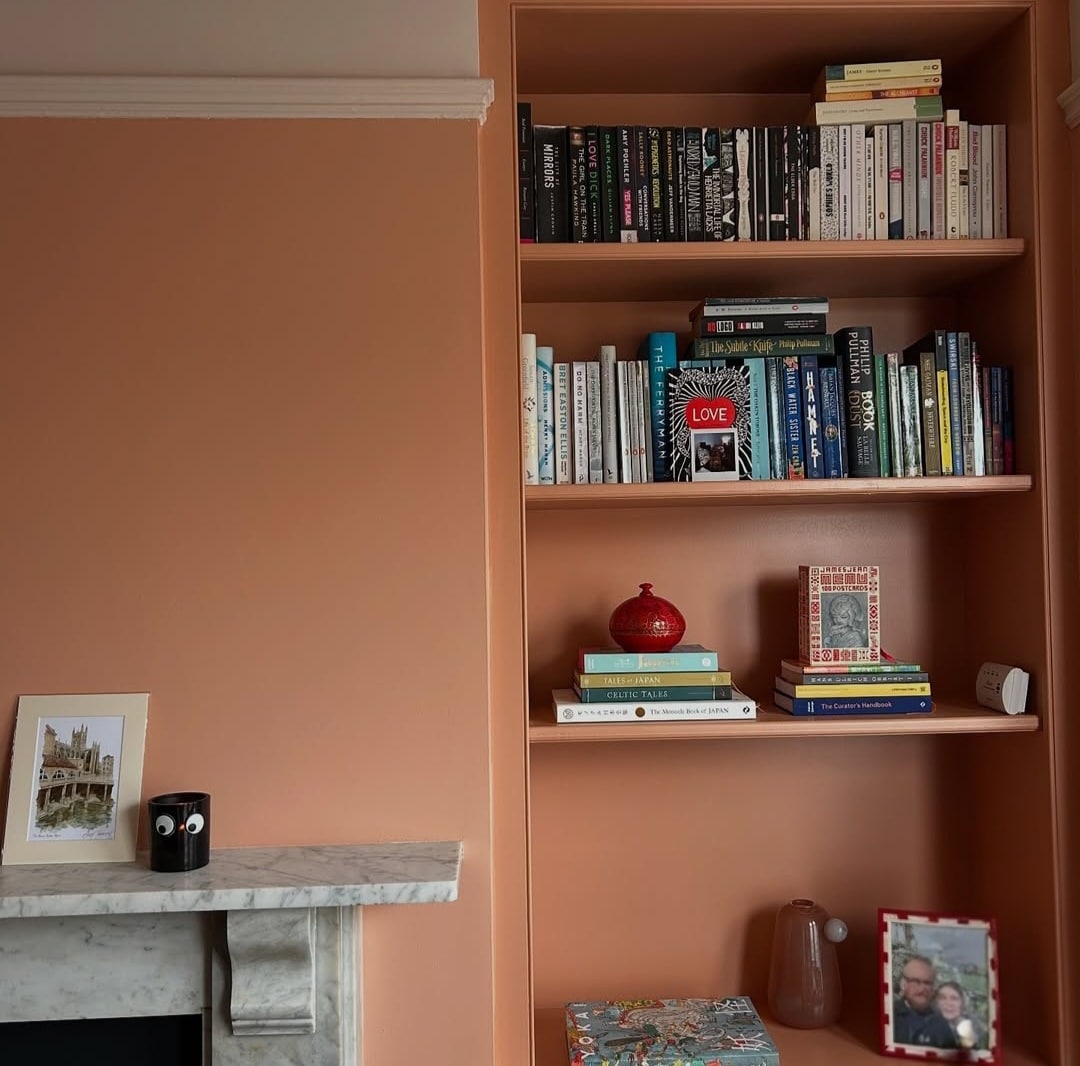
Sulking Room Pink
I’ve shared Sulking Room Pink a lot on Sleek-chic Interiors over the last few years and it really is one of my favourite pinks by Farrow and Ball for projects.
It’s mature, not overly feminine yet adds a dramatic feel to any room with its muted rose demeanour. I love the versatility of this colour, it works beautifully with neutrals, and finish it off in a colour scheme with some black accents. You’ll see how it pulls the colour scheme together and makes the space look ‘finished’.
Have a look at what it looks like in our downstairs toilet makeover too!

Bedrooms, living rooms, small downstairs toilets, sulking room pink really does it all! Whether you have a period property or are opting for a modern design, it melds well to whatever design trend you’re trying to achieve.
I’m a huge fan of their Dead Flat finish which can be used on woodwork too so you can use the same paint throughout if you’re looking to colour drench the space with the colour.

Tailor Tack
If you’re looking for something a bit punchier than an off-white but not something in your face, Tailor Tack is a perfect choice. This delicate pink has a warm undertone to it making it suitable for colder North facing spaces too.
Like most pinks, you can treat it in the same way with what colours you pair with it. Some well placed black accents will ground the colour scheme, as expertly shown in the living room below.

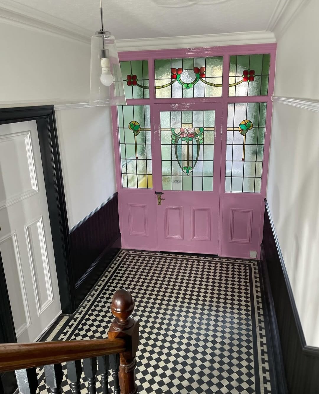
Peignoir
This soft pink is grounded by grey undertones giving it a really subtle finish that brings a gorgeous depth to an interior.
This colour virtually looks perfect in any room. Swap your traditional bright white or off-white for this stylish shade in your hallway. It’s welcoming, warm and cocoons you as you step through the door.

Alternatively, it makes a refreshing alternative in a bedroom. Pair with a picture rail and carry up to the ceiling with a bright white to draw the eye up.
It looks great in a boho inspired bedroom like this, pair with neutral colours and introduce natural materials such as wood, rattan and seagrass to cement the look.

Middleton Pink
But of course, if a more feminine pink is what you’re drawn to, look no further than Middleton Pink. It is described as Farrow and Ball’s prettiest and most delicate pink in their collection.
Pair with whites or neutrals for a fresh feel, or team with other pastels for an uplifting look. Take note from the gallery wall below – add a mix of frame finishes for an eclectic style.

It also looks super in this warm and well lit dining room. Contrast with green and black accents. Whilst brass hardware makes for a great pairing, consider using copper too. This warm finish adds depth and warmth to a colour scheme.

Templeton Pink
A warm and welcoming pink, Templeton Pink is a slightly more intense pink than the ever popular Setting Plaster. It could almost be described as a salmon pink and is a gorgeously pared back shade of pink.
It works beautifully in a more traditional colour palette with grey, white and antique brass tones.

Take inspiration from the below and pair it with classic marble or quartz in a kitchen design. The brass hardware adds a gorgeous warmth to the pink.

Calamine
Yes, this popular pink shade really is named after the childhood lotion. This subtle pink is soft without it feeling sickly in nature.
It feels more delicate in larger spaces, take inspiration from this kitchen which balances the intensity of colours beautifully. Navy blue, white and brass details create a gorgeous balance with Calamine.

Or, create a cosy, enveloping bedroom. In smaller rooms calamine can feel quite intense, so soften things with a picture rail and carry a white all the way up and across the ceiling.
We adore the red and blue accents in this room for a playful, bold contrast.

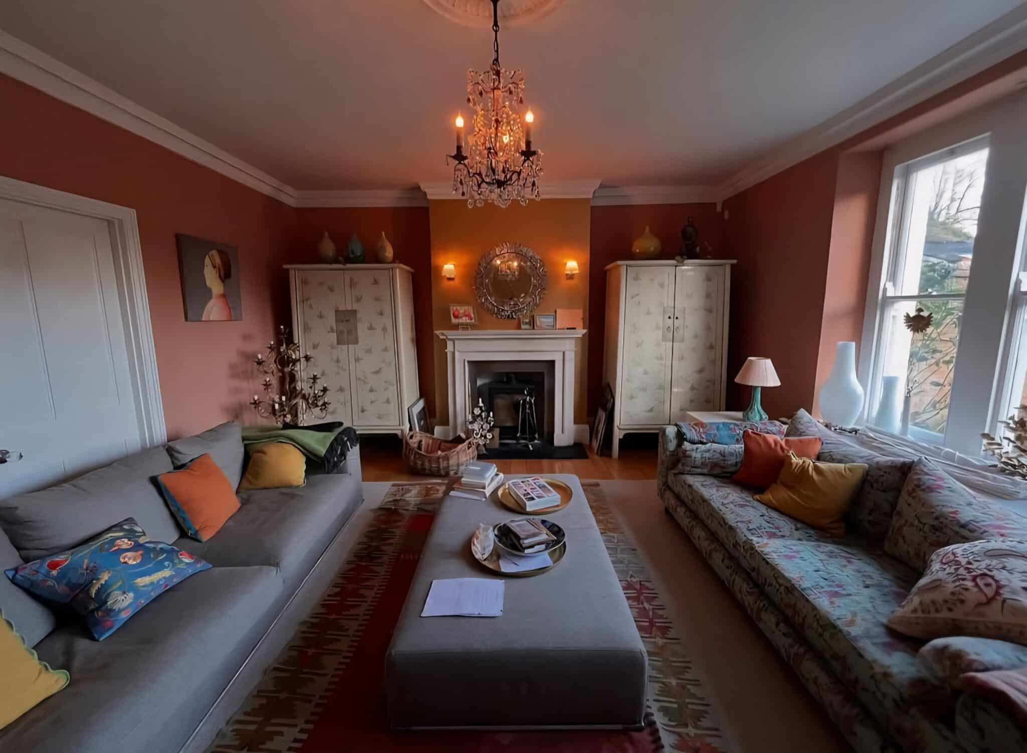
Cinder Rose
Cinder Rose is a bluer and more romantic pink than most other pinks which usually carry a yellow pigment. It’s the perfect colour for a child’s bedroom and beyond, it brings a dusky feel but soften it by pairing with wallpaper and an off-white.

It makes a gorgeous feature wall accent colour, working beautifully with soft neutrals, grey, whites and defining shades such as black. It’s such a versatile pink which is much loved in Farrow and Ball’s collection.

Setting Plaster
Arguably, Setting Plaster is one of the most renown pink colours in their collection. Named after the blushing walls you see after having freshly plastered walls, this soft and subdued pink is the perfect way to elevate a neutral colour scheme.
How stunning does it look in Elle’s home below? You can really bring out the pink tones of this colour by pairing with bolder pink shades, it creates a layered look that feels rich and sumptuous.

Another example of how well all pinks team with black as an accent. It will tie your colour scheme together but also grounds it so your colours actually look and feel intentional in the space.

Pink Ground
A soft blush that doesn’t feel sickly sweet, it does have a slightly more feminine feel to it than its counterpart Setting Plaster.
Whilst it teams well with a bright white, instead try an off-white such as Great White or even Wevet in South facing spaces that could benefit from a more subdued colour with a grey undertone.

It feels more like a modern neutral in this space and looks incredible set against this eclectic gallery wall. Grey works beautifully in a colour scheme with Pink Ground, providing the perfect stabiliser against the warm tones of it.

Rangwali
Rangwali is a stunning entrant that is the most exotic and adventurous pink on their roster. Albeit bright, it brings a wonderful depth to an interior and a real conversation starter.
You can lean into a bold colour scheme here, but do ground it with black, it adds definition and modernity to the overall design.

It adds a fun addition to a room in small doses too. Look how effective it is on the vanity unit. It is a match made in heaven with green, grounding it and giving it a natural base to work from. In a bathroom, instead of gold or brass, lean into chrome which will balance the intensity of Rangwali.
Naperon
One of the newest Farrow and Ball shades to hit the market in 2025, I am a huge fan of this shade!
It’s something we haven’t seen before and the perfect bridge between a pink and an orange for an earthy, almost apricot shade.
I adore this on an accent wall or on an accent piece of furniture for something a little bit punchy in the space.
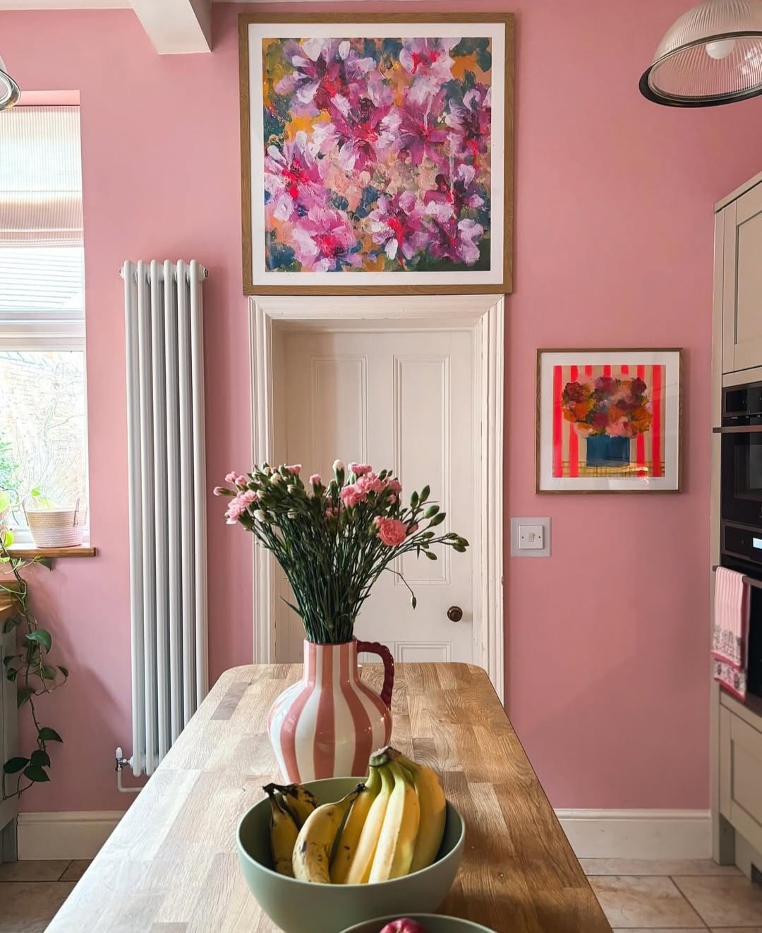
Nancy’s Blushes
Inspired by rosy cheeks, this gorgeous shade is the perfect antidote to a cold interior. It’s fresh, uplifting and ideal for cold north facing spaces.
Pair with a pink toned off-white such as Tailor Tack on woodwork and ceilings for a soft balance.
Ointment Pink
A favourite from their archive collection and what I’d describe as a heritage pink. It’s described as being warmer and brighter than Dead Salmon or Setting Plaster.
A soft orange pink that will warm up the bones of any room. Just look how fab it looks in the traditional living room below.
Shallot
Or why not introduce a punchy shade to a front door? It will draw the eye in and it’s a fun way to introduce some daring colour into an interior that may feel daunting to use throughout a space.
Shallot is an cheerful, punchy pink that is best used on accent areas such as key pieces of furniture or even accent walls for a fun approach in any room.
Which of these Farrow and Ball pink paints are your favourite? If you have any questions about what colours to pair with specific shades, please leave a comment below and I’ll come straight back with my recommendations.

Hi, just painted my hall F&B Masquerade 334. It’s perfect. I’m redoing my living room from scratch and would like your advice on what colour would complement Masquerade. I am open to ideas. The living room is facing west.
Thank you.
Morning! I’m not familiar with that F&B shade, is this the Little Greene Masquerade? Let me know and I will send some suggestions over, Nicole x