
Neutral colour schemes are invariably popular as they offer an ultra relaxed, yet stylish feel to any room.
Dulux Timeless is just one of those gorgeous neutral shades that looks fab in any room of the house, and it pairs well with both neutrals and racier shades such as terracotta and navy blue. It’s a warm colour due to its yellow undertones which gives this popular off-white Dulux paint shade a yellow, sunny disposition, particularly good for use in cold, north facing rooms.
If you’re about to don a paint brush with a tin of Timeless, I cover all the colours that go well with it, their perfect Dulux colour co-ordinates for a consistent, and cohesive colour scheme in your home.
What Colour Is Dulux Timeless? Dulux Timeless Undertones
Dulux Timeless is a warm, creamy white shade that is a versatile, and dynamic white for every room in a home.
It has yellow undertones which make it an ideal colour for North facing rooms as the yellow helps to counteract the coldness of blue light.
It’s also a much more forgiving white colour than a standard Dulux Bright White shade which will pick up every blemish, fingerprint and scratch.


Dulux White Cotton or Timeless?
Not sure how to choose between these two off-whites? Dulux Timeless has much stronger yellow undertones than White Cotton as you can see in the image below.
If you have a very cold North facing room, either of these shades would be appropriate in combatting the blue light associated with a North facing space.
However, if you don’t appreciate a very yellow, sunny disposition, White Cotton is a better alternative as it’s a couple shades closer to being a classic white, but with a slight yellow undertone which becomes visible in different lights. White Cotton would be better suited to sunnier south facing rooms or those that receive a lot of natural light during the course of the day.
This is why it’s always important to get a tester of shades before committing, as they do look different in different lights, and with natural and artificial light.

What Colours Go With Dulux Timeless?
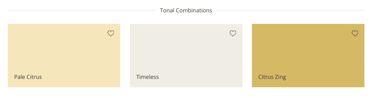
Tonal Combinations
When picking complimentary colours, a paint chart is always needed to check undertones.
For example, a yellow wall pairs well with a warm off-white with a yellow undertone, or 2 neutrals from the same family such as pink and pink. But never combine yellow with blue as you will have a colour temperament clash.
In the case of Dulux Timeless you want to look for tonal combinations, other Dulux colours with a yellow undertone.
Both Pale Citrus and Citrus Zing paint colours are perfect for layering with warmth and a cohesive feel. If you don’t want to go down such a yellow route, combining with other warm neutrals will work best for you.
Neutral Combinations
As Timeless is a creamy, white shade it also pairs well with other neutral colours.
Both Ashen White and Calming Meadow are great choices. Use Calming Meadow as a grounding colour in a space such as on architraves, skirting or doors.
Pretty much any neutral combinations work with a cream shade, think earthy greens, browns, greys, creams and whites. This colour scheme is perfect for many home decor styles including Scandic, modern, rustic and modern farmhouse.

Designer’s Choice Combinations
Whilst it’s best practice to follow the undertones of your main colour paint which in this case is yellow, rules were meant to be broken, right?
The designer’s choices add instant warmth to the creamy white shade of Timeless for a high impact look.
Pretty Pink and Raspberry Diva are quite contrasting shades, but anything really does go with a shade such as Timeless.
Don’t just think of paint colours here, whilst Dulux recommend paint colours, these shades could be used throughout home furnishings, cushions, throws and decor accessories.

Timeless & Black
Black isn’t a colour that should be shied away from in interiors.
Black accents against Timeless can look phenomenal, and super styled. Rich black is a great choice from Dulux if you’re looking to paint some accents in the room.
Think about subtle accents such as door handles, styling accessories, side tables and door hooks.
These subtle accents tie the room together for a cohesive feel, yet Dulux Timeless keeps the room light, and minimal. Black is an absolute essential accent colour if you’re looking to create a modern style interior.
If black feels a little too harsh, you might want to consider a navy blue option to add definition to the room with a colour such as Sapphire Salute by Dulux.

Timeless & White
As Timeless has yellow undertones, pairing it with pristine white creates a really crisp contrast which keeps the room neat, and minimal.
Add bright white to ceilings, skirting and fireplace mantels for that crisp contrast. You can achieve a similar look with Dulux Pure Brilliant White.
To avoid it looking too clinical, you’ll want to introduce a third colour into the mix to warm things up slightly. Opt for a colour with warmth such as green or black.

Timeless & Earthy Green
Earthy Green is the most perfect pairing for another neutral colour such as Timeless. Earthy design is hugely trending right now and so easy to achieve with a colour scheme like this.
You only need subtle accents to tie the space together, think of earthy green patterned cushions, fresh greenery and touches of green on decor accessories.
Dulux Heritage Sage Green is a great complementary colour for Timeless, such a tranquil pairing too.

Timeless & Brown
If we’re looking at neutral combinations, light brown is a natural pairing to timeless. Brown and creams continue to be popular colour schemes in home, lending a really bohemian and cosy feel to a space.
If you’re looking at brown paint shades, always get a tester pot and test in your home before committing. You can also easily interweave brown throughout with decor accessories, furnishings and textiles.
It looks beautiful in this half wall panelling look with Dulux gentle fawn on the upper half of the warm which draws the eye up and brings some added warmth to the hallway.

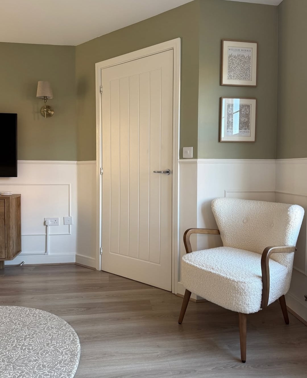
Timeless & Grey
A defining grey such as Dulux natural slate used on this half wall panelling in a bedroom brings a grounding look to this colour scheme, and it can be a nicer alternative to black.
The warmth of Timeless ensures the overall scheme doesn’t feel cold, although, Timeless works well with light shades of grey through to your more defining and grounding greys like charcoal and slate grey.

Overtly Olive
If you’re looking for another earthy green to consider, Overtly Olive is one of my personal favourites, it’s a great colour match for F&B Treron.
Timeless on the lower section of panelling and woodwork creates a beautiful balance, perfect for creating a cosy living room space.
Dulux Timeless Kitchen
Just look how good Timeless looks on the walls and ceiling in this kitchen. Pair with a paint colour a couple of shades darker on your cabinetry for an ultra stylish and relaxed look.
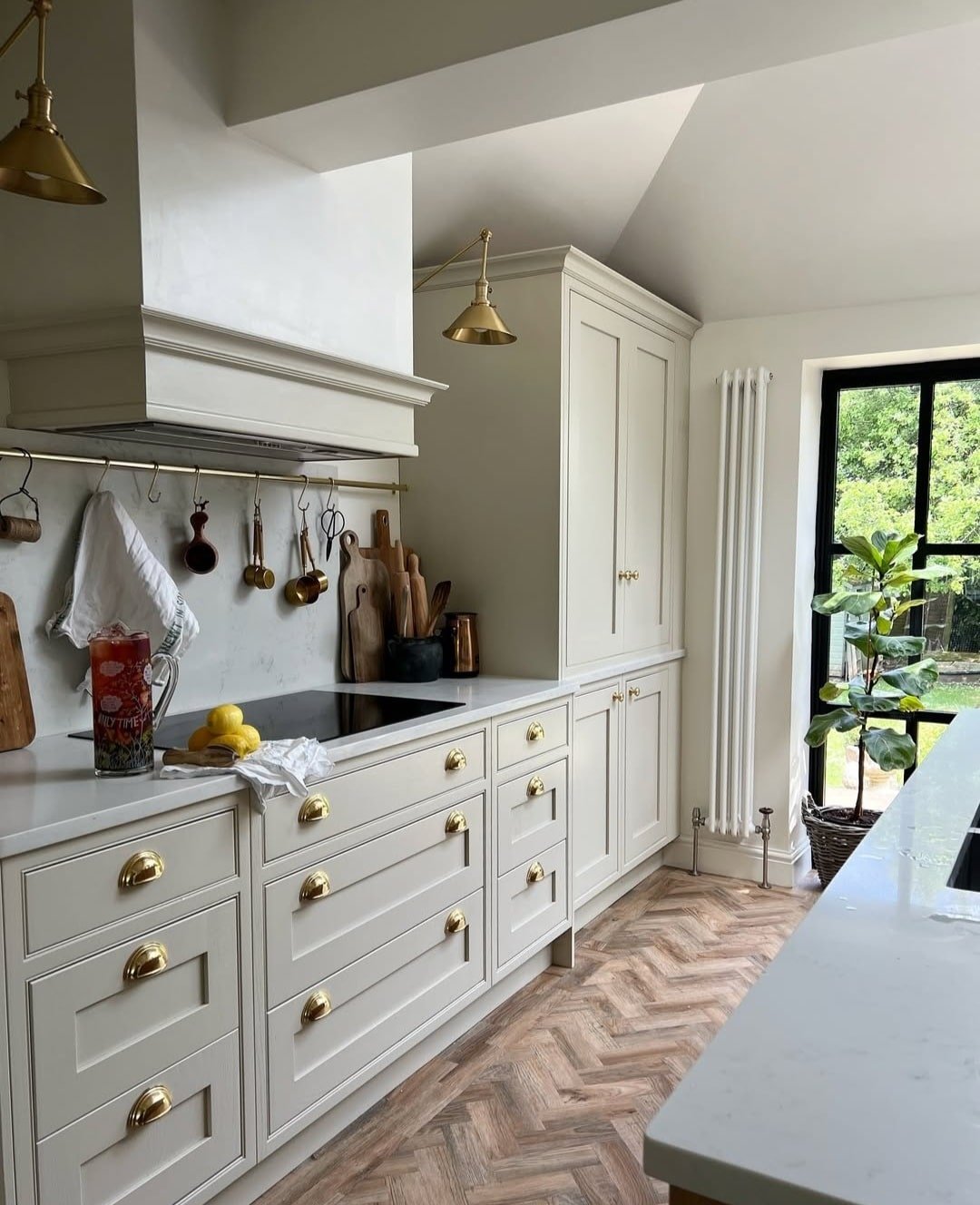
If you’re looking for a versatile white shade from Dulux that’s more forgiving than brilliant white, and a little bit warmer, Timeless is a great choice for any project.
Warm the colour up by incorporating a range of other neutrals, or be daring and incorporate bolder pops of colours.
Just remember to use the undertones as a guide when picking other like colours, but you can experiment with bolder pops of colour too if you want a more maximalist decor scheme in your home. Happy painting!
Hi does green Chappell & timeless go well with white ceiling ! The ceiling is high , feature wall Chappell green with surrounding walls timeless white satin woodwork
Thanks for your comment! Yes – these two colours go well together, whilst white is going to create a crisp contrast and draw the eye up, however, I would keep your woodwork such as skirtings the same colour as the walls to avoid an overload of colours, it will elongate the walls doing this too.
Hi can you help? I. Really stuck with choosing g an accent colour wall in my lounge.i have oak furniture, a white fireplace, cream carpet.and plum curtains s.
I have timeless paint on half of walls. My lounge is west facing, and I want a lovely neautral beige to not darker the room.As the wall that needs the slightly darker paint of beige that will bring out tones of my oak, and plum curtains s.only one wall..I don’t know what would compliment these cours in my lounge.looking at deluxe paint. Can you advise Thankyou
Thanks for your comment, I’d have a look at the following warm, neutral beiges but they have a bit of depth to them so will contrast well with your furniture and curtains. I’d get a tester pot of a few you like to test them in the space as they do look different depending on how the light floods the room; Egyptian Cotton, Gentle Fawn, Just Walnut are a few popular ones with a yellow undertone to them like Timeless. Nicole x