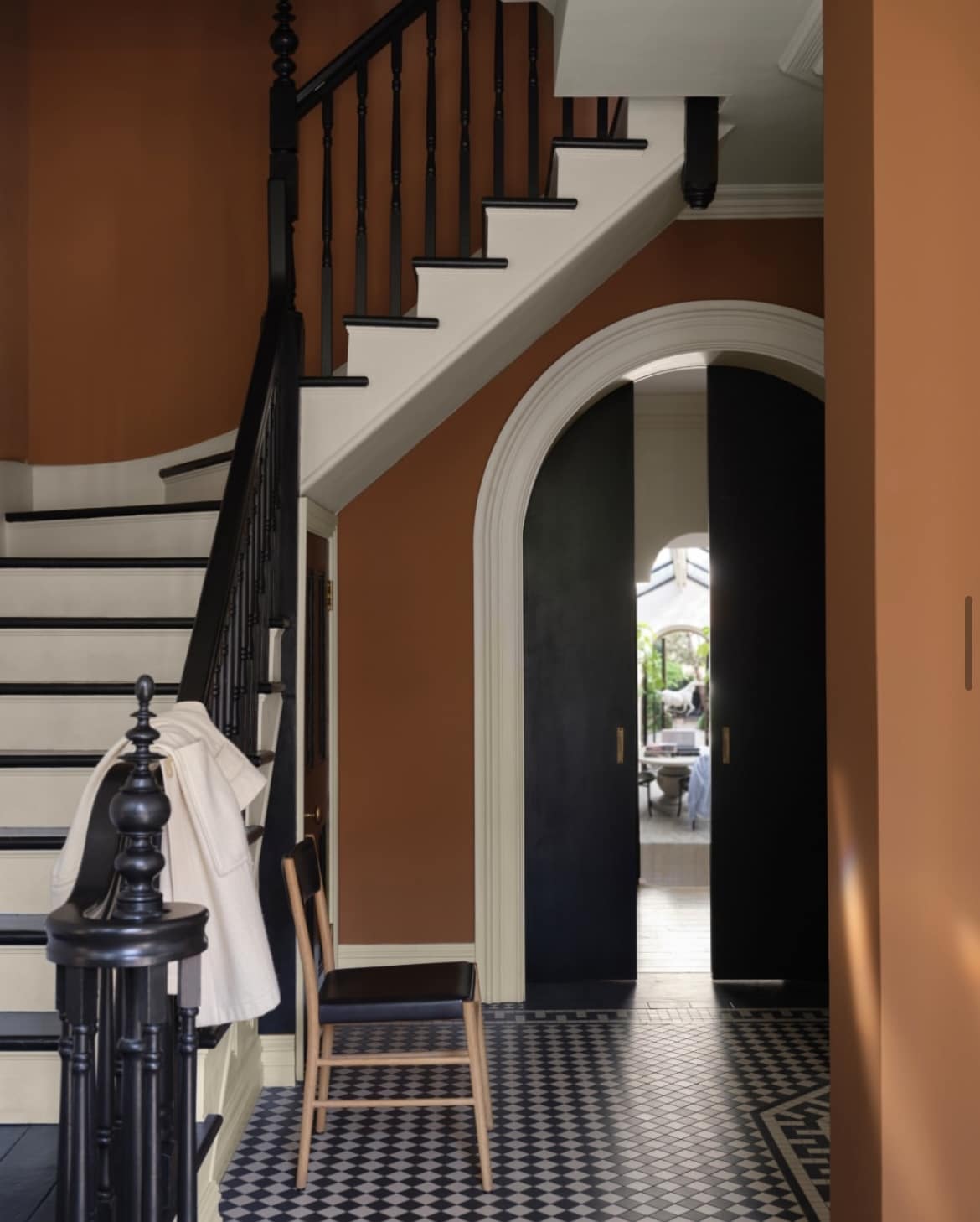
Having recently renovated my own home, I can confidently say that Farrow and Ball wins my heart every time for their richly pigmented collection of paint shades.
They have unrivalled depth of colour and often carry a unique metamorphic quality which makes the shades appear different in different lights.
The hardest part? Choosing a colour when you love them all! If you’re in the process of decorating right now, I’ve pulled together over 40 of their paint colours situated in real homes to give you plenty of inspiration and colour ideas for your own home.
43 Farrow and Ball Paint Colours In Real Homes
1.Sulking Room Pink
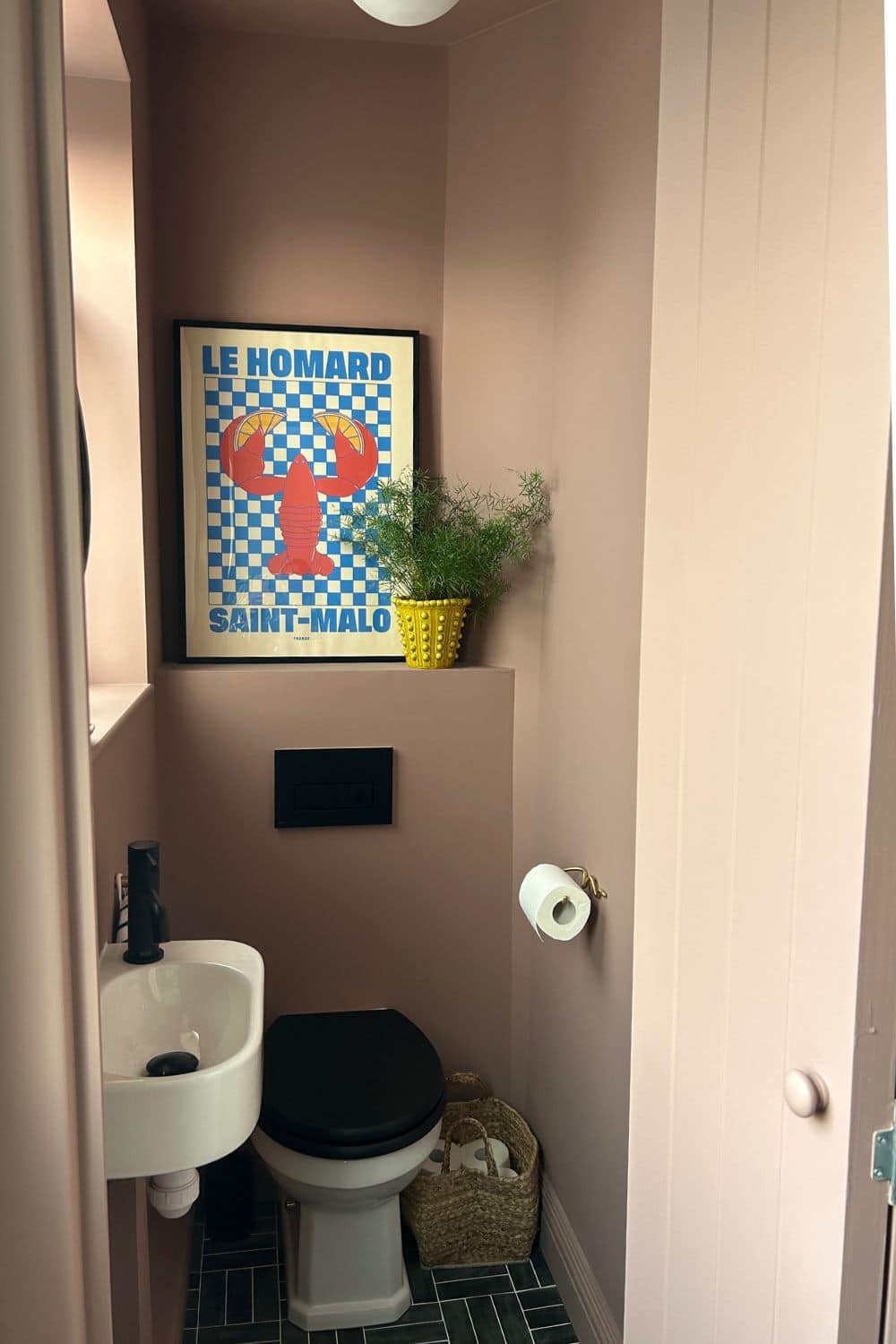
Kicking it off with my own downstairs toilet, colour drenched in the dreamiest pink – Sulking Room Pink.
This sultry, moody pink takes on a different colour as the sun hits it in the middle of the day. This is a south facing room and the picture was taken in the morning as the light feels softer and is more diffused. It’s the ideal barter against the intensity of the sun during the height of the day.
I used their multi surface dead flat finish in this space to avoid colour differentiation on the woodwork. I adore it!
2. Red Earth
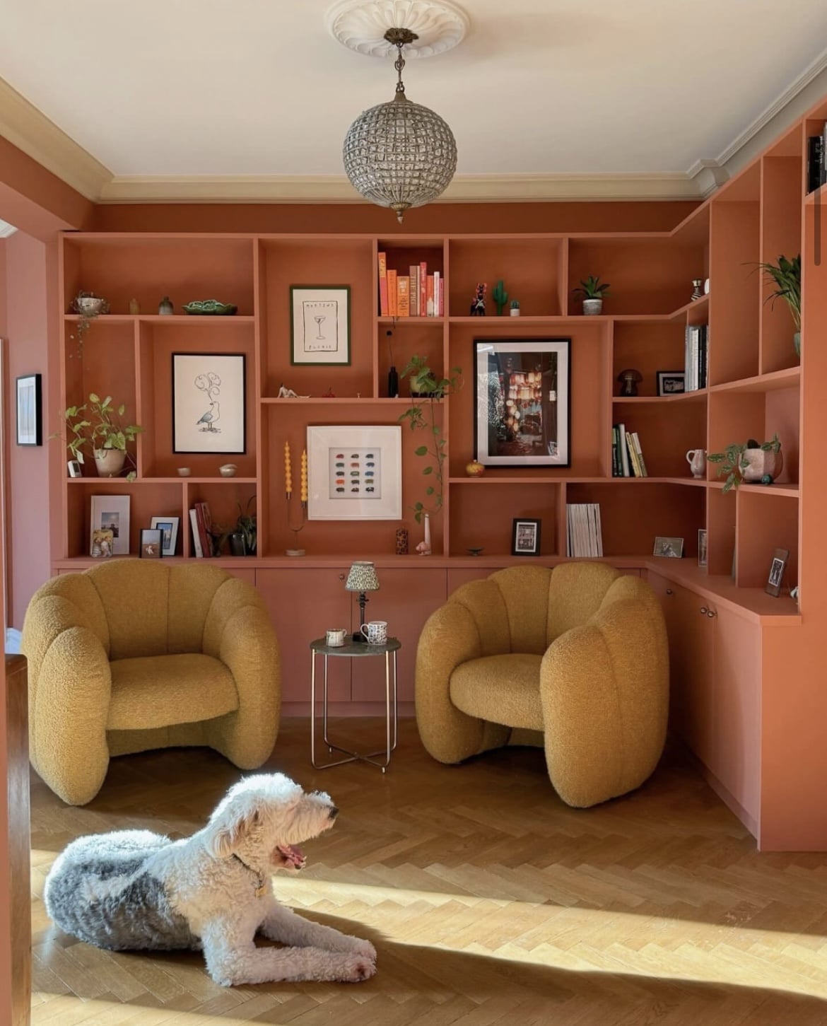
Earthy, grounding colours are very firmly in and if you’re looking for a warm, earthy red, this one is a perfect contender.
This rich shade draws its warmth from the soil beneath our feet, the shade changes with the light growing cosier as day turns to night. Beautiful across all the walls, or in a moody north facing room on an accent piece of furniture.
3. Wevet
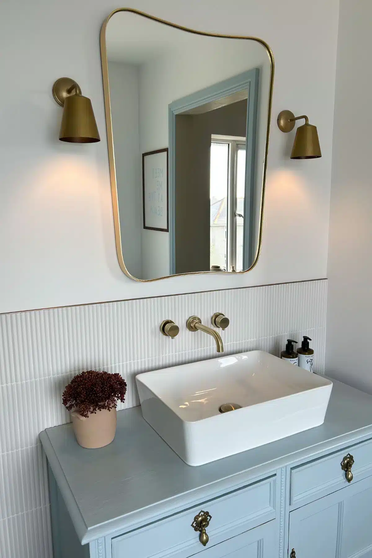
This adaptable, cool white in our bathroom is one of the closest to a bright white but with a touch of grey which creates a cool toned white which is perfect for very sunny south facing rooms.
It brings a subtle softness to any room and is a perfect alternative to a bog standard bright white. I’ve paired it with Parma Gray on the woodwork in our bathroom for a coastal inspired feel with is soothing and relaxed.
4. Selvedge
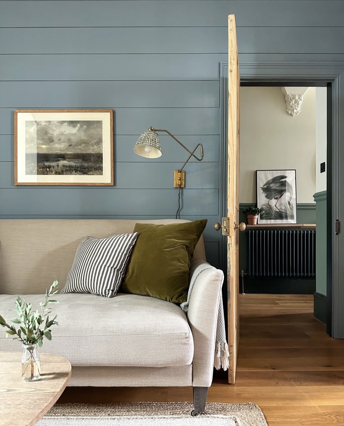
This laid-back blue feels good to be around. Bringing slightly more definition with it than a bright and breezy blue, feeling more intimate in a dark room.
It sets the tone in an earthy and coastal inspired colour scheme. Pair with other earthy colours and use natural materials such as wood, rattan, brass and seagrass for a breath of fresh air.
5. De Nimes
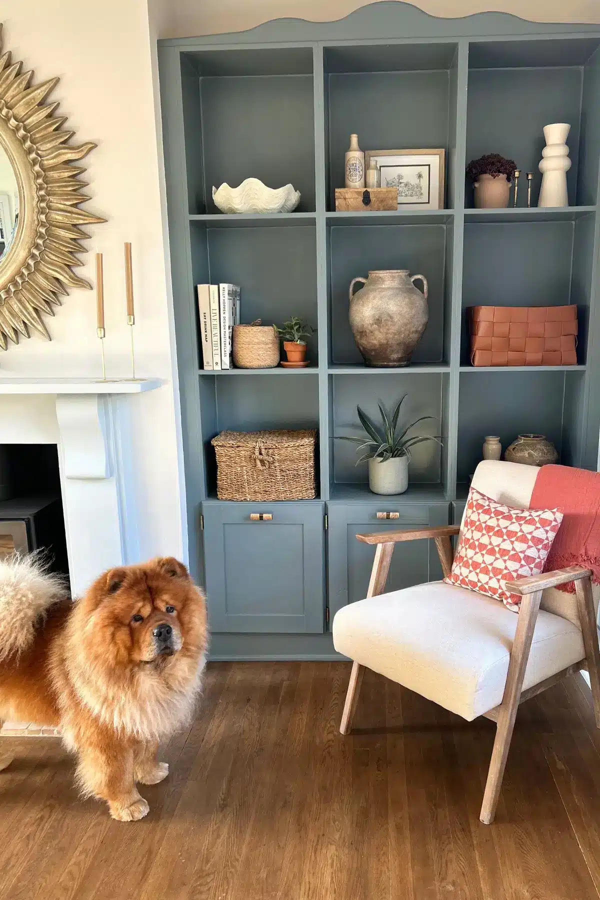
Perhaps my favourite blue is De Nimes, this unique colour shifting blue is in the north end of my living room on my alcoves and it’s the most beautiful, moody blue which creates a gorgeous entrance as you step into the room.
This colour looks equally good in a colour drenched approach, or on an accent piece of furniture like the below which balances well with the warmer tones in this room. This is important if you have a dark north facing room and you still want the space to feel light and bright.
6. Stirabout
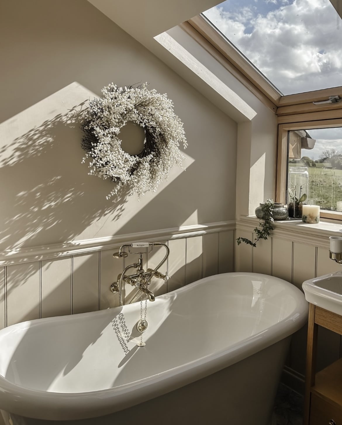
Warm and uplifting, Stirabout is a modern elevated neutral that sets the tone for any type of interior scheme.
With more depth than a white or creamy off-white, this shade has been colour drenched in the sloped bathroom for a seamless look that draws you in.
7. Bancha
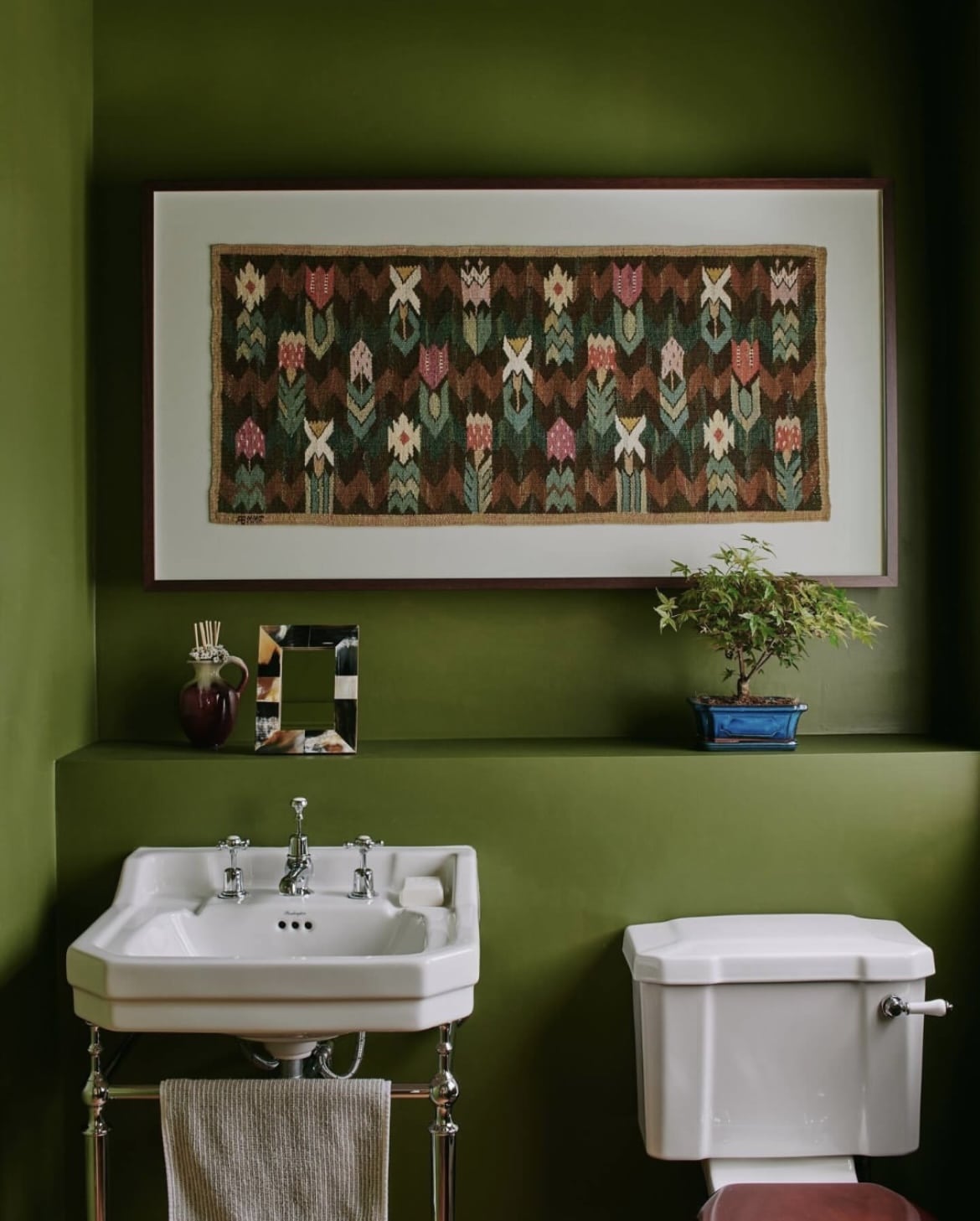
This bathroom below has been colour drenched in Bancha to create a high impact space. The depth of this shade is second to none, and it looks beautiful in the heart of a traditional or Mid Century Modern interior scheme.
Position it against bold hues such as blue or red to create a fun contrast that draws the eye in.
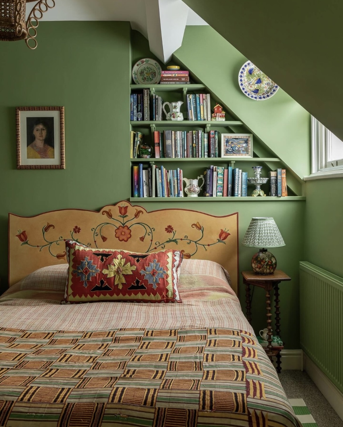
8. Yeabridge Green
For something a little bit lighter, Yeabridge Green is an avocado shade which is inspired by lush grass. It’s hard to feel bad when surrounded by a good green, and this one ticks all the boxes.
It creates a dramatic look in a colour drenched space, or team with a white on the ceiling to create a lighter, brighter feel that draws the eye up as you step into the room.
I particularly love the combination with the yellow and red accents on the bed.
9. Joa’s White
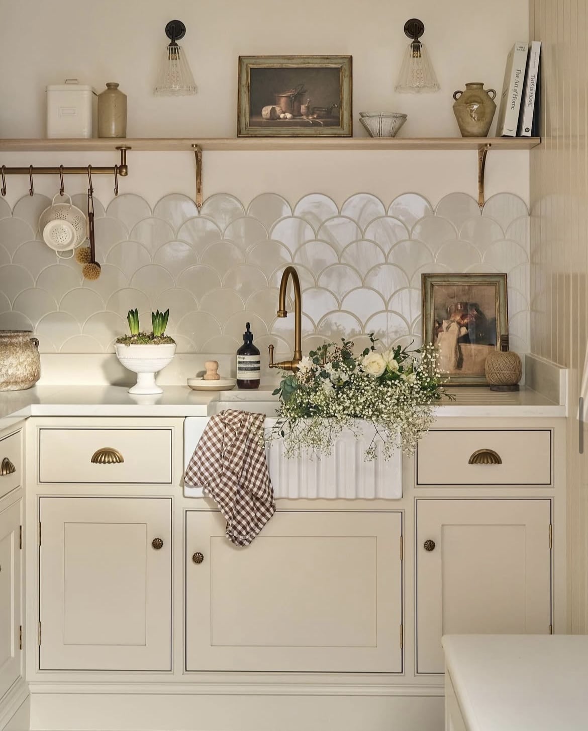
One of Farrow and Ball’s warm neutrals looks beautiful on the kitchen cabinetry in the image below. It’s paired with pointing on the walls which adds a gentle contrast against the light taupe.
This type of colour differentiation works particularly well in situations like this, or on a walls vs skirting/woodwork colour. Leaning into a paint colour a couple of shades darker on woodwork brings the right level of definition which is stylish, yet ultra relaxed.
10. Blue Gray
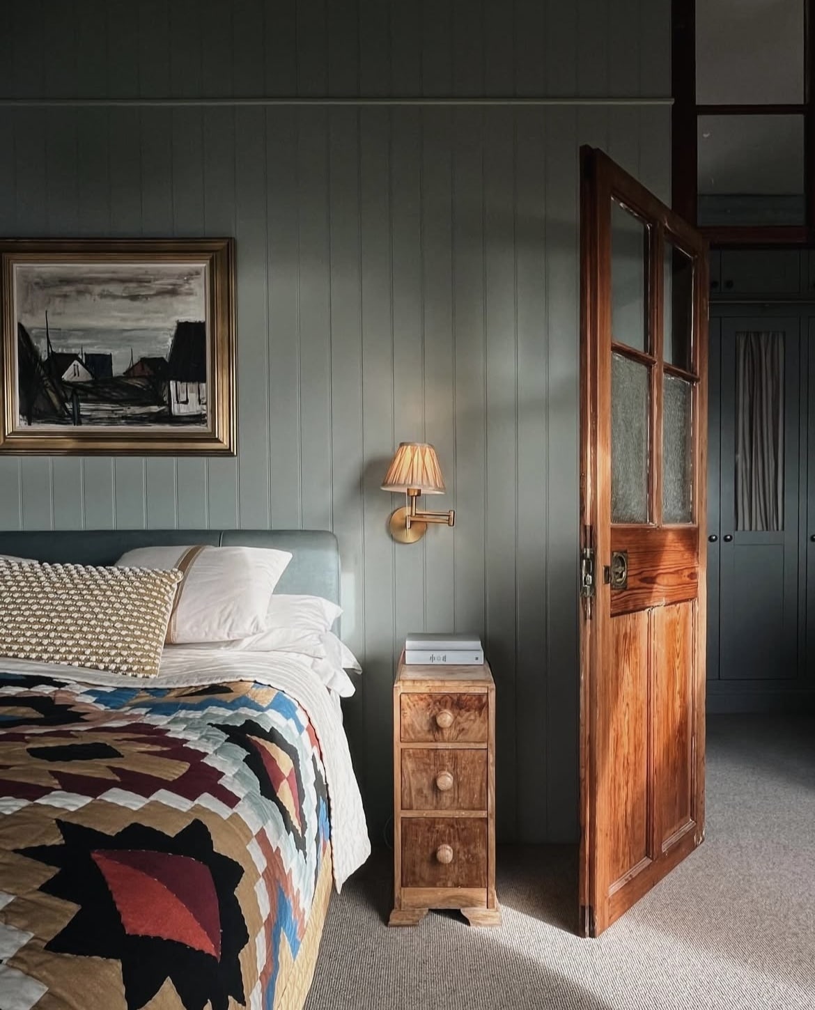
This unique blue has a subtle mix of blue, green and black pigments for a weathered version of French Gray but has a metamorphic quality to it, shifting between both a blue and grey depending on the light the room is receiving at the time.
It brings defintiion to a colour scheme yet feels laid back and relaxed at the same time.
11. Kakelugn
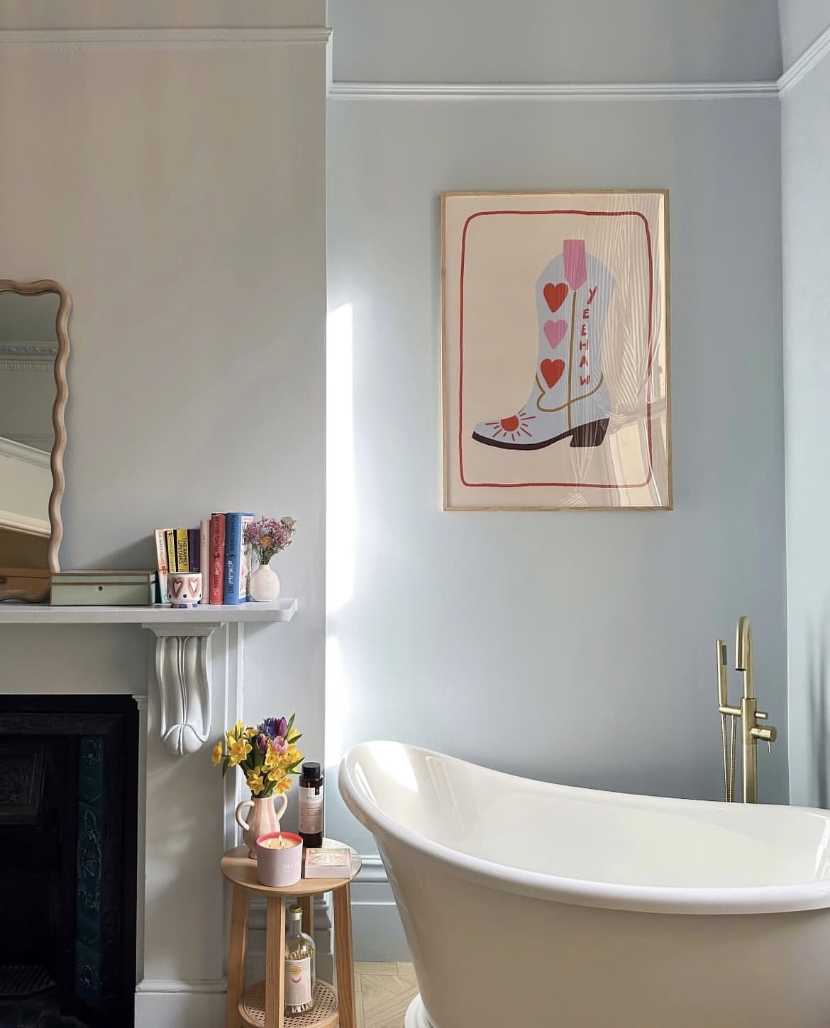
This is Farrow and Ball’s newest blue, and it’s completely timely with the rise of using bright and breezy blues in an interior.
A good light blue can practically be classed as a neutral these days, lifting and creating a bright and breezy feel in an interior without it feeling cold.
The bathroom below has been colour drenched in this delicate blue for a serene space. Pair with brass or gold hardware for some natural warmth that creates a gorgeous balance.
12. School House White
It’s one of the most popular whites, because it’s just so versatile! This timeless neutral is evenly balanced and perfect for both cold north facing rooms, and bright south facing spaces.
Bring in some natural definition with natural elements such as wooden furniture, not skipping the memo on browns which can create a deliciously earthy interior scheme that feels grounding.
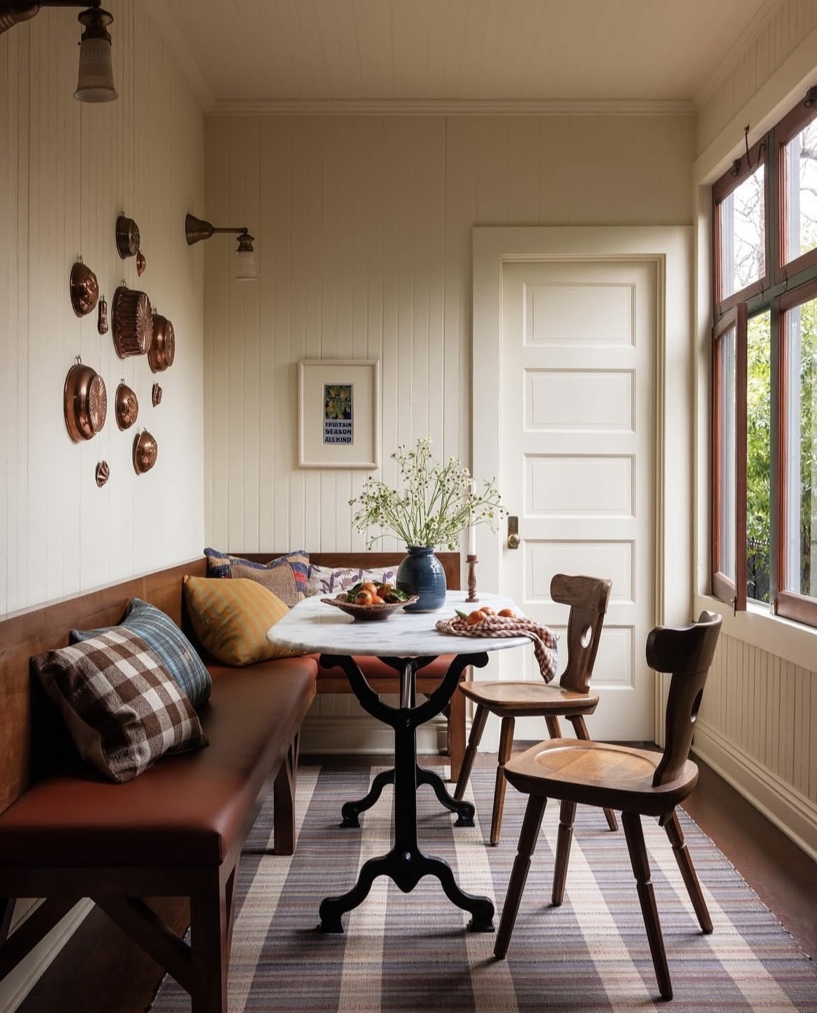
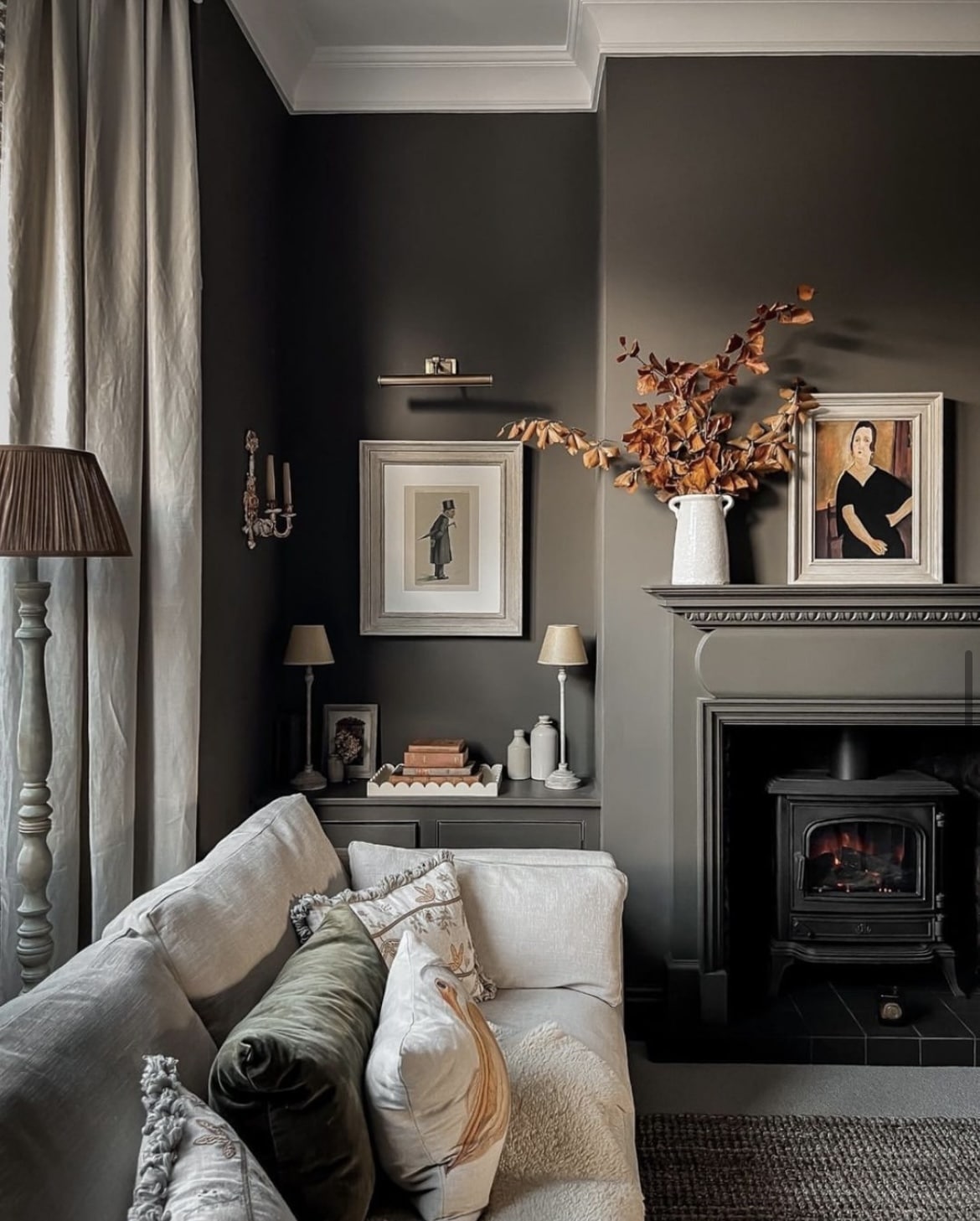
13. Mouse’s Back
Brown is becoming the new neutral, it’s grounding and brings a touch of understatement with it. Mouse’s Back might just be one of the best browns out there.
It’s ridiculously decadent and looks fab on woodwork as shown in the living room below. Use it as a grounding neutral in an earthy colour scheme.
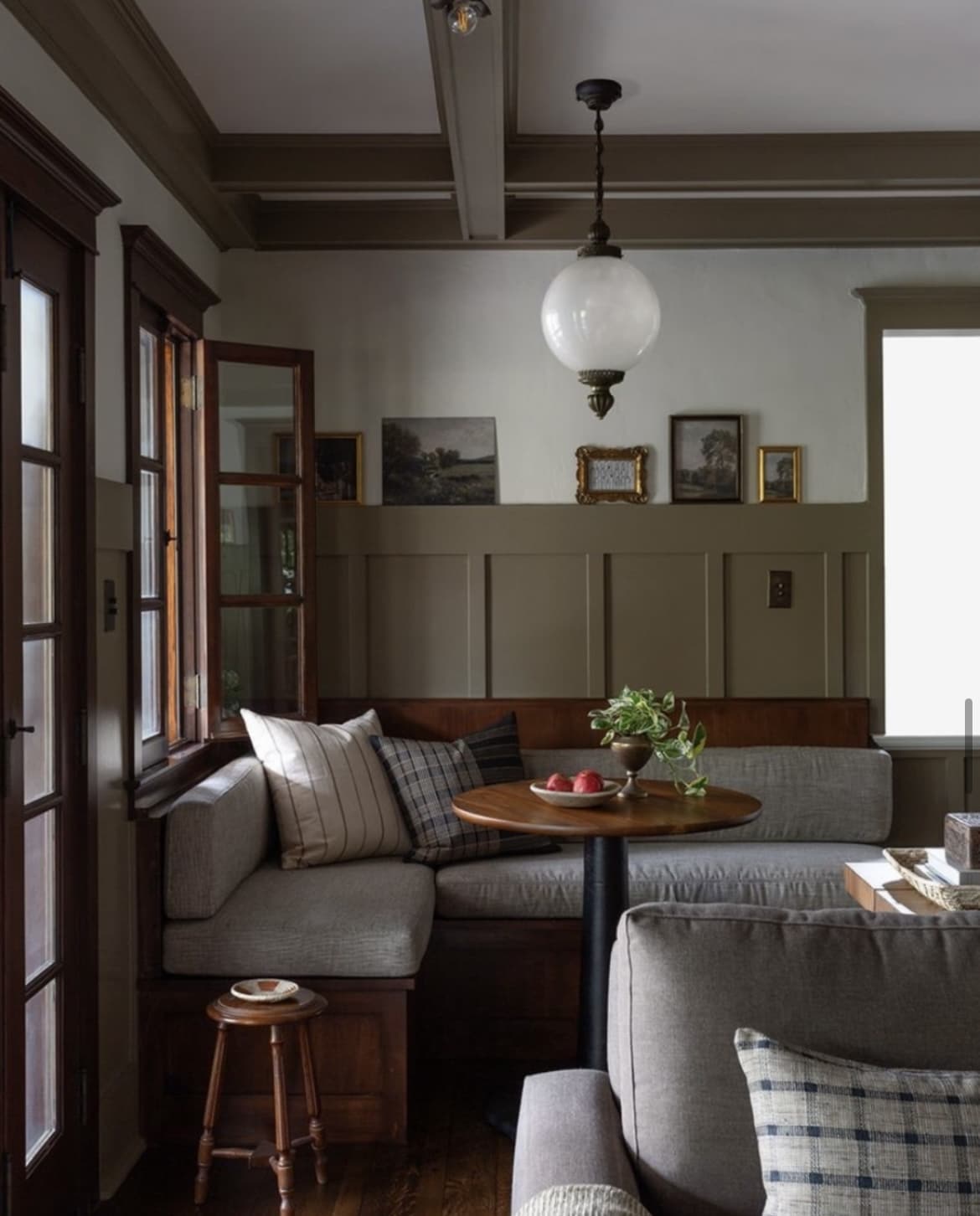
14. Brinjal
This deep aubergine like colour is a lot of fun, and where better to go wild with it than in a tiny powder room. A warm yet sophisticated colour that looks fab wrapping a room in a colour drenched approach.
The contrast between the brass switches and marble sink creates a striking balance that just works.
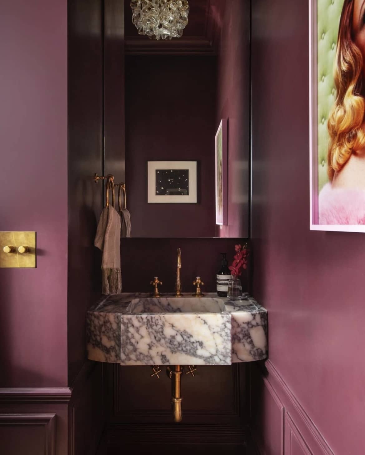
15. Stiffkey Blue
A mid to dark blue that’s enduringly popular. Take a look at it colour drenched in the below hallway.
An inky navy, this traditional blue creates a richly dramatic space, pairing with wooden elements helps to avoid this blue running away with itself.
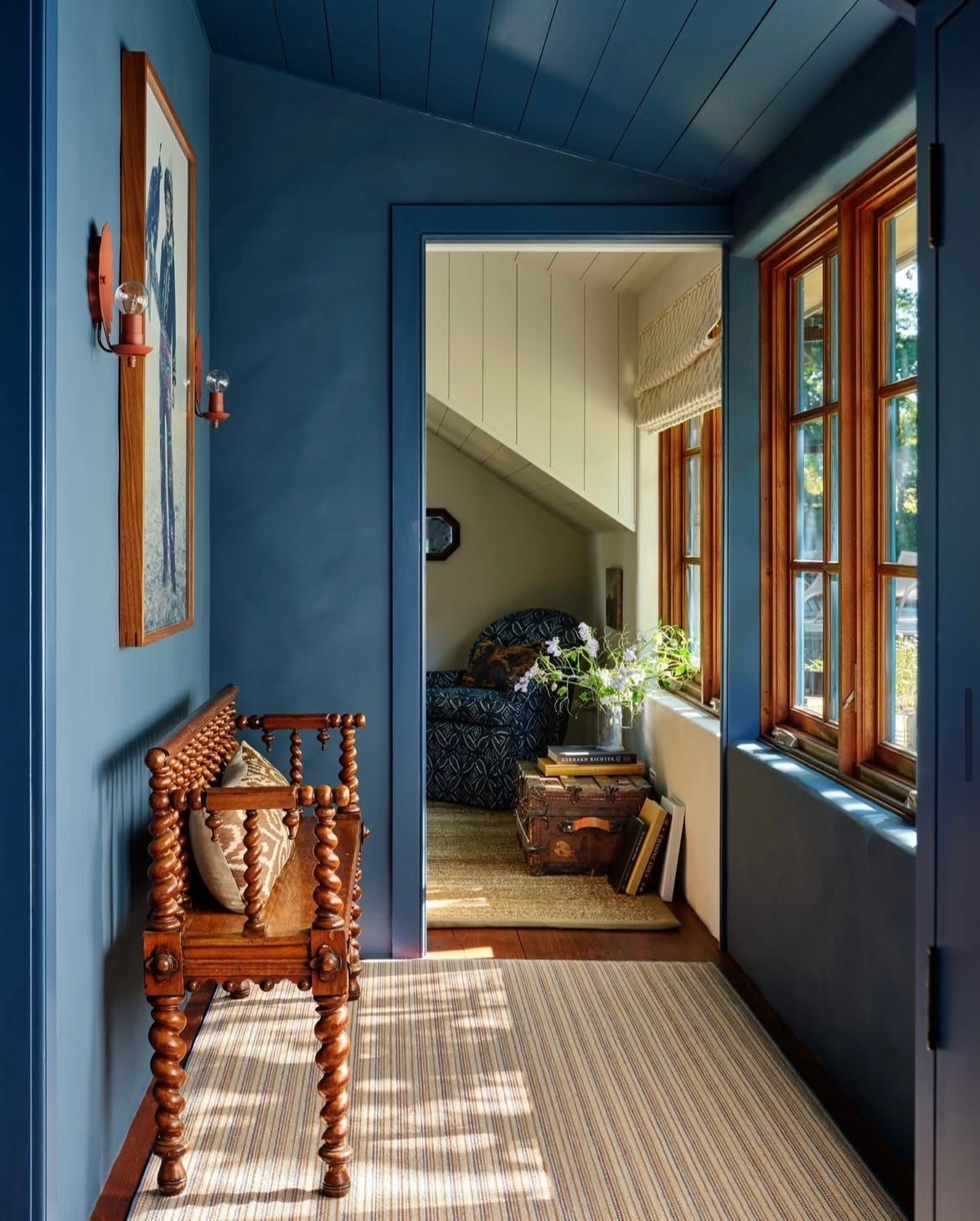
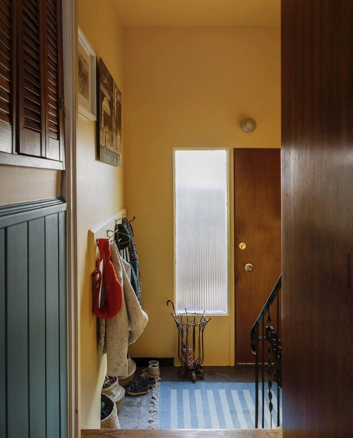
16. Citron
Want something warm and uplifting? Nothing portrays the sentiment better than a fresh yellow.
This warm lemon yellow creates an intense appearance in small spaces, and even more so if you take a colour drenched approach. As it’s a stimulating colour, use it in a transitional space such as a hallway to create a fleeting first impression.
17. Pantalon
Nothing says earthy more than Pantalon. A rich and grounding demeanour which makes it the perfect foundational colour for creating such a scheme.
Lean into the darkness in a north facing room with it. Balance with a white on the ceiling and woodwork.
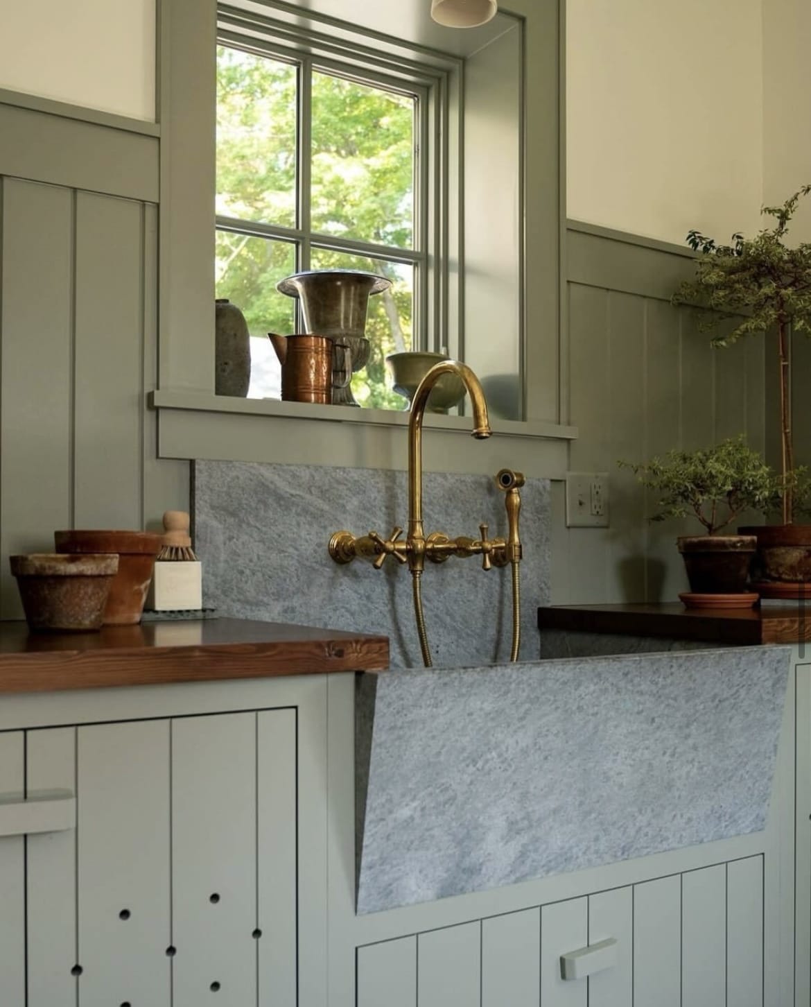
18. Pigeon
A cosy and nostalgic blue grey, Pigeon is a mystery colour, appearing like a blue, grey and even a green depending on the time of the day and the light coming into the room.
Another earthy, just as good neutral that will bring welcome definition to any room of the house. Take inspiration from the below with it on half wall panelling and a warm, uplifting white on the upper walls for a lovely balance.
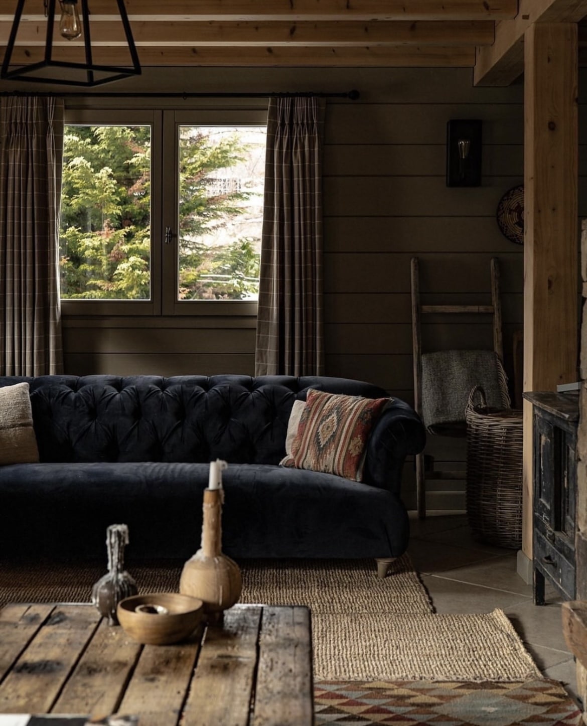
19. Light Gray
Light Gray carries a subtle green base for this stony grey, a gorgeous backdrop in the right setting.
Earthy, traditional and you can just feel the depth of colour on the walls below in this lodge. Paired with natural wood elements it sits right at home.
Some warmer, bolder accents against it help to lighten up the overall colour scheme.
20. Railings
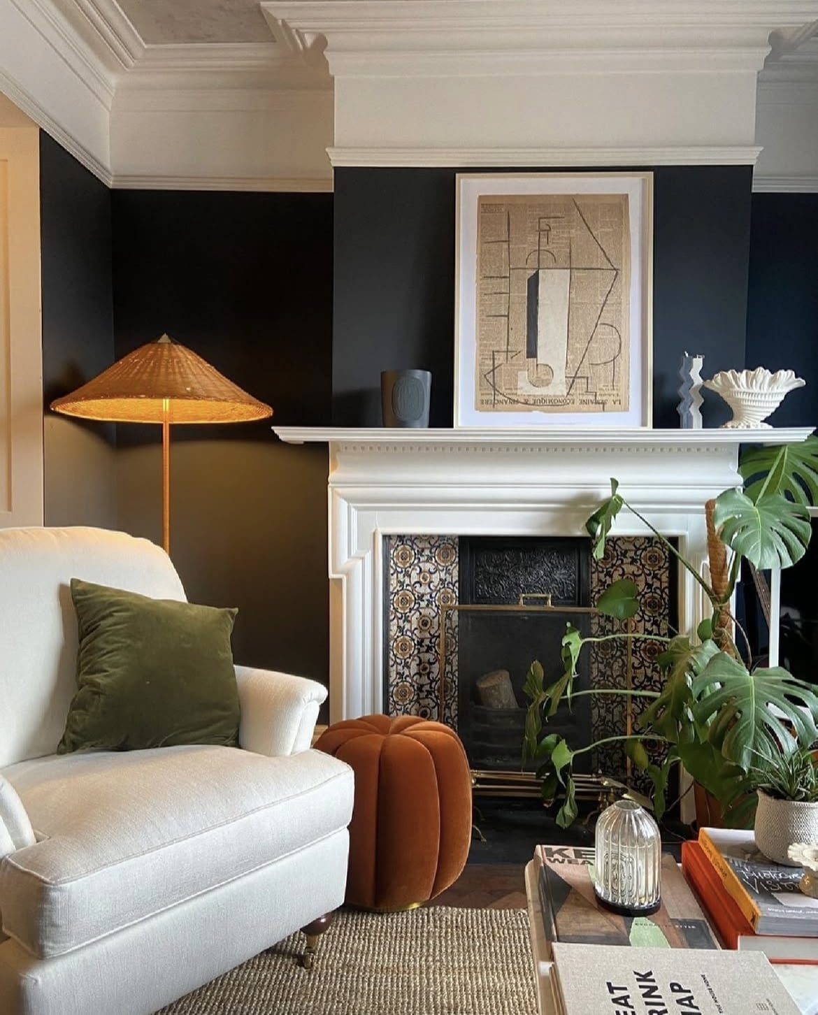
Railings is one of the most popular dark shades from their collection. A soft black with blue undertones for a cosy and timeless feel.
In the living room below, it has been paired with All White from the picture rail up which helps to soften the overall tone of Railings.
Pretty much any colour looks good with Railings in the background, warm tones like red, orange and green look particularly good with a high contrast.
21. Wimborne White
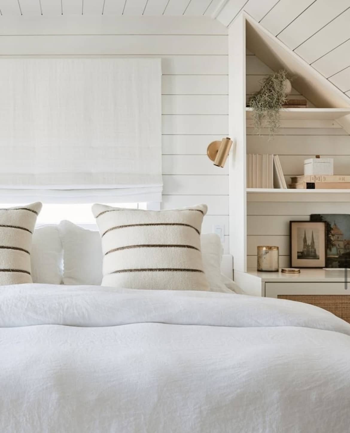
A delicate white that’s a shade away from a pure white, this warm neutral has a slight yellow undertone to it which makes it adaptable to rooms with all lighting conditions.
It sets the breeziest backdrop and looks particularly gorgeous in a coastal inspired theme. What colours to pair with it? This versatile white pairs with pretty much every colour, whether you want to lean into warm neutrals, earthy colours or bold, statement making shades.
22. Cooking Apple Green
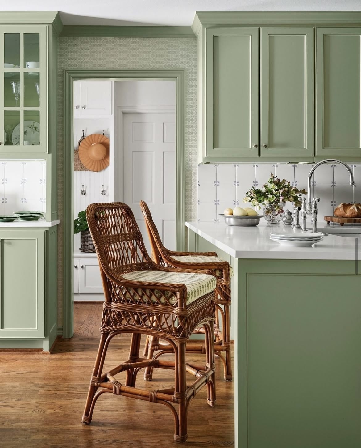
This classic shade is one of the easiest on the eyes, an ideal sage green which creates feelings of health and the natural world. It creates a rich look in darker rooms, appearing much fresher and lighter in rooms with a sunny stance.
Look how gorgeous it looks on the kitchen cabinetry and woodwork in the kitchen below. Contrasted with white worktops it feels even lighter and soothing.
23. Loggia
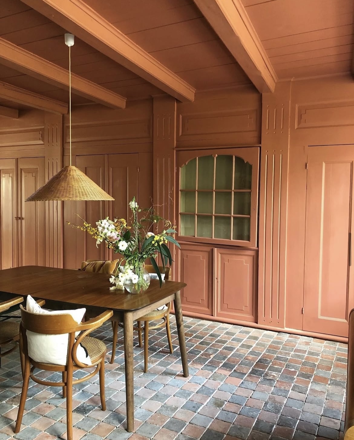
Part of F&B’s archive collection of shades we have Loggia. It’s less terracotta than red earth but still packs a punch.
This spicy shade comes into its own when colour drenched, but also looks great in a small accent area for a fiery touch of red. It will help you tap into that ‘unexpected red theory’ too, a colour that can help to tie together the look in any room.
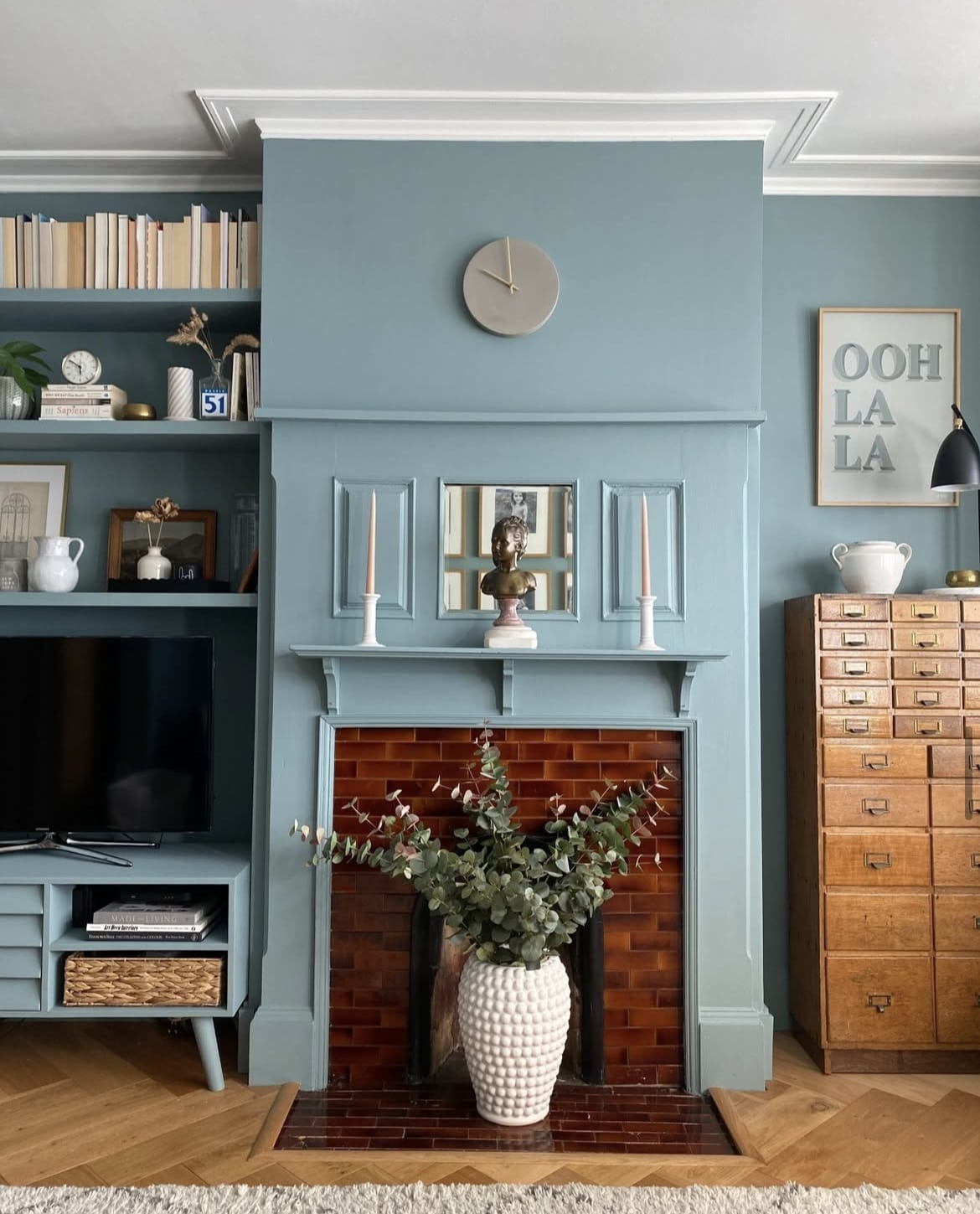
24. Oval Room Blue
The most blackened of their blues, this welcoming blue sits well with greys to create depth and balance in a room. Alternatively, pair with a cool white such as Wevet on the ceiling and woodwork to uplift this blue.
I love this shade in a living room, it creates a really sultry and cosy feel which would work well in darker, north facing rooms.
25. Setting Plaster
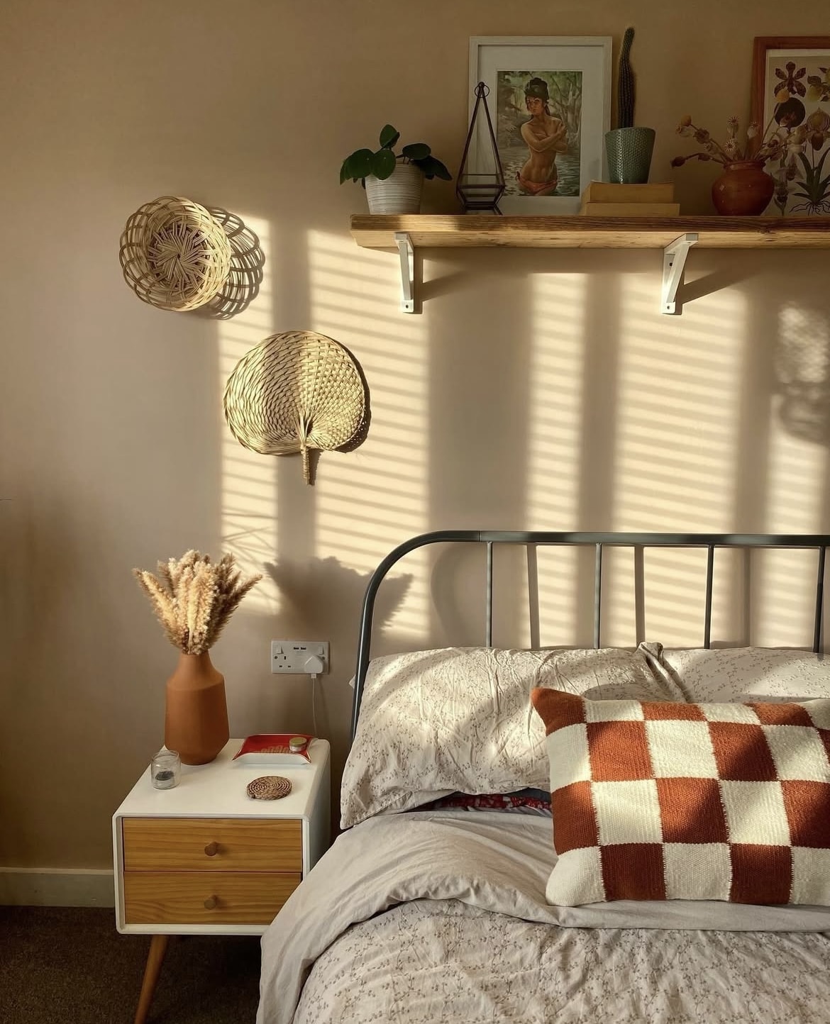
There’s nothing better than that feel and warmth from freshly plastered walls, and Setting Plaster encapsulates those blushing walls perfectly.
It has a slight softness to it with the inclusion of yellow pigment and is a shade that works in any room, no matter the orientation. Pair with darker pinks or reds to bring out the pink, delicate tones in this well known paint colour.
26. Green Smoke
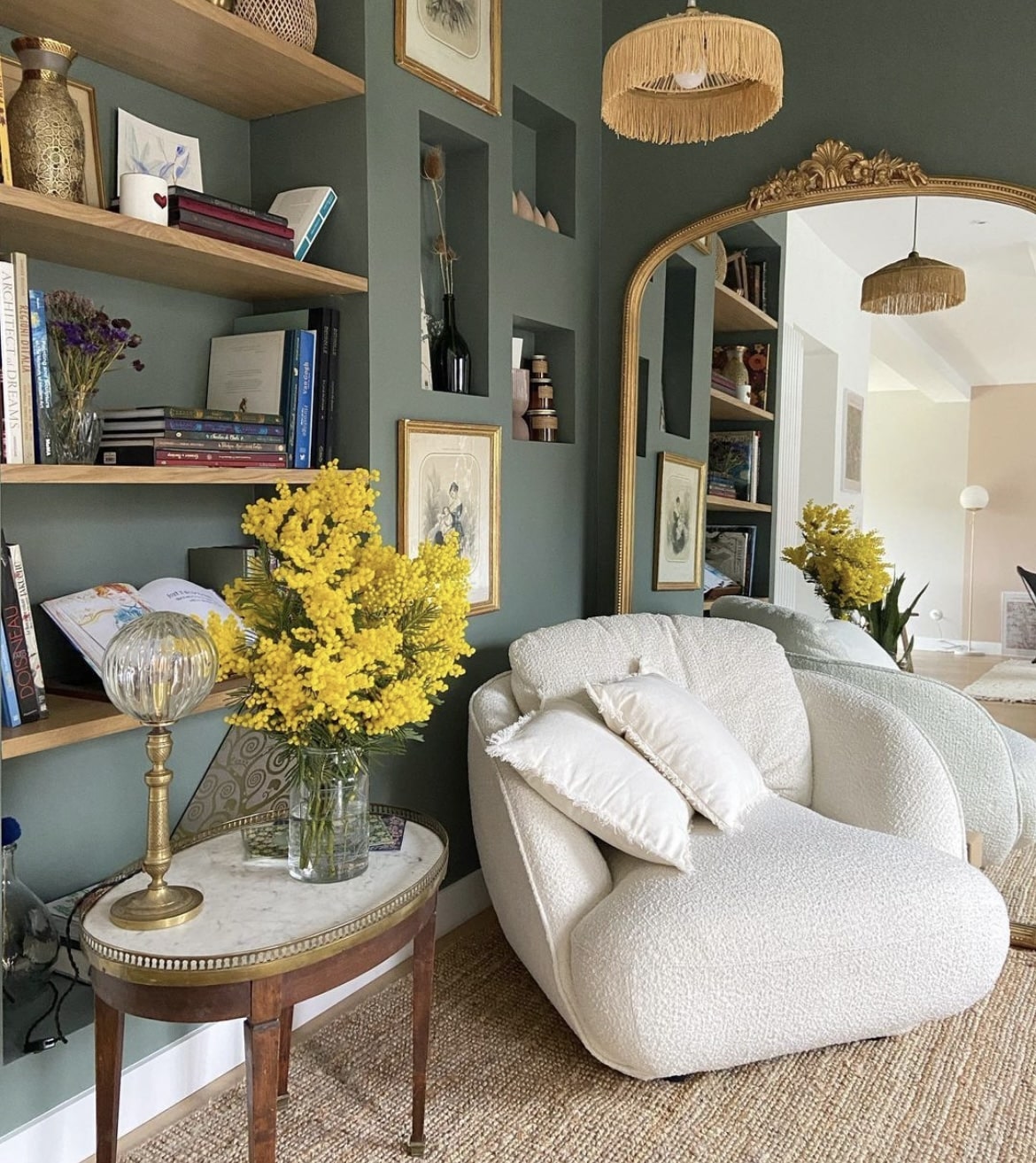
This dark, smoky green is one that is comfortable to sit in. It has an irresistible depth to it that would suit a dark north facing room, particularly if you wish to lean into the darkness.
It has a quality to it that will make your darkest corners feel almost like a dark inky green, black. Lift the shade with warm neutrals and natural materials including wood, rattan and seagrass.
27. Stone Blue
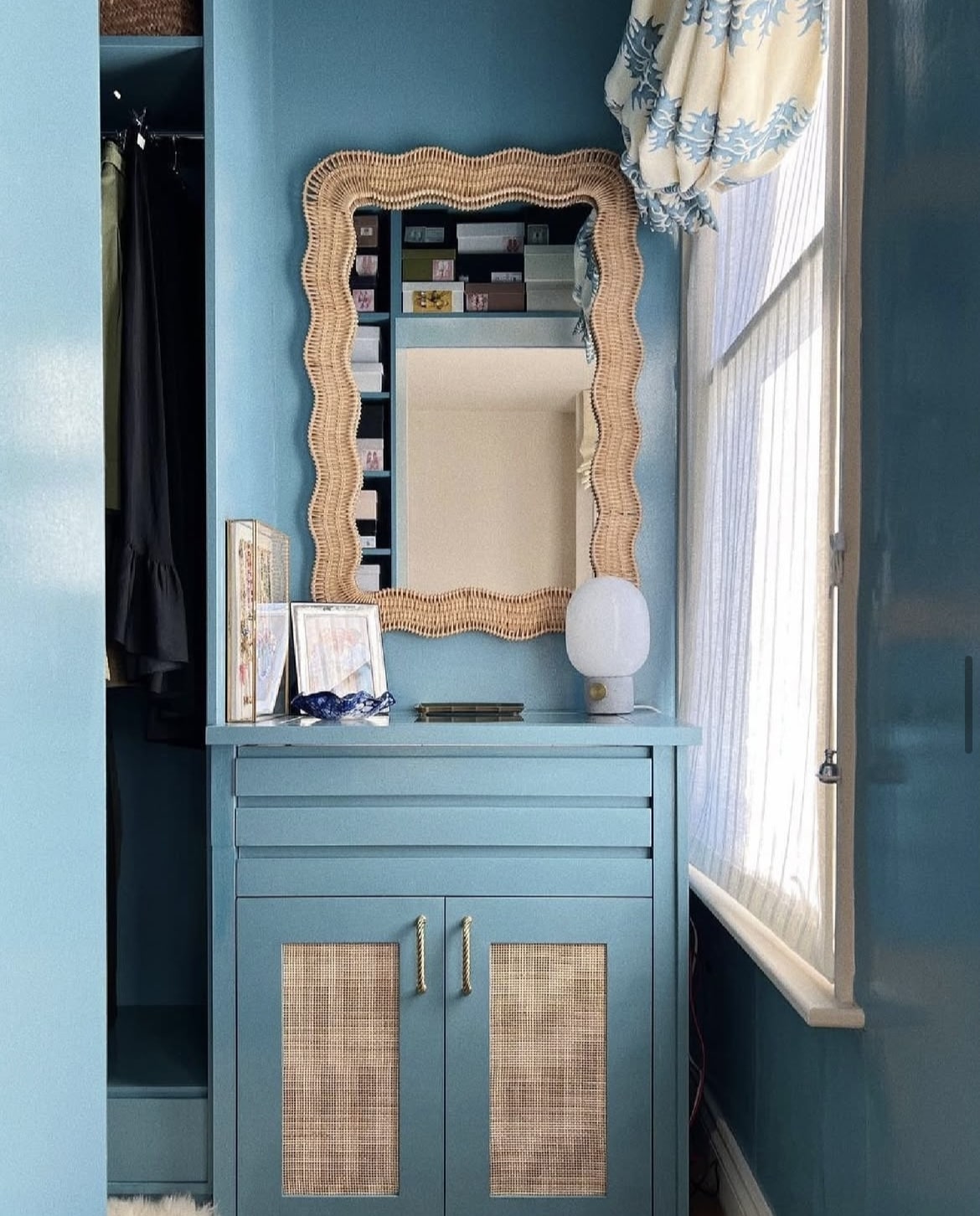
This playful blue is enduringly warm and timeless, looking good in traditional, coastal and contemporary inspired interiors.
I particularly like it positioned in a coastal inspired theme, used as the main backdrop of colour. The gentle pairing with the rattan elements in the dressing space below grounds it but also lifts it with natural warmth.
28. Scallop
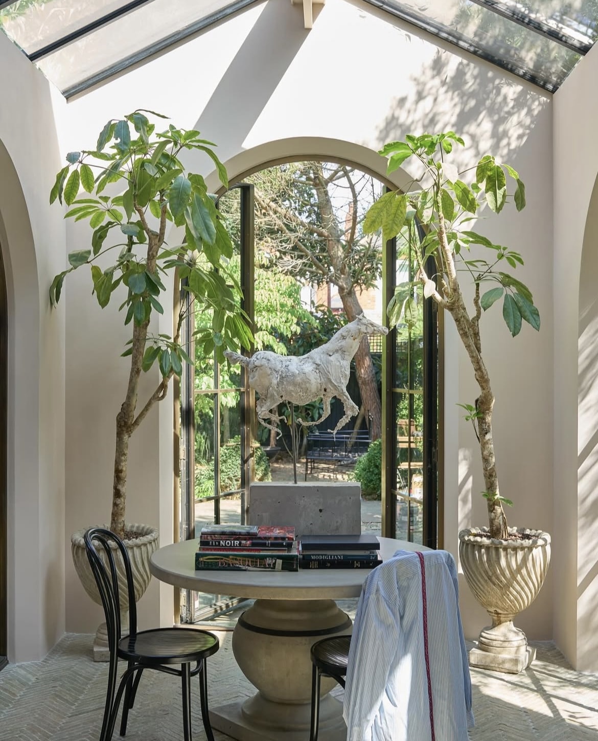
One of my favourite new shades from Farrow and Ball, this dainty pink feels mature and grown up. It has a softer salmon hue to it, a lighter shade than the popular Dead Salmon.
Its soft hue is inspired by prized shellfish. It’s versatile enough to class itself as a neutral, pair it with green for the most beautiful take on this colour.
29. Hay
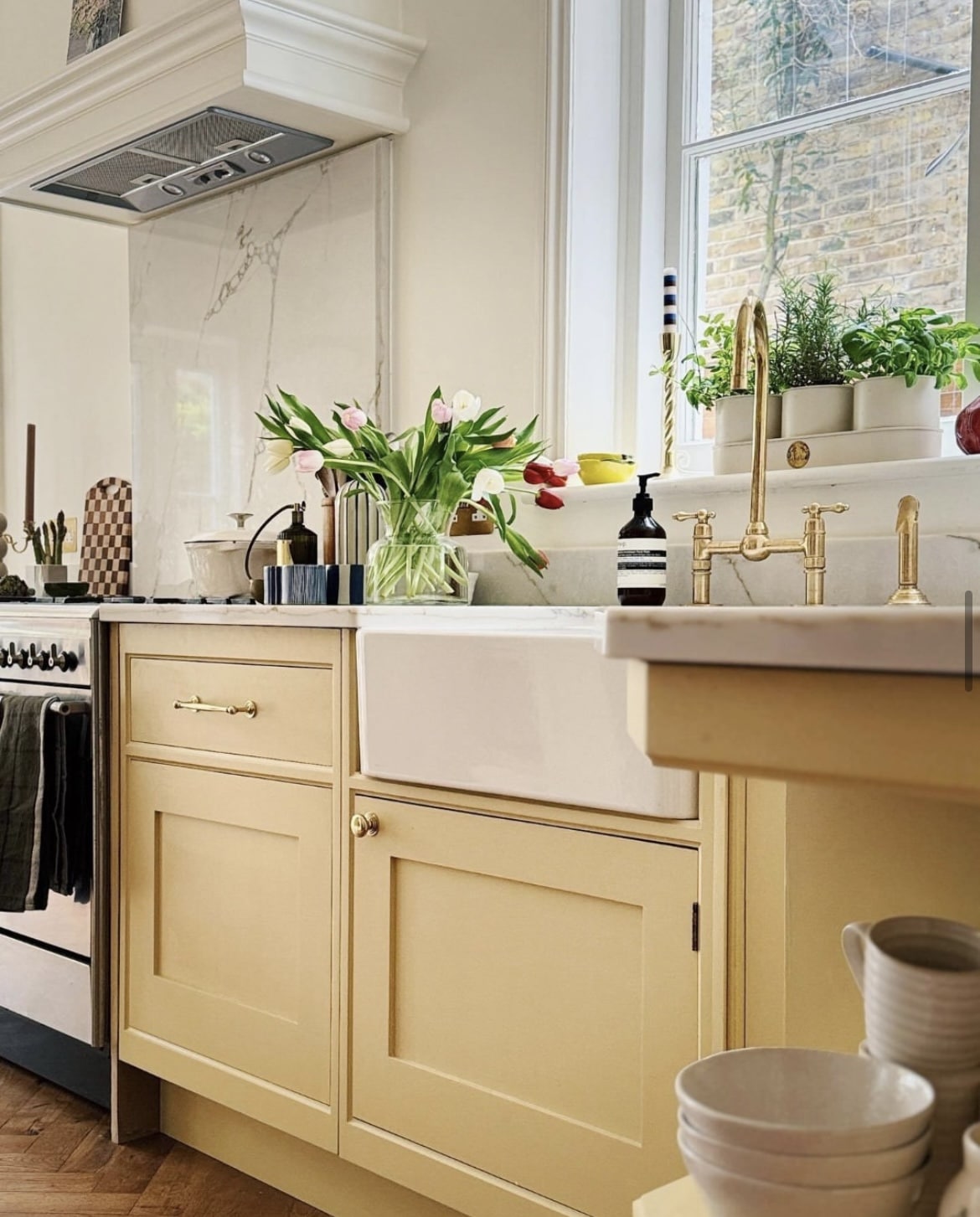
Butter yellow has influenced our fashion through to our interiors this year. It’s uplifting and a lovely take on a yellow.
Hay is like a heritage yellow, not gawdy and not wishy washy. Pointing on the walls in the kitchen below is a perfect off-white to balance with it to create a wonderfully cosy scheme.
30. Yonder
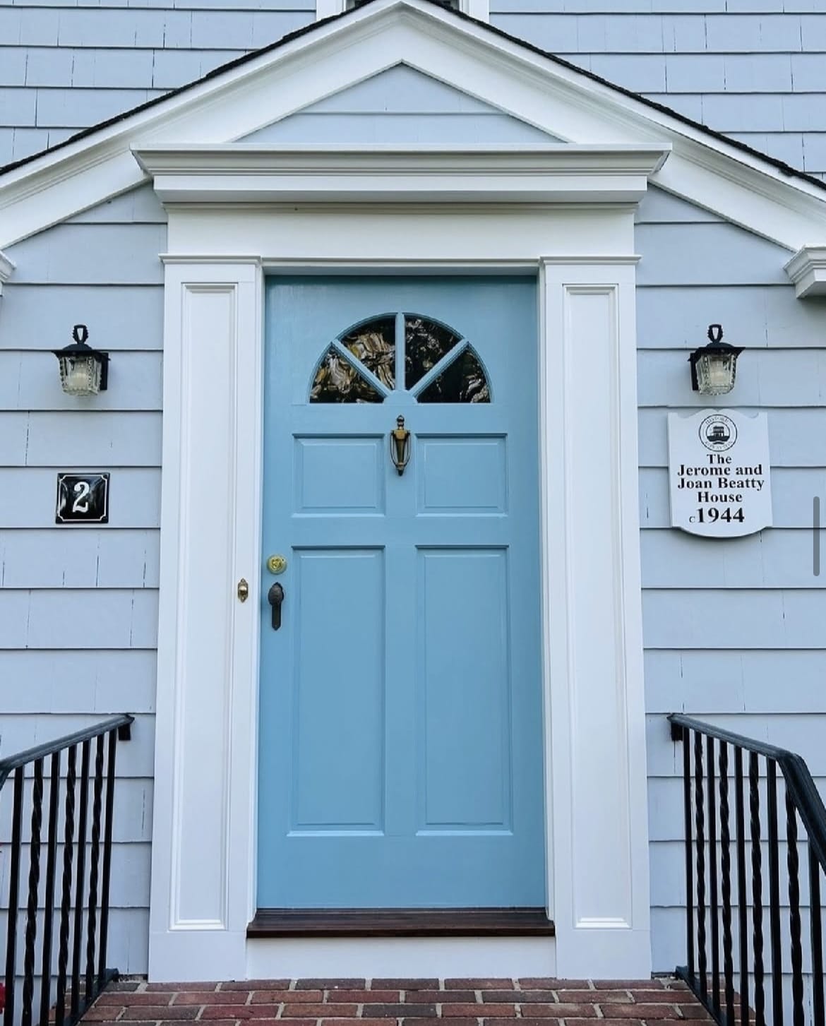
Looking for some colour inspiration outside of the house? It goes without saying that all Farrow and Ball shades look gorgeous on a front door, but there’s something quite different about Yonder.
An unexpected front door colour that is refreshing and imitates the colour of the sky (albeit it on a nice day!), paired with white on the exterior woodwork it creates a fresh combination.
31. Inchyra Blue
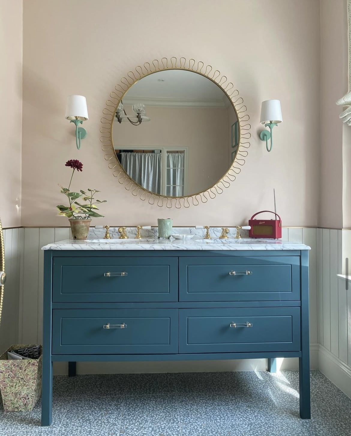
This dark blue grey is slightly more defining than its lighter counterpart De Nimes, acting as a wonderful accent colour in a scheme.
In the bathroom below it has been teamed with Pink Ground on the walls which makes this paint shade appear more blue. Position it against a grey and it will feel darker, and more like a charcoal hue.
Blue always deserves to be seen with a pink and it creates a delicate, more romantic combination.
32. White Tie
This creamy off-white is a true favourite. A traditional neutral that has a yellow pigment to it. This style of off-white is ideal for particularly cold, north facing spaces that don’t receive a lot of light.
Virtually any colour works well here, position it with yellows to make it appear more yellow or temper with bolder shades such as reds and blues for a warm, inspiring scheme.
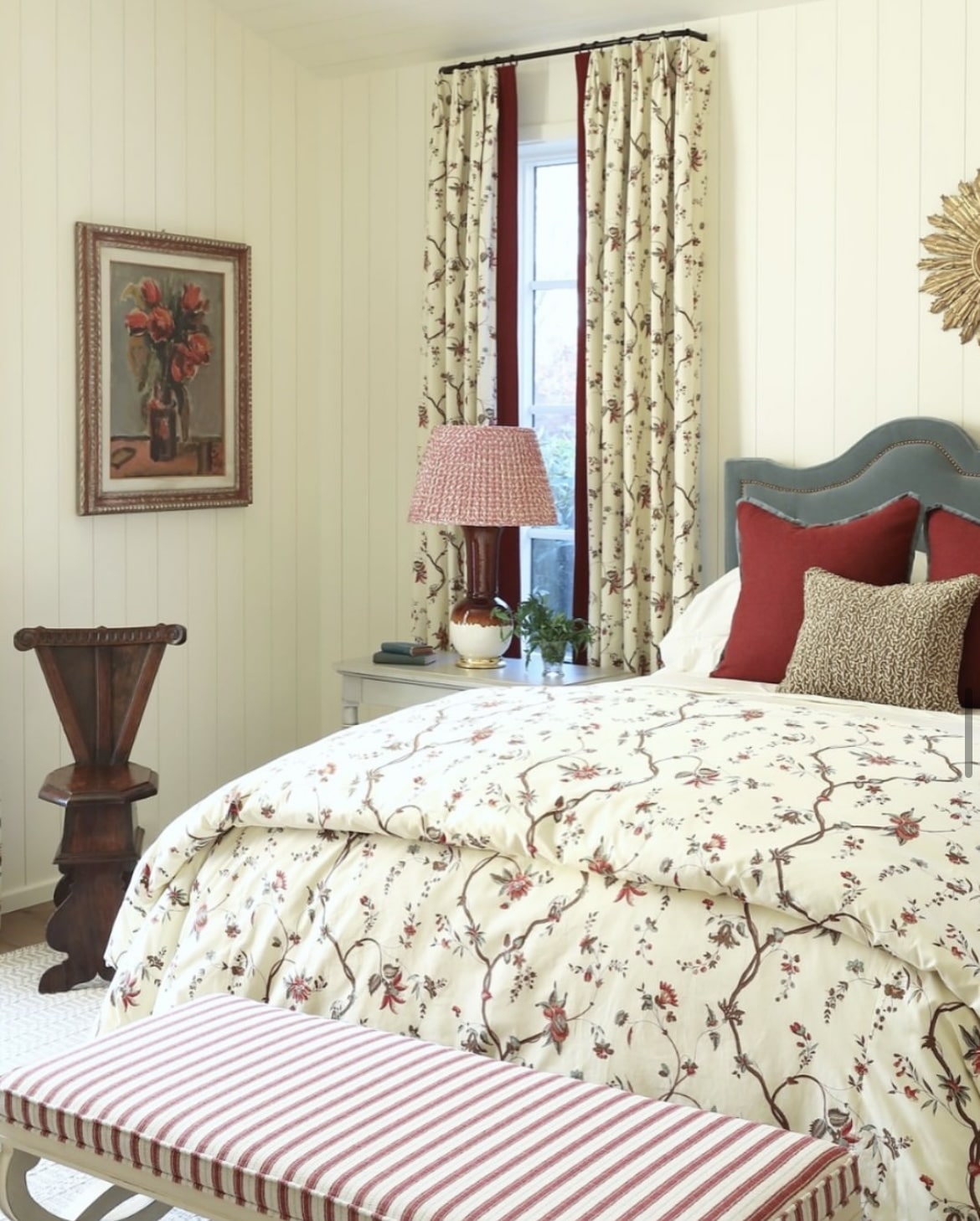
33. Slipper Satin
This grey green neutral will create a sophisticated scheme, no matter where it’s used.
Pair with muted blues or greens for a beautiful contrast, but don’t be afraid to introduce bolder shades such as reds and oranges to create a beautiful depth of colour in the room.
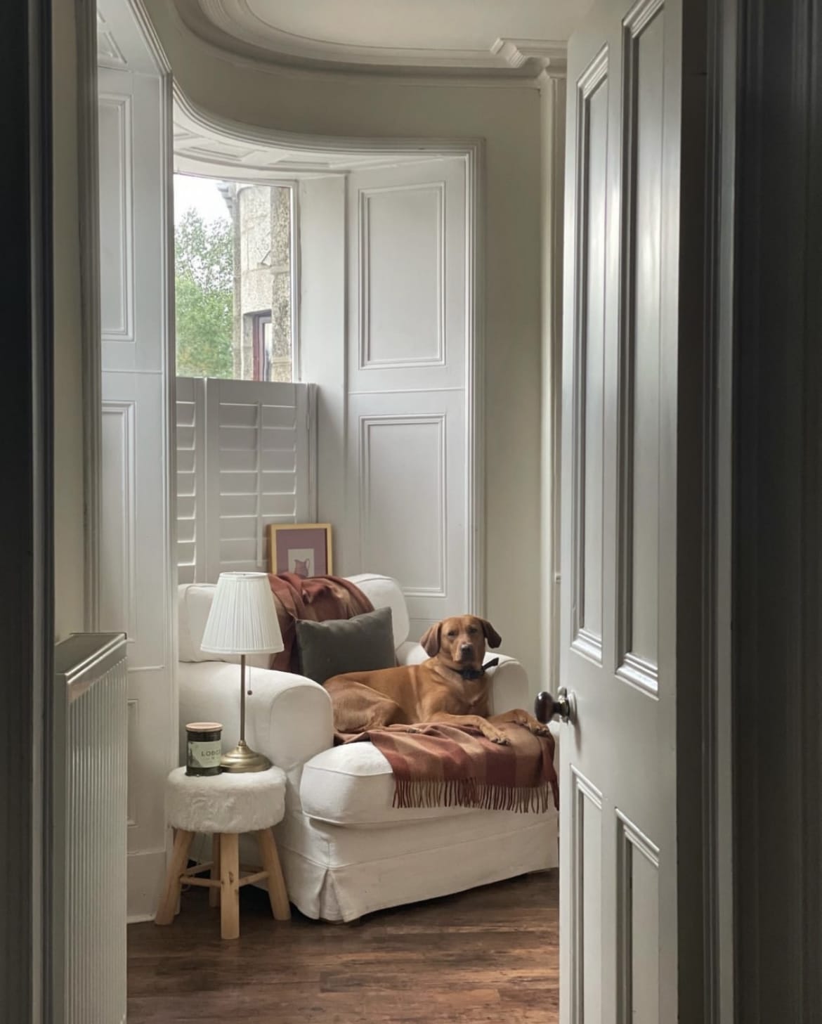
34. Calamine
Named after the lotion, this sweet pink really is a feast for the eyes. It has a slight undertone of grey to it which avoids it feeling too gawdy.
A delicate pink that is fresh and uplifting in equal measure. I particularly love it with tones of green and yellow for a warm, cosy feel.
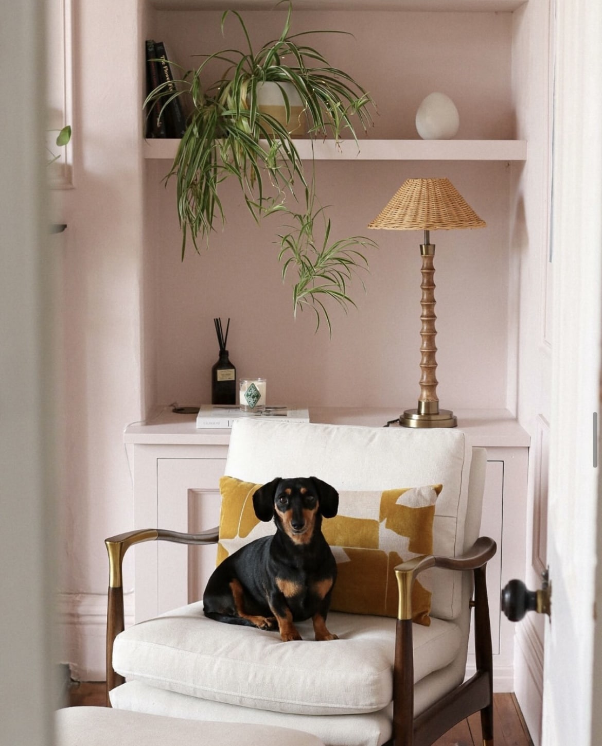
35. Faded Terracotta
This gentle colour is a perfect alternative if you’re looking for something warm, but not a shade which is underpinned by a yellow pigment.
An archive shade which is described as a soft, pale orange – similar to the hue of the Californian sun. Use it with bolder hues of orange and blue for a fresh scheme that you can’t help but feel happy surrounded by.
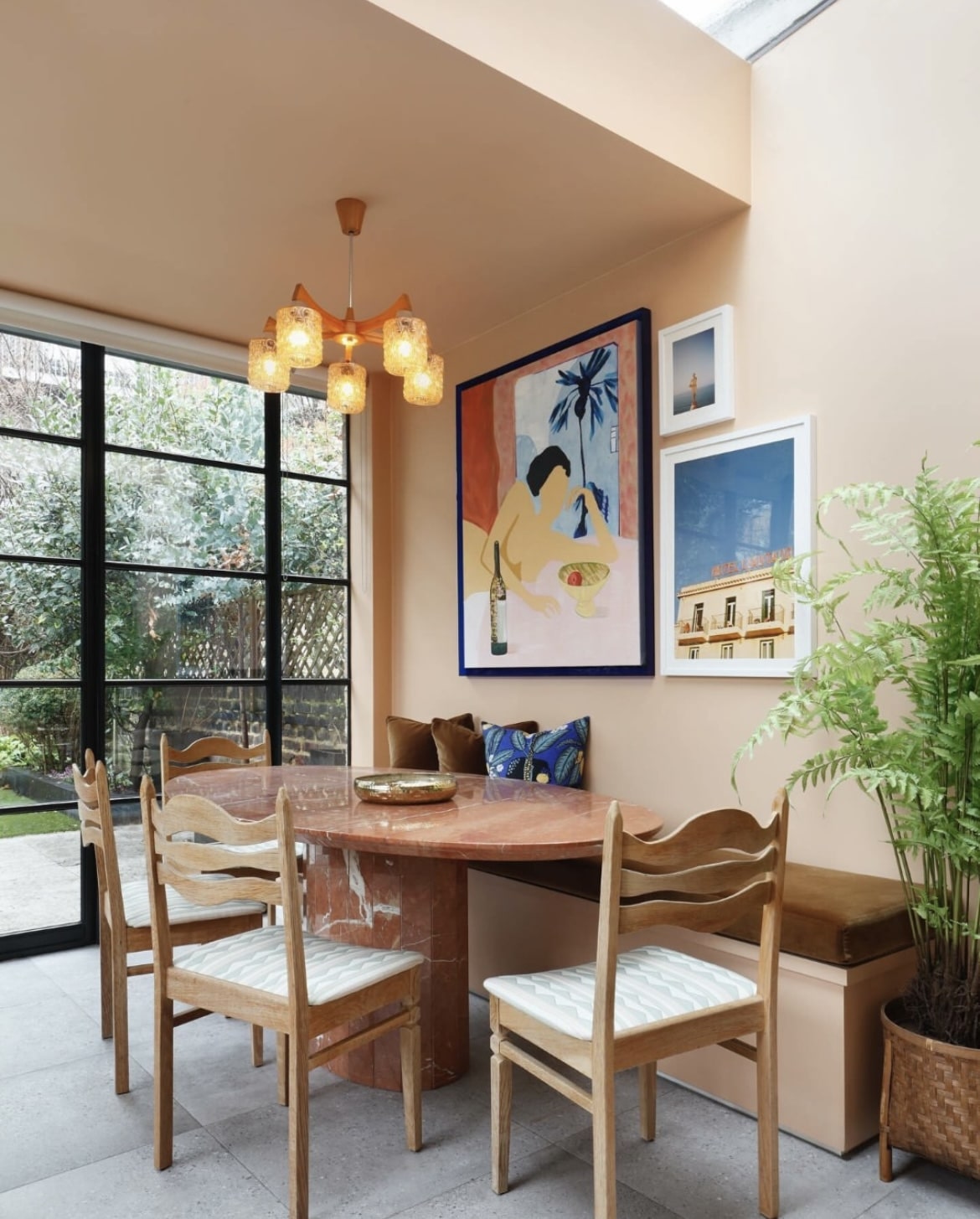
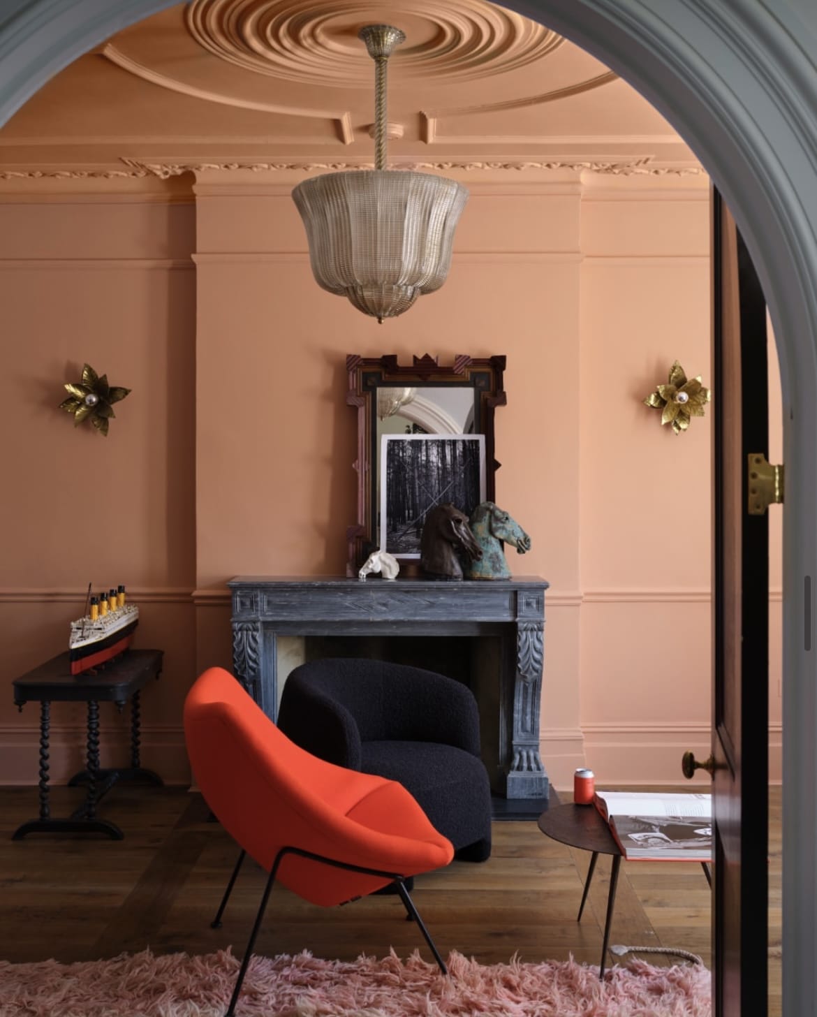
36. Naperon
Looking for a slightly darker more grounding orange shade? Enter Naperon, one of the newest F&B shades that launched this year.
This rich terracotta is a familiar clay colour, surprisingly a shade that teams well with most colours. Create a more intense feel by collaborating it with dark charcoal hues or bolder pops of red.
37. Lulworth Blue
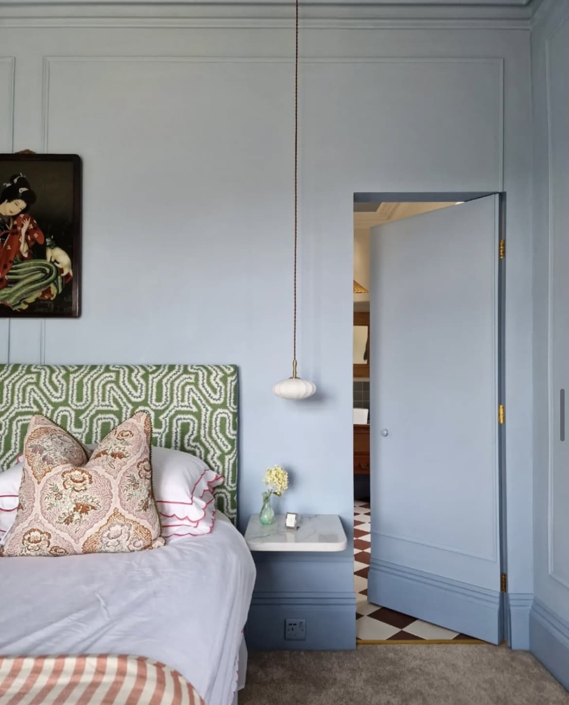
This bright yet soothing blue is as good as it comes. Again, this shade of blue is one that can almost be classed as a workable neutral.
A beautiful shade to use in a bedroom scheme that’s soothing and won’t stimulate the mind as you’re trying to wind down in the evening.
Forget everything you know about using green and blue together, it’s rather refreshingly beautiful to see them both working in harmony together in the bedroom below.
38. Cornforth White
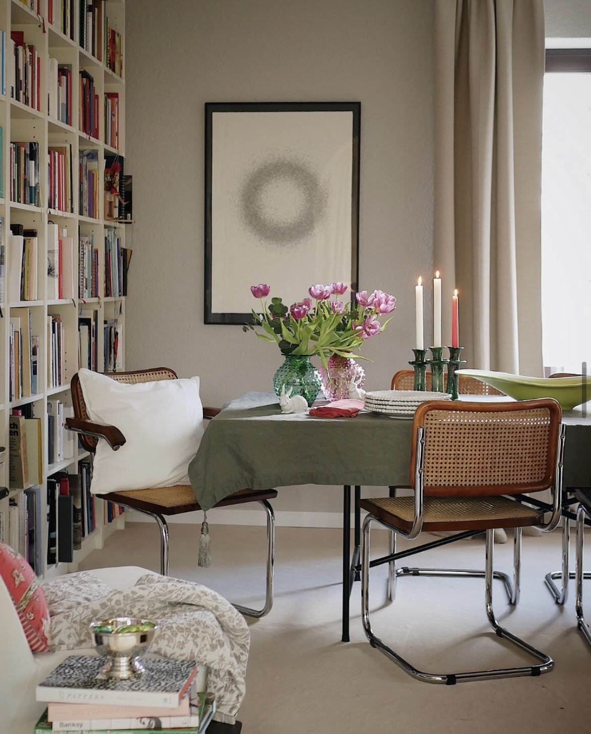
Cornforth White is a relaxed neutral with grey undertones. It’s incredibly stylish and neither too warm or too cool for a scheme, it’s what makes it workable with most colours.
Choose to lean into warmer colours, or pair with cooler, moodier shades for a more intimate feel.
39. Dimity
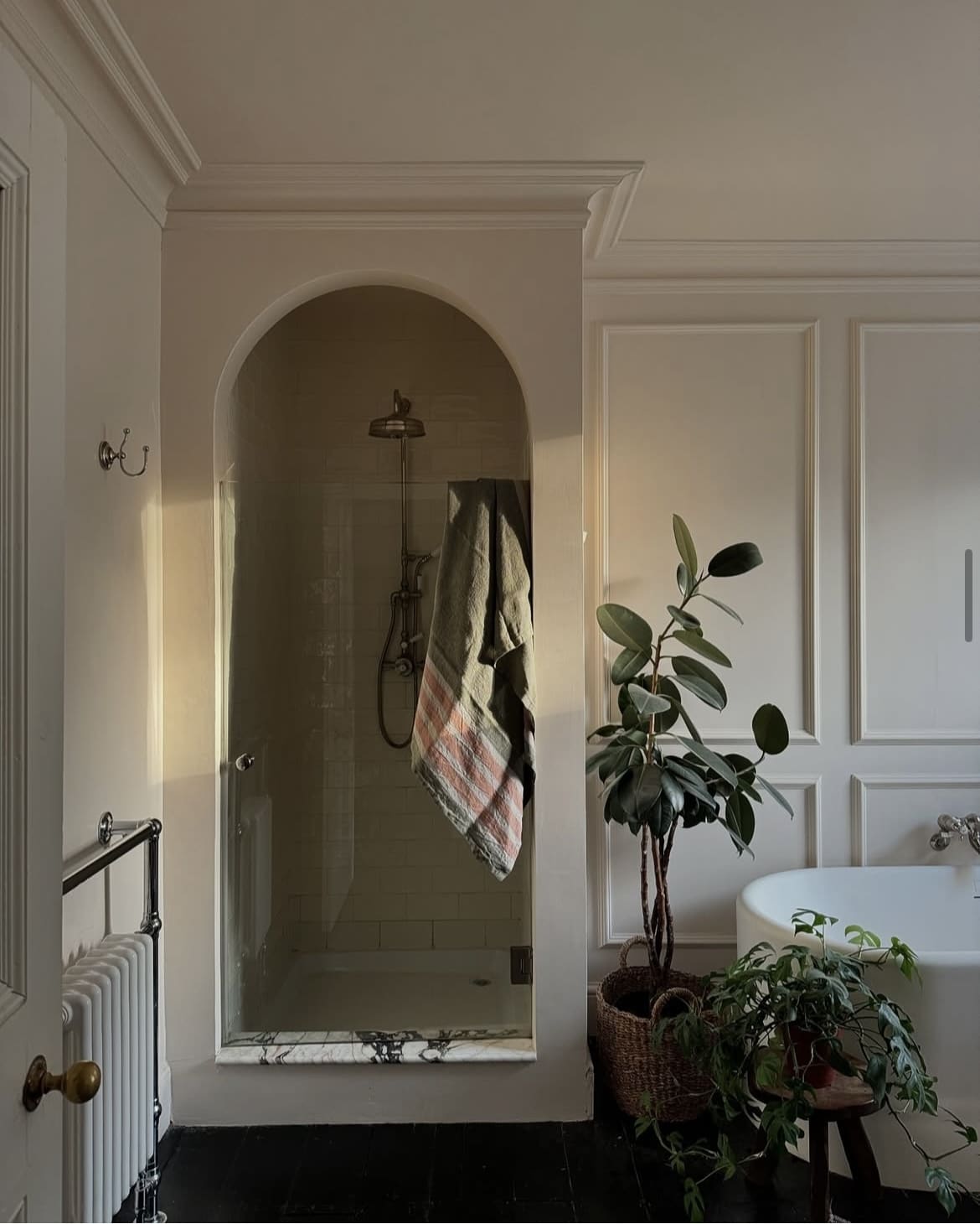
A delicate white with red based undertones, Dimity is a beautiful soft white with a warm base and one I would recommend if you are looking for a warm white which isn’t comprised of yellow undertones.
Pair with warm reds and pinks for a more romantic scheme, or lean into greens, whites and natural materials to set the tone in an earthy inspired scheme.
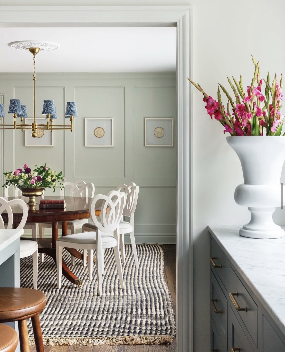
40. Cromarty
One of the lightest greens in their collection, Cromarty sometimes appears like a sage green or a light grey, depending on the light in the room.
A muted shade that is soothing and natural. It’s just one of those greens that will pair with most colours too, equally as striking in a traditional interior scheme and a coastal inspired one.
41. Pointing
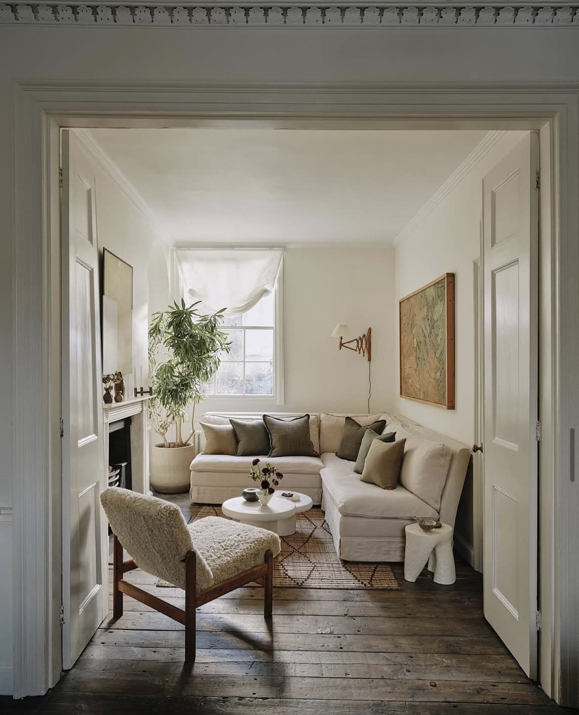
Fresh and delicate, this warm white has a red undertone to it, and is not far off a bright white. It’s subtle and will create the prettiest space, no matter what type of light your room receives.
See how cosy it makes the living room space look below, colour drench it across the walls and skirting, it will help to give the illusion of a bigger room.
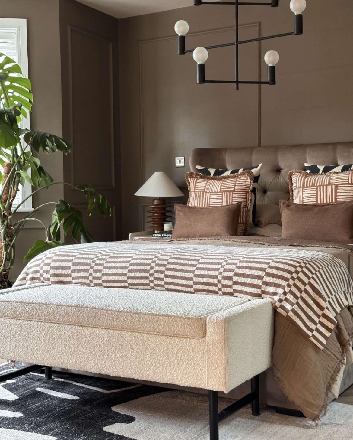
42. Broccoli Brown
A colour that returned from the archive collection this year, this dark shade feels ridiculously decadent. It’s comforting, intimate and something a little bit different to your bog standard mid neutral.
Create the most indulgent bedroom scheme with it. Introduce warmer earthy colours such as rusty reds and warm neutrals for a layered scheme that feels inviting and super intimate. The below? They’ve nailed it!
43. Marmelo
One last shade that F&B launched this year, and another nod towards where we’re moving to colours this year and beyond.
I always think of marmalde when I see this colour, it’s rich, it’s got depth and feels warm and inspiring at the same time. It’s traditional too, it pairs beautifully with a white such as All White on woodwork to lift this inspiring shade.
