
Farrow and Ball have just dropped 12 new paint colours for 2025, cosy, grounding colours that reflect the paint trends for the year ahead.
Three of the shades have been revived from their familiar archive collection, with nine indulgent new shades joining their line up that have equally as unique names.
The new range of shades ranges from the perfect modern warm neutral to a deep red and breezy blue which can almost be classed as a versatile neutral.
The new additions will be available for purchase from Farrow and Ball on the 27th February. Here’s what we know, and think so far.
Farrow and Ball’s 12 New Colours For 2025
“We’re not looking to anyone for permission on how we use color anymore” were the words of Elle Decor on paint trends for 2025, and this definitely rings true with the new shades on the block from Farrow and Ball.
Joa Studholme, Colour Curator at Farrow and Ball said, “Over the last few years, we’ve relished living with colour. It’s opened our eyes to all the shades surrounding us, which we often don’t think about. The treasures right under our noses.
Now, we’re ready to embrace more colour and celebrate these unsung heroes in our homes.”
There’s really something for everyone from this collection, and at first glance they feel like shades that will just feel so good to be around, they’re earthy, rich and highly pigmented.

Scallop
I was instantly drawn to the warm, modern neutral feel of Scallop. It perfectly sits between the popular shades of Setting Plaster, less pink, and a lighter interpretation of Dead Salmon.
I see this as a versatile neutral that could pair beautifully with any of the other new additions to their palette of colours.
Imagine it with Naperon on woodwork for a ‘double drenched’ look, or with Dibber to create an earthy, natural colour scheme.


Dibber
It can be difficult to find the perfect earthy green that’s comfortable to sit in, but I think Farrow and Ball have nailed this one.
Dibber is a mossy green, with an olive demeanour that will bring definition and ground a space. It lends itself perfectly to an earthy colour scheme throughout an interior.
Reduced Green
Actually, Reduced Green would make a fabulous pairing with Dibber for a double drenched look in an interior. Farrow and Ball describe this deep hue as an intense muddied green.
It also has a metamorphic quality to it, looking both brown and green, depending on the light that it’s present in.

Sizing
Fresh and breezy, this new shade has distinctive blue undertones, yet can be classed as an almost neutral. It’s fresher and more neutral than Borrowed Light.
The name? It’s derived from starch! Giving it that crisp feel that would look great as a neutral in most rooms. Whilst many may feel blue is naturally cold, Sizing brings a whole new meaning to a neutral, it’s one that can be both cool yet light and bright in a darker room.


Naperon
I have a thing for rusty reds and terracottas this year, and Naperon is certainly my favourite of the new shades.
This familiar terracotta colour is warming, inspiring. Pair with Marmelo for added definition, or introduce a green such as Sap Green for a playful colour scheme.
Marmelo
Check out Marmelo on Joe Studholme’s dresser in her kitchen, the true star of the space. A warming, cocooning accent colour against classic School House White on the walls.
Named after Marmelo Quince, the inspiration for this punchy colour comes from marmalade. It certainly brings a delectable feel to any surface.

Kakelugn
A clean, light and optimistic blue, it’s classed as a cleaner interpretation to Light Blue. It’s also paler, fresher and more delicate than Parma Gray with an ever changing tone that responds beautifully to light.
Kakelugn shown below with Scallop on the ceiling for an interesting, cosy feel in this bedroom.

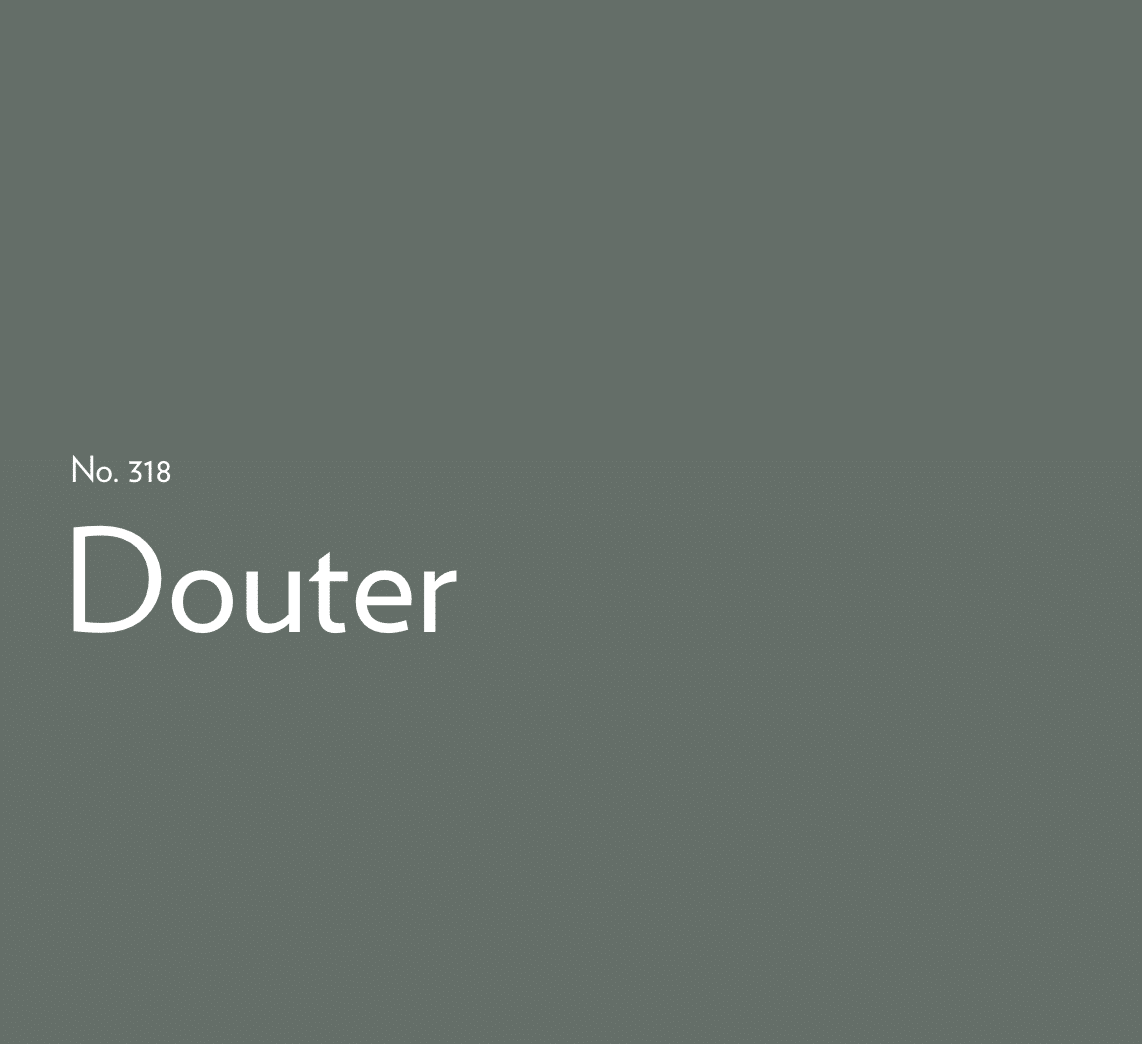
Douter
A moody grey-green, drawing inspiration from the aged patina of soot and tarnished brass on traditional candle snuffers, Douter offers a rich green take on their beloved Inchyra Blue.
Douter is stronger than Green Smoke with a similarly complex character and sits between Green Smoke and Inchyra Blue.
It can read greener in brighter light and greyer in low light. When paired with Off-White or Jitney it will feel warm and welcoming.
Duster
Of course, there is a brand new yellow shade to join their collection. Dulux announced their paint colour of the year, True Joy which was a joyous yellow shade, and very much on-trend for 2025.
This deep ochre shade feels stylish and aged without being overtly yellow. Duster is a comfortable yellow that might just change your opinion on using yellow in a space.

Etruscan Red
Resurrected from their archive collection, this is one I am very happy about.
Etruscan Red is a brown-based deep red, this is very much in line with the colours we have been seeing that are trending for 2025. It’s undoubtedly rich, and is the perfect way to pull off the ‘unexpected red theory’ that captivated social media users last year.
Use it to define a colour scheme.
Broccoli Brown
If you hate broccoli, don’t worry, you’re not going to want to sit this colour out.
A quiet dark stone, it sits effortless alongside natural materials. Broccoli Brown is rich, comforting and would create a dramatic yet reserved feel in a study or living room.

Sap Green
If you’ve been eyeing up Sap Green in the archive collection for a while, it’s been brought back to join their 9 new paint shades.
Farrow and Ball added, “an Archive shade at the time, which we love so much, we’ve reintroduced it to our Signature Palette — fit the bill perfectly. To truly drench the space, Joa used our multi-surface Dead Flat finish across the walls and woodwork”.
If you’re looking for a punchy, fun loving green, it’s got to be this. An enticing olive shade that feels intense in small spaces. Look how beautifully it pairs with Pink Cup on the ceiling in Joa’s home.
Whilst the new shades are launching on 27th February, for the first time ever, you can discover these colours before the launch as sample pots are available for purchase.
Which shades are you loving? If you have any other questions about the colours, please leave me a comment below and I’ll come straight back.

Naperon and Scallop all the way baby.
I’m with you on that, so warm and gorgeous!