Farrow and Ball paint shades are among some of my favourites to use in projects. They’re a great way to get your interior immersed in colour for a confident, and stylish interior.
If you’re looking to refresh your home office in the coming year, we’ve put together a list of some of the best Farrow and Ball paint colours for a home office that will help boost your productivity, and style stakes in your home!
The Best Farrow and Ball Home Office Colours: 17 Stunning Ideas
1. Add A Moody, But Relaxing Feel With Hague Blue
A midnight blue might not be the first colour on your list when it comes to choosing paint for your home office, but it’s worth considering when it looks this good.
If you pair with a bright white on the ceiling, you don’t have to worry about Hague Blue feeling oppressive in the space as it will draw the eye up, and make the space feel airier.
Introduce brass accents and a leather desk chair as shown below to add some welcome, natural warmth into the colour scheme.
Paint colour used: Hague Blue

2. Don’t Forget About The Fifth Wall!
The ceiling, otherwise known as the fifth wall is something often forgotten and typically painted white, but you can utilise it as a design accent and work it into your scheme as expertly shown below.
Farrow and Ball Babouche, a jubilant yellow has been used on a half wall panelling look and paired on the ceiling to create a cohesive pull in the space, and add interest to the eye as you enter.

3. Elevate The Space With Panelling
What’s not to love about this gorgeous neutral office?
Hardwick White has been used on some panelling for a uniformed, stylish look. Panelling is a great way to elevate your desk wall and add interest, it totally transforms an otherwise empty wall space.

4. Opt For A Warm, Modern Neutral
If you’re considering using a bright white in your home office, think again. Whilst white can feel like a comfortable and safe option, it doesn’t inspire and it can leave a room feeling flat.
Instead, opt for a warm, modern neutral such as Strong White, as shown below. This gorgeous neutral brings warmth and character, as well as pairing beautifully with earthy colours and brass accents.

5. Pair With Bold Colours For A Warm Feel
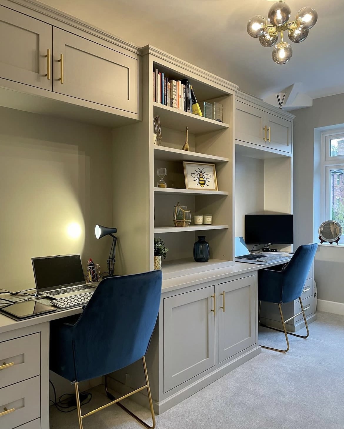
Purbeck Stone is another enduringly popular modern neutral for a home office, and for good reason. Whilst it pairs effortlessly well with neutrals, it looks great with bold colours such as a royal blue, brass accents, emerald green and even mustard yellow.
We just love this co-working unit setup!
6. Use One Colour All Across For A Minimalist Feel
If your home office has become a part of a multi purpose living space, then you might not want to draw so much attention to it.
We love this bespoke unit which has been built and painted in Skimmed Milk White to match the walls. It keeps the entire space feeling connected and minimal, yet the decorative details on the unit help to effectively zone this space.

7. Add Black Accents For Definition In A Neutral Colour Scheme
Old White is a soft grey green which adds warmth and a restorative feeling to an office. It’s very much down to personal preference, but I personally find restful colours are much more comfortable to work with when you’re in the space for a long period of time.
If you’re looking for restful tones stick to off-whites, sage greens and muted tones of your favourite colours.

8. Use A Dado Rail For Perfect Colour Separation
Mizzle is one of my favourite Farrow and Ball greens, a perfect neutral green that is restful and soothing on the eyes.
Add a dado rail for perfect colour separation, use bright white above to draw the eye up. It will make the office feel bigger and deliver a light and airy feel. You can replicate this look with any colour.

9. Combine Railings With Wooden Details For A Natural Contrast
Railings is one of the most popular Farrow and Ball shades, if you’ve never considered a darker paint before, this home office inspiration is for you.
With the addition of panelling on this feature wall, it adds further depth and character to the space. The addition of the wooden shelving balances the depth of Railings, finished with other natural accessories for such a fun, and cohesive work station.

10. Get Creative With A Half Painted Wall
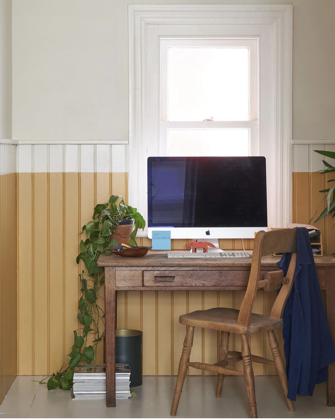
We love a half painted wall in an interior for added visual interest. Typically, you would use panelling for the colour separation, but just by taking this white shade further down onto the panelling to meet India Yellow, it makes the room feel taller and larger.
A clever trick which we’ll definitely be adding to our little black book of interior secrets!
11. Create A Rustic, Earthy Feel With Pigeon
If you love green, Pigeon could be a perfect choice for your home office. It’s darker in nature than paint colours such as Pigeon and it’s complementary to both neutral and earthy colour schemes.
Add some black and brass accents into the room to finish off and tie the room together.
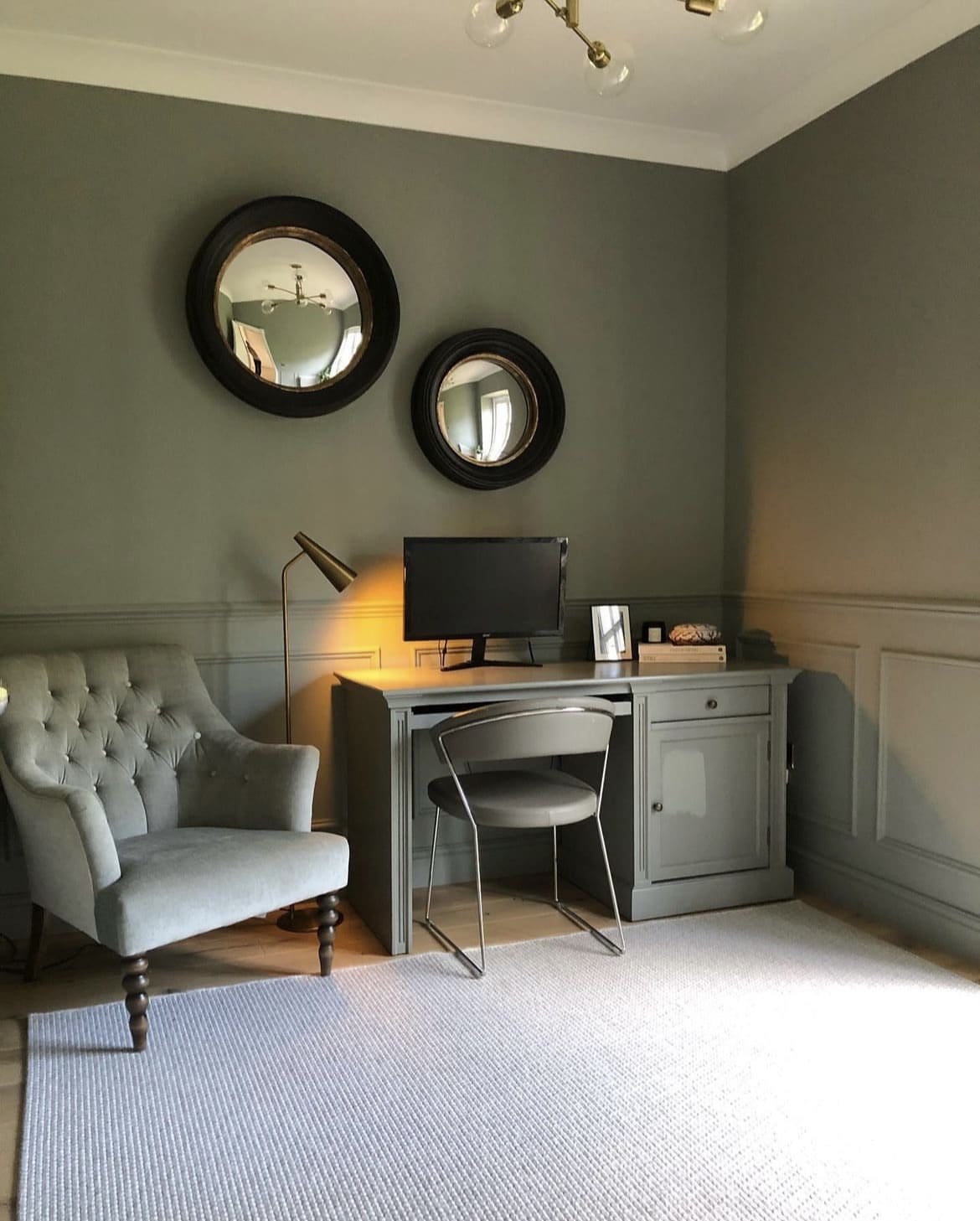
12. Sulking Room Pink For A Mature, Feminine Look
If you have a bedroom office combination, this may influence your colour choices more as it needs to be something that’s cosy and restful, but also perfect for boosting productivity.
Sulking Room Pink is a popular pink shade, yet also highly versatile to an interior. It’s a more mature shade of pink and brings more depth than a classic blush pink.

13. Boost Your Workspace With Stiffkey Blue
We’re often led to believe that blue in a space can feel cold and depressive, but this Stiffkey Blue home office is certainly an exception to the rule!
It’s all about what you pair it with. Lift and balance the shade with wooden tones, a white ceiling and plenty of office plants (real or fake), as long as you layer colour appropriately, blue can be a great shade for an office!

14. Card Room Green
Looking for a comfortable green that just feels good to sit within? Card Room Green ticks all the boxes.
A green is virtually one of the easiest on the eyes which is what makes it soothing to sit within, even more so if you’re sat in your office for long periods of time each day. I love this colour drenched wall with the inclusion of the desk for an intimate feel.

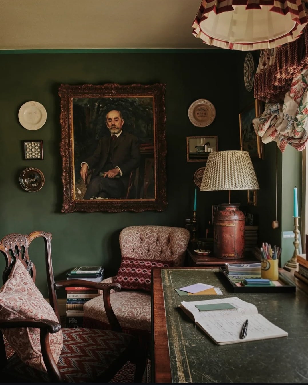
15. Minster Green
Looking for something slightly more defining? Check out Minster Green in Patrick’s home office below. A beautiful deep green shade that can bring a moodier feel to a north facing room, or one that will temper the intensity of the sun in a south facing room.
Bring a traditional feel by combining with wooden tones, brass and a couple pops of red.
16. Dead Salmon
Uplifting, sultry and feel good – Dead Salmon is one of the most popular pinks, and a comfortable, un-stimulating shade for a home office.
It brings the softest, most subtle feel to a room, and paired with an off-white on the ceiling it creates such a stunning balance between the two.
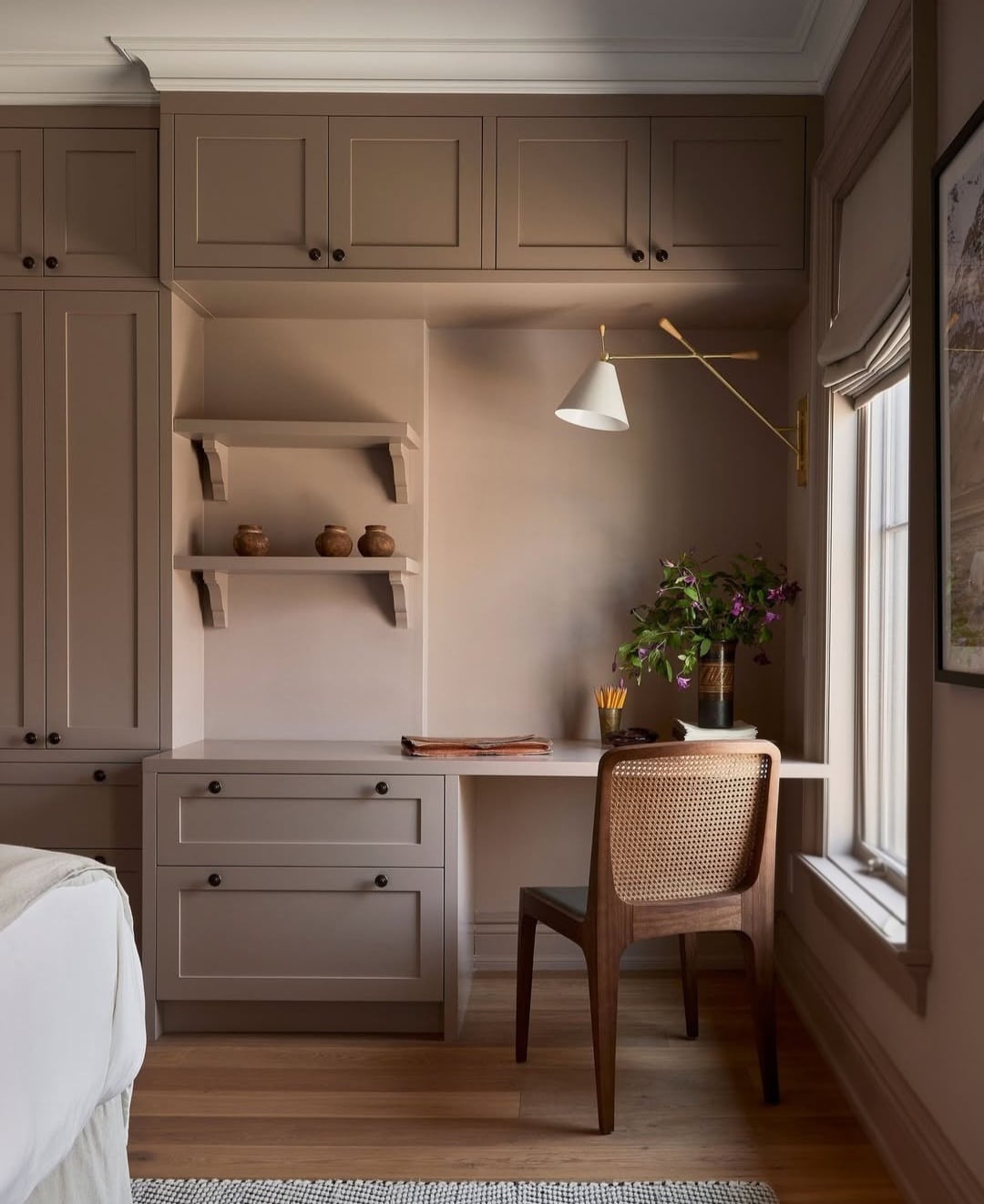
17. Light Gray
If you want a slightly cooler tone in an office because you have a sunny south facing office then Light Gray, a stony grey green which is grounding and perfect for an earthy inspired scheme or beyond.
Which Farrow and Ball office colour is your favourite? If you have any questions about pairing colours in your space, please leave me a comment below and I’ll come back with my paint recommendations.
