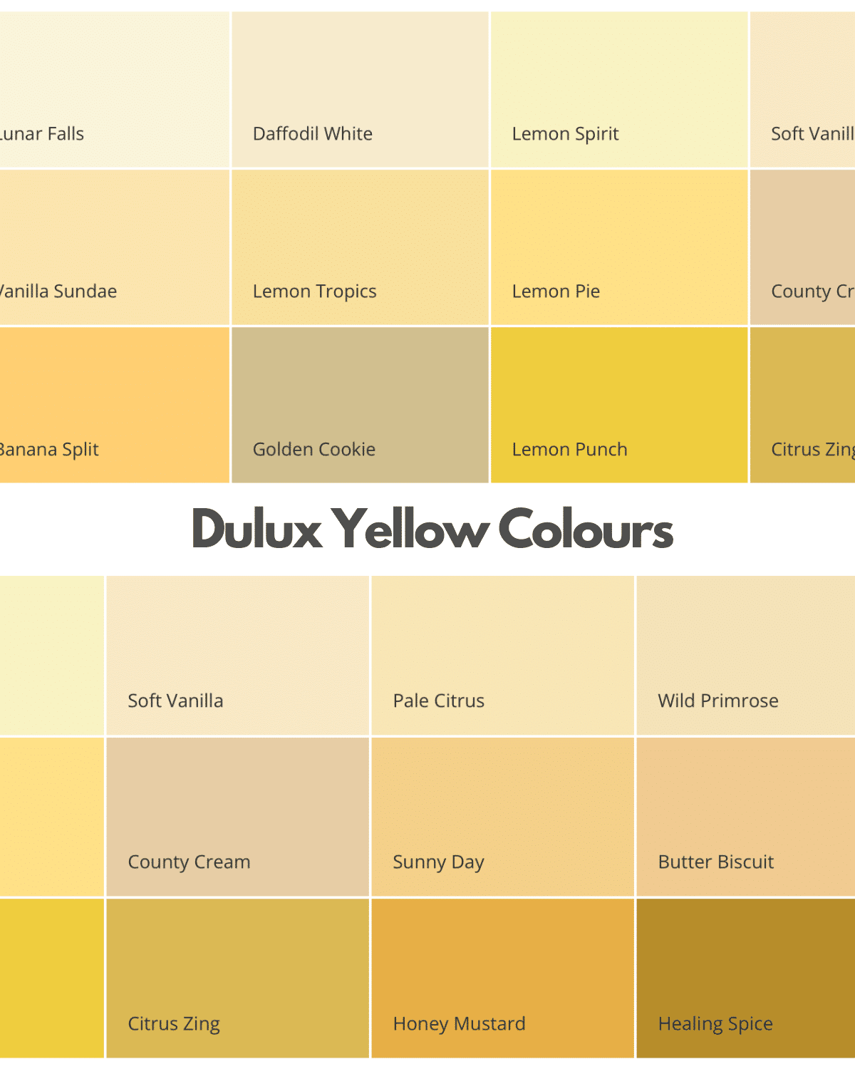
Looking for the perfect yellow shade for your next home project? Here you’ll find the best Dulux yellow Paint colours in one place so you can find, compare and pick your perfect yellow!
Yellow based paints are popular choices for North facing rooms as they help to counteract the coldness associated with blue light. The right tones of yellow can bring brightness, warmth and a touch of sunshine to an interior scheme.
Whether you’re looking to incorporate yellow into your hallway, bedroom, living room or beyond, join me as I explore all of the Dulux yellow paint colours in their offering.
The Best Dulux Yellow Paint Colours
Lunar Falls
Lunar Falls is one of my favourite Dulux yellow paint colours. This muted shade of yellow is on-trend and pairs beautifully with colours such as lilac, sage green and other neutrals.
This paint is part of Dulux’s light and space range, paint which includes light reflecting particles which can help to make a small room feel bigger.
If you’re looking for something slightly brighter than an off-white, this really is a perfect choice for a North facing room.
Check Prices For Lunar Falls
Daffodil White
A creamier alternative with slightly less yellow undertones is daffodil white. This yellow shade has green undertones for an almost honey coloured shade.
A perfect tonal pairing with other green colours in the space, but it equally works well with neutrals such as grey which will also add some much needed definition to the colour scheme.
Check Prices For Daffodil White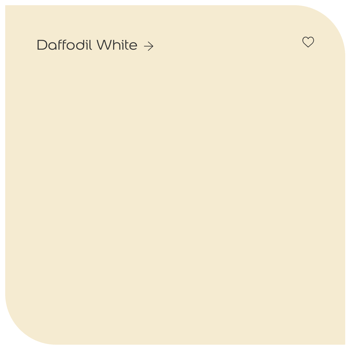
Lemon Spirit
This bright and vibrant shade will reinvigorate any interior space. Derived from green undertones, this sprightly shade could feel quite overwhelming throughout an entire space, so think about using it on a feature wall or as an accent colour within the scheme.
Pair with greens, neutrals and black accents to ground the design scheme.
Check Prices For Lemon Spirit
Soft Vanilla
If you’re not a fan of very yellow based shades, Soft Vanilla is a much softer colour which has been designed specifically for use in a kitchen, offering grease and stain resistance.
If you’re working it into your kitchen design, the colour would complement green and white style cabinetry.
Check Prices For Soft Vanilla
Pale Citrus
This sunshine tone is a mood lifter in an interior, with true yellow undertones and a perfect demeanour for cold North facing rooms.
Keep things simple with a neutral colour scheme, or inject some further colour with on-trend colour combinations to yellow such as lilac and sage green.

Wild Primrose
A popular Dulux yellow paint colour for kitchens, hallway and landings, this yellow based shade really is perfect for transitional spaces in the home like a hallway, delivering an instant warm lasting impression as you step through the door.
Ground things with a more defining accent colour in the space like black or charcoal grey. For a modern rustic interior, introduce natural materials such as jute and rattan through light fixtures, baskets and decor accessories.
Check Prices For Wild Primrose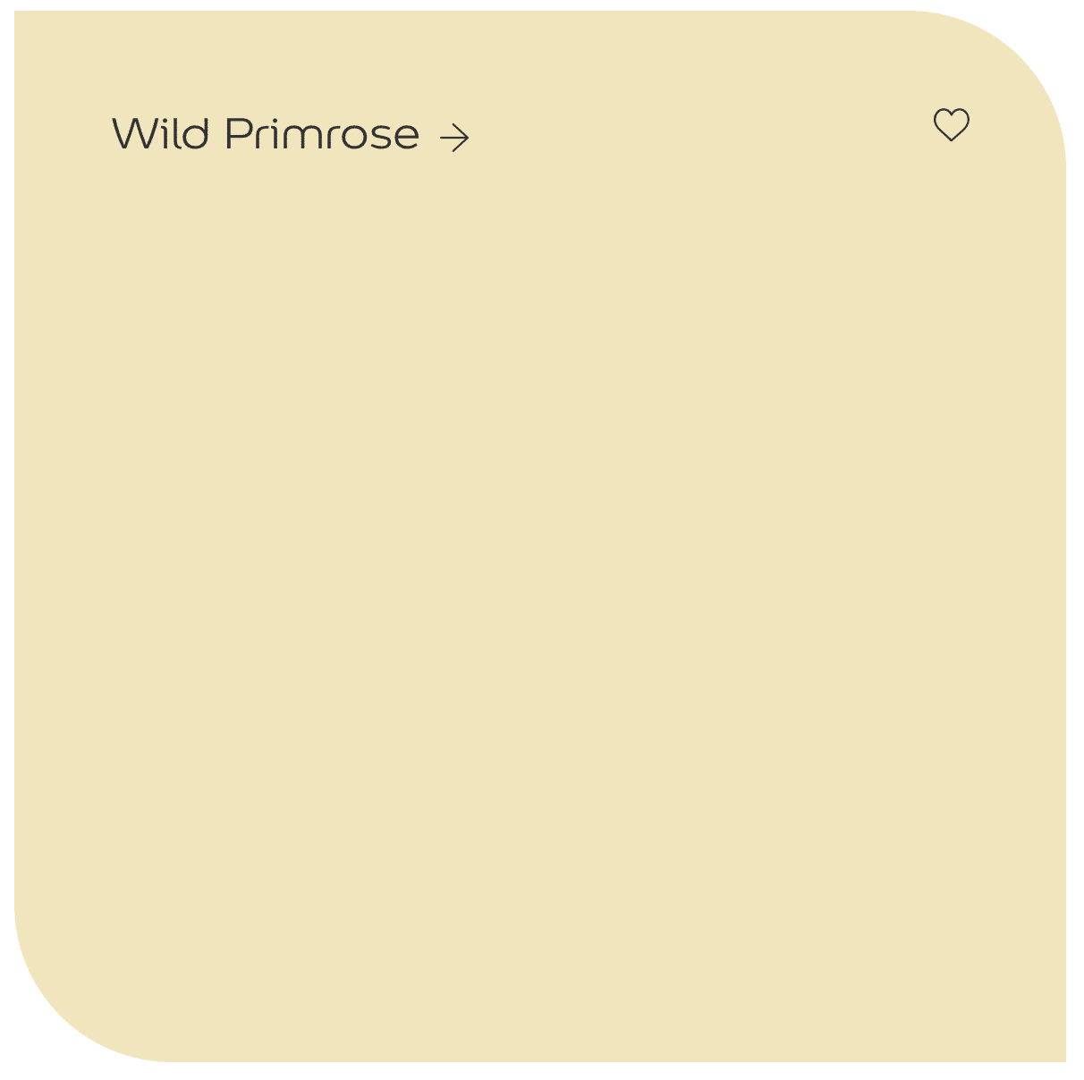
Vanilla Sundae
A versatile and distinctive shade of yellow, vanilla sundae is a warm paint shade with yellow undertones.
A slightly darker alternative to Wild Primrose. Comparing different shades of yellow can seem cumbersome and exhaustive as they vary ever so slightly in their tones.
I’d always recommend getting a tester pot of a couple of shades to test in your chosen room before committing. This way you can see how the different shades look in different lights throughout the day.
Check Prices For Vanilla Sundae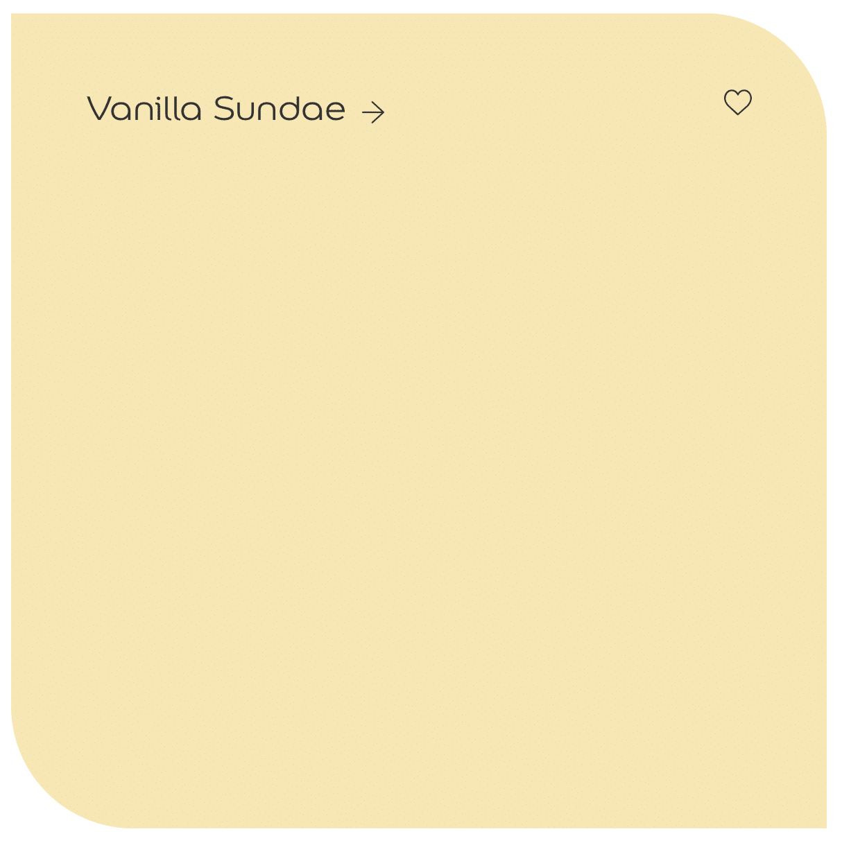
Lemon Tropics
Moving onto something a little more true yellow in colour is lemon tropics. This bold and bright shade would look incredible in a colour scheme with a highly complementary colour like navy blue or forest green.
Introduce some black accents to your colour scheme for a touch of modernity.
Check Prices For Lemon Tropics
Lemon Pie
If you want to make a bold statement in your interior, lemon pie will bring warmth and vibrancy to a space. It’s not a colour for the faint hearted in an interior and it can quickly go wrong if not styled appropriately.
Use as an accent colour only in the space, and introduce neutrals or softer shades such as sage green into the space to balance the colour.

County Cream
County Cream is one of Dulux’s Weathershield exterior paints. It’s part of the collection of Dulux yellow paint colours, but it has distinctive shades of yellow and brown which creates a gorgeous, caramel esque type of colour.
Check Prices For County Cream
Sunny Day
A fitting name for a sunshine filled colour. Sunny Day has distinctive yellow undertones for a bright and vivacious interior shade.
It’s not as luminous as lemon pie, and despite being bright, it’s still more understated with a softer edge on the colour.

Butter Biscuit
If you want to benefit from the power of yellow undertones but aren’t fond of a true yellow in a space, butter biscuit is a beautiful amalgamation of both yellow and caramel coloured undertones.
Pair with lighter creams in the space for a neutral, modern inspired interior scheme.
Check Prices For Butter Biscuit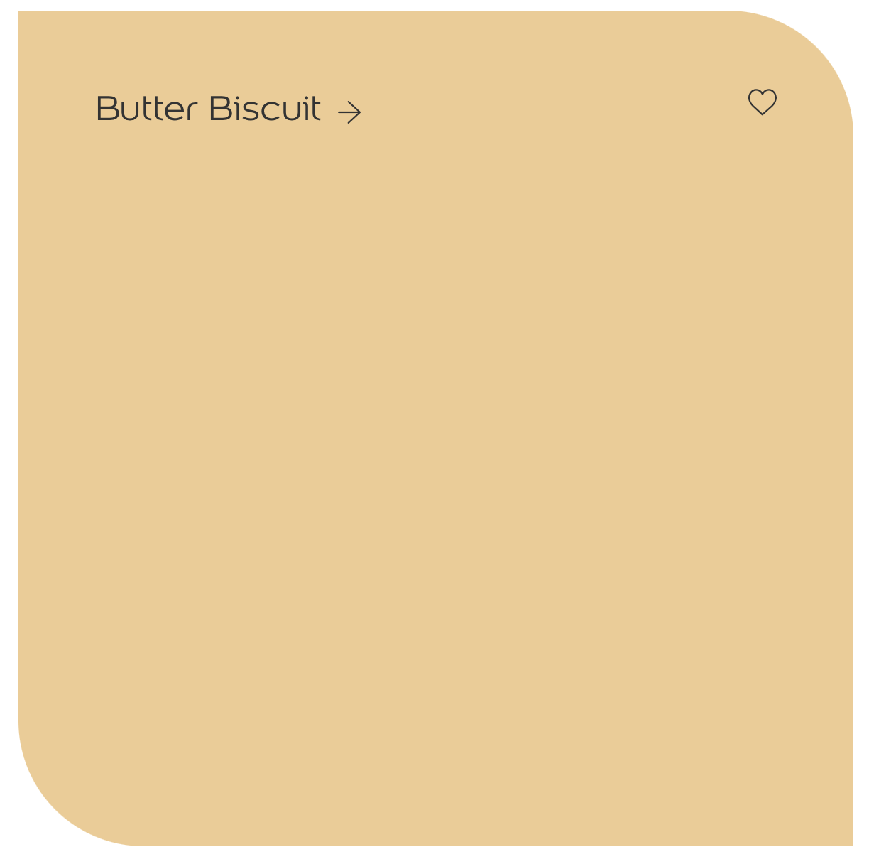
Banana Split
A deep sunshine yellow bursting with vivacity, banana split will bring a notable touch of sunshine to your interior.
Because this shade is so bold, I’d recommend pairing with cool white or pale greys to balance the colours in the room.

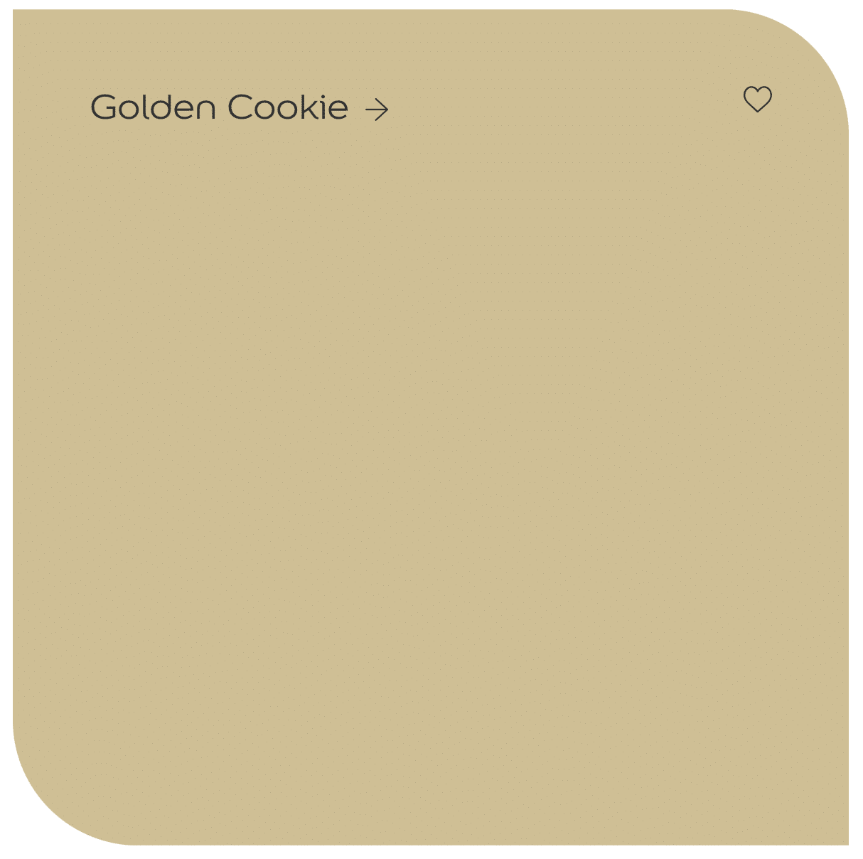
Golden Cookie
Golden cookie could also be described as a ‘warm wheat brown’ shade, it has yellow undertones but has a much more demure look.
This neutral would look perfect in a collective neutral scheme, layering with colours such as mink, creams and whites.
Lemon Punch
It’s the Dulux yellow paint that certainly packs a punch – this striking colour was designed to make a statement in an interior, but admittedly, it’s not for everyone.
If you’re looking to leave a lasting impact in a space use on a feature wall or as a small accent colour in the space.

Citrus Zing
This medium light shade of lime green has deliberate yellow undertones for a paint colour that will bring an instant splash of colour to an interior. It could even be described as a dulled down mustard yellow or heritage yellow colour.
Pair with highly complementary shades such as navy blue, or balance and lighten the rom with airy neutrals such as off-whites and creams with yellow undertones.

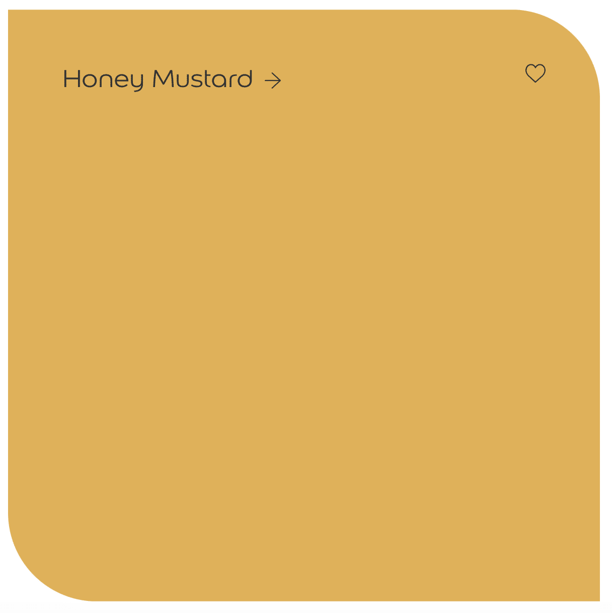
Honey Mustard
For something a little bit spicier. I love the vibrancy of honey mustard, an orange shade with yellow undertones that will add presence and drama to a space.
Again, pair with highly complementary shades such as navy blue for high contrast. This type of colour combination is best for transitional spaces as the colours are not considered restful in situations such as the bedroom and living room.
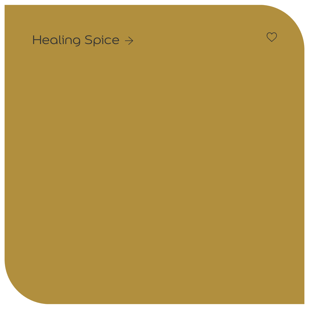
Healing Spice
With a mix of yellow undertones, healing spice could be described as an almost heritage khaki green colour.
This Dulux yellow paint would work with a range of neutral shades, greys and more defining accent colours such as black for a touch of modernity.
You will naturally be drawn to one colour during this time, and if not, why not try incorporating a mix of them all in some way? Which Dulux yellow paint colours are you drawn to the most?

LEMON ZING…LOOKING FOR A YELOW CITRUS FOR EAST FACING NEW GLASSED IN VERANDAH 12 METRES LONG BY 3 METRES WIDE. WHAT WOULD A HALF YELLOW ZING LOOK LIKE? THINK A COLOUR WITH MORE OF A LEMONY LOOK WOULD BE MY PREFERENCE. LIVE IN QLD ON SUNSHINE COAST. HAVE FILLED SPACE WITH MANY POT PLANTS BASICALLY GREEN
I’d be inclined to lean into a more heritage yellow IF you get a lot of bright light in the morning as a citrus yellow may feel too intense with the sun. I’d grab a tester pot of a few, paint it on an A4 sheet of paper and see how the colour feels at different times of the day as light affects how we perceive it so much! Look at Capital Yellow, Bee Hall and Sunbound (these are shades available in Australia!) hope that helps, the space sounds wonderful.