Tackling a hard to please north facing room? If you’re struggling to find the right paint color to make a cold room feel warmer, you’re in the right place. There are some guiding principles which will make the selection process so much easier.
Typically a north aspect room receives very little light during the course of the day, and any light it does receive is typically blue in color. This is the number one reason why a bright white paint will NOT make your room feel lighter, it actually has the reverse effect as there is no warm light to bounce around the room.
I have rounded up the best Benjamin Moore paint colors for north facing rooms, along with the different ways you can tackle the space and choose the right color to suit your needs for the room.
The Best Benjamin Moore Paint Colors For North Facing Rooms
White Paint Colors
If your north facing space is a bedroom or a room you use throughout the day, you might want to lean into a white to counteract the blue light and make the space feel warmer.
Choosing an off-white for a north facing room is a popular choice because of this, but be sure to stay clear of bright white shades. When choosing a white paint color, always look for one with a yellow, pink, red or green based undertone. This will give natural warmth to the paint shade, helping to balance any blue light the room comes into contact with.
Here are some of the best warm toned whites for a north facing room.
White Chocolate OC-127
This soft and subtle off-white is one of my favorites from their collection. It has a yellow undertone to it which gives soft cream notes to the color.
This quietly luxurious color is a perfect base in a cold room, it will add instant warmth and pairs beautifully with most colors.

Cotton Balls OC-122
If you’ve still got your heart set on the brightest white, Cotton Balls is a great middle ground. It’s a go-to bright white yet its got an uplifting trace of yellow undertone so it carries a natural warmth with it.
If you don’t like overly yellow off-whites, this is a perfect choice. Farmhouse, modern, traditional, earthy and boho inspired schemes all look great with this shade.

Mountain Peak White OC-121
I wanted to share one more off-white with a yellow undertone. Slightly darker in overall tone, this shade carries soft notes of yellow which add richness to this crisp white.
Pair with black accents for a beautifully modern or farmhouse inspired scheme.

Evening White OC-81
I have also included one off-white with a pink/red undertone so you can get an idea of what style of white you might like to try most.
This warm and uplifting shade has delicate notes of peach which gives it a cozy, welcoming feeling. I would personally color drench a north facing room in this shade for a cocooning, warm feel, no matter the time of day.
Always grab a tester before committing, I really rate Benjamin Moore’s peel and stick samples which are even more important in cold north facing rooms as it allows you to test the swatch in the darkest corners of the room too.

Neutral Paint Colors
Choosing a warm neutral is another alternative to creating a warm, welcoming north facing room. You can be slightly bolder with your choices, but still follow the guiding principle of choosing neutrals which have a warm based undertone.
Stony based shades, warm taupes, sandy and warm based browns are perfect choices. Avoid cold grays as they will make a dark room feel even darker.
Manchester Tan HC-81
Part of Benjamin Moore’s historical collection of paint colors, I’m a huge fan of this sandy toned paint color for a cold space.
Its yellow undertones give it instant warmth, yet it’s a fresh, sophisticated beige that is perfect for most interior schemes.

Wheeling Neutral HC-92
If you love earthy inspired interiors, this paint shade forms the perfect base. This powdery, beige is ultra relaxed yet stylish in any setting.
You can still introduce bolder shades for an accent color or through textiles. Greens, browns and creams form a gorgeous earthy color palette with Wheeling Neutral.

Lenox Tan HC-44
This popular neutral has a wonderful metamorphic quality to it, it looks like a khaki color, but in certain lights appears like a sandy shade.
Offering modern day elegance, this laidback shade brings warmth and modernity, pairing well with a modern or earthy color palette.

Warmer, Uplifting Shades
Alternatively, add an upbeat step to your north facing room with a warm, bright shade that is guaranteed to add warmth and change the outlook of a cold north facing room.
Still working from those guiding undertones, explore apricot shades, yellows, reds, pinks and soft shades of green.
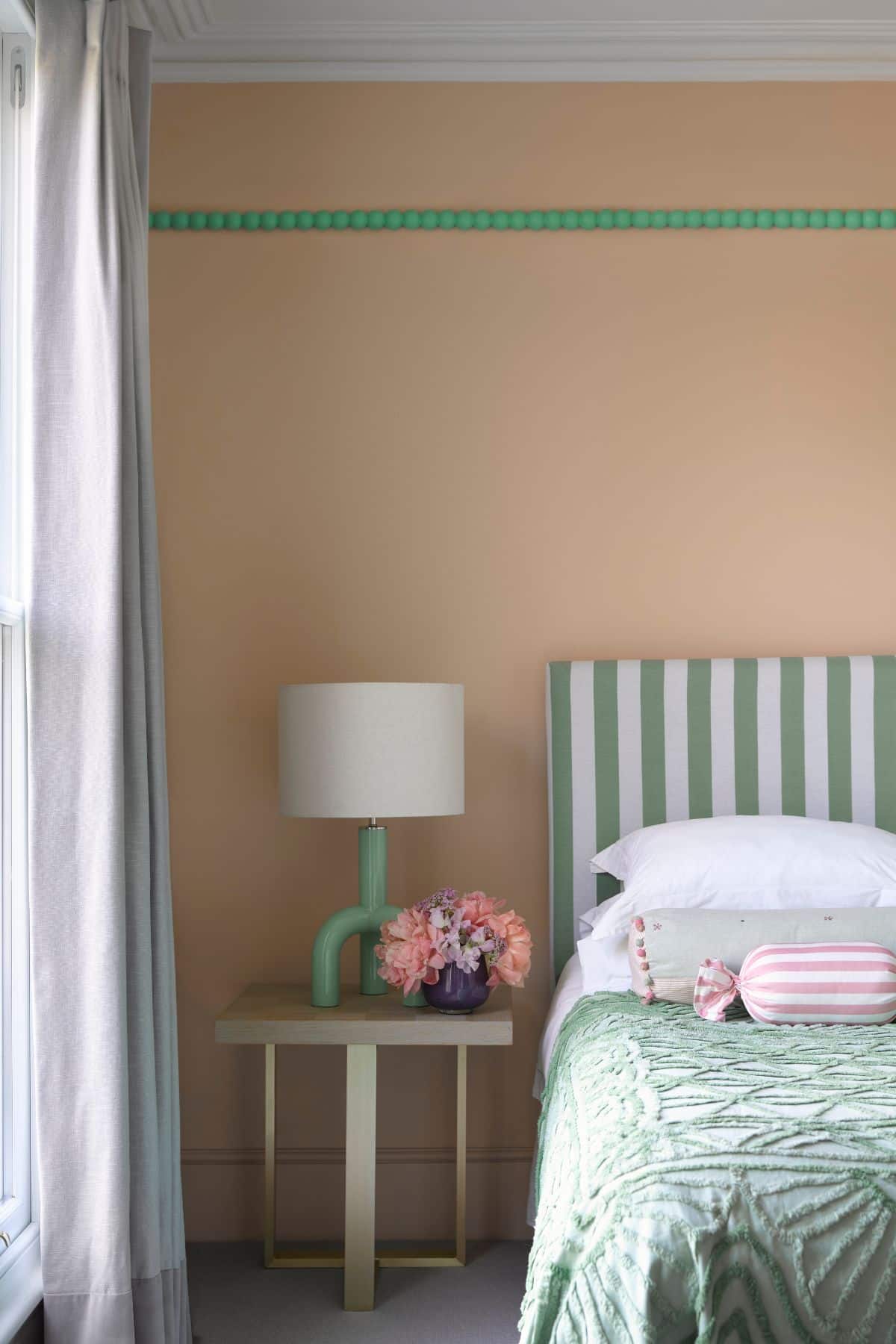
Springtime Peach 2014-50
What’s not to love about this peachy shade? It’s super fresh and uplifting and an ideal shade for a cold north facing room.
It’s described as a fizzy light orange and it pairs beautifully with bolder shades of green, pink and softer shades like whites and greys, as shown beautifully in the bedroom below.
Proposal AF-260
Truly lean into those pink undertones and opt for a shade such as Proposal, it has a pale wash of gray which gives it the versatility of a neutral.
What I love about a pink is it virtually goes well with most colors, it’s such a refreshing addition to a north facing room.

Windham Cream HC-6
Buttery yellows are among the hottest paint color trends for 2025. This sunlight, cream color has a whisper of peach and really is a color that will transform the coldest north facing room.
Much like pink, yellow can be considered a neutral in its own right and pairs well with both softer and bolder colors in a scheme.

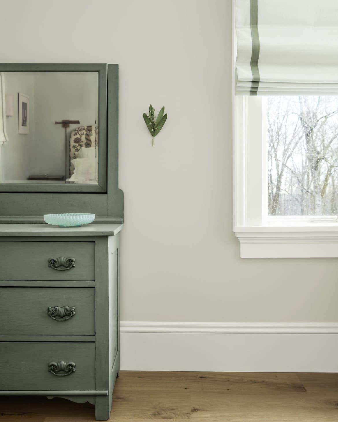
Paris Rain 1501
Paris Rain is part of Benjamin Moore’s 2025 color palette and is designed to work perfectly with the other colors in the palette.
This is one of the softest greens, but has an uplifting quality to it. Greens are one of the easiest colors on the eye, they keep us connected to our natural side and are a beautiful way to invigorate a north aspect room.
In the image below, Glacier White has been used on the baseboard and window trim, with Rosepine on the dresser. This is a perfect example of how you can still use those darker, more defining colors in a north facing room scheme.
Dark Paint Colors
Now, let’s flip the north facing room colors on their head. You don’t have to just lean into warm, uplifting shades.
In fact, you don’t have to run away from the darkness, you can choose to lean into it. This type of color scheme is best for specific types of rooms that lend themself to coziness, a cinema room, lounge, snug or small powder room are great examples where this method could be employed.
The design theory is that embracing and leaning into the darkness can pay dividends and create a dramatic, interior design led space. Here are some paints to inspire you!
Cushing Green HC-125
A dark, rich green is always a good idea. Cushing Green is one of their most popular greens, a balanced dark hue that can flatter a wide range of interior schemes.
Go for a full color drenched approach to really appreciate the richness of this paint color.

Van Deusen Blue HC-156
This foundational blue color can be used in both modern and traditional design schemes. This shade works beautifully in cinema rooms or cozy reading spaces.
I wouldn’t generally recommend it for places such as a bedroom or office as it can feel quite overpowering to sit and focus in.

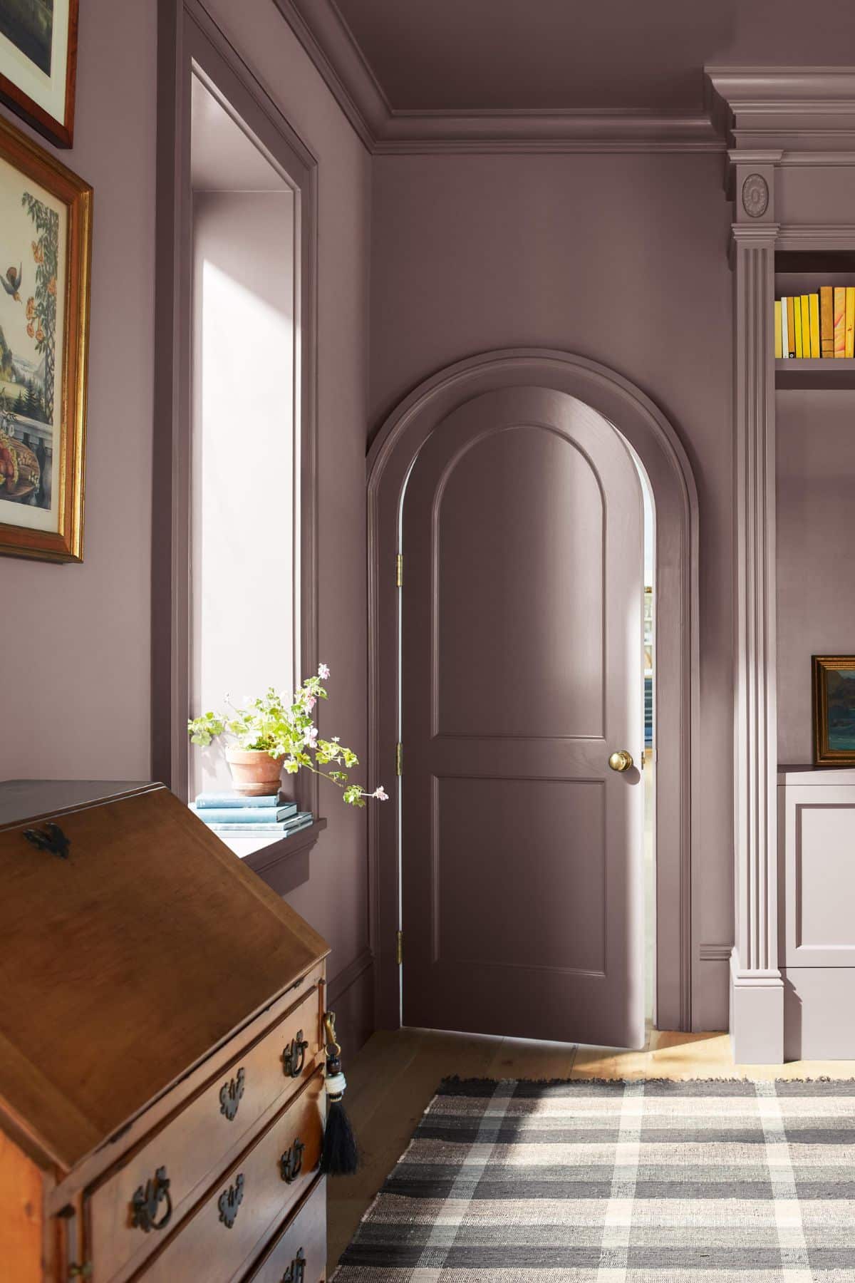
Cinnamon Slate 2113-40
I had to include the color of the year, Cinnamon Slate. This plum based, velvety brown has an endearing quality to it, and is the ideal color to color drench a north facing space with. Just see how incredible it looks in the entryway below!
You can uplift it with other colors in their 2025 color palette. The most beautiful, on-trend shade for 2025 and beyond.
Have any questions about tackling north facing spaces or want anymore Benjamin Moore paint recommendations?
Please leave me a comment below and I’ll come back with recommendations for your space! You can also attach images to your comment which can help me better visualise your room.
