Sitting in the middle of the colour spectrum, it’s no wonder that a good shade of green is virtually the easiest on the eye. If you’re looking for a soothing, comfortable shade for your interior, green is a good place as any to start.
From soft sage green hues to more domineering, olive greens, greens feel good to be in and keep us connected to our natural side.
With a rise in earthy inspired interior design trends this year, greens aren’t going anywhere anytime soon. Not sure what nuance of green to start with? I’ve rounded up a whole host of Benjamin Moore greens in real homes for you to peruse.
Benjamin Moore Green Paint Colours In Real Homes
It’s fair to say that choosing the right shade of green for your interior can become that little more difficult with the vast array of shades to choose from. Yep, Benjamin Moore have a whopping 645 different green paint shades!
So, here you’ll find 17 different green shades from their collection (in real homes), adaptable to different lighting conditions, but most importantly, timeless green paint colours that will work this year, next, and beyond!
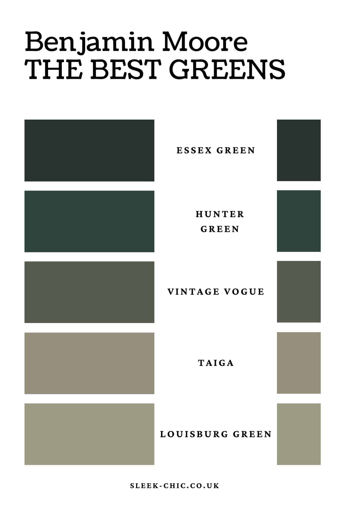
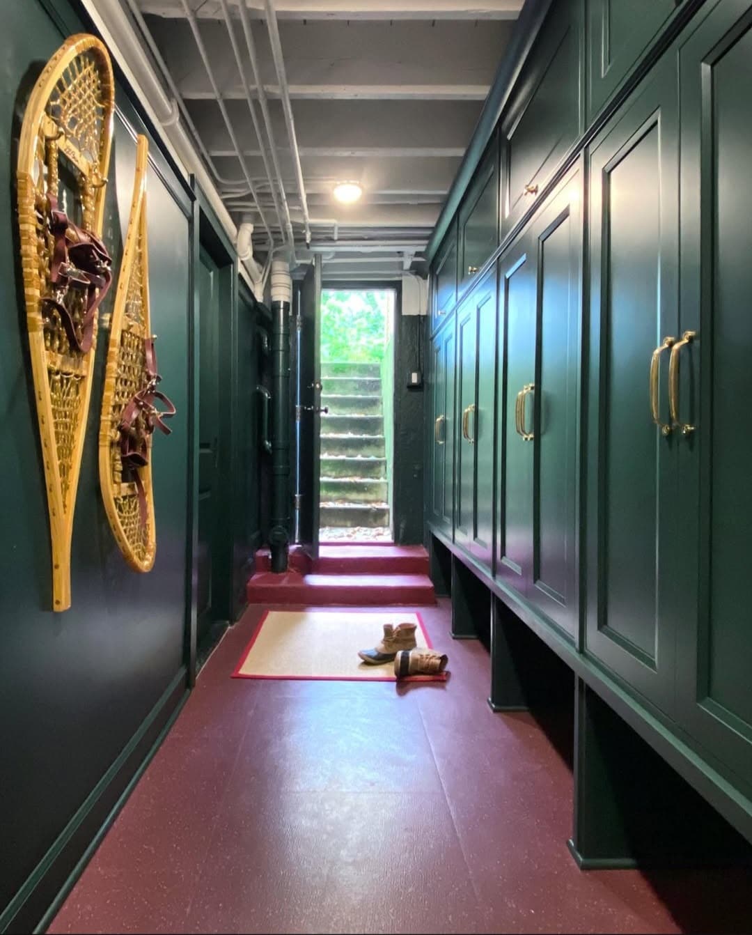
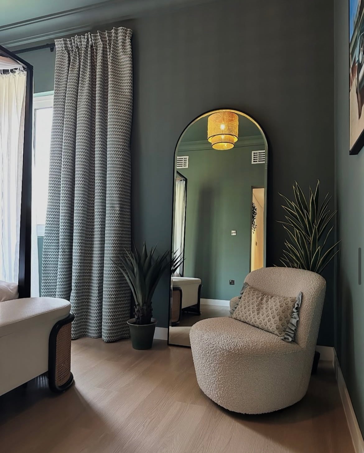
1.Essex Green
One of their deepest shades of green, this deep ivy shade will bring high impact to any space.
Perfect for creating a moody, sultry feel in the right setting, especially if you want to lean into the darkness in a north facing room. Or, perhaps take note of the below and use it a mudroom or side entryway for a warm welcome home.
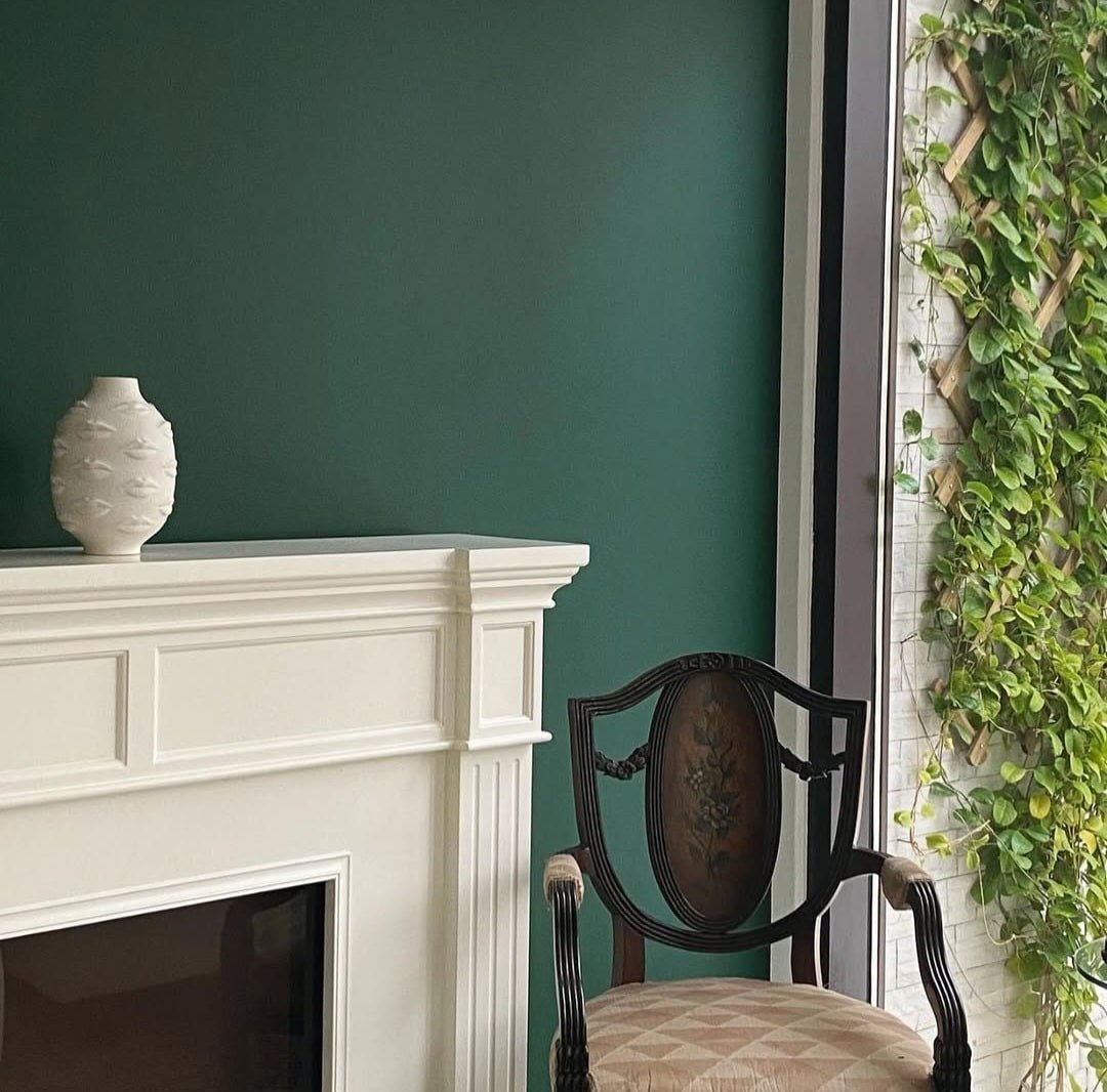
2. Hunter Green
If you’re looking for a timeless dark that will keep you in touch with the outside world, this elegant green is sophisticated and perfect for both traditional and earthy inspired greens.
What colours to pair with it? Well, virtually any colour works well with green. Think of introducing creams, whites, reds and greys for an earthy colour palette.
3. Vintage Vogue
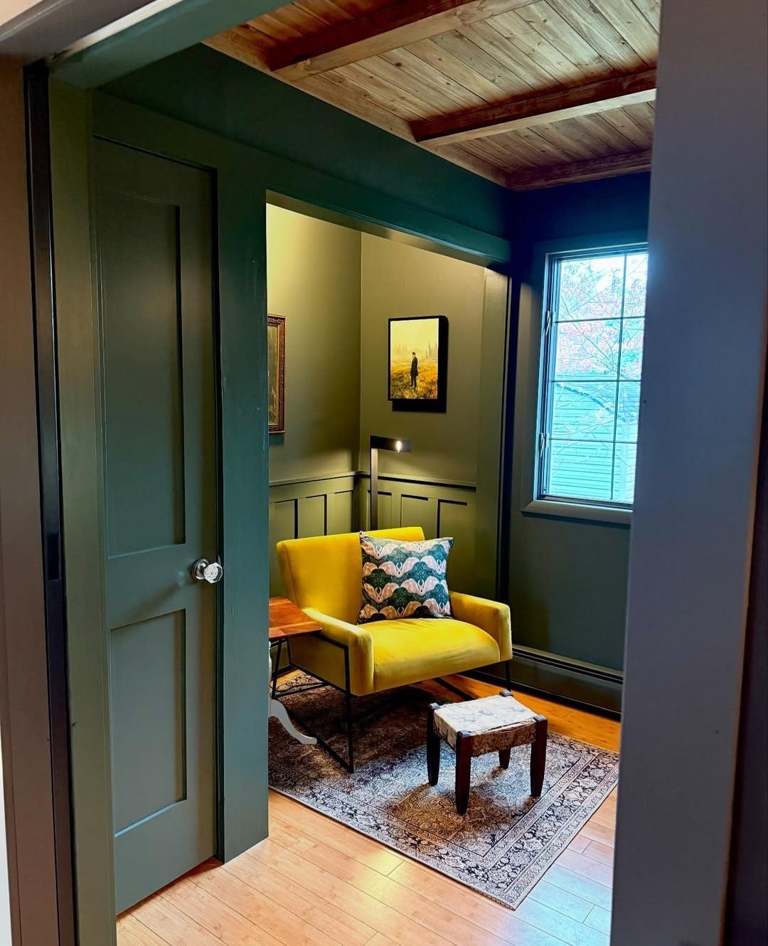
This is one of those green shades which really is the most comfortable green to sit in. Described as an ultra-dark smoky green, this olive green shade will help to create a cosy, intimate space.
Colour drench a south facing home office with it, it will balance the intensity of the sun beautifully, or lean into the darkness in a north facing living room to embrace the feeling of cosiness and calm. I adore how that yellow pops against it in the space below!
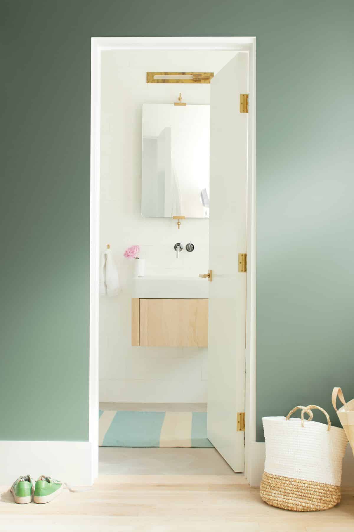
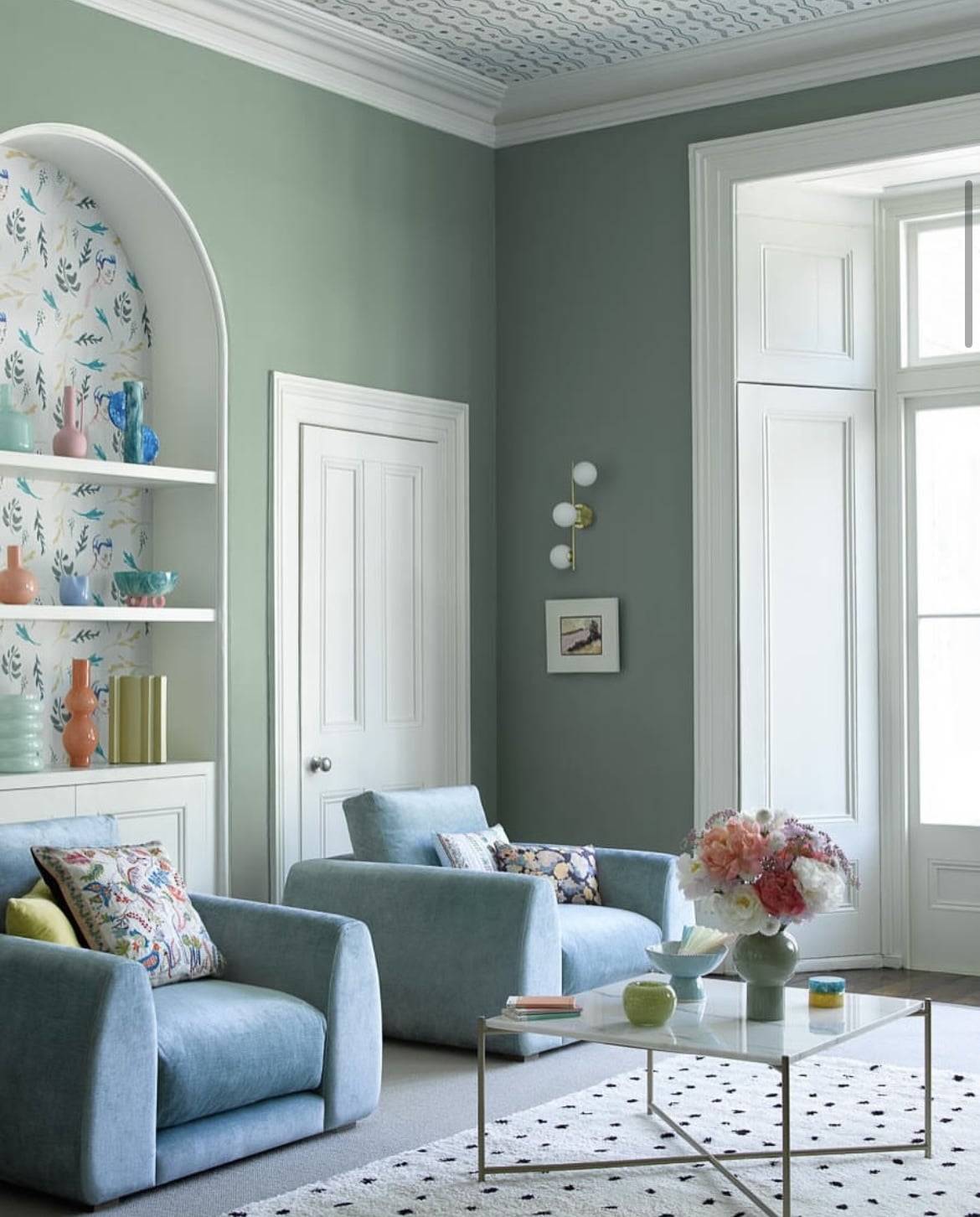
4. October Mist
Nothing says timeless more than the perfect soft sage green. Sage green is one of the easiest shades of green on the eye, perfectly adaptable to any room no matter the lighting conditions.
This gentle sage green is one of Benjamin Moore’s most popular greens. Pair with white for an instant lift in a dark room, or lean into cosy, earthy shades, adding definition with a black or brown to ground the room.
5. Manchester Tan
This popular neutral has a nuance of green to its undertone which makes it highly adaptable to any lighting conditions. It feels like an elevated, modern neutral and is a great middle ground if you want something a little bit different to a bog standard beige paint shade.
6. Taiga
I must admit, this is one of my favourites from the entire Benjamin Moore green collection. It has a metamorphic quality to it so it looks like a taupe in some lights, but also appears as a soft, muted sage green, depending on the lighting conditions.
It has the slightest hint of a green undertone which creates this muted, soft green which is a treat for the eyes.
7. Louisburg Green
More of a muted, to mid green, this earthy classic has slight grey undertones to it which gives it a slightly cooler demeanour. An ideal shade for particularly sunny south facing rooms, creating a perfect balance of colour and coolness against the intensity of the sun.
What I love about green is how well it pairs with other shades and accents, black, brass and copper will add elegant warmth against a green like this.
8. Easter Hunt
Something a little bit sweeter and softer, this pastel, almost mint green is a darling shade for a kids bedroom or used as an accent colour on a piece of furniture.
Take inspiration from the below piece with upcycled golden handles for a warm touch.

9. Edgecomb Gray
This go-to neutral has the slightest hint of green for a workable neutral that will work in any space, no matter the orientation or lighting conditions.
If you have a particularly dark room, lean into colour drenching for a high impact, warm and welcoming feel.
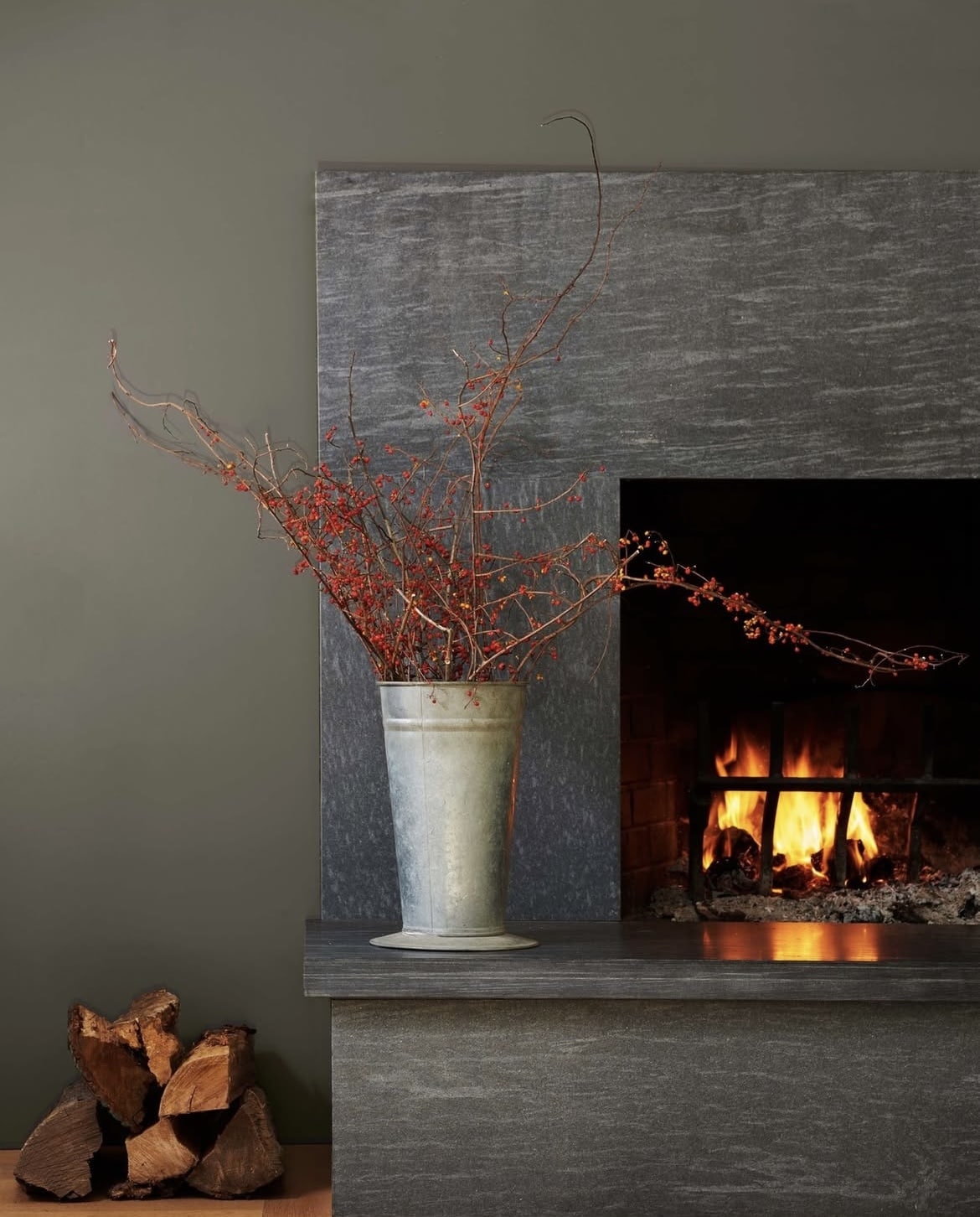
10. Antique Pewter
It might not seem like it, but this shade is part of the green family and has a notable green hue which is surrounded by a touch of grey.
Appearing like a different shade in different lighting, this slightly darker overall hue makes it best suited to sunnier rooms.
11. Cedar Green
Fresh and uplifting, this green has real character to it! If you’re not feeling it as a one colour fits all in a room, why not add it as an accent colour to half wall panelling, or something similar like shown in the below image.
It’s a bit of a punchier green but could still work beautifully in an earthy inspired design scheme.
12. Kensington Green
I do love a blue-green shade that’s uplifting yet brings a touch of coolness with it, ideal for sunny south facing spots in your interior.
Kensington Green offers the best of both worlds with a calming grey undertone which makes it a versatile shade for pairing with most colours.
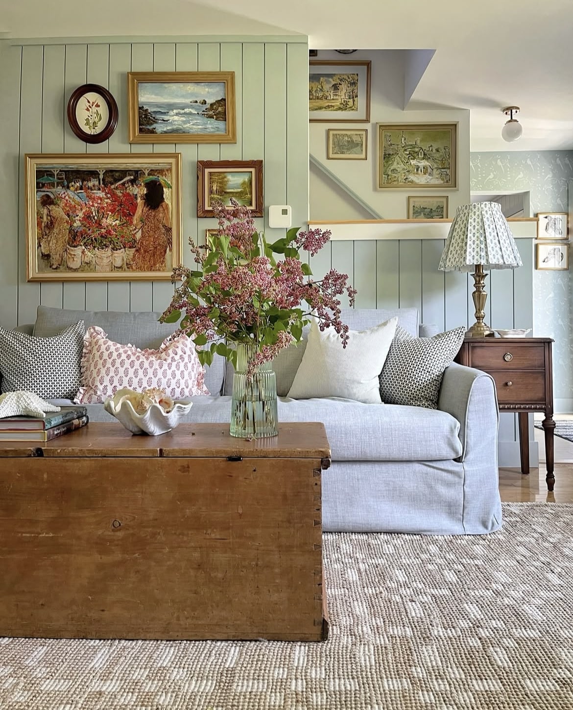
13. Smoke
This muted soft green has blue undertones to it as well for a really soothing, almost coastal inspired shade.
How stunning does it look in the living room below? It creates a lived in, cosy feel and works so well with wooden accents and warm furnishings and textiles for a tactile feel.
14. Sparrow
Ground any rooms scheme with Sparrow, a unique dark grey with earthy brown undertones that looks like a khaki green in certain lighting conditions.
Work in plenty of other earthy shades for a cosy scheme, think rusty reds, wooden accents, olive greens and creams to lighten and layer the look.
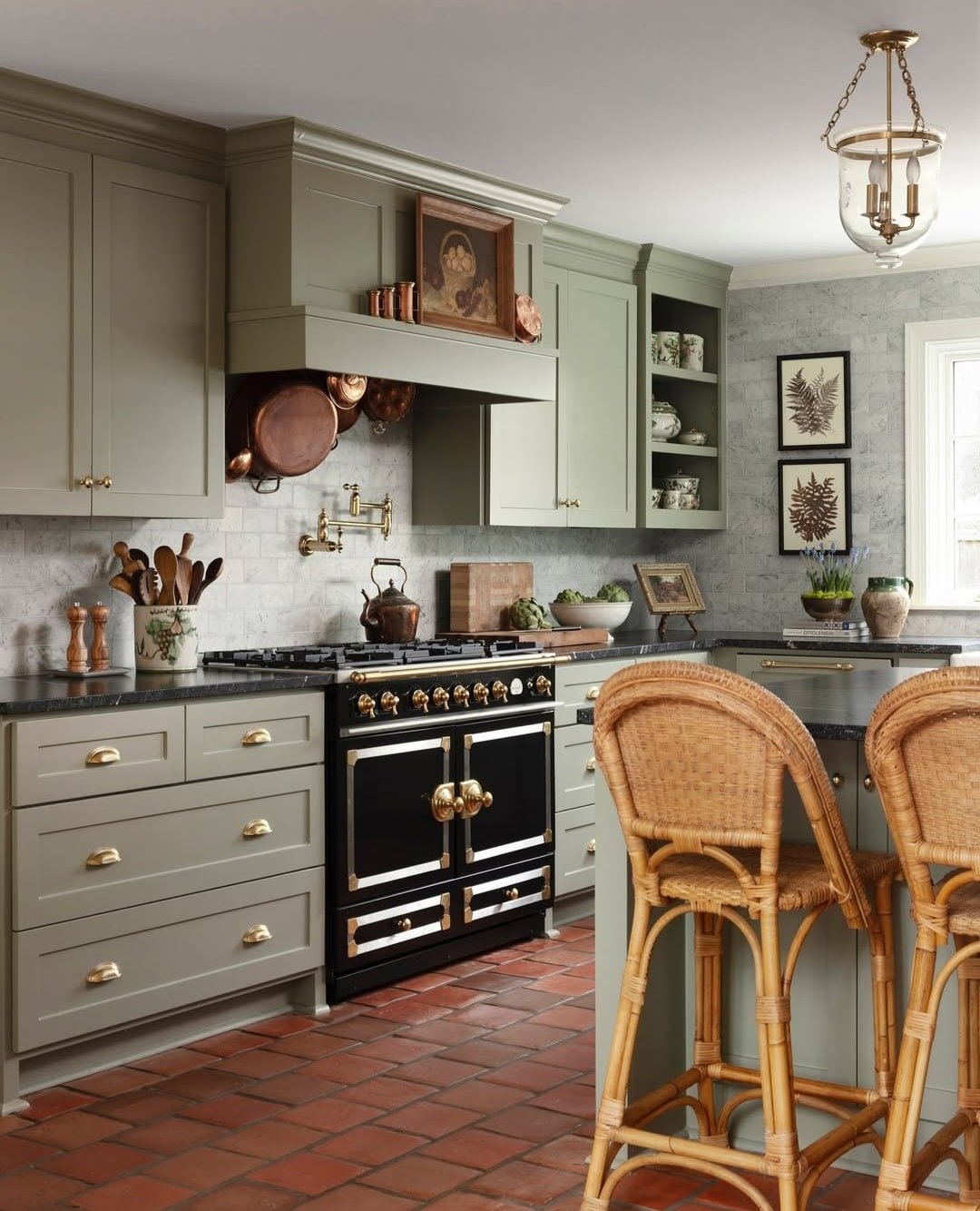
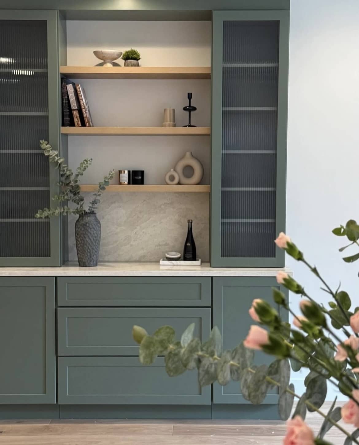
15. Rosepine
Could this be the most perfect olive, forest green yet? I adore this on the cabinetry below, it feels modern, earthy and super grounding against the neutral walls.
This green is one of their most popular, it features hints of grey for a versatile finish.
16. Caldwell Green
With a subtle slate undertone, Caldwell Green is a sophisticated, comfortable forest green. Take inspiration from the below where the colour has been used up and across the ceiling too for a fully encompassing feel.
17. Cushing Green
This mid-dark green is slightly lighter in overall tone and provides a beautiful depth of colour when positioned against more neutral rooms, such as the below.
I have a very similar shade in our south facing home office, and it’s honestly such a comfortable green, feels good to be in and gives an inside, outside feel.
Which of these green shades are your favourite? If you’re looking for more recommendations or what paint shades to pair with any of them, please leave me a comment below and I’ll come straight back!