


Earthy inspired interiors are not going anywhere in 2027, and this is evident in the paint colours that are trending for the year ahead. We’re also starting to see bolder, deeper colour choices coming through that feel sophisticated, and indulgent to sit within.
“We’ll see even more influence from nature and a real desire to bring the outside in which has been appearing more over the last few years”, says Holly Scott, Interior Designer at Holly Scott Interior Design. “Think earthy greens, warm browns, soft blues and muddier, more complex shades all sit beautifully alongside natural woods, stone and tactile materials”.
I’ve caught up with some leading designers in the industry to bring you first hand advice on what paint colours are really going to be trending in 2027, alongside a painting technique that’s overtaking the popular colour drenching approach.
9 Paint Colour Trends That Will Be Everywhere In 2027, According To Designers
1. Celery Green
Green is one of those colours that is timeless, it’s one of the easiest colours on the eye and it makes us feel good when we’re surrounded by it. Soft, soothing sage greens and earthy olive greens have been popular in the last couple of years, but we’re seeing different nuances of green taking the spotlight this year which have a yellow undertone to them.
Celery green or Chartreuse are the need to know colour names for 2027. Chloe Barrow, Head of Creative Interiors at Laura James says, “We’re already seeing bright yellow-green shades gaining attention, so chartreuse is going to be one of the more surprising colours to watch in interiors”.
“There are two directions I’m seeing within green right now – a yellow-green with herbal vibes (think: Sherwin-Williams’ Celery), and a deeper, more mossy version (think: Behr’s Grounded). Celery has a muted undertone, making it more yellow-green than minty green, thus steering clear of anything cool or crisp”, says Lucia Fuentes, an interior designer and professional organizer at Coastal Maid San Diego.
Alper Yuksekogul, Principal/Owner at Ecay Architects agrees, “The most consistent theme across the 2027 predictions is the rise of greens and yellows (in all earthy variations). A big name that came up this year was Celery: a soft, muted green with warm yellow undertones. We’ve had clients practically rush to it after pitching, and based on our experience, it’s the same airy and herbal shade that brings a sense of wellness which they look for”.
Perhaps what’s so versatile about this shade of green is that the yellow undertones make it suitable for use in both cold, north facing rooms, and sunny south facing rooms as well. There’s something so fresh and uplifting about this shade that feels both earthy, and warm.
Chloe adds, it’s brilliant for injecting unexpected pockets of energy throughout the home, but the real magic happens when you anchor it against a deep burgundy.
Here are some celery green shades to watch out for;

2. Smoky Blue
Soft, as good as neutral blues breezed into our interiors over the last year. Lucia confirmed that blues will continue to be popular, but they’ll be less predictable in 2027 than recent years.
This year, the colour ways are getting slightly moodier and indulgent with smoky blue hues bringing a touch of definition and character to an interior.
“Instead of dark navy or crisp coastal blue, I’m noticing lots of midtone blue that’s softened with grey, has hints of green, or even violet. Take, for example, Valspar’s Cottage Door. During the day, it creates a peaceful vibe. At night, the colour takes on more depth and personality”.
“Smoky blue would look gorgeous as a bedroom colour, kitchen cabinet colour, powder room colour, or home office colour. I’d decorate around smoky blue using apricot, creamy white, rust, tobacco brown, unlacquered brass, walnut. It would look fresh and interesting paired with warm white and light oak. It could also serve as the starting point for a moodier palette including plum, muted brick red, dark wood, charcoal”.
Smoky blue paint shades to inspire your next project:

3. Grape Purple
One shade that’s upsetting the apple cart (in a good way) this year is Grape Purple. Delightfully rich and indulgent, this wine coloured purple is the ultimate deep shade for spaces where you want to lean into the darkness.
“Rather than treating it as a bold accent colour, Grape is set to become a more considered colour of the living room. Shades like aubergine, plum and deep grape can be particularly forgiving as they borrow the calming aspects of blue with the vibrant energy of red, bringing a rich and elegant vibe to any room”, says Chloe.
“What makes these deeper purple tones particularly great is their ability to create a sense of depth without feeling as overtly heavy as some darker browns or blacks. This is especially important in living rooms, where we tend to favour colours that feel inviting and cocooning”.
If you love the idea of using a similar shade in your living room but find the process of colour matching accessories daunting, Chloe suggests to avoid trying to make every element in the living room match, a deep grape cushion next to a slightly softer plum throw feels much more natural than a matching set.
Get the look with these grape purple paint shades:
- Pelt – Farrow and Ball
- Tyrian Plum – Annie Sloan (shown in the image below)
- Royal Berry – Dulux

4. Tangerine & Teal
It doesn’t get more audacious than tangerine and teal. Both sitting opposite one another on the colour wheel, these colours create an incredibly high impact look when paired together.
According to Chloe, these colours work best together rather than in isolation because the teal calms the orange down and stops it from taking over the entire room.
“We’re seeing energetic shades of orange becoming much more important in interiors, particularly when paired with teal. A burnt, terracotta orange feels earthy and quite easy to live with, whereas a brighter orange like tangerine can give a room that slightly unexpected 70s sitcom feel”.
Understandably, after years of neutrals, the concept of pairing these together might feel difficult. Chloe recommends clashing your woodwork like skirtings, trims, and cornicing in opposing colours to your main walls, or by saturating the walls and contrasting them with a different colour on the ceiling.
“For those looking for an accent in their living room, I’d recommend adding teal to built-in shelving, like a bookcase. That way, you’re still getting a burst of colour without a complete overhaul.”
Rome by Little Greene is one of my favourite Teal shades, and Dutch Orange in the archive collection by Farrow and Ball might be one of the most true tangerine paint shades on the market to try.


5. Earthy, Warm Neutrals
One colour group that will always feature in these annual colour trends is neutrals, an interior pleaser that feels calming and soothing.
But, like most recent years, we’ve progressed since the clinical bright whites and grey washed hues, and this years neutrals are much warmer, and earthier than before.
“Where people do want something neutral, I’m seeing much warmer neutrals coming through. They make a home feel softer and more inviting and less sterile and are a much better backdrop for introducing colour or more of an elegant way to use neutrals”, says Holly.
Neutrals and whites with a yellow and pink undertone are classically what you would consider as a warm neutral, their warm base keeps an interior feeling uplifted and bright, counteracting any cold, blue light associated with north facing rooms.
I particularly love to use neutrals with a metamorphic quality where they look slightly different depending on the light they’re perceived in, Oxford Stone by Farrow and Ball is one I continually use in my own personal projects as it’s so adaptable, and earthy toned.
Earthy, warm neutral paint shades I love:

6. Coffee Brown
Muddy, coffee browns continue to be popular through 2027, they’re not oppressive like a black shade, and their link to nature makes their presence feel soothing to be around, especially in an interior.
“We’re seeing a real return to darker, richer wood tones, particularly coffee brown, which has been all over fashion for the past couple of years”, shares Chloe.
“One thing worth knowing before you commit is that coffee brown sits warm, so it can sometimes clash against other warm woods like orange oak. In my experience, people buy one dark piece, get it home, and then the two woods end up fighting each other across the room. You can hold a sample next to what you already own in daylight, and this will tell you fairly quickly whether your undertones actually work together. Rust and terracotta work much better in smaller doses, so I’d bring those in through a cushion or statement chair as this really helps to break up the brown.”
This type of indulgent brown lends itself to spaces that aren’t being used constantly throughout the day, so living rooms, cinema rooms and even transitional spaces like a hallway are areas that would benefit from such an earthy, defining shade.
Coffee brown paint shades to get to know:
- Broccoli Brown – Farrow and Ball
- Warm Baguette – Graham & Brown (shown in the image below)
- Cold Brew – COAT

7. Sunwashed Yellows
There’s no denying that yellow is a good feel good colour, but getting the right shade of it will make a huge difference to your interior. Heritage Yellow has been popular for the last few years, and not far behind the celery green, we’re seeing a return to sunwashed yellow tones.
“Beyond the specific Colour of the Year selections, a broader palette of unusual and emerging shades is showing up in our radar”, shares Alper.
“Some of our competition have reported growing interests in sunwashed yellows, such as Benjamin Moore’s Goldtone and Fuchsia, which are more prominent in small, creative spaces”.
Alper adds that these colours are not for every room, but their presence in the forecast signals a broader willingness to embrace saturation and personality after years of desaturated, dusty tones.
Sunwashed yellow paint colours to brighten your interior:
- York Harbor Yellow – Benjamin Moore (as in the image below)
- Goldtone – Benjamin Moore
- Babouche – Farrow and Ball

8. Layering, Colour Capping > Colour Drenching
When the internet got hold of colour drenching a few years ago, this painting technique has been rinsed and repeated so many times, and for good reason. It creates high drama, suits both small and large rooms, and well, you had us at no cutting in.
But, painting techniques are evolving, and perhaps with one singular shade, you miss out on the opportunities for extra visual interest and character in a room, and this is why layering, and colour capping is going to be hugely popular in 2027.
Holly agrees, “One thing that particularly struck me at the Little Greene preview was the idea of using families of colour rather than one shade in isolation. Layering different tones across walls, woodwork, furniture or even the ceiling creates so much more depth. Again this is something I’ve been doing for a while now, but think we will see it even more next year”.
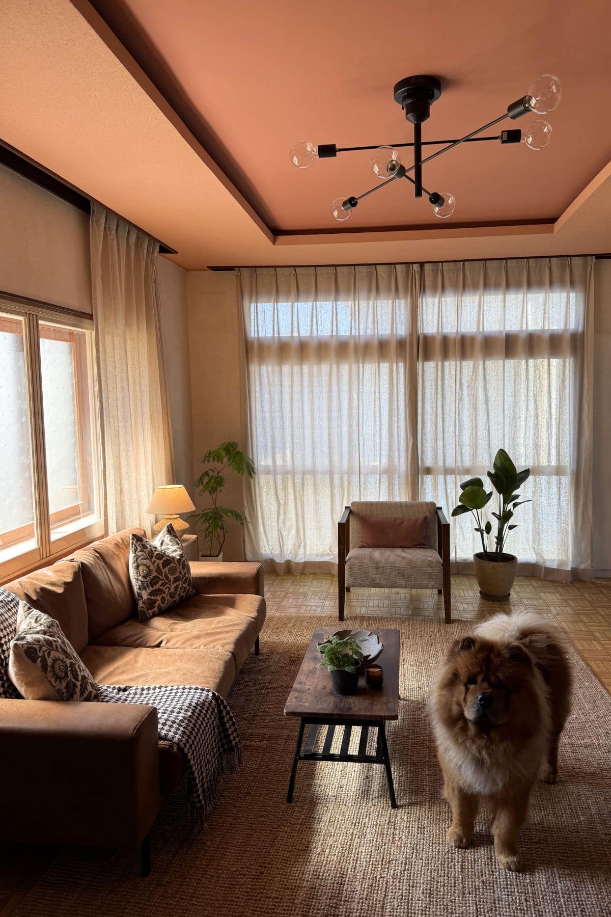
The below living room colour capping approach uses Naperon by Farrow and Ball on the outer ceiling, with Red Earth in the centre.
The key to getting this layered painting approach right is to pair, or group tonal shades that are only between 1-2 shades apart from your base shade. This is what creates that subtle, yet highly visual look that can totally transform a room.
9. Clay Pink
Warm neutrals such as creams and beiges will remain popular, but Clay Pink is another earthy derived colour that brings a little extra warmth and character to it that you don’t get with some yellow based neutrals.
“I predict we’ll be seeing dusty rose, faded plaster, pink-brown neutrals, clay pink (think: Graham & Brown’s Rose Earth) in spots that may have automatically reached for beige in the past. Rose Earth is an earthy, warm-toned pink. It’s not as limiting as pastel pinks – it’s forgiving and flexible. I’d categorise this colour as a neutral – a warm-toned one that’s gaining momentum now that interiors are moving away from cool grey and stark white”, says Lucia Fuentes.
This hugely versatile colour works just as well in north and south facing rooms thanks to it’s warm disposition. You can choose to lean into more muddier clay pinks with a brown undertone, or stick with a plaster style pink for something a little bit warmer and more uplifting.
Clay pink paint shades:
There’s a resounding return to nature with this years colour predictions for 2027, lots of shades derived by nature, along with some bolder, more audacious shades that will help to add drama and character to our interiors.

