

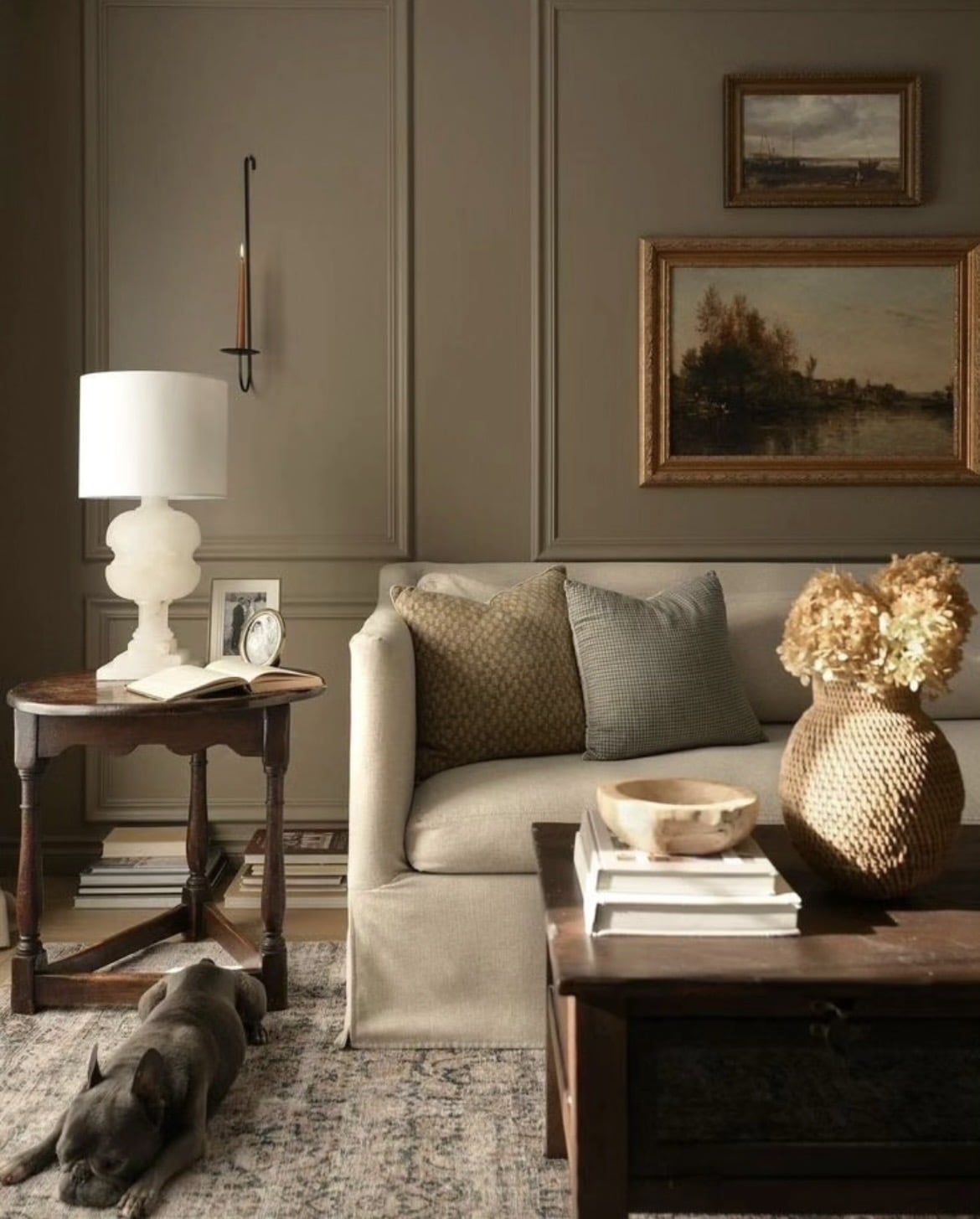
Browns are being considered as the new ‘cream’ in 2026, a versatile neutral that’s earthy, grounding and feels good in an interior. Mouse’s Back by Farrow and Ball might not need an introduction, but it is one of the most popular browns in the F&B range thanks to its calming green undertone.
From moody, earthy living rooms to focal accent walls, this brown is feel good, indulgent and brings character to any space that chooses to be brave and go for it. If you’ve never considered a brown before, let this be the only inspiration you need to don the paintbrush for the new season ahead.
Farrow & Ball Mouse’s Back: The Earthy Neutral Your Home Needs
1.Adding Depth With A Two Tone Wall
Instead of leaning in to using Mouse’s Back all over your walls, consider adopting a two tone wall approach for character and balance.
Using in a bathroom with half wall tiles creates a calm, soothing backdrop for the brown. Whilst I would typically recommend using your darkest colour on the lower half of the wall to ground the room, it actually works beautifully on the upper half as shown in the bathroom below as it does an effective job in drawing your eyes up to the ceiling.

2. Draw The Eye Up With A Lighter Ceiling
The way this brown wraps and cocoons a room is my favourite thing about an earthy shade like this, with its slight green undertone to it it makes it adaptable to rooms with both lots, and limited natural light.
To make the room feel less oppressive, carry a soft off-white from the picture rail up and across the ceiling. Avoid a bog standard bright white which will make the finished look feel uncomfortable, instead use a soft white with a subtle green undertone such as Slipper Satin from F&B.

3. Use Panelling To Bring Character
Panelling is one of my favourite ways to add instant character to a room, whether you take it from floor to ceiling or do a 2/3 approach like the below. If you’re zoning a space or looking to make a space feel cosier, this can be an effective way to do it.
Use a softer neutral or an off white on the upper half of the wall, recreate a similar look to the below with Lime White.

4. Focal Feature Alcoves
Mouse’s Back is actually a favourable shade for accent areas, especially when pairing with more traditional shades such as Setting Plaster and Lime White.
It has a similar impact to that of the ‘unexpected red theory’ as it instantly focuses your eye as you enter the room.

5. Moody Kitchen Scheme
Okay, when can we move in? This ultra moody kitchen scheme has been executed to perfection with this brown, and what I love about it is how it reads slightly more green in direct light.
Understated brass knobs add the perfect accent against this colour, and it might be one of the best colours in a high traffic area as it doesn’t show dirt easily.

6. Cottagecore Style
This is one of those colours that just lends itself to cottage style interiors, it feels traditional, cosy and looks perfect when painted onto some tongue and groove panelling.
Pairing with a natural wooden worktop in this setting is a lovely way to keep those earthy, rustic tones running through this interior scheme.

7. Ground With Dark Accents
Just because Mouse’s Back is dark, it doesn’t mean you have to go the other way and just use bright and light accessories and decor in the room to balance it.
In fact, featuring darker accents such as beams as shown below, dark rattan baskets and a dark stained wooden bench actually adds further definition to the colour scheme and it makes Mouse’s Back feel lighter in this interior.

8. Tie In The Wooden Details In Mouse’s Back
Don’t just stop at using Mouse’s Back on one area such as panelling. To make this colour feel more intentional in the room, bring in the wooden elements and paint them in the same finish. This could be skirting, architraves, doors or beams in the case of the below dining room.
It just makes the scheme feel more cohesive, and adding it to the ceiling draws the eye up whilst it grounds the room.

9. Feature Wall
Using Mouse’s Back as a feature colour on an accent wall or media unit is one of my favourite uses of this colour. It just looks incredible on this feature wall below and it totally pops against the books and decor details throughout the little spaces.
Having the added cornicing and details across the wall help to add further character, it just stops the overall finish from looking flat.

10. Add A Crisp White Trim
If you love the idea of adding a pristine white against the brown, take inspiration from the below living room. Tie it in with all of your wooden details and ceiling so it feels a little more intentional in the room.
My best advice would be to avoid a bright white if possible, but if you have your heart set on it I would look at a shade such as All White by Farrow and Ball.

11. Pair With Black For A Surprising Look
Brown and black is an unexpected combination that we don’t see side by side often, but it works!
This black marble worktop looks incredible against Mouse’s Back, it feels luxurious and certain about its presence. Use brass as an accent to add warmth against these two colours and it will help to brighten and lift the finishes.

12. Cosy, Moody Living Room
I really love seeing this brown in a living room, for a room that you want to feel cosy and inviting it can be really effective. For sunny, south facing rooms, it’s such a good colour to lean into as it will balance the intensity of the harsh sun.
This type of colour can feel very oppressive if you’re sat in it all day, so it’s best used in spaces that you want to create some ambience and cosiness, such as living rooms and cinema rooms. This mainly applies when you are using the colour across the entire room, rather than accent areas.
13. Red & Brown Deserve To Be Seen Together!
Red and brown is really a colour combination that I love to see together, the red lifts the brown and it adds an earthier overall approach to the scheme.
Get inspired by the below dining room which uses both Preference Red and Picture Gallery Red in the combined colour scheme.

14. Half Wall Panelling
In a large hallway, half wall panelling can be an effective way to break up the monotony of a single run of colour, and it can make the space feel more inviting.
I love Mouse’s Back when used on the lower half of the wall and skirting, it grounds the room and adds instant character. Use a lighter shade on the top and carry this up and onto the ceiling for a flawless effect.

15. Tongue and Groove Panelling Adds Instant Style
There are so many types of panelling you can choose from, but tongue and groove is one of those timeless finishes that just looks great in most interior styles.
Carry the colour on it straight down to the skirting for a cohesive, stunning finish.

16. Colour Drench For A High Impact
Drenching in one colour throughout a room is just as popular in 2026, and it can be super effective in creating a high impact look in a space.
Adding in some black accents like with the hooks and on door handles is so subtle, yet focuses the eye and adds a touch of modernity to the colour scheme.

17. Pair With A Subtle, Off White
This hallway space is the stuff of dreams, and in a space which receives different levels of light, this type of brown can be a really smart choice.
On the ceiling choose to pair with a subtle off white like School House White or Lime White, it will make the room feel so much softer, and draw the eye up naturally as you step into the room.

