The incoming year of paint trends is a special one. I’ve been writing these paint insight round ups for years now, and each year we’re seeing the introduction, and perhaps, the return to bolder and more audacious colours.
For 2026, there’s still very much a resounding earthy feel with some of the colours – these grounding colours whilst trending, are utterly timeless in situ. Jewel teal tones are hitting the interior world, a real cyclical moment for this paint colour which we’ve not seen in the mainstream for a while.
Paint colour trends tend to come and go, so before picking up the brush, just make sure you personally love the colour. With that being said, it’s hard not to want to dabble with some of these exciting new colours on the horizon.
I’ve enlisted the help of some other interior designers to bring you 9 of the biggest paint trends for the year ahead.
The Biggest 2026 Paint Colour Trends, According to Interior Experts
Each year the major paint brands release their paint colour of the year, these colours are forward looking and speculative and can be a great insight into how paint colour trends may evolve over the coming year.
This round up 9 paint colour trends are derived from interior experts insights, paint colour launches and my own predictions, based on what I have been seeing in the interior world.
1. Ocean Blues
Bright and breezy blues were top of the charts for 2025 paint trends, and blues aren’t going anywhere this year. We continue to have this need for creating soothing, serene spaces, and blue ticks all the boxes for this.
Dulux announced their colour of the year for 2026 which was in fact a trio of blues, for the first time in their history of releases. The new shades include Dulux Free Groove™, Mellow Flow™ and Slow Swing™, a combination of ocean blues from soft and muted hues to deep depths of the ocean.
Heleen Van Gent, Creative Director at AkzoNobel’s Global Aesthetic Center said, “People around the world want to slow down and recharge their batteries. They want to feel in tune with others and celebrate kinship. They want to be bold, have fun and feel carefree. To reflect these moods, we’ve centred our colour stories around three different rhythms – Slow, Flow and Free, and chosen ‘Your space, your pace’ as our theme“.
I’m a huge fan of a blue in an interior, and even a bright breezy blue can be the perfect antidote in a north facing room. They’re almost as versatile as a neutral as it goes with pretty much any colour. It’s also a perfect alternative to a green if you still want a soothing shade that has a link to nature.
Here are some other fan favourite blues that will keep your interior bang-on trend next year.
- Farrow and Ball Cook’s Blue
- Little Greene Pale Lupin
- Benjamin Moore Blue Nova 825 (as shown in the image below)
2. Light Adapting Neutrals
Warm neutrals have perhaps been some of the most popular paint colours in recent years following the demise of grey-washing. I’ve recently shared some of the top neutral paint colours for 2026, and what is clear is that we’re starting to see two tone neutrals that share both warm and cool undertones, making them perfectly adaptable to changing lighting conditions that we experience in the UK.
The pursuit of trying to find the most perfect neutral may have you feeling like Goldilocks, as they can either end up looking too yellow or too pink. Perhaps, this might be the answer to everyone’s prayers, and the beauty of these paints is that is makes them just right for dual aspect rooms which receive different light down either end of the room.
Amateur Ceramics by COAT is a perfect example which has been a new release this year, an organic, grounding plaster-off white which has both red undertones and grey notes that create a more subtle, sophisticated neutral.
Farrow and Ball also do this really well with their traditional neutrals collection which have a unique grey-green complex, this makes them adaptable to working in both dark and light conditions. These sorts of neutrals will work so much smarter for your interior, and they pair well with virtually any colour.
Here are some of my recommendations for two tones neutrals that just work;
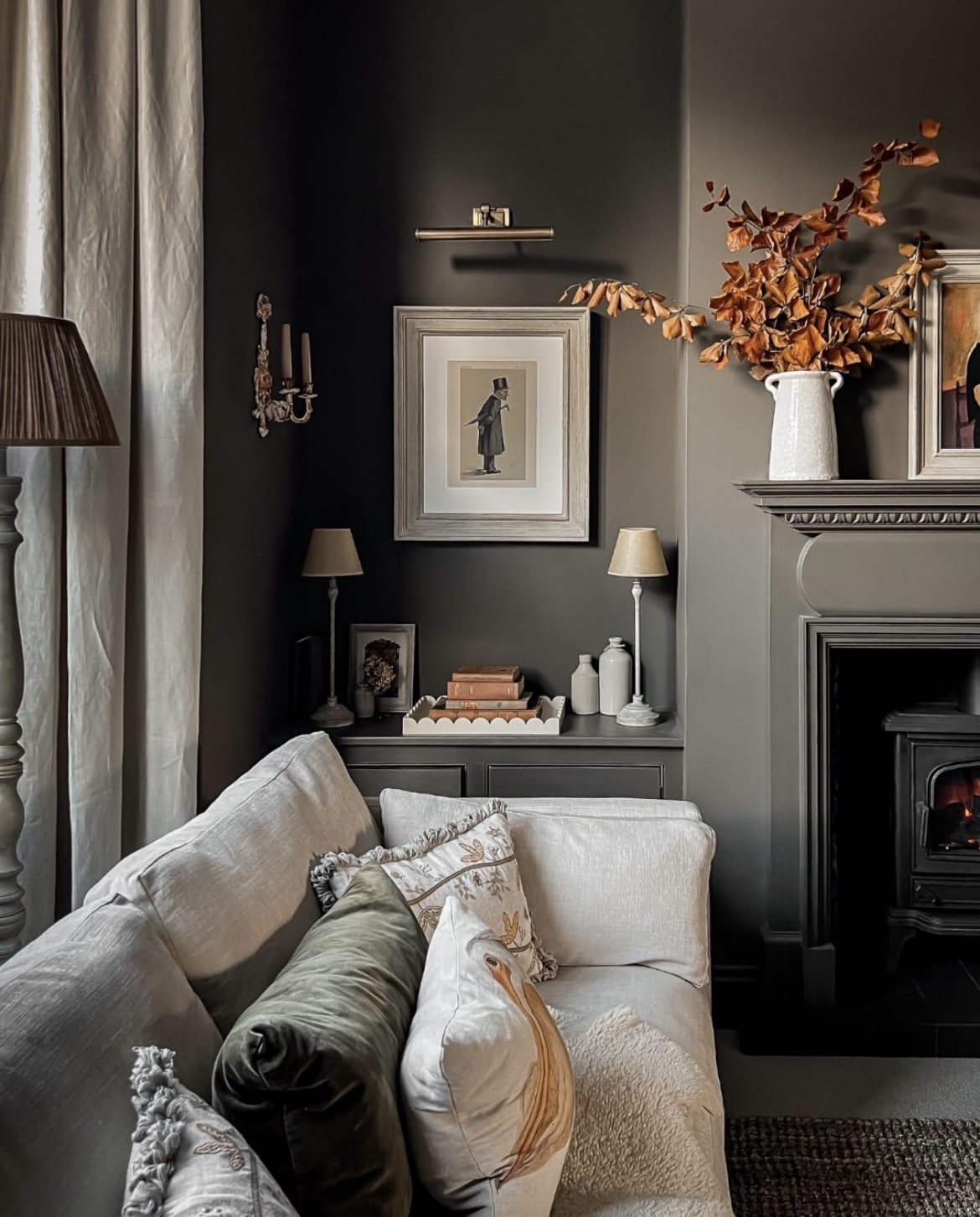
3. Earthy Browns
Browns are back on the paint cards for another year, but this time, even earthier and grounding. Earthy inspired design is hugely popular, and colours that can be taken from the natural world around us generally make us feel comfortable and cocooned.
Courtney Batten, Interior Designer at Paige Studio added, “I’m definitely seeing a shift toward warmer tones across the board, especially browns. I love Sherwin Williams “Sealskin” for a deep brown that feels rich without going muddy. It’s the perfect brown for those color-drenched, cocoon-like rooms that are having a major moment right now”.
Pantalon by Farrow and Ball shown in the living space below is in my opinion, the most perfect earthy brown of the year. It’s neither brown nor green, but carries a mysterious tone which shifts in different light conditions to always offer something new. F&B shades tend to all share this metamorphic quality which keeps them so interesting, yet timeless at the same time.
Sherwin Williams colour of the year also supports this. Universal Khaki (SW 6150) is a warm, earthy neutral intended to be adaptable and grounding. A mid tone brown which is elevated and warm at the same time, colour drench it in a cinema room or living space to really benefit from the cosy, cocooning nature of it.
Other earthy brown colours worth looking at include;
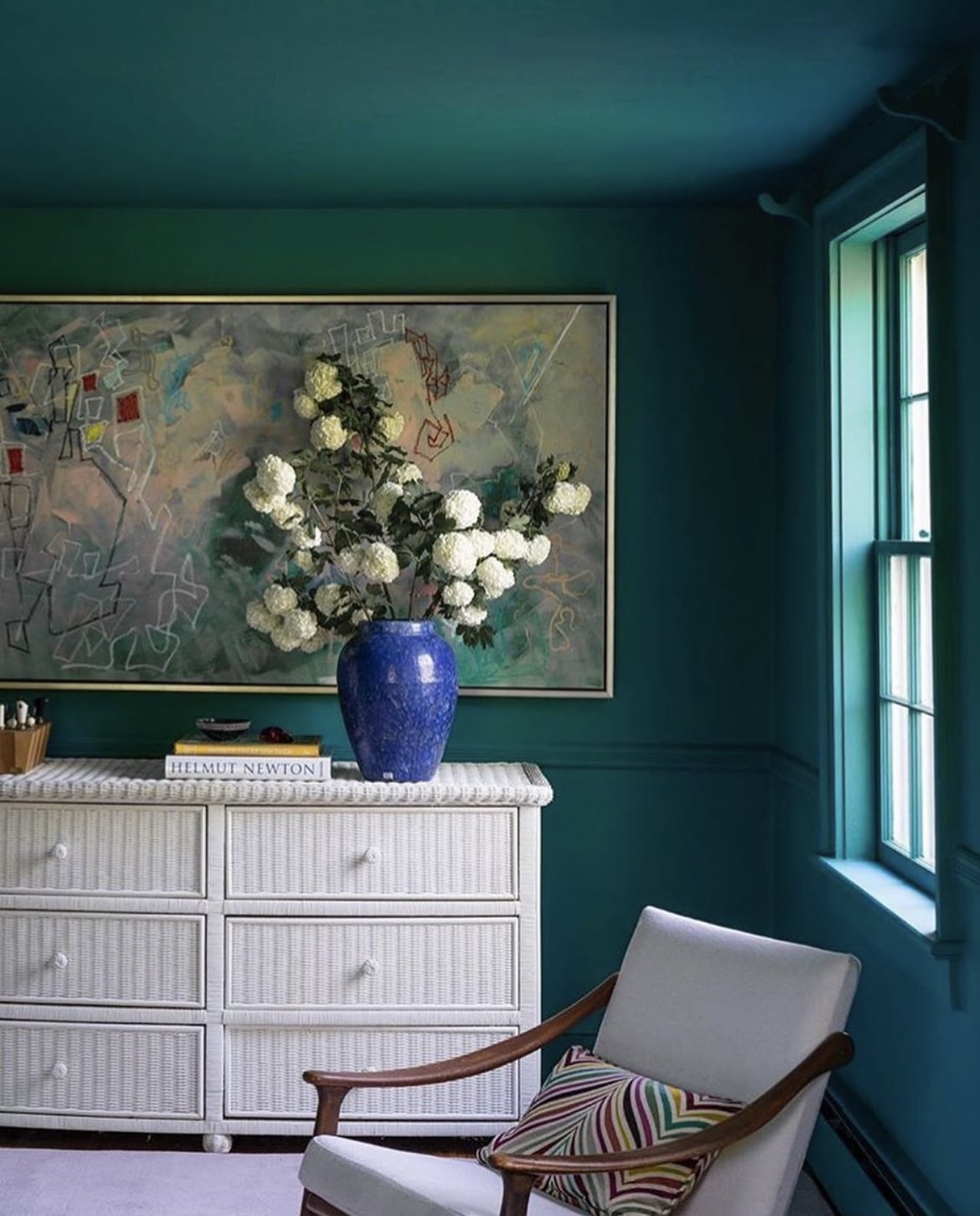
4. Get To Know Teal
Teal is one colour thats certainly not been considered ‘mainstream’ for a number of years, but trends are cyclical, and it’s so exciting to see some bolder, richer jewel like tones coming through.
“In terms of colour, I’m seeing a major trend toward teal. It feels like a natural evolution of the navy trend from the 2010s, but a bit fresher and more nuanced. I prefer using muddier teals that feel a little more grown-up. Sherwin Williams Still Water is a current favourite”, said Courtney.
Whilst teal can be a little trickier to tackle with colour pairings, the results speak for themselves, with Vardo by Farrow and Ball used in the image below.
This blue green shade combines the best of both worlds for an incredibly soothing and easy on the eye colour. If you want to create a high impact contrast in your interior, pair with red-orange tones. The experts at Wallsauce added, “Ideal for lounges and spa-inspired bathrooms, it pairs well with warm metallics, earthy materials, and layered fabrics for a versatile, textured look”.
You can also dull down the colour somewhat for a more subdued, mature feel, adding neutral tones such as creams and whites will help to balance the intensity of the teal.
Get your own taste of teal in 2026 with these other paint colours;
5. Greeny Greige
You’ve met greige, but it’s all about the greeny-greige this year. A sophisticated green, grey and beige complex that’s understated, and the perfect addition to any interior.
Bar Zakheim, CEO of Better Place Design & Build shared, “One neutral colour we’re getting a lot of demand for is Grey Green, and similar tones. This adds a hint of tropicality to our designs, which really suits the area (I’m based in San Diego) and the Spanish-style exteriors of many of the homes we work on”.
I have Cargo by COAT (shown in the image below) in my own home, used across woodwork. It’s the most beautiful defining colour against a warm off-white, stylish yet doesn’t look out of place.
This green inspired shade taps into the earthy design trend perfectly, without having to fully lean into a green. With those soft green tones, it makes it easy on the eye, and the most soothing shade to use on walls. Or simply just use it on woodwork for an elevated feel that doesn’t include a bright white.
Greeny greiges to add to your list;

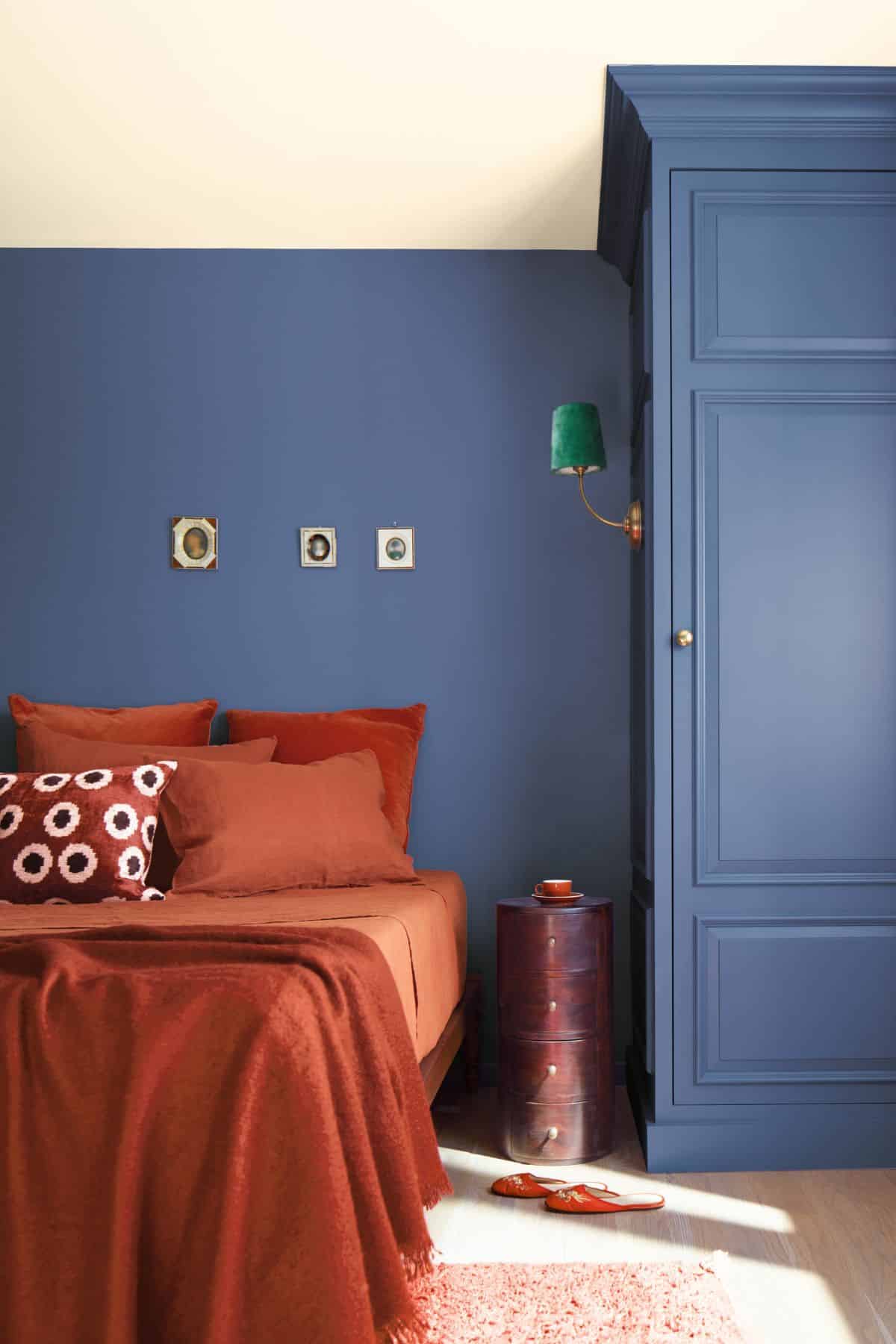
6. Purple Berry
Graham & Brown’s 2026 colour of the year is Divine Damson, a deep, moody purple/berry tone. It’s rich, decadent, yet feels good to be around. Take a look at it colour drenched in the hallway below, a true beauty to lean into if you want to embrace the darkness in a space with little light, or perhaps, a north facing room.
On their colour of the year, Graham & Brown said; “This opulent shade is inspired by the lush tones of ripe damson and fig. Its layered depth shifts gently with the light, revealing hints of mulberry and garnet. Luxurious yet comforting, our Colour of the Year brings warmth to any space – perfect for adding drama in a subtle, yet liveable way”.
It seems like other nuances of purple are on the rise too, “Velvet Plum is a rich, romantic purple that adds drama and personality, perfectly suited to the moody interiors trending in 2026”, added Wallsauce.
Whilst not known traditionally as an earthy shade, these richer tones really do lend themselves to an earthy nature that looks beautiful layered with natural elements, creams, browns and greens.
Get your purple berry fix with these other paint shades;

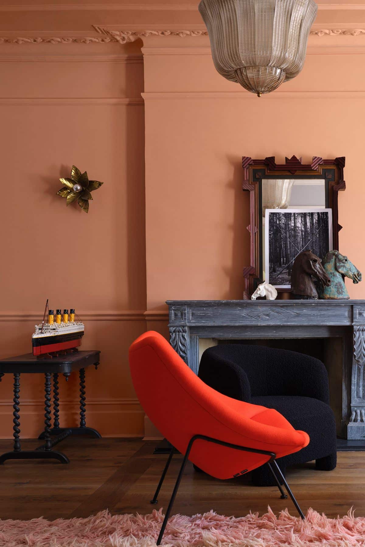
7. Grounding Reds
The viral ‘unexpected red theory’ had a lot to do with the rise in reds through 2025, but they’re still a signature look for 2026, in more grounding, earthier tones than before.
Naperon by Farrow and Ball as shown below springs to mind, a new release from Farrow and Ball this year. Joa Studholme, Colour Curator at Farrow and Ball said, “Over the last few years, we’ve relished living with colour. It’s opened our eyes to all the shades surrounding us, which we often don’t think about. The treasures right under our noses. Now, we’re ready to embrace more colour and celebrate these unsung heroes in our homes.”
Adopt this earthy and indulgent orange-red in a colour drenched approach for the cosiest feel. Particularly useful in larger spaces for making the ceiling and walls feel closer, creating a more intimate look.
Red is the ideal starting point for building an earthy scheme out, or in fact pairing with other audacious colours for a truly unique look.
Take a look at these other earthy grounding reds;
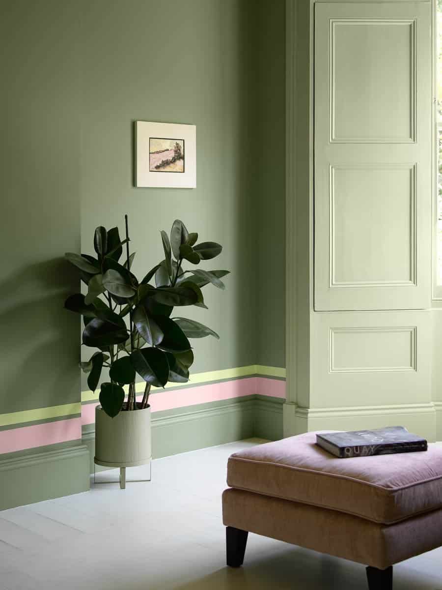
8. Soft Greens
One colour that’s not going anywhere anytime soon is green. Uniquely positioned in the middle of the colour spectrum, this makes green virtually the easiest colour on the eye. According to CNN Heath, “Some scientists and researchers also believe that because our eyes are at the peak of their perception to detect the wavelengths corresponding with the color green, the shade may calm us down”.
Sage greens whilst still popular, we’re seeing more soft-mid range greens now that bring more definition, and nature inspired warmth with them.
You could even adopt a similar ‘double drenching’ approach like the below which involves using two very similar tones of green around 1-2 shades apart to give added interest in a rooms scheme.
Green pairs remarkably well with other shades that are inspired by nature, browns, creams, reds and oranges. There are plenty of comfortable greens on the market to help kickstart your decorating plans;
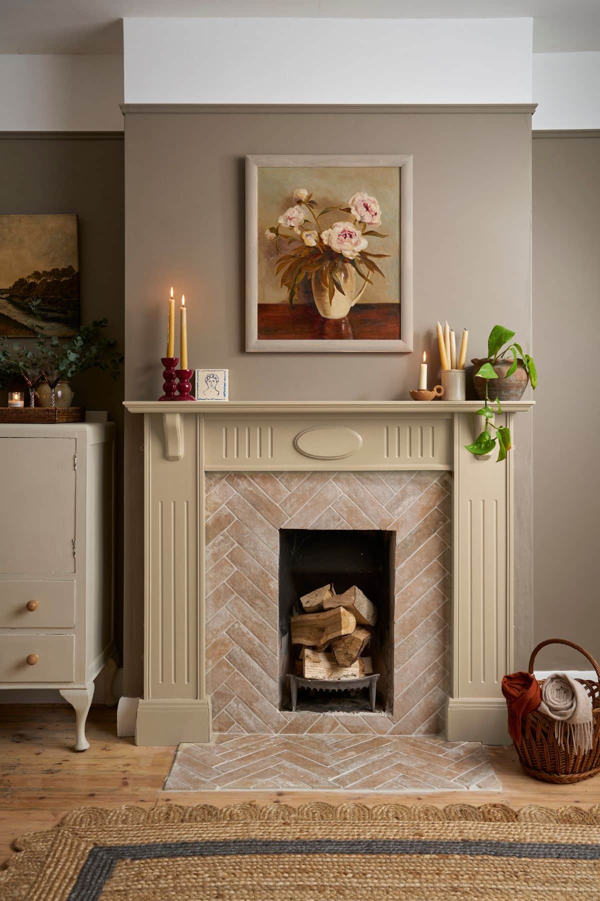
9. Warm, Creamy Neutrals
Earthy, creamy neutrals are going to be among the hottest neutral paint colours for 2026. Angie Kreller, Interior Designer at Yabby, said, “I’m already seeing a shift this year toward more earthy undertoned neutrals, and I think this is going to get more popular in 2026. Think of your classic beige, but instead, with a hint of pink. This is great for minimalist designs, or even just to use in spaces like bedrooms or studies”.
“When it comes to undertones particularly, I think we are going to see hues like caramel and blush get more popular. While there will still be space for cooler neutrals in the home, we are going to see less icy hues and more that are warmer in tone”.
Take inspiration from the below which uses French Linen Wall Paint by Annie Sloan with a Country Grey fireplace painted with Annie Sloan Chalk Paint. Adding a couple of different nuances here is key to creating a well layered and cosy interior. Opting for neutrals with the same undertone will give your interior a more seamless and intentional look.
Here are some of my favourite creamy neutral paint shades;
What do you think of the 2026 paint colours for our interiors?