
Colour drenching has been the ‘it’ decorating trend for the last couple of years. Saturating a room in a singular colour for a dramatic look, and needless to say, it always had us at no cutting in.
But, we’re starting to see shifts with how colour is being used in homes, and we’re demanding more visual, enticing spaces. ‘Colour Capping’ has been coined by Benjamin Moore, this clever painting technique involves using 2-3 tonally related colours to create a seamless transition from walls, to woodwork to ceiling.
It’s a far cry from the realms of bright white ceilings, and the inclusion of the ‘fifth wall’ in design plans is changing things for good. No longer an afterthought, ceilings can cleverly be pulled into the spotlight, whilst delivering a smart design that pulls everything together.
What Is Colour Capping?
This up and coming paint technique involves using 2-3 tonally related shades to pull an interior scheme together. This can be achieved by leaning into the different shades on walls, woodwork and ceilings.
“Pulling the often neglected fifth wall – the ceiling – into a coordinated look that feels considered is a gentle way to add cohesion and polish”.
“This is a finish that can be quietly impactful, even in a palette of neutrals, where an off-white wall colour is capped with a slightly more saturated hue in the same tone, gently drawing attention to period detailing while making the ceiling an integral part of the décor”, shared Benjamin Moore.
With 100s of paint colours to choose from, choosing just one can be daunting enough, so how to find shades that work together?
One of the best ways to do this is grab your favourite paint brands colour chart. All colours are grouped together in their colour family, such as all greens together, all yellow based whites, all reds etc. Once selecting a colour, lean into the lighter and slightly darker shade – this is the perfect way to get 3 tonally related shades that will work seamlessly with one another.
Whilst neutrals work beautifully, for added drama, bolder hues can be quite impressive. “Colour capping in this way also works with bolder, knocked-back jewel tones or a palette of warming autumnals, ranging from buff through to rust. A soft hue for walls moving into a mid-tone for cornicing and topped by a warm terracotta ceiling, creates an instantly pulled-together feel which can be followed through via soft furnishings and window treatments”, says Benjamin Moore.

Colour Capping Ideas To Try
Dulux’ trio colours of the year for 2026 are the ideal way to capitalise on this trend. Their three shades of blue are designed to work in harmony with another.
Shown below is a dark blue bookshelf in Dulux Slow Swing™, set against a wall painted in Free Groove™ to create a space that’s made for quiet focus. The slight colour variation draws the eye in, but keeps the room feeling relaxed and intentional.

Neutrals can be a comfortable and quiet way to start embracing this decorating look. Breaking away from the construct of bright white ceilings will honestly change the game in your interior design.
By selecting a slightly different, but tonally relevant colour on the ceiling, your eyes are still instantly drawn up with interest. This gives the illusion of a bigger space, just as the principle of a bright white ceiling, it’s just that that’s all we’ve been used to for so many years.
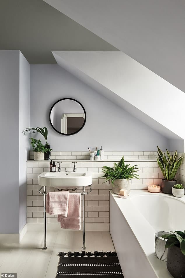
Colour capping feels just as immersive and enveloping as colour drenching, but that slight colour variation just delivers a beautiful balance which can suit rooms with changeable light.
Take inspiration from the below bedroom which has leaned into a duo of soft greens. Practically the easiest colour on the eye, and perfect for use in a bedroom.
Recreate the look with Herb Bouquet 460 on the ceiling and Fort Pierce Green 712 on the walls.
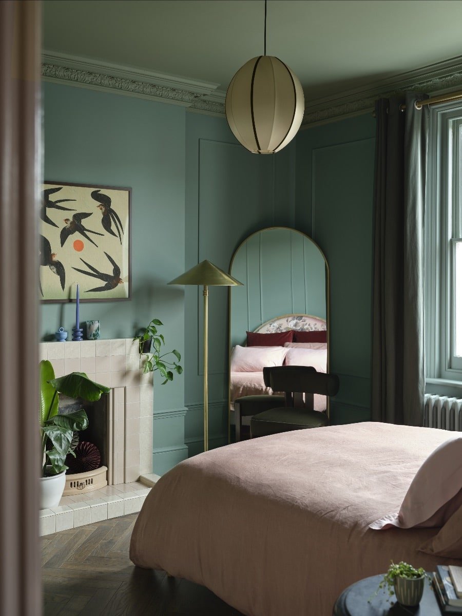
“Painting the ceiling and woodwork in a tonal colour variant and introducing warmer blush elements results in a harmonious feel that strikes just the right note between warmth and earthiness”, noted Benjamin Moore.
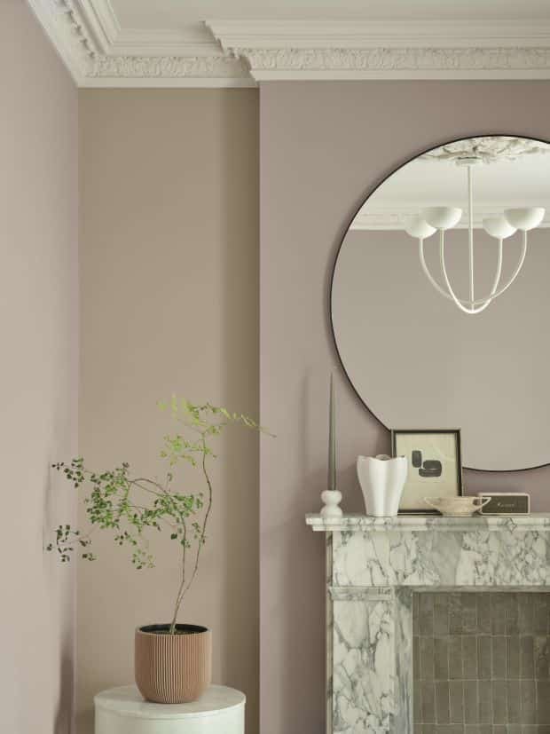
If you’re not ready to fully commit to a non-white ceiling just yet, find opportunities to introduce two tonal shades for a stylish, sophisticated look.
Note the below living room with Batik AF-610 by Benjamin Moore on the walls and Whispering Woods 1012 on the alcove space.
A subtle gradient between the two causes you to take a second glance, and the slightly lighter shade in the hollow of the room creates a lighter, more interesting feel.
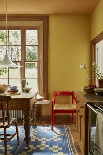
Perhaps, one of the easiest approaches to tackling this paint trend is to pick one colour to saturate the walls, woodwork and doors, and one colour for the ceiling. Or you could introduce a third colour onto your woodwork, as shown below.
This dining room uses Middle Buff on the ceiling, Yellow-Pink on the walls, finishing with Affogato by Little Greene on the woodwork.
Little Greene make it even easier to pick tonally related shades as they typically offer a pale, mid and deep shade for their colours.
This laid-back, coastal inspired study below is a gorgeous example of how you can tap into colour capping for a refreshing, restorative feel.
The lighter blue hue on the ceiling draws the eye up, giving the illusion of a bigger space, and you can see how the slight colour variation ignites more interest than a full colour drenched room.
Paints used Rear wall & Ceiling:Blue Verditer™, Left Wall & Left Skirting:Tivoli®, Alcove & Right Skirting:Woad™
What’s the verdict? Is this a paint trend you see yourself trying? For any other questions on advice on paint colours, please leave me a comment below!

that so great