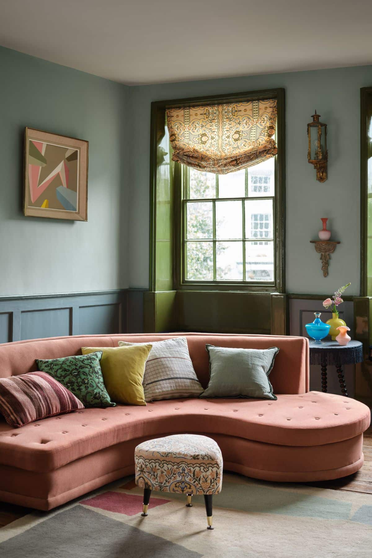
Choosing paint colours can feel daunting enough, but trying to please two types of orientations at the same time is possibly one of the trickiest types of rooms to tackle.
Expecting that one singular paint colour will look the exact same in either end of the room just isn’t going to happen here. However, these types of rooms can actually be some of the best to decorate with savvy combinations of colour, and leaving behind the notion that you’ll find just one paint shade that will please both ends.
I’m an interior designer and I’m sharing my breakdown on how to confidently choose colours for these spaces each and every time, along with colour combination ideas to try in your own home.
How To Decorate Dual Aspect Spaces (Plus, Paint Colour Ideas!)
Dual aspect rooms are typically north and south facing, or east and west facing, but of course, there’s always an exception to the rule with window positioning. However, these are the two most common dual orientations you will find.
Whilst there are pros and cons for both – north and south facing rooms are usually easier to tackle as the south facing light that the room receives balances with the coolness of the blue light, and generally the space has a much better kind of balanced light all day round.
There are a few things you need to consider before even getting to the paint colour stage that will really help;
- Understanding the orientations of both ends (you’re likely know this without using a compass due to the light changes in the room, however using a compass app on a phone and positioning it in front of your windows will give you an accurate read of the position).
- How do you use the rooms, and are they separated by function (dining room and living room) – this will greatly impact what choice of colours you might lean into, neutrals can be more forgiving and soothing to sit in all day, whereas darker, moodier shades are a great choice if the room is predominantly used in the evening.
- How do you want to feel in the room – this should ultimately lead your final colour choices, colours can have a subconscious effect on how we feel, and what we’re more drawn to.
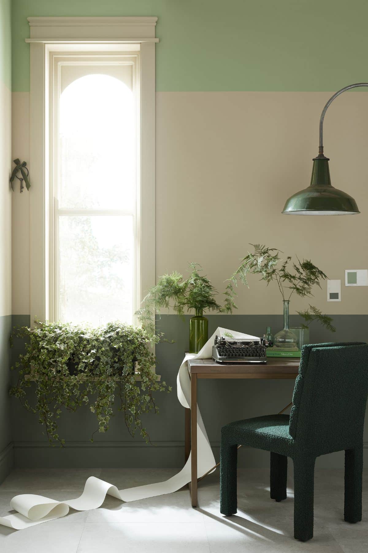
Now, we’ve covered that, here are some guiding principles to follow when choosing colours.
As I touched on, choosing one paint colour and hoping for the best just isn’t going to cut it here, because you’ll find that the paint shade looks so vastly different from one end to the other.
Instead, I recommend using a combination of up to three colours in the space, this way it creates a much better balance, and depth of colour in the room. Any differences between the shades is less noticeable as it’s broken up by the introduction of the other colours. Like with any pairing of colours, one of them will be your dominant colour.
Leave the colour drenching for another room, however tempting, as it just won’t do your space justice. So, how to use three colours in a space?
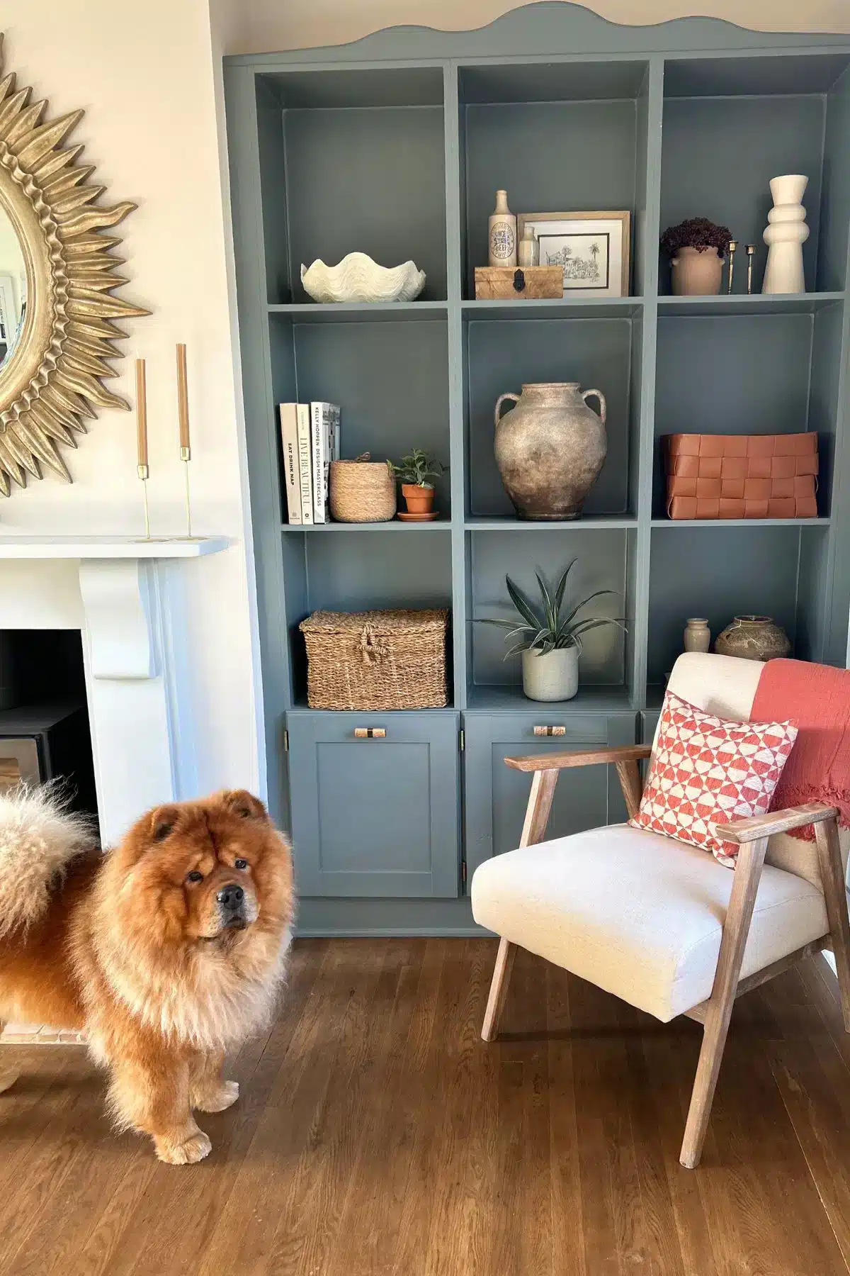
Below is an example from my own living room with is north and south facing (not segregated in the centre of the room). I have used half wall panelling in one colour (COAT – The Good China) with a lighter, warm off-white on top (Jojo’s White).
I’ve then leaned into a much darker, moodier shade as an accent colour on my alcove shelving in the north end of the room which is Farrow and Ball De Nimes. The three colours work beautifully with one another and the colour difference is barely noticeable down either end, instead your eyes are drawn to the alcove area for the right reasons!

If you have a period property, your dual aspect space may actually house two different rooms, commonly a living room and a dining room.
With this approach you absolutely can use different shades down either end, tying the spaces together with a key colour accent whether this is on decor, or as a woodwork colour is a good way to form some kind of cohesion between the spaces.
Dual Aspect Colour Palette Ideas
This is your reminder that you don’t have to lean into a bright white because one end of your room can get dark at certain times of the day, and you also don’t have to use bright and bold colours if you don’t want to.
Always test your paint samples before committing, paint an A4 sheet of paper and test during a gloomy and sunny day throughout the day so you can see how the colours are perceived with the light your space receives.
I’ve pulled together a few different ideas on pairing colours to give you inspiration that you can draw from in your own interiors.
Earthy Colour Palette
Earthy inspired design has been a big hit this year, it’s grounding, soothing and is one of the easiest to pull off. Drawing the colours from nature, this includes colours such as greens, reds, neutrals, browns and greys.
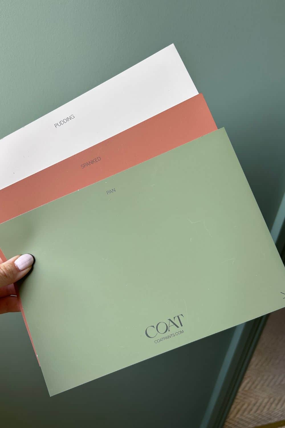
The below colour palette uses COAT paint colours, Pudding, Spanked and Pan. There are a couple of different ways you could use this depending on the style of your rooms and orientation. If it’s two rooms that are separated which are north and south facing, lean into the green shade in your south facing end, it will temper the intensity of the sun and look stunning against Pudding in the north facing end. It will create a beautiful depth of colour, but then you can tap into the ‘unexpected red theory’ by using Spanked as an accent colour on a piece of furniture or alcove shelving.
Alternatively, if the room is joined, you could use half wall panelling with the green on the lower half and the warm neutral on the upper walls and ceiling.
East and West facing rooms act in a bit of a similar way, but they flip over depending on morning and evening so it can be really difficult to please both sides. I’d still lean into this in a similar approach as the above as you’ll find that the light coming in either side will be enough to balance it when used in a way such as half wall panelling and a warm neutral on the upper half.
Pink & Blue
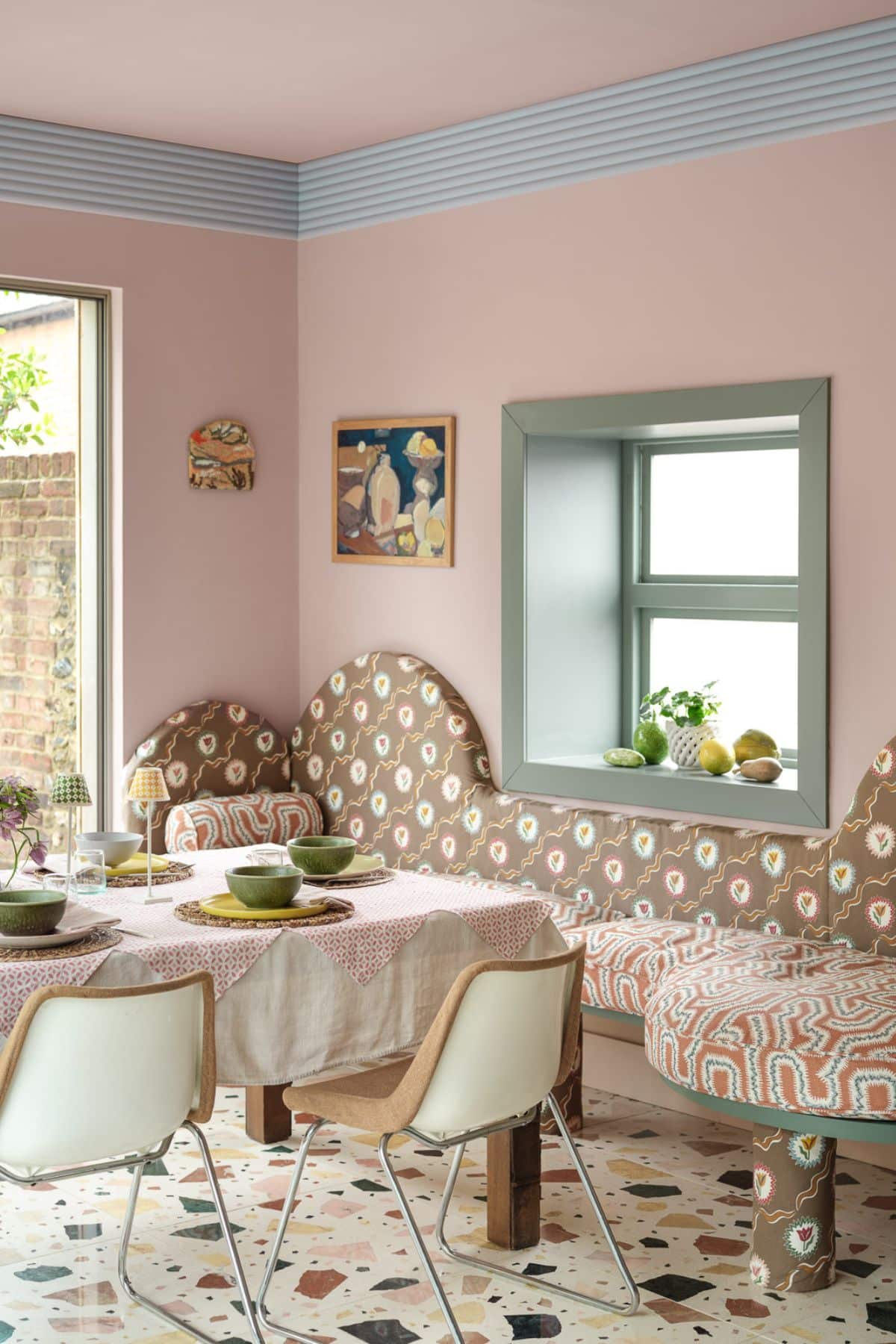
Another lovely way to tackle a dual aspect room is by combining both warm and cooler tone colours that will provide a more adaptable colour scheme to the changing light conditions.
Whilst the same colours are carried through the rooms, using a blue on coving in a way such as the below breaks up the run of pink, with a differing shade on woodwork which draws the eye in too.
This is such a fun and fresh approach, whilst a good shade of pink is perfect for balancing both cool and warmer tones in a room.
Colours featured in the room below: Benjamin Moore, November Skies 2128 50, Palladian Blue HC 144, Proposal AF 260
Follow The Undertones
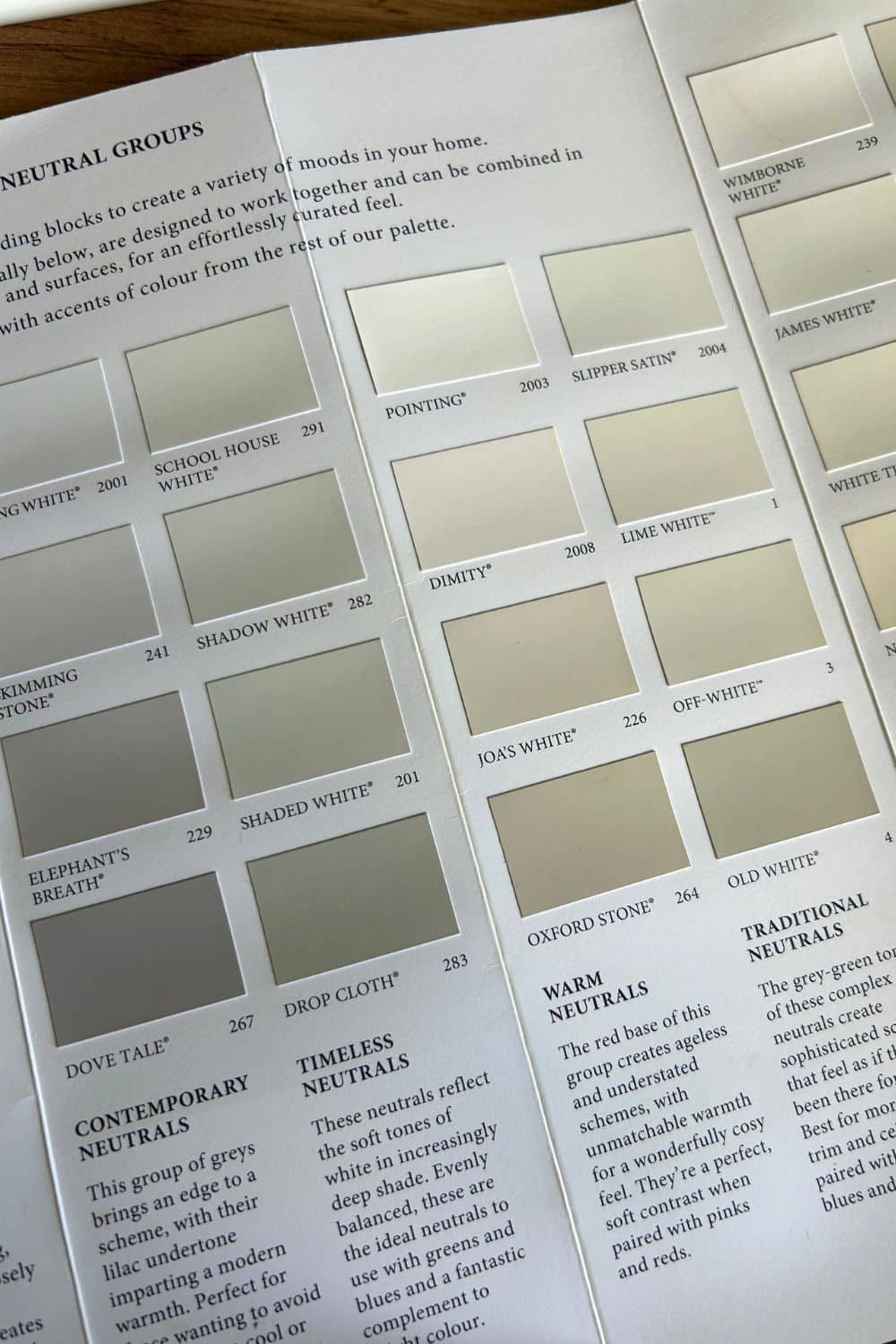
If you’re not a fan of introducing a punchy or defining colour, a really easy way to create a seamless colour scheme is by pairing colours that share the same undertone.
Paint brands make this so easy for consumers as in their colour charts they pair colours with like undertones together. This is an ideal way of pairing a wall colour, with a slightly darker colour on woodwork for a stylish look that works.
Using the same woodwork colour across both ends to the room (if rooms are segregated by purpose) is a really lovely way to still tie them in with one another for a good flow between the spaces.
Using Farrow and Ball paints, a classic colour combination could be Shadow White on the walls and Drop Cloth (a couple shades darker) on the woodwork which grounds the room.
These timeless neutrals also have a green-grey complex so are much more adaptable to light conditions, we’ll be seeing many more neutral paint colours like this in our homes in 2026.
Please leave me a comment below if you have any questions or would like some other paint recommendations for your own space. Feel free to attach an image to your comment as it allows me to give more targeted advice for your room.
I also have a video version below where I talk through dual aspect colour schemes in more detail!
