
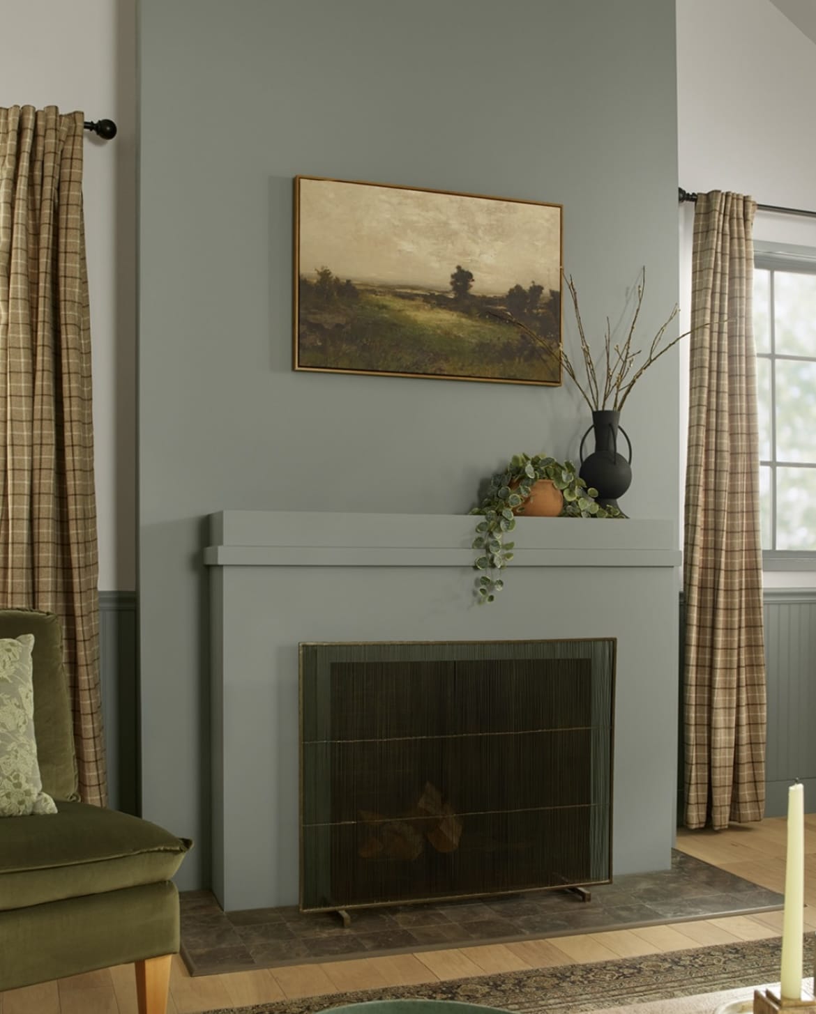
Earthy inspired interior design has become one of the hottest ways to decorate this year. There is something ultimately grounding and soothing about being surrounded by earthy paint colours, they just make us feel good! I firmly believe that anything we reference from the natural world outside in our interiors is why it creates such a comforting interior on the inside.
It’s also one of the easiest design trends to follow. An earthy colour palette is typically colours derived from anything that can be found in nature, so this includes shades such as reds, greens, browns, warm neutrals, greys and sometimes blue.
My favourite thing about any earthy shade you pick is its ability to make a room feel calm and comfortable because of that intrinsic link to nature. I’ve pulled together over 20 trending earthy paint colours from a range of paint brands that will help you give that nod to the natural world, and make you feel good within it.
23 Popular Earthy Paint Colours To Try That Will Ground Any Interior
How to find an earthy shade? Anything you can possibly reference from what surrounds us outside will have you on the right track. Soil? Think earthy reds and muddy browns. Trees and foliage? Pick your shade of green.
The inspiration around us is the best for choosing colours, and there’s a reason we find ourselves drawn towards them, because of our link to the natural world.
There’s tons of earthy paint colours out there, but here are some that are trending right now.
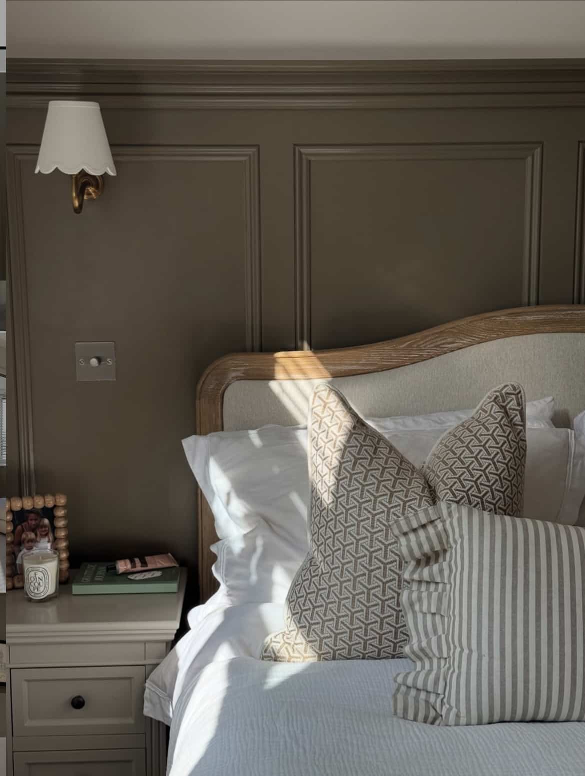
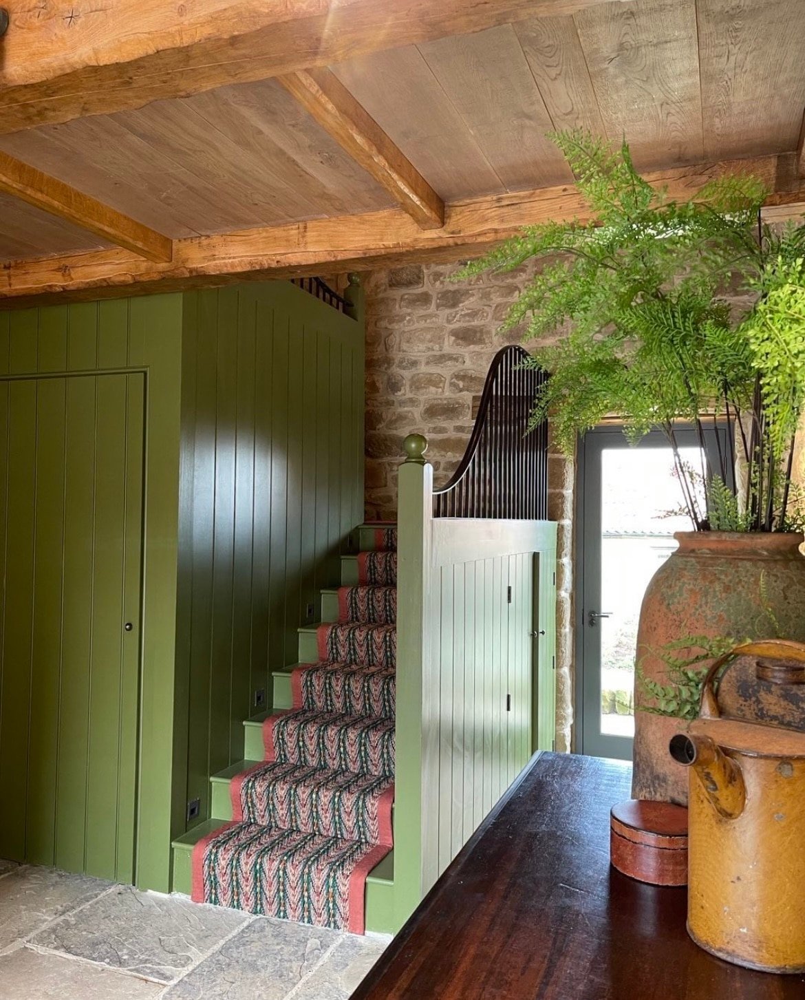
1.Mouse’s Back – Farrow and Ball
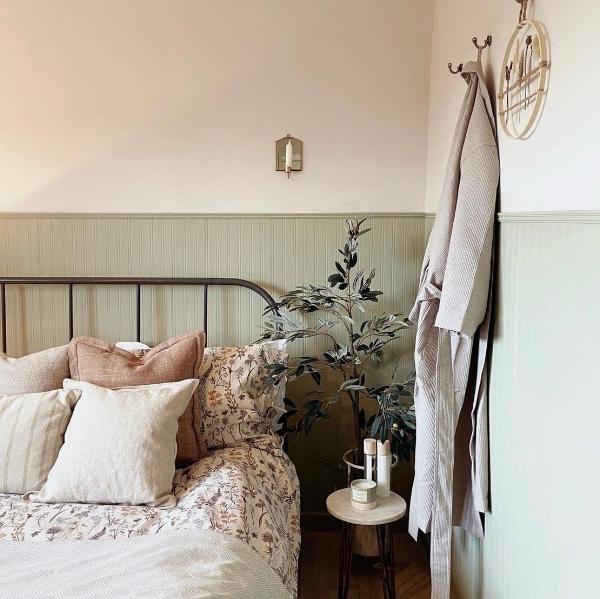
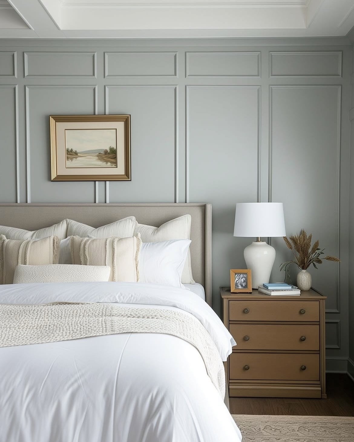
Kicking it off with a very likeable brown. As we move into 2026, rich, indulgent browns are worth getting to know. Untimely grounding and an alternative to lighter neutrals.
This earthy brown really does feel good to be around. I adore it in this bedroom below, used on panelling to define the room. Equally it would look beautiful colour drenched in a north facing living room where you want to lean into the darkness.
This shade is so easy to layer with and build in other earthy colours for a cosy feel – lighter neutrals, rusty reds, stony greys and green would create a perfect colour palette.
2. Warm Eucalyptus – Valspar
Valspar have announced Warm Eucalyptus as their 2026 colour of the year, a restorative and earthy mid to olive green shade which perfectly fits in with the way I am seeing paint colour trends head over the coming year.
There’s genuinely no such thing as a bad green in my opinion. Due to its central position on the colour wheel, greens really are the easiest colour on the eyes. Ophthalmologists have even found the colour to be soothing to the visual analysers.
So, when it comes to earthy colours, green might be the most soothing of them all in a room.
3. Leather Saddle Brown – Benjamin Moore
I love the muddy warmth that exudes from this Benjamin Moore shade. This shade was part of their colour trends for 2026, a rich brown with warm red undertones to it for that red, earthy soil like feel.
Create a high impact look by colour drenching an entire room in it. Alternatively, this bold shade would look beautiful as an accent wall, on shelving or a piece of furniture. Team it with a warm neutral or a green for an encompassing feel.
4. Red Earth – Farrow and Ball
No one does paint colours quite like Farrow and Ball, so richly pigmented and an entire colour palette of reds that all look gorgeous.
This terracotta red is earthy, reminiscent of the soil beneath of feet. This shade has a metamorphic quality to it, appearing deeper and cosier as the sun drops, so a perfect shade for north facing or west facing rooms.
5. Overtly Olive – Dulux
There are still lots of lovely earthy shades from Dulux worth knowing about. Overtly Olive is one of their most popular green shades, a mid to olive green shade that is refreshing and soothing at the same time.
This soft shade is ideal for pretty much any room, but it really comes into its own in cosy spaces like in a bedroom or living room. Go all in with this shade, or create a soft balance by pairing with a warm neutral shade such as Natural Hessian.
6. Portland Stone – Little Greene
You don’t have to lead with a red or green paint colour to still tap into an earthy colour scheme. Using a warm neutral with stone or sandy coloured undertones is a perfect base to build on, and it’s just as soothing and calming.
Portland Stone is a grey based neutral and is available in a range of tones to suit your interior, their Pale shade (shown below) works beautifully as a soft base, whilst the Deep shade looks like a greige with both green and grey undertones.
All of the tones in the collection are designed to work with one another, so if you’re looking for complementary woodwork colours, this is the way to do it.

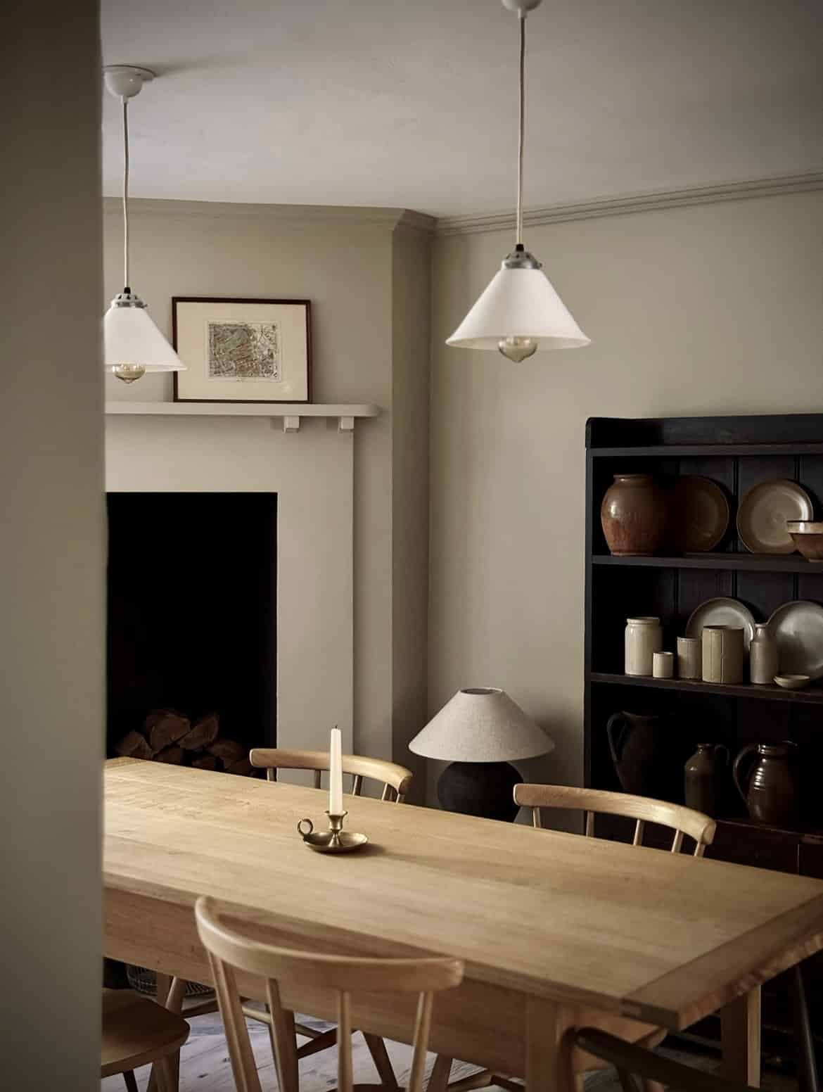
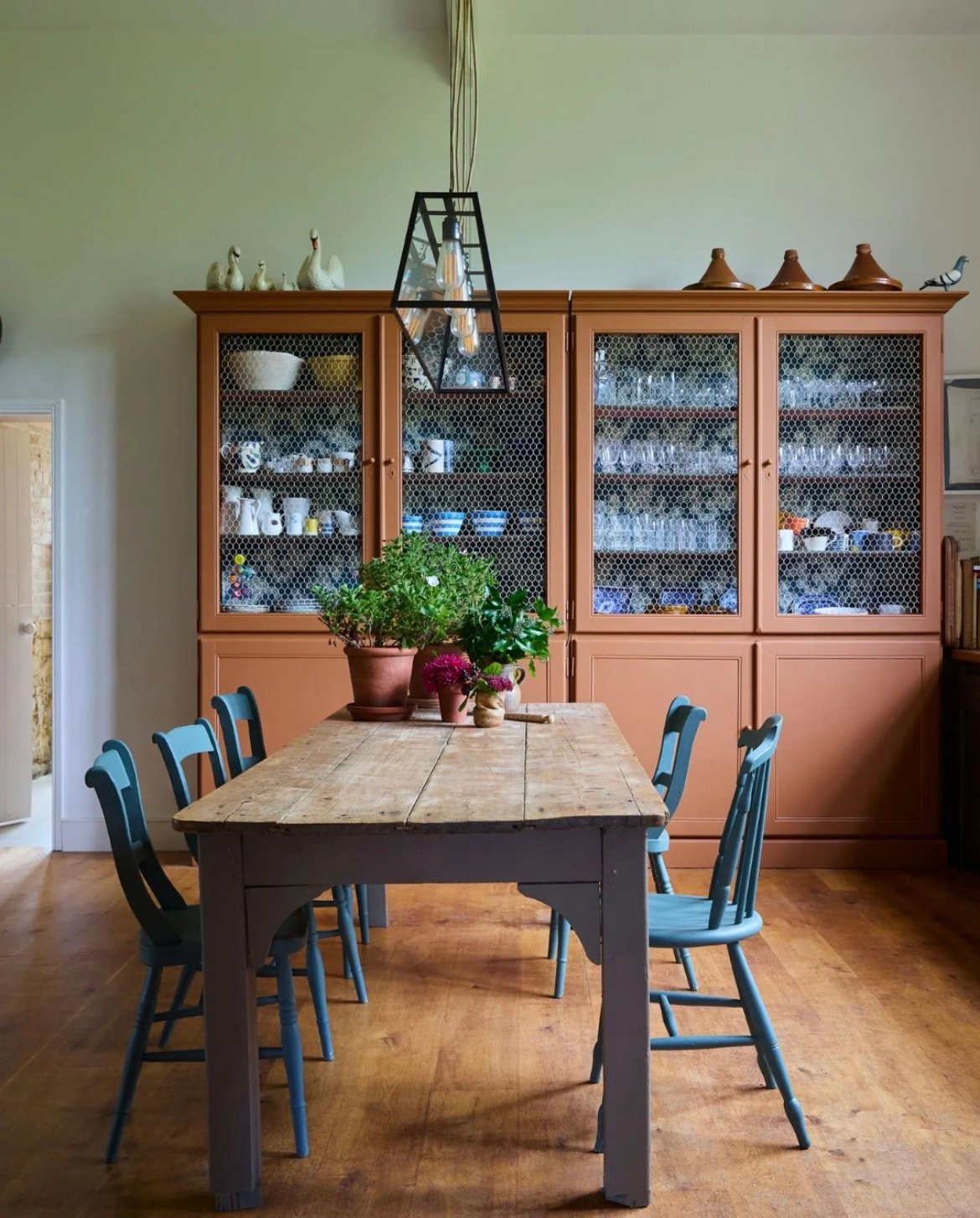
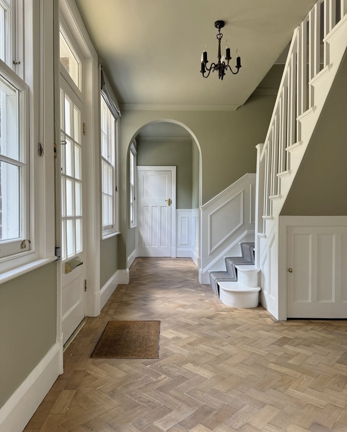
7. Old White – Farrow and Ball
This traditional neutral has a grey-green complex which makes it a versatile earthy neutral for any room. It’s sophisticated and understated and really does make a great base colour for building an earthy scheme.
So buildable with other earthy neutrals, as demonstrated in the below dining room. Pair and layer it with shades of green to bring out more of the green undertones in this paint shade.
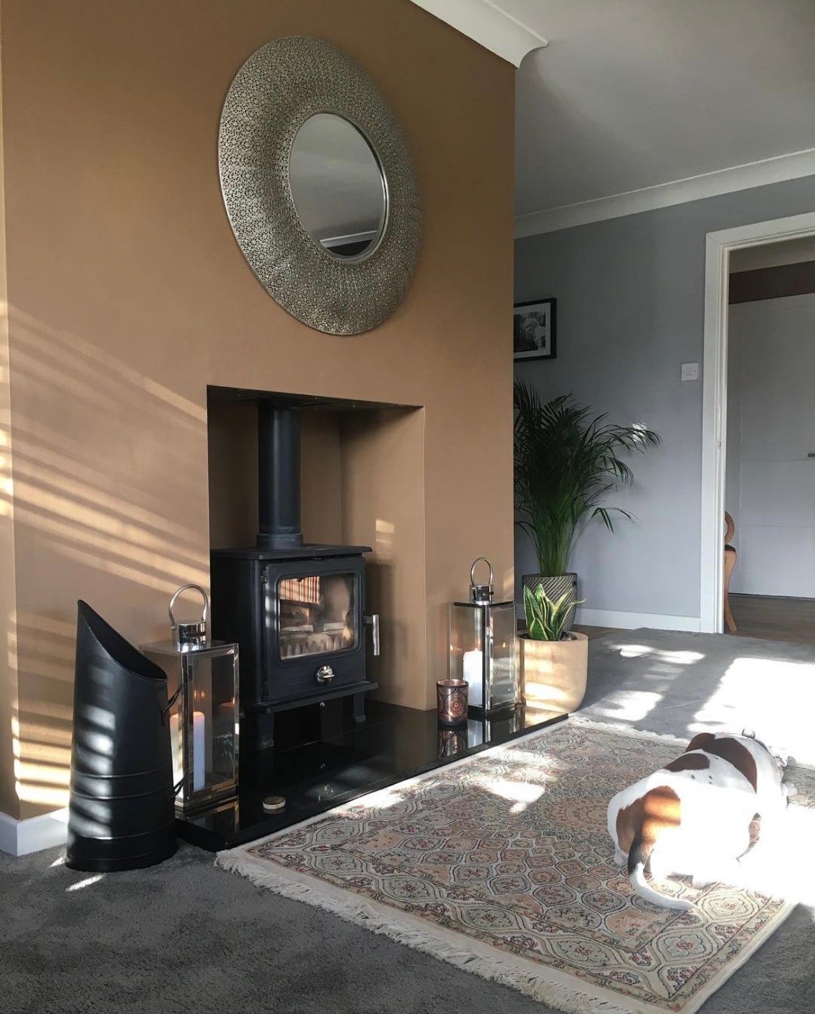
8. Spiced Honey – Dulux
This soft, terracotta brown was actually the colour of the year in 2019. It’s a bit more vibrant than Mouse’s Back by Farrow and Ball, but still a lovely earthy shade that serves well as an accent colour, or one to drench a space in.
It’s such a cosy shade and works particularly well in a living room, both in sunny south facing spaces, or perhaps if you want to embrace the darkness in a north facing room.
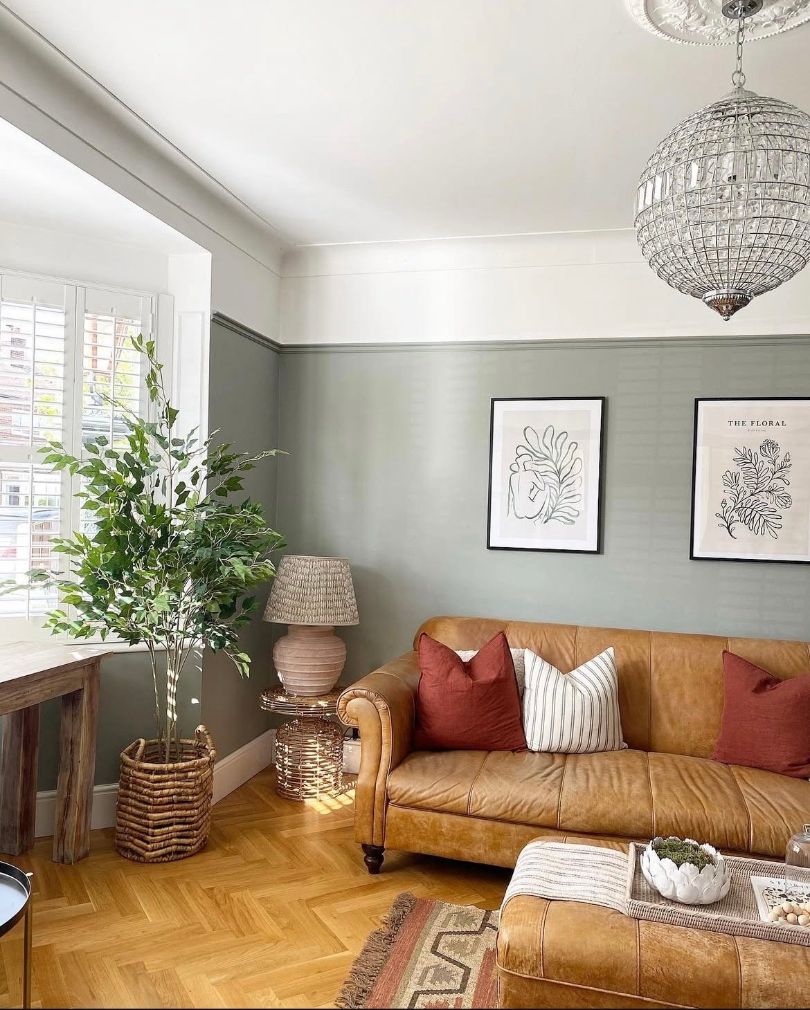
9. Pigeon – Farrow and Ball
Described as a blue grey, Pigeon is invariably popular because it’s such a relaxed and cosy shade of green.
It brings a tad more definition with it than some of the lighter shades of green such as Cromarty, but it’s just as workable in any room scheme.
Take inspiration from the below living space, using a soft white on the picture rail and ceiling to draw the eye up. The brown leather sofa adds to the earthy scheme and provides some lovely natural warmth and definition to pull the scheme together.
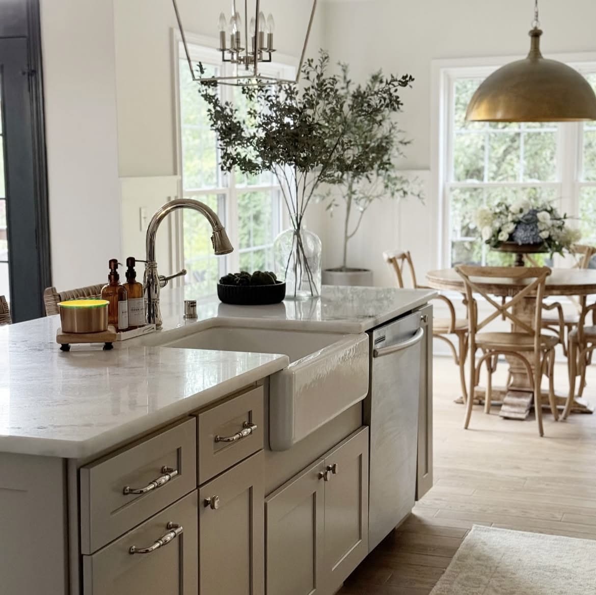
10. Pashmina – Benjamin Moore
Pashmina is a light sandy taupe shade, and one of the most reached for neutrals from Benjamin Moore. This is such a versatile, no-nonsense warm neutral that will elevate any scheme, be it on kitchen cabinetry like in the below kitchen, or a base on walls for your earthy scheme to take shape.
Just as good as a white, it practically works with any shade. To introduce some warmth in an earthy scheme, natural brass on light fittings, hardware or sockets and switches will finish off any colour palette for a high end feel.
11. Marmelo – Farrow and Ball
This warming orange is one of the newest shades that Farrow and Ball released this year, and it’s quickly become one of my favourites.
It is inspired by marmalade, and it’s so wonderfully portrayed in this shade. I love it as an accent colour as demonstrated below, but I already have my mind set on a design project, colour drenching a very small, windowless space for a warm but dramatic look.
If you’re using it as an accent colour, it pairs well with Joa’s White or Oxford Stone due to their warm, red undertones.
12. Park Life – COAT
I have this shade in my south facing office and it really is a comfortable green. A mid to dark earthy shade that works beautifully with wooden elements for natural warmth, and brown leather for a defining accent.
This shade can get pretty intense and dark in your darkest corners so it’s not personally one I would recommend in a dark north facing room, as even in our south facing office it takes on a whole new look when it’s a gloomy day!

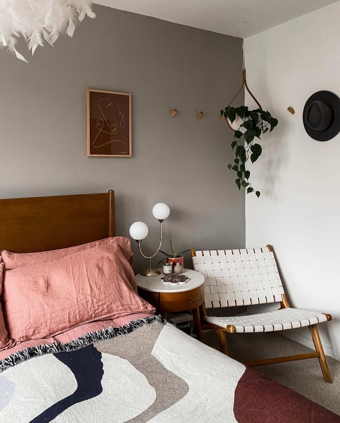
13. Antique Pewter – Benjamin Moore
Another trending neutral from Benjamin Moore is Antique Pewter, a beautiful well balanced greige which has both grey and green undertones.
Almost as versatile as a neutral, this soft muted shade of green looks good with practically any colour, but really comes into its own in building out an earthy colour scheme.

14. Dove Tale – Farrow and Ball
Whilst you might not instantly think of grey as an earthy colour, it absolutely is! Grey hues come from natural materials such as slate and clay and really do belong as part of an earthy colour palette.
F&B have some lovely grey shades, but Dove Tale is slightly more unique. It has a gentle lilac undertone which makes this grey feel warm and uplifting. They recommend pairing it with Skimming Stone for a more subtle finish in a room.
15. Spanked – COAT
A blend of terracotta and aged red, this audacious colour is one of House Nine’s paint colours as part of their collaboration with COAT.
This intense shade is a lot of fun in small spaces such as downstairs toilets or under stairs cupboards, I’d also use it on accent areas be it on stair treads or a fun piece of furniture.

16. Boho Berry – Frenchic
You can also take the lead from some earthy shades and lean into something a little bit warmer. This Berry inspired shade caught my eye by Frenchic. A deep aubergine shade with warm undertones that would look gorgeous in an earthy scheme when used as an accent colour.
Pair with soft naturals and natural materials to create a beautiful balance.

17. Stony Ground – Farrow and Ball
Drawing from the natural colour of stone, you can’t get a more earthy paint colour than Stony Ground. It has an underlying tone of red for natural warmth which makes it a perfect paint choice for all types of rooms, no matter the orientation.
Pair with Mouse’s Back on an accent wall or woodwork to really ground a room.

18. Broccoli Brown – Farrow and Ball
Another new shade to join Farrow and Ball’s collection this year is Broccoli Brown, if you really want to lean into a dark, moody brown this year, let it be this shade.
Intensely dark, this reserved yet comforting shade will sit beautifully alongside natural materials, and other earthy shades such as greens, reds and warmer neutrals.

19. Dalston Chat – COAT
A combination of a beige, greige and taupe, this clever colour is a warm neutral that’s both earthy and uplifting in a room.
It has a metamorphic quality to it so appears like a different shade depending on the type of light the room is receiving at the time. It makes a beautiful foundational colour.

20. Boothbay Gray – Benjamin Moore
Blue can absolutely sometimes be classed as an earthy colour, especially if you want to lean more into the coastal, natural side of things.
This complex colour combines both grey and blue tones for an interesting shade that shifts between these two colours depending on the time of the day and the light the room is receiving.
21. Bancha – Farrow and Ball
Bancha is truly an attention seeking green and one that just feels fun to be around! Whilst not typically earthy, this vibrant green has a true olive like tone to it.
Check it out as an accent colour in this hallway, and how beautifully it works with natural wooden elements that temper the intensity of the green.
22. Book Room Green – Little Greene
This might be the softest shade of green, and positioned in a hallway it creates the most welcoming approach, and it’s virtually the easiest colour on the eyes.
Pair with bright white for a pristine, traditional feel. Or why not lean into a slightly darker green, one or two shades darker for a stylish, defined finish.
23. Etruscan Red – Farrow and Ball
Last up is another earthy red, and one that can help you tap into the ‘unexpected red theory’ on an accent wall or piece of furniture.
This deep red is inspiring and sits into an earthy colour palette with ease.
