

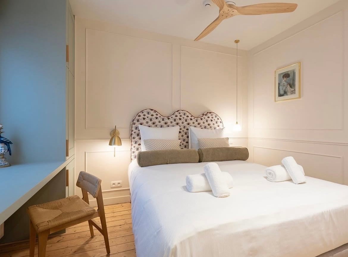
If you’re in the midst of choosing the perfect paint colour for your home, you want something subtle, neutral but not bright white, Farrow and Ball Dimity just ticks all the boxes.
Dimity is a pale and subdued taupe and the most beautiful way to bring in character and warmth to a room without having to commit to a bold shade.
It’s comfortable to be around, and with its soft, warm undertones and it pairs well with practically any colour. Here are 15 different colour schemes, and ways to style it out in your own interior.
15 Farrow and Ball Dimity Colour Schemes For Any Interior
1.Soft Neutrals
Neutral interior design is not going anywhere anytime soon, and Dimity is just one of those perfect foundational colours to set the tone for a colour scheme.
Layering is one of the best ways to create an elevated, stylish interior, and it’s so easy to recreate. Build in other neutrals in softer or darker shades through textiles, accessories and lighting to add depth and cosiness to a room.

2. Colour Drench With It
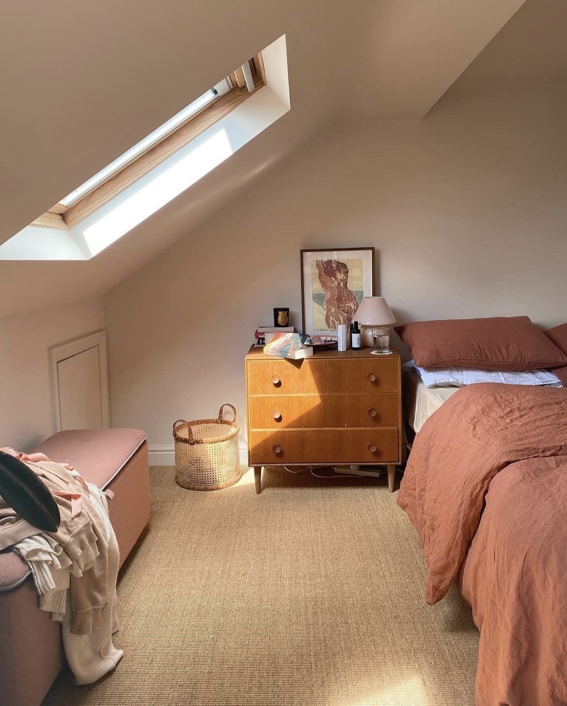
Colour drenching is still a popular and effective decorating technique, and it looks incredible in rooms such as the below which have a sloped ceiling. It stops drawing attention to the ceiling, and instead the room flows better.
Dimity has a natural ability to pair beautifully with practically all colours, but I do love it when paired with darker reds, oranges or terracottas as it makes dimity feel even warmer, and pinker in comparison.
3. A Soft Touch of Green
Whether it’s a soft sage green like the one below or an earthy, olive green, a good shade of green always feels good to be around.
Using Dimity as a secondary colour in a scheme like this works really well, and it adds so much more warmth to an interior scheme than a bog standard bright white does.
The green in the bedroom used below is Hopkins Grey from Crown Paints or get a similar look with F&B Vert De Terre.

4. Ground With A Grey
If you’re using a neutral like Dimity, I always recommend introducing a darker neutral into the space which will ground the entire colour scheme.
Instead of a knee jerk reaction into using a black, something like a charcoal grey brings a little more softness to a scheme and really sets the tone in this bedroom colour scheme below.

5. Keep It Minimal
If you like minimal or Japandi inspired interiors, take note of the below dining room space! Dimity might just be the most perfect neutral, it’s not too cool, nor too warm which makes it perfect for both dark north facing rooms and south facing spaces as well.
Introducing a bright white on a piece of furniture taps into that Japandi style interior, with wooden elements bringing in that natural element that feels good to be around.

6. Elevated Hotel Style Bedroom Scheme
If you want to create a luxury, hotel style bedroom scheme, use Dimity as your main wall colour (or colour drench!) and bring in a stand out headboard to create a focal feature.
Something with a gentle or interesting pattern will create the most beautiful look, instead of going for something lighter, opt for something neutral with a bolder shade, or go for a darker shade in general which will naturally add definition to your colour scheme.
7. Chic Wainscoting Panelling
Whilst not strictly a colour scheme, this is a way to add instant character to your interior scheme. Panelling is not going anywhere anytime soon, and it’s such a simple way to elevate plain painted walls.
Wainscoting panelling like below is a more traditional style of panelling which looks beautiful in period homes. A colour drenched look like the below really suits high ceilinged rooms as it makes the room feel more intimate.

8. Transitional Scheme
Combining a love of old, antique and new items will help to create a transitional look that feels personal, and unique to your own home.
Focus on intentional pieces that work with the colour scheme, adding pieces over time that you find along the way. The below bedroom is a perfect example of this!

9. Draw The Eye In With A Darker Shade
Leading from one bold colour into a softer one is a lovely way to create fun interior design moments in your home. In the image below, De Nimes in the hallway leads into Dead Salmon on the panelling with Dimity above.
Positioning Dead Salmon next to Dimity brings out the pink undertone in it which makes it look so warm and welcoming. The layered tones across the textiles feel so soft and tactile in this scheme.

10. Cottagecore
In smaller, darker rooms, Dimity brings warmth and airiness to a space. It works so well in a cottagecore style scheme as it’s classic, uncomplicated and darker wooden tones look beautiful against it.
Focus on introducing cosy textiles across a bed or a sofa for a sumptuous, luxurious feel.

11. Coastal Inspired Scheme
It’s no secret that coastal inspired decor schemes are one of my signature decorating styles, and i feel like Dimity is the most perfect neutral for a coastal decor backdrop.
It pairs beautifully with yellows, blues, black and brass accents, and cooler tones such as grey or ocean/beach depicted hues.

12. Sumptuous Colours & Patterns
I adore this bedroom scheme below, the rise of the extended fabric bed head is growing in popularity. It gives a boutique hotel vibe and brings such texture and warmth to a scheme.
A sumptuous dark green as featured on the bed cushions add some much need definition to this colour scheme and instantly focuses the eye as you step into the room.

13. Vintage Styling
How chic does the below styling look? Dimity is such a classic colour so it really is well suited to period or more traditional style interior schemes.
You can’t beat introducing some vintage accessories which bring natural character and depth to a scheme. I particularly think aged brass with a natural patina and aged wood creates such a tactile look and feel.

14. Soft, Floaty Fabrics
Dimity is the most beautiful backdrop for soft, floaty fabrics and this mediterranean inspired bedroom scheme perfectly fits the bill.
With a focus on soft white and floaty fabrics around the bed it just softness the straight lines on the panelled ceiling.
It goes without saying that adding a black accent to any interior scheme is a gorgeous way to add modernity and definition to a colour scheme.

15. Combine With Accent Metals
Styling a bathroom with Dimity? Black and brass are two of the best metals to pair with it. Brass brings natural warmth and glamour, whilst black adds definition and grounds the scheme.
Can’t decide which one to lean into? Feature both like the below for a beautiful interior design scheme.
Dimity is one of those super versatile neutrals that works beautifully with pretty much any colour, hopefully these colour scheme ideas can help with your next project!

