As far as earthy greens go, Pigeon is one of the most popular from Farrow and Ball, and it looks even better in a kitchen.
What is it about greens right now? It comes as no surprise that greens are virtually one of the most soothing colours visually because of their prized position in the middle of the colour wheel. If creating a soothing and calming kitchen is at the top of your list, it’s definitely worth considering Pigeon.
There’s plenty of opportunities to make the most of the colour, from drenching your walls, using it as an accent colour or even just spray painting your cabinetry. Here’s some ideas of how you can integrate this green into your kitchen this year.
17 Farrow & Ball Pigeon Kitchen Ideas for a Timeless Look
This comfortable green is a true timeless classic. Renovating a kitchen can be expensive, so opting for timeless colours is always a better move than leaning towards a shade, or paint colour that is ‘trending’.
Greens are almost as good as a neutral as they can pretty much work with virtually any colours. A true icon among neutrals, other earthy shades, and of course, bold opposing colours to green such as pink and red. Yes, Pigeon truly ticks all the boxes.
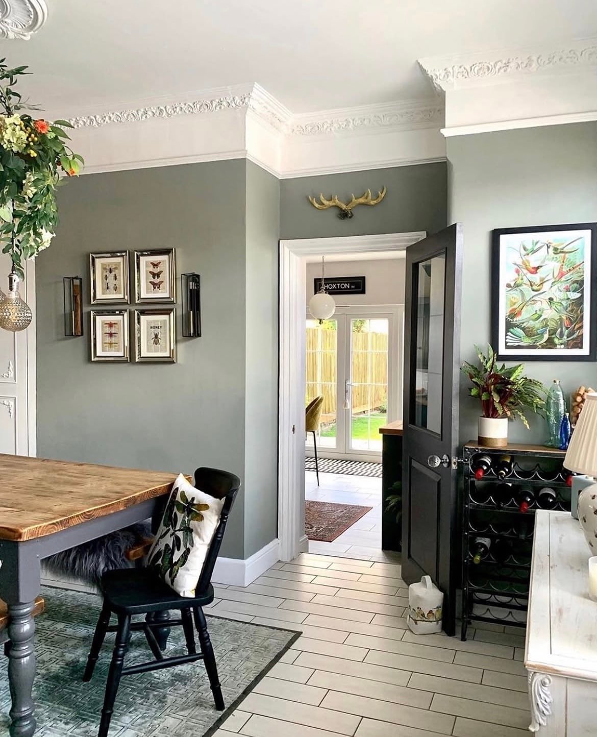
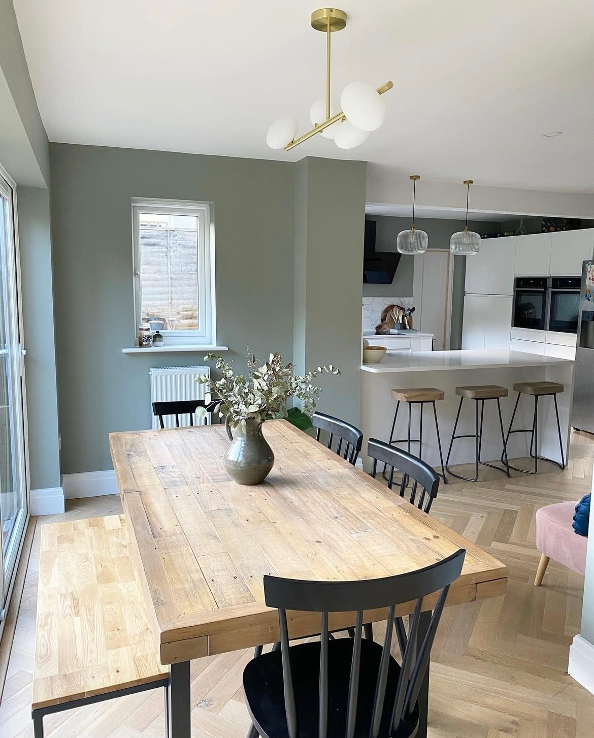
1. Pigeon and White Make A Classic Colour Combination
If you have a shared kitchen/dining room, green can be a lovely colour to work in around the walls. White is a truly classic colour combination, and if you have a picture rail, using the same white shade down onto this part of the wall can create more of a cosy, enveloping feel.
Recreate a similar look by using All White F&B on the ceiling.
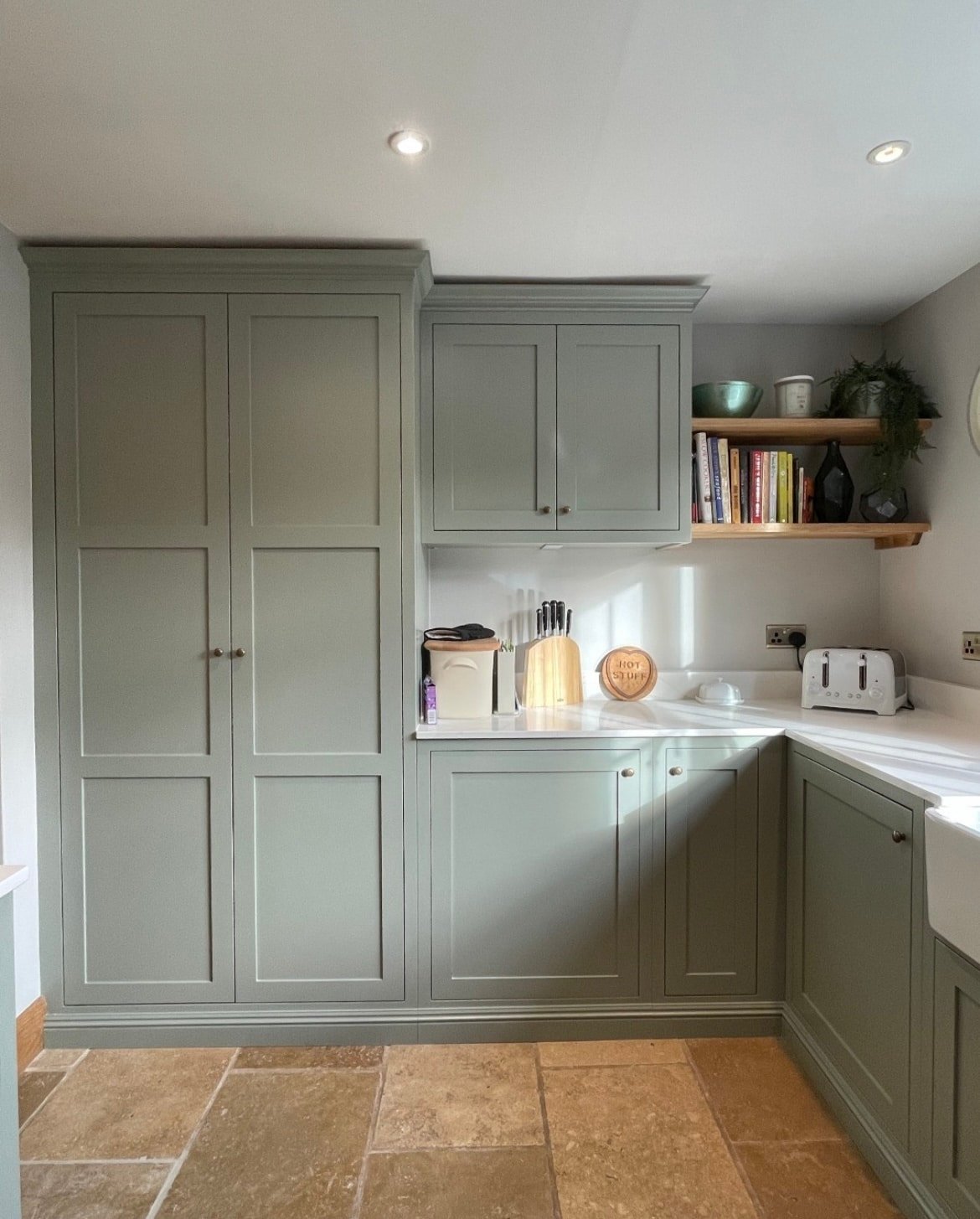
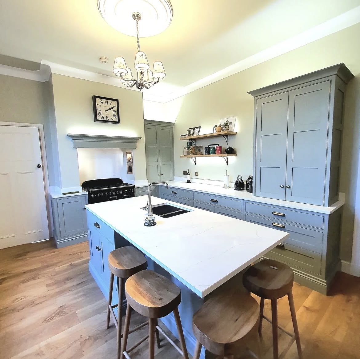
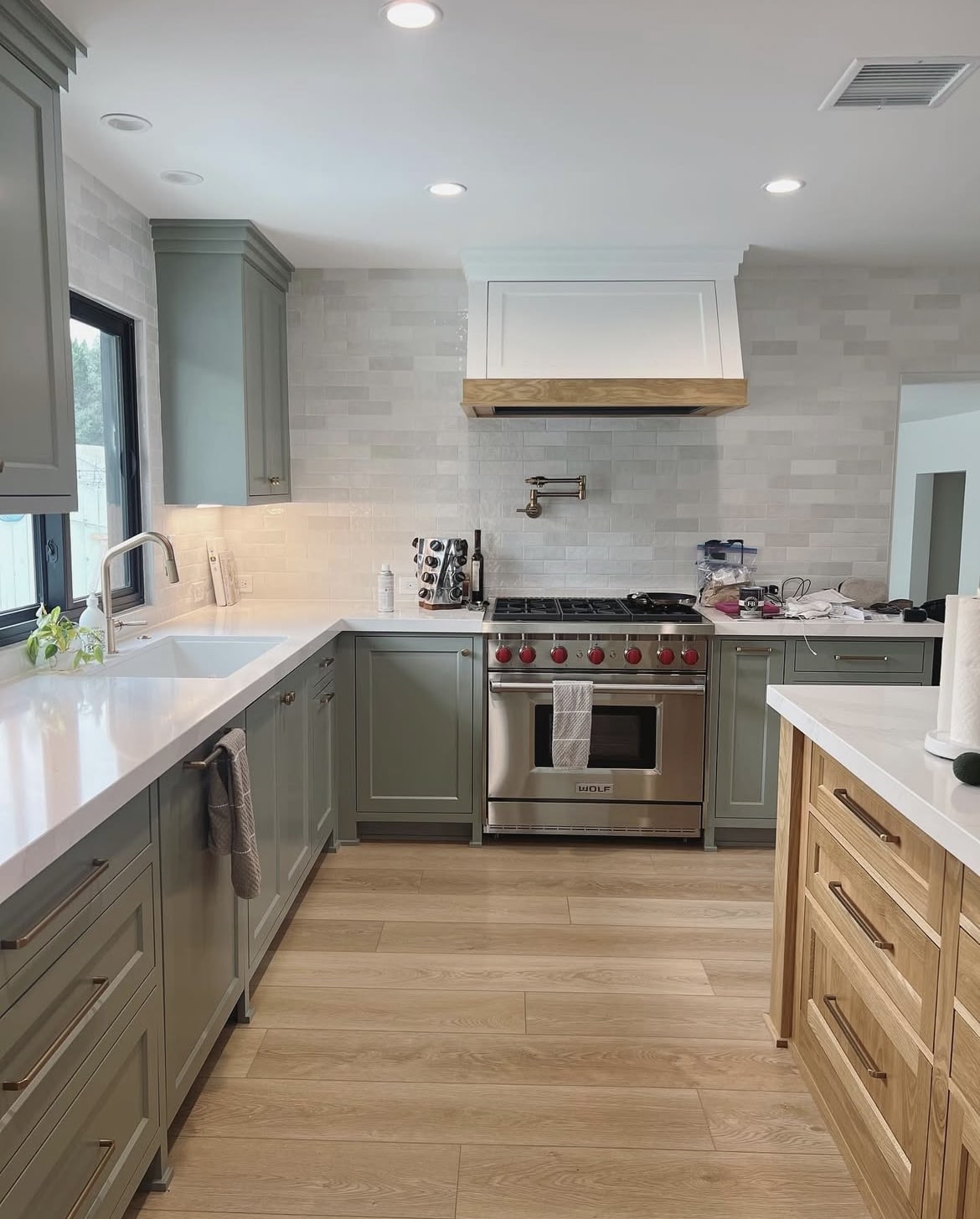
2. Earthy Inspired Scheme
An earthy kitchen is one that is grounding and soothing, and if you’re planning on using terracotta or brown based floor tiles, you’re already setting the tone for this natural inspired trend.
When creating an earthy colour scheme in your kitchen, think about using colours that can be taken directly from nature. This generally includes greens, creams, browns, reds and greys. If using Pigeon on your cabinetry, choose a wall colour and work in another accent colour or two on your decor accessories, or even hardware details.
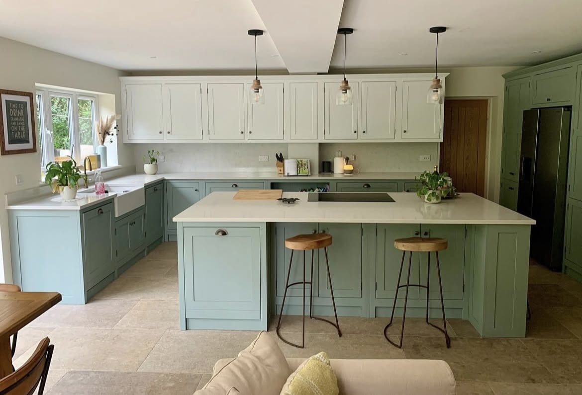
3. Ground Lower Cabinetry With This Feel Good Green
Two tone kitchens are a fab way to introduce further visual interest into a kitchen, it helps to break up the monotony of a single colour.
In the case of this, lean into your darker shade on all lower cabinetry/kitchen island as it will define the room. For upper cabinetry, use a shade that is around one to two shades darker with the same undertone to create a flawless scheme. You could create a similar look to the one below by using Shaded White on upper cabinetry.
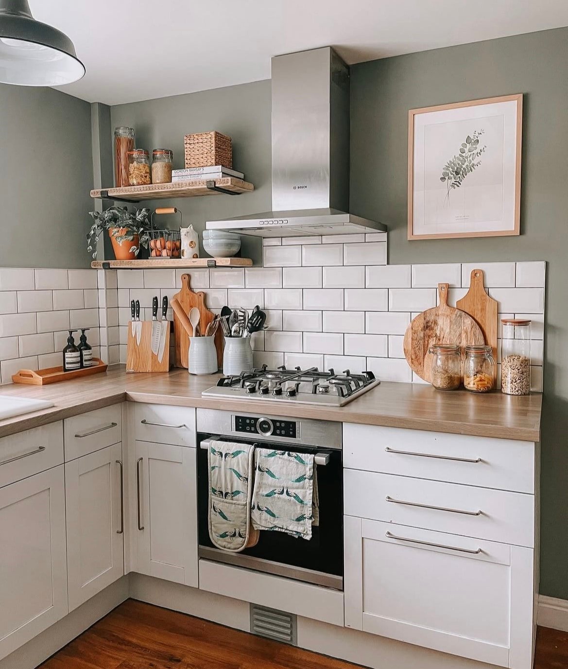
4. Pair With Wood For A Rustic Feel
If you’re considering your flooring or worktop options, wood is a natural choice that will help to form more of an earthy inspired kitchen scheme.
Both light or dark tones will work well. Generally I’d lean into a darker shade for flooring and a slightly lighter or warmer tone on a worktop.
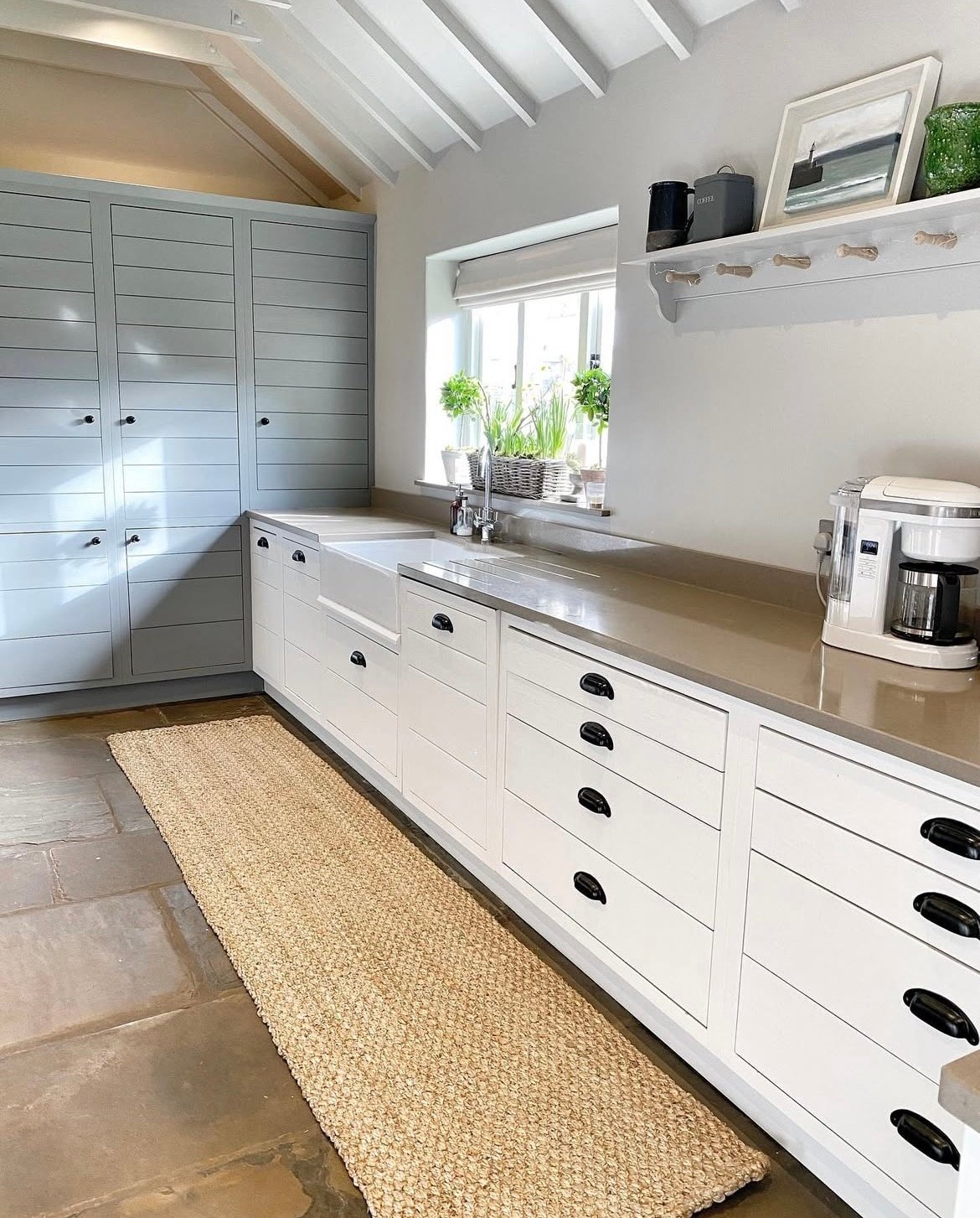
5. Lean Into An Off-white With Green Undertones
Not sure what colour to pair on your walls with Pigeon? A versatile, high performing shade is an off-white with green undertones. It will still bring warmth to darker or north facing kitchens and using a white with a green undertone creates a much more cohesive and intentional colour scheme.
Farrow and Ball have quite a large range of whites with these tones, Lime White and James White are two classic choices. Use the same colour up and onto the ceiling too for a more inclusive feel, this becomes even more important in kitchens with a particularly low ceiling as it will make the space feel larger than it actually is.
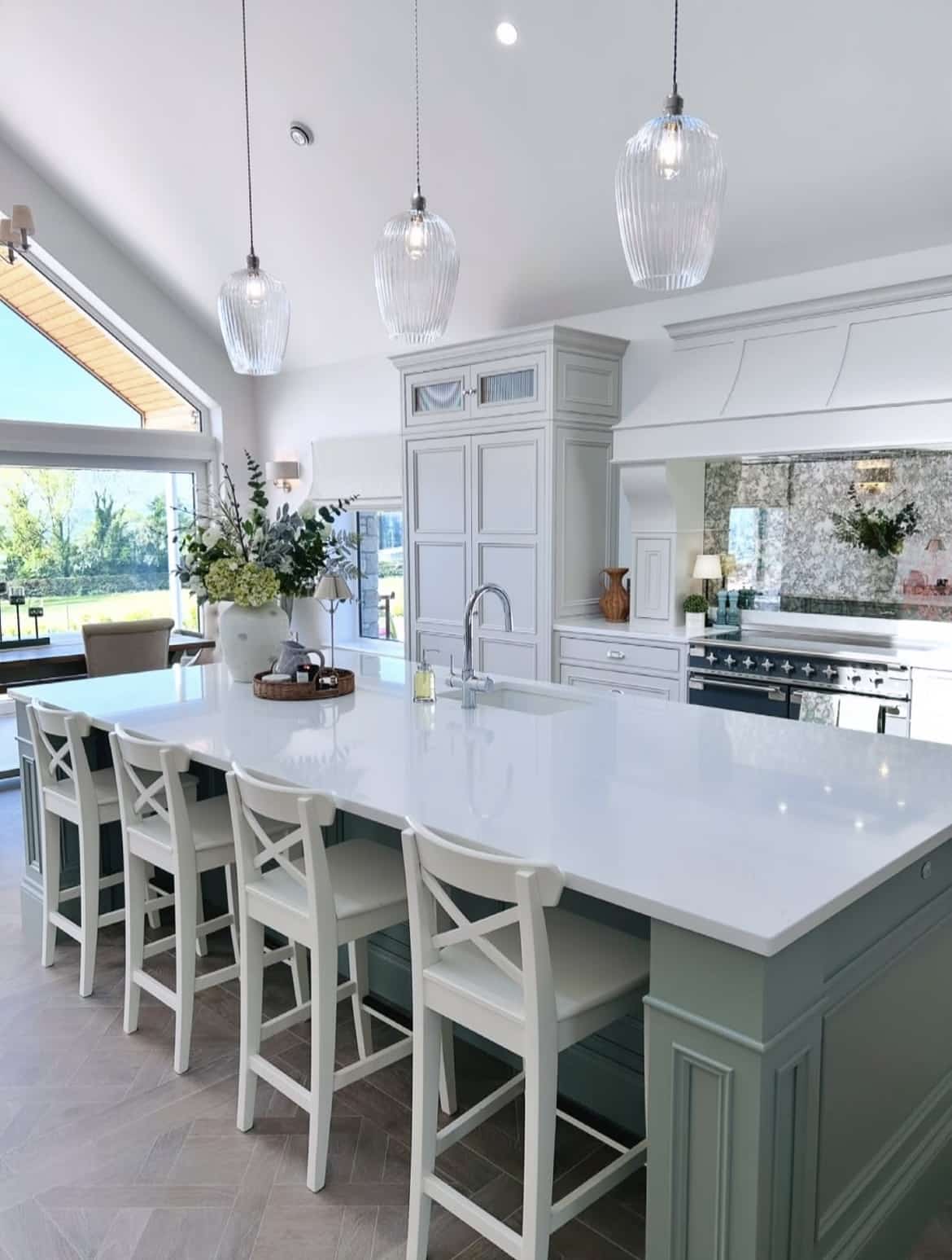
6. Gorgeous Glass Lighting
Anything pretty much goes with a versatile green like Pigeon, and for lighting choices, glass is a fail safe option.
For both light and dark kitchen spaces, glass is a great choice because it will continue to disperse and allow light to pass through the shades uninhibited throughout the day, and without needing to switch the lights on.
If you’re lighting a kitchen island, working in odds will help to keep things well balanced, although I really am a stickler for opting for two very large pendants instead as I love the look this creates. Just remember, you need to scale up!
7. Ground The Kitchen With Black
A little like the ‘unexpected red theory’, black is a colour that has the ability to define any scheme, and make it appear much more finished than it does without it.
Black is so easy to introduce, especially in a kitchen. Accent details on chair legs, interior hardware such as handles and sockets and switches, cookers and of course decor accents. A few well placed accents is all you need to bring it together.
8. Zellige Tiles For An Organic Feel
As far as backsplash options go, the world is your oyster, but I wanted to share a very much on-trend tile choice right now that really does fall into being a timeless tile choice.
Zellige tiles are the new ‘matte white brick’ tiles in my opinion. They’re much more elevated, have a semi gloss finish and carry a slight colour variation. This means that they engage you differently no matter what angle you perceive them in, and they bring an organic feel. Even in white, they look so gorgeous in a scheme.
9. Use Pigeon As An Accent Colour
Instead of using Pigeon on cabinetry or walls, use it as an accent colour in your scheme on cupboards, or a piece of furniture.
This can be another lovely way to break up one single use of colour in a kitchen, and I always think that pairing up to three colours in a colour scheme, no matter the room is the perfect way to create a stylish, and visually interesting space.
10. Mix & Match Hardware Finishes
It was once considered taboo in interior design to pair different hardware finishes, but now it’s seen as a rule breaker that works.
Instead of using just one interior finish such as brass, pair at least one juxtaposing metal for a visually interesting and well balanced look. I personally love the use of brass with black or nickel, or in fact, just pairing a couple of differing shades of brass for a really warm feel.
It all pairs well with Pigeon!
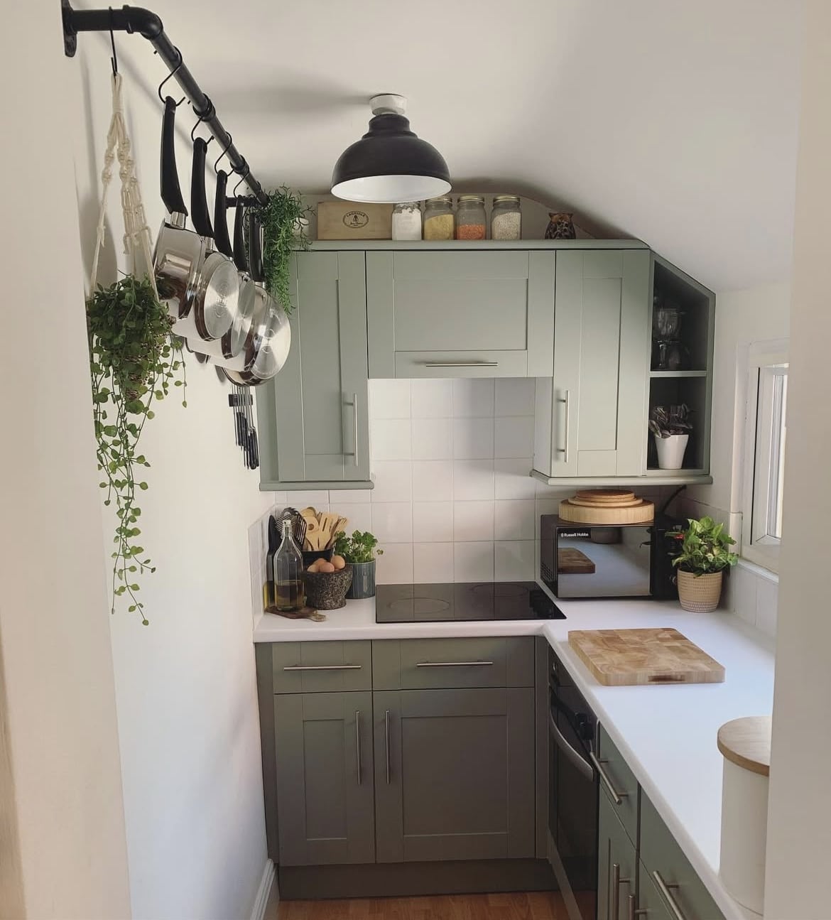
11. Draw The Eye Up
Pigeon used on the walls is another lovely way to do it justice in an interior. Paired above a neutral kitchen it just instantly draws the eye up, and this in itself creates the illusion of a much larger kitchen.
For more of an intimate, cocooning feel, try using the shade up and across the ceiling too for a semi colour drenched approach in a kitchen.
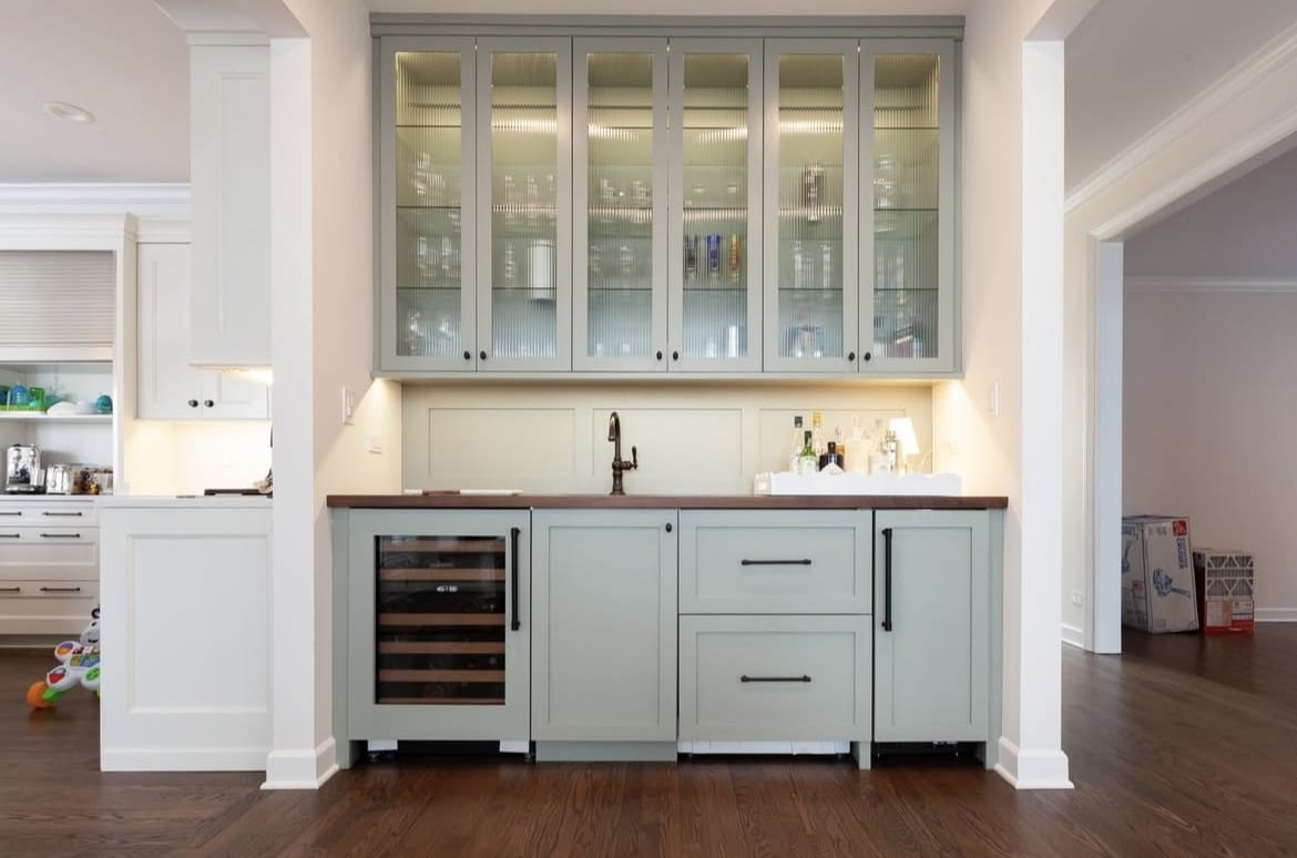
12. Two Tone Kitchen
If you love the idea of a two tone kitchen, take inspiration from the below. Not only does this style look great when used on cabinetry and a kitchen island, it also makes a lot of sense if you’re zoning a separate section in an open plan room such as a bar area, or utility space.
The two colours blend together beautifully in this space, I also love how the cabinetry is taken to the top of the ceiling to really maximise the space.
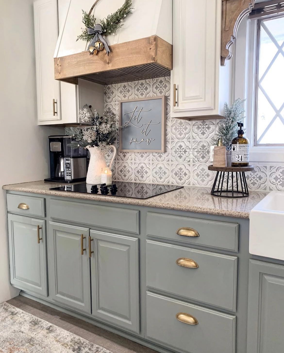
13. Pigeon & Cream
White can sometimes feel too clinical and uncomfortable in a kitchen, but cream is a next best favourite which is inherently more earthy in nature too.
I do love how the two different tones complement each other in this two tonal approach. The wooden detail on the enclosed cooker hood adds further definition, and something that would be easy to recreate with a little bit of DIY in your own kitchen.
14. Chrome & Black Details
Another example of how you can absolutely pair two different hardware details for an on-trend kitchen.
Black and chrome naturally work together hand in hand because of their cool undertones, yet black really does have the final say in this design, tying it in with the light fixture and cooking details in this kitchen shown in the image below.
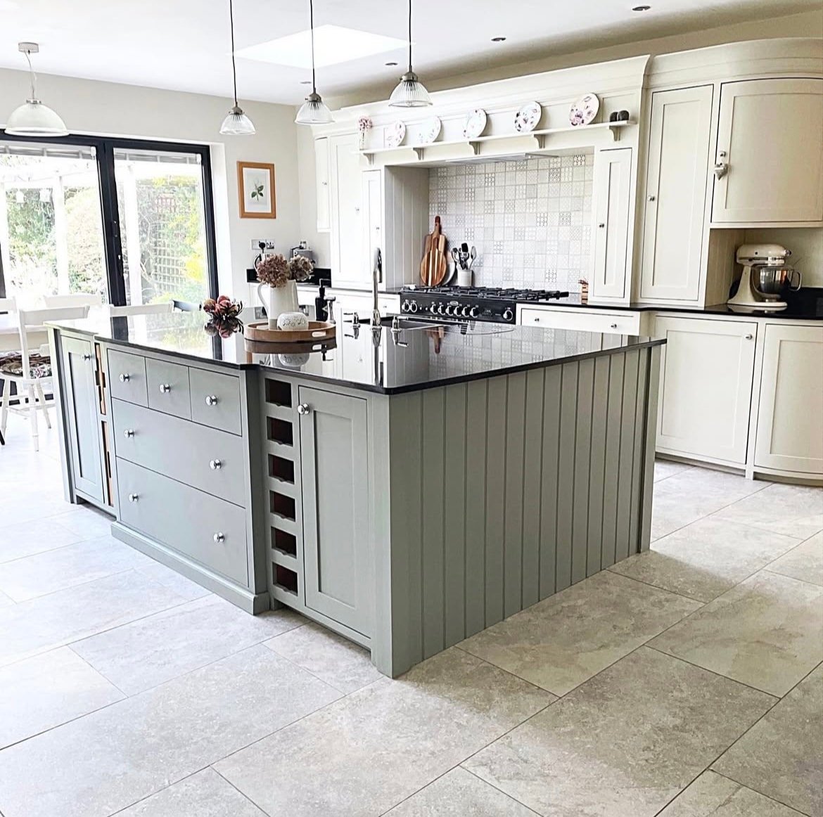
15. Tongue & Groove Panelled Kitchen Island
If a two tonal approach isn’t enough to instigate some interest, adding tongue and groove panelling to a kitchen island is another way to add further interest and detail to your kitchen design.
The panels add instantly verticality as your eyes are naturally drawn up the lengths of the panels. This is something that can be DIY’d onto your kitchen island at a later date relatively easily too.
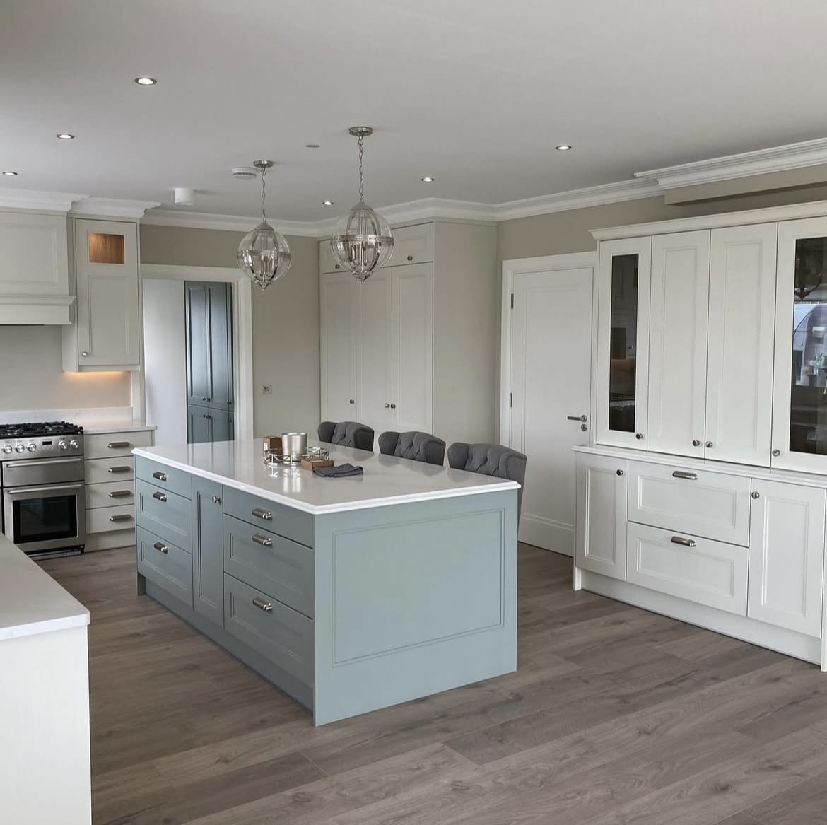
16. Pigeon & Slipper Satin
A beautiful Farrow and Ball kitchen combination is Pigeon on a kitchen island and Slipper Satin on the walls and some of the cabinetry as shown in the kitchen below.
These two paint shades share the same undertone for a naturally workable scheme. This is adaptable enough to work in both super sunny and north facing kitchens.
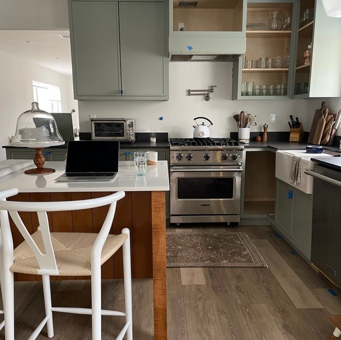
17. Complement With A Wooden Island
Instead of leaning into a two tone kitchen, why not opt for a wooden kitchen island instead. It goes without saying that it perfectly complements the earthy nature of Pigeon whilst defining the overall kitchen design.
Pigeon is one of those unique colours that can sometimes read like a blue or a muted sage green, depending on the light that the colour is perceived in.
So, I definitely recommend grabbing a tester pot of Pigeon before committing to ensure you like how the shade reacts to the light in your own kitchen.