We are starting to see a subtle shift with neutrals into crowd pleasers that have a metamorphic quality to them. Warm neutrals have typically had very classic undertones to them, yellow, red, pink or green – take your pick.
But we’re seeing a new wave of paint colours that share both warm and cool undertones that make them perfectly adaptable to all light conditions.
Like them or hate them, neutrals bring a timeless appeal to a home and will please the darkest of spaces. I enlisted the help of a handful of industry experts in the space to share their predictions, and what neutral paint colours they’re already starting to see take off with 2026 in their sights.
The Neutral Paint Colours Everyone Will Want in 2026 – What’s Trending
Each year we see a gradual move towards differing tones of neutrals, in the last few years we have seen this transition from greys, to greiges to beiges. But in 2025, richer, warmer neutrals were on the rise, especially those with a taupe like quality or those with a brown undertone.
As we head towards 2026, warmer, richer tones are still the thing, but we’re seeing this evolution into light adapting neutrals, more earthier grounding neutrals and more of an inclusion of greens.
Browns Are Staying
Fawny-tawny tones of browns offer a richer appeal to beiges, they’re grounding in a colour scheme and tap into earthy interiors perfectly.
Courtney Batten, Interior Designer at Paige Studio specialises in renovations and new construction homes, “I’m definitely seeing a shift toward warmer tones across the board, especially browns. I love Sherwin Williams “Sealskin” for a deep brown that feels rich without going muddy. It’s the perfect brown for those color-drenched, cocoon-like rooms that are having a major moment right now”, says Courtney.
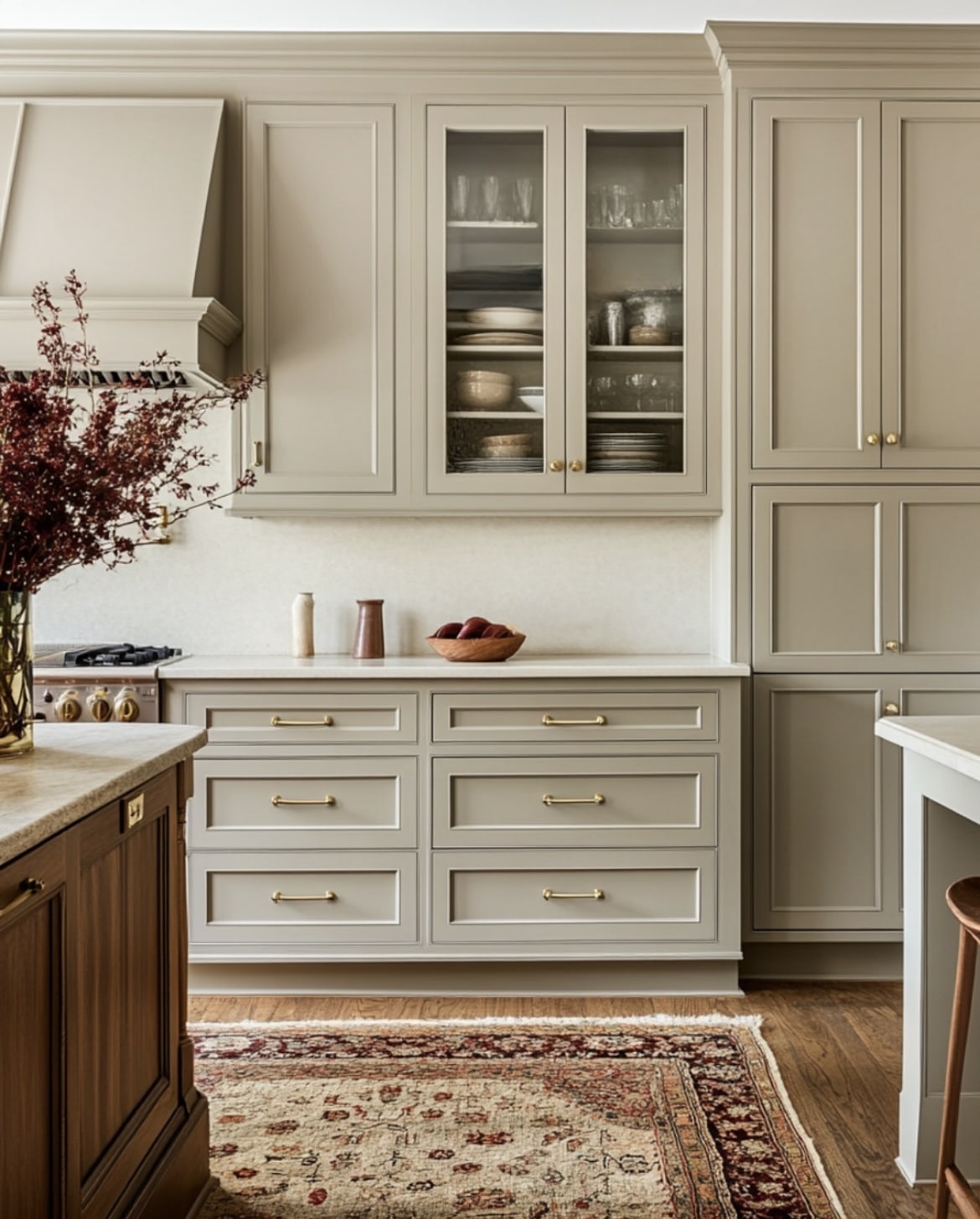
Mouse’s Back by Farrow and Ball is another alternative, a quiet grey brown which is classic and feels soft in both large and small rooms. It looks particularly sumptuous when paired with a warmer neutral such as Setting Plaster in the below picture.
If you’re looking to create a cosy and indulgent scheme, this type of neutral will keep you bang-on-trend as we head into 2026, and they work beautifully with soft neutrals, or punchier shades such as red.
Warm & Cool Undertones
We’re no longer seeing cookie cutter neutrals that are either suited to a dark or light room.
Working in the industry, I have been seeing more paint colours come onto the market that share both types of undertones, and the result are light adapting neutrals that have a clever metamorphic quality to them.
If you’ve tested neutral paint colours and either found them too yellow, too red or too cool, this is the middle ground of neutrals that will completely change the outlook of your space.
Amateur Ceramics by COAT is a perfect example here, an organic, grounding plaster-off white which has both red undertones and grey notes that create a more subtle, sophisticated neutral.
I’m also a huge fan of Farrow and Ball’s traditional neutrals that have a grey-green complex, Off-White and Old White are two of my favourites. They’re so adaptable and tap into the grey, greens we’re also seeing much more of…
The Elevated Return of The Greige
Don’t let the overuse of grey put you off these new, elevated greige shades that will be ever popular throughout interiors in 2026.
The need for soothing, grounding spaces rises, and tapping into the earthy design trend helps to fuel these greige shades.
Bar Zakheim, CEO of Better Place Design and Build agreed, “One neutral color we’re getting a lot of demand for is Gray Green, and similar tones. This adds a hint of tropicality to our designs, which really suits the area (I’m based in San Diego) and the Spanish-style exteriors of many of the homes we work on”.
So, what is it about greens? Sage greens alone have had a huge moment in our interiors over the last few years, and reaching for these shades as a neutral feels like a natural next step. Green sits in the middle of the colour spectrum and is virtually the easiest colour on the eye, it’s soft, soothing, yet greiges make a colour scheme that little bit more versatile.
Emily, the Director of Operations & Marketing at Proximity Plumbing, added, “Neutral colors are steering away from those quite cool and weird whites we’ve had in the past three years and warmed up to a much earthier palette”.
“Greyed-down greens and beiges, (say a bit of brown or terracotta) are also popular. These tones make the interior down-to-earth yet not too excessive. In the event you wish a neutral colouration with a sort of relaxation, however a little more attention-seeking, then softer tans such as the gentle green hint of Grey Dove, a Taubmans paint, are coming into style”.
My favourite greige is currently Cargo by COAT – I have this on all my woodwork in my hallway and it offers the most grounding, yet delicate balance against a softer neutral on the walls. Farrow and Ball Old White is fairly similar in tone.

Reimagined Beige Hues
‘Beige’ has received a bit of a rap following the foosteps of grey, but it’s still a versatile and popular neutral for adding warmth to a cold interior. But we are seeing it with different undertones for a more unique feel in a space as we head into next year.
Angie Kreller, Interior Designer at Yabby, said, “I’m already seeing a shift this year toward more earthy undertoned neutrals, and I think this is going to get more popular in 2026. Think of your classic beige, but instead, with a hint of pink. This is great for minimalist designs, or even just to use in spaces like bedrooms or studies”.
“When it comes to undertones particularly, I think we are going to see hues like caramel and blush get more popular. While there will still be space for cooler neutrals in the home, we are going to see less icey hues and more that are warmer in tone”.
Regarding brands, Angie said that Sherwin-Williams never misses it with their shades, and despite a grey undertone, Accessible Beige is a great choice as it gives the appearance of caramel and looks so beautiful when used to create a warm atmosphere.
Weekender by COAT has a similar caramel, biscuity feel and Joa’s White is a true classic with red undertones for the most warming, comforting shade that has a sandy appearance to it.
White’s Aren’t Going Anywhere!
There is still very much a place for the right shade of white in an interior. It has the ability to lift and freshen a space, but leaning into the right type of white will help position your interior in line with the trends.
“White still reigns, but I’m finding that we’re leaving behind those bright, museum whites in favor of creamy, warm whites that feel softer and more welcoming. Alabaster and Greek Villa from Sherwin Williams are two of my go to’s, they stay fresh and clean but bring just enough warmth to avoid that sterile look”, says Courtney.
Angelique added, “I think colors like these are going to continue to rise in popularity. Not only are they timeless, but they can easily evolve with decor trends, and pair with almost any color. As well as this, they can be used in almost any room!”.
There’s no shade where white is considered in interior design, and it’s totally dependent on how you want your space to feel, and of course, what light your rooms receive.
White Dove by Benjamin Moore continues to be one of their most popular neutrals in their collection, with Wimborne White by Farrow and Ball a true classic. It carries soft yellow undertones which makes it perfect for adding a warm, creamy touch to a cool room.
Neutrals are not boring, and they continue to be versatile shades to reach for no matter the interior. Emily agreed and said, “These are not basic backdrops by any means these shades make rooms look warm and inviting and put one in a relaxed state”.
“They are particularly useable in larger areas or open rooms where a bit of heat can ease up the atmosphere. I have noticed that the warm greys which are colored either with pink or yellow tendencies are gaining popularity as they are super versatile and compliment all textures and materials”.
There’s no denying that these smart and sophisticated neutrals are much better catered to our interiors today, they’re versatile, warm and will ground any scheme you have in mind.
What do you think of these new and improved neutrals?