Warm, elevated neutrals are very much bang on-trend as we head towards 2026, and no one does them better than Farrow and Ball.
I’ve used a lot of paint brands in my own projects and Farrow and Ball are ones that I consistently come back to. They’re highly pigmented and I love the way that many of their colours carry a metamorphic quality with them, appearing like a different colour depending on the light the room is receiving at the time.
If you’re looking for the ideal neutral paint colour for your next interior project, I’ve rounded up some of their trending colours right now in real homes, how to style them and what rooms they’re best for.
19 Trending Farrow and Ball Neutral Colours In Real Homes
1.Oxford Stone
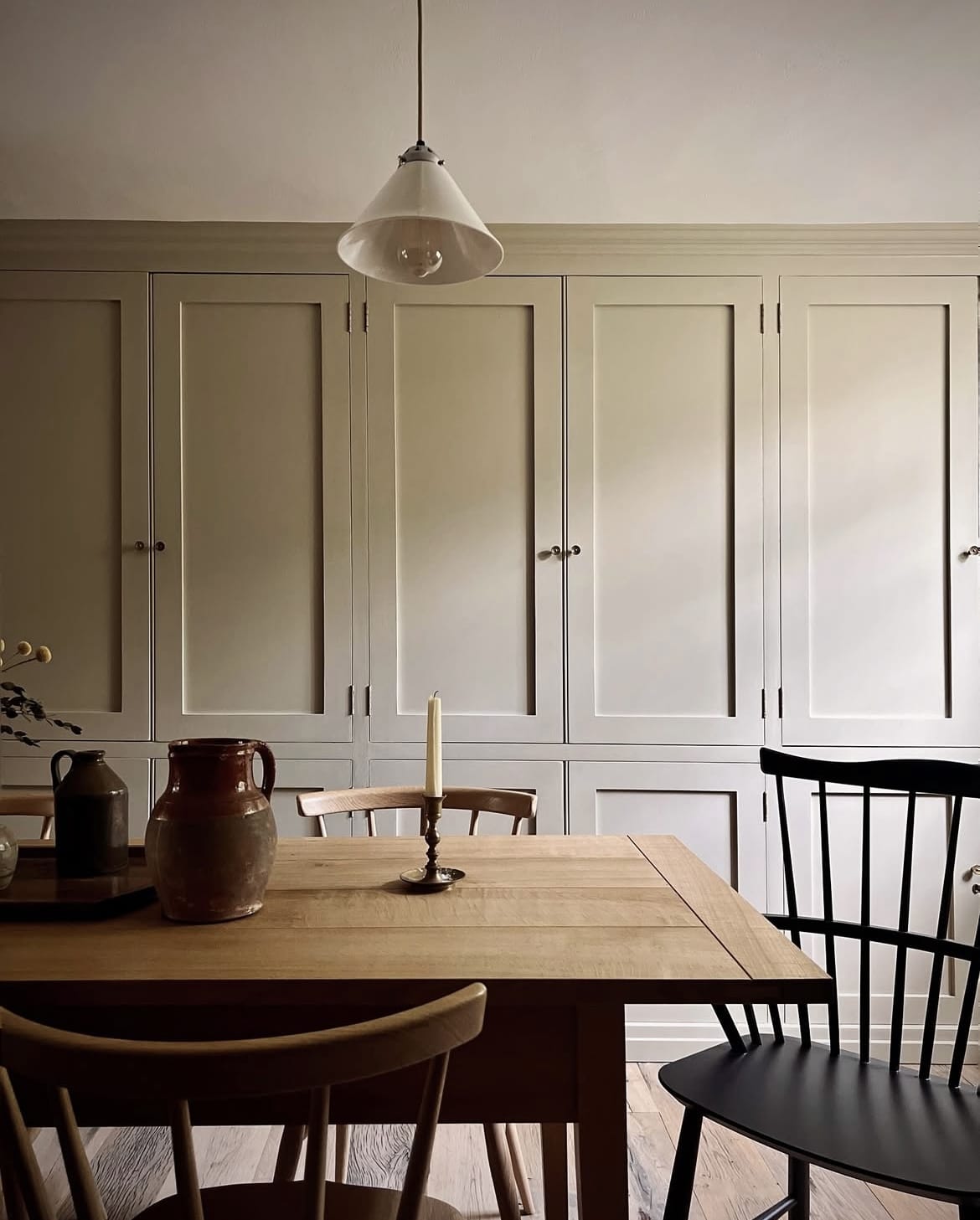
This sandy, mushroom toned neutral is one of my favourites, having used it in my own very dark north facing bedroom. It has a red undertone to it which makes it a preferable choice if you don’t like the yellowness that can come with some warm neutrals.
Oxford Stone looks like a warm sandy beige and sometimes a mushroom and taupe, depending on the time of the day, and the amount of light the room is receiving.
Lean into the undertone of this shade and use warm red, rusty tones in textiles and accessories to make the shade feel warmer. Alternatively, position is as a base in an earthy colour scheme, build with other earthy tones such as browns, greens, reds and creams.
2. Wimborne White
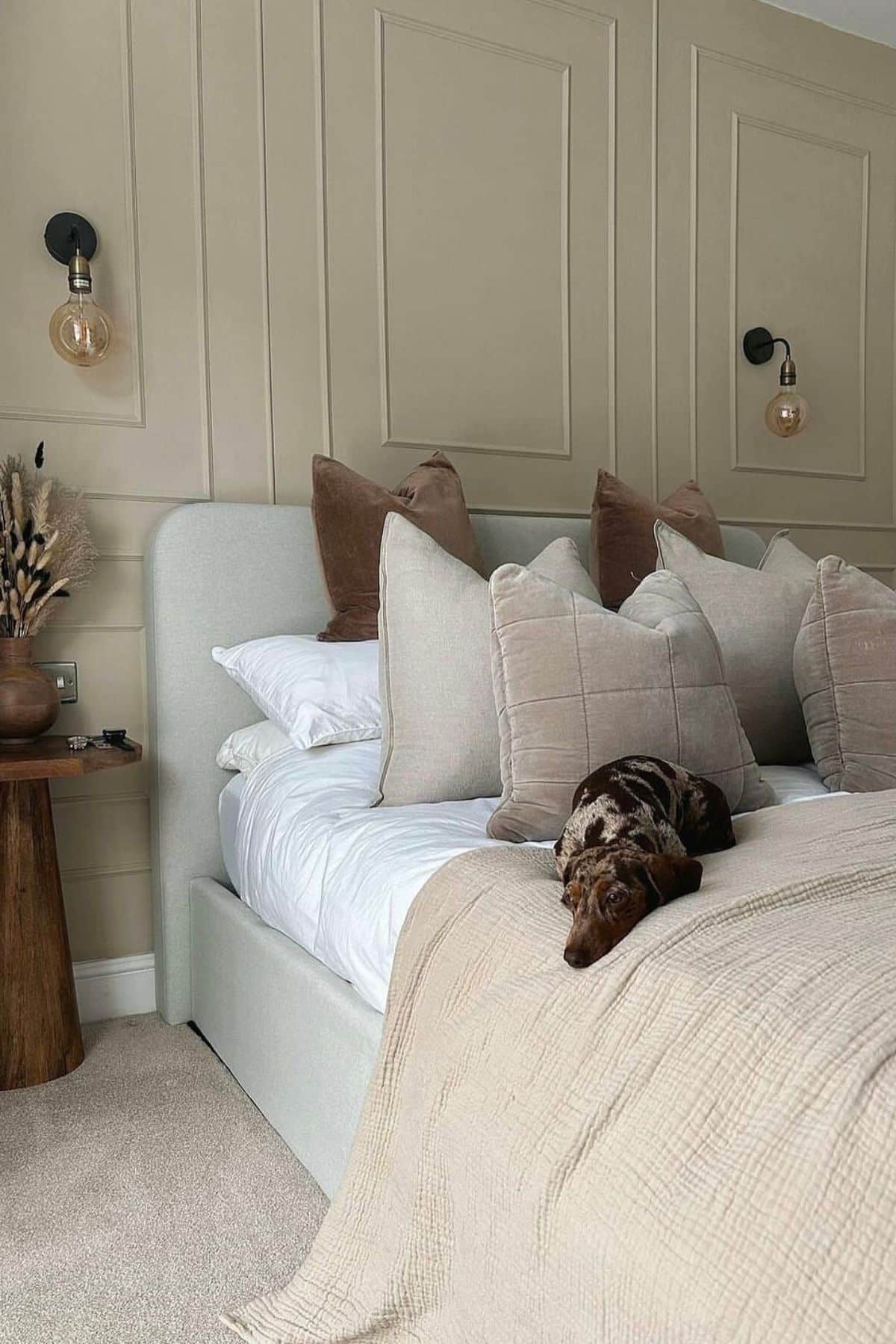
If you’re looking for a much brighter aesthetic, steer clear of a standard bright white and instead lean into a colour such as Wimborne White. This colour is only a shade away from a pure white but has a yellow pigment to it which makes it a warm off-white that is versatile enough for any room, no matter the orientation.
It can appear more yellow in certain lighting conditions, and when positioned against other yellow shades. The below hallway space has Shadow White on the woodwork for a trendy, stylish combination.
I choose my skirting vs walls colours in a very similar way, I always lean into something a couple of shades darker on woodwork so you get a beautiful definition that grounds the space.
3. Scallop
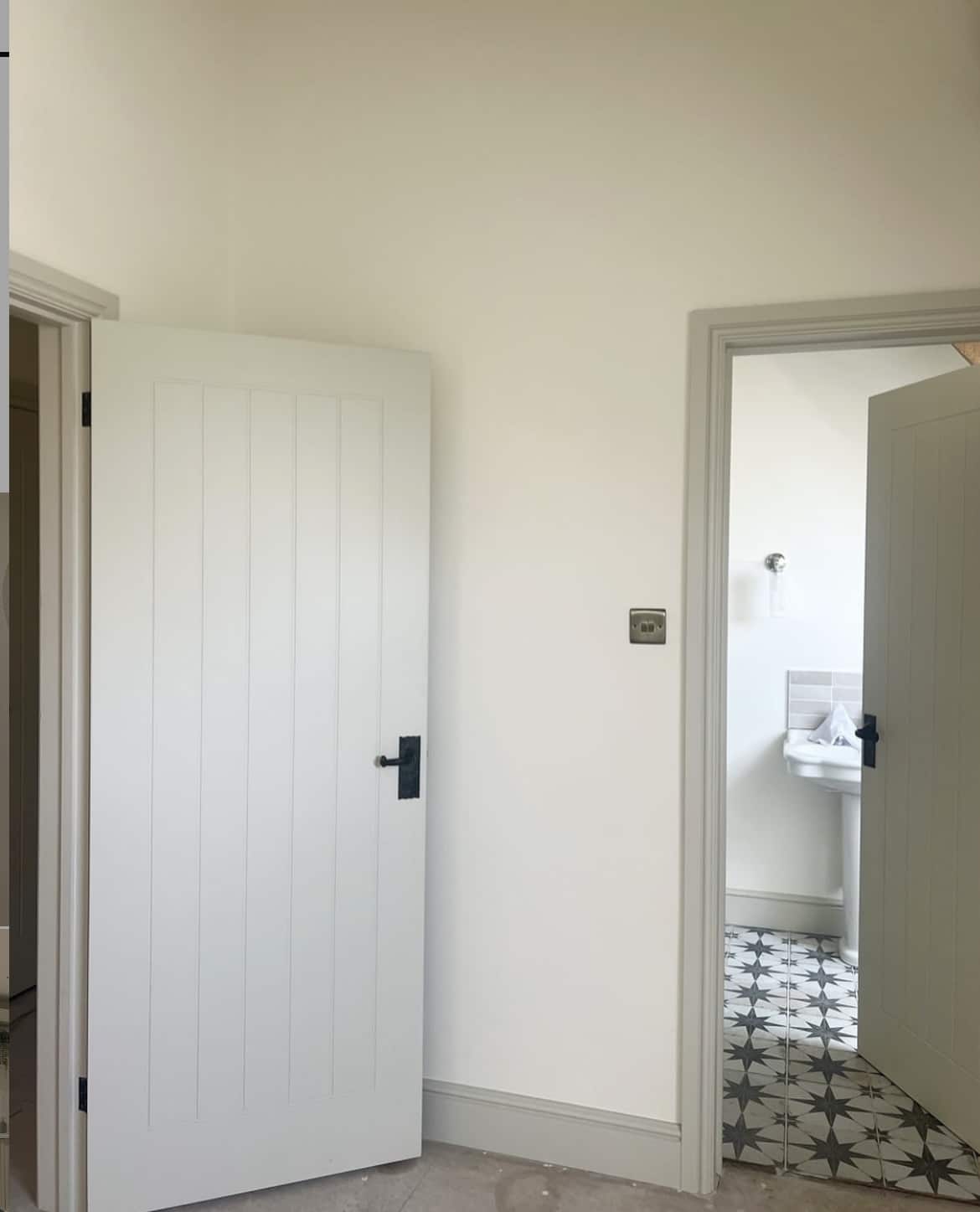
This delicate pink is one of the newest shades that joined Farrow and Ball this year. A warm neutral that offers a little bit more than a standard off-white.
Carrying a delicate warm, pink undertone, this shade is a beautiful antidote to a very dark or north facing room. It works surprisingly well as a base in an earthy colour scheme, and if you like the look of dried plaster walls, this one ticks all the boxes.
A match made in heaven for pairing with green and black tones, or why not add in some punchy tones of pink or red to bring out the best in this paint colour.
4. Lime White
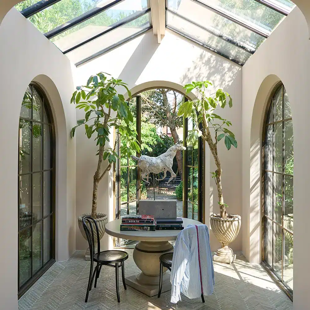
This chalky off-white carries a small green pigment, a versatile neutral that’s not too warm or cold so it’s adaptable no matter the lighting conditions.
If you’re wanting to create an earthy or sophisticated design, or perhaps you want to feature darker green tones such as with kitchen cabinetry or a bed frame, lean into a neutral such as this as positioned next to green tones and it will make the paint colour appear greener.
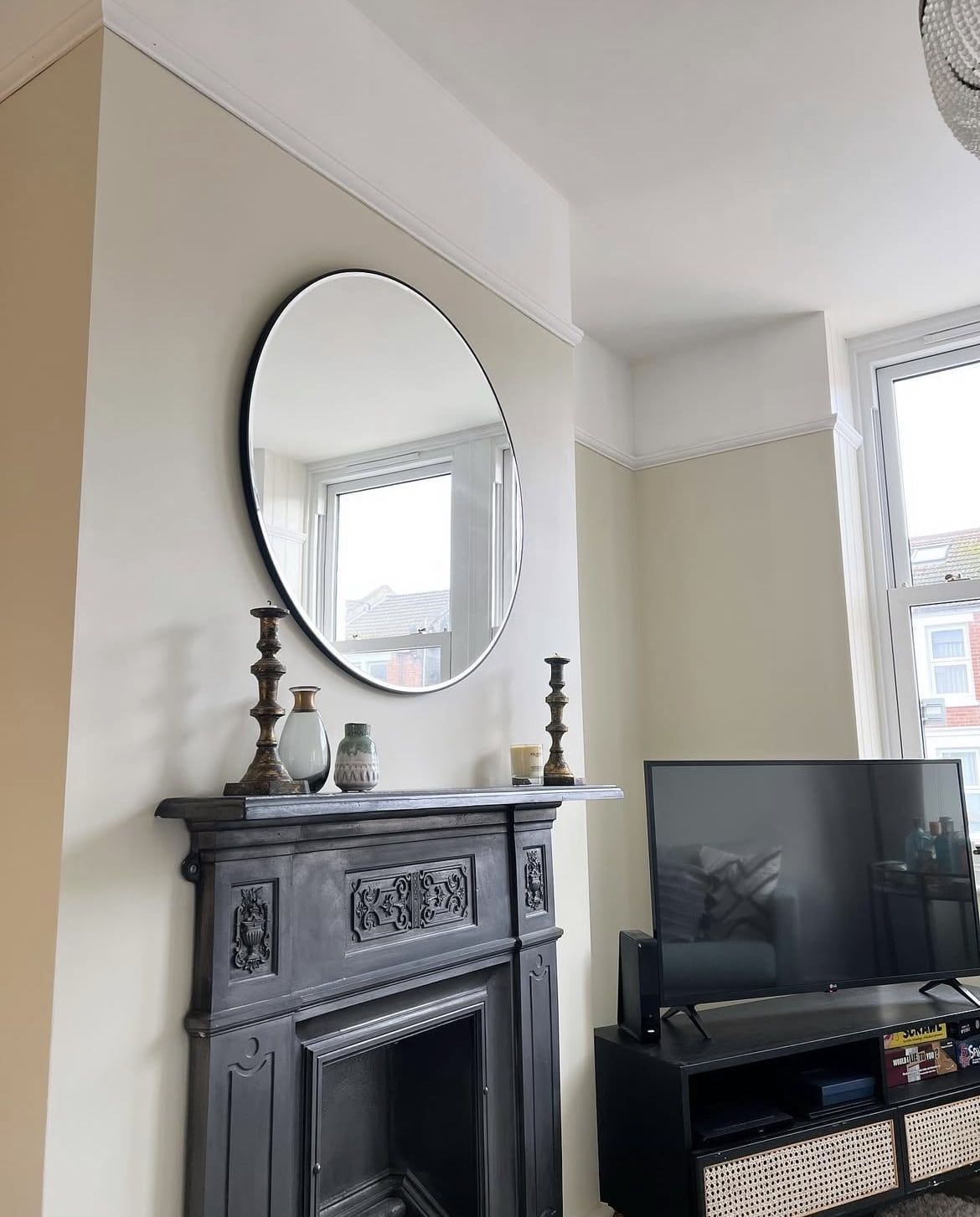
5. School House White
Enduringly popular, School House White might just be one of Farrow and Ball’s most popular neutral, and there’s something totally timeless about this shade which works in just about any design scheme.
It’s one of the softest off-whites with no cool undertones to it, so if you want to create a warm, welcoming colour scheme without using a pure white, this no nonsense white will deliver elegance and a touch of sophistication.
The beauty of a neutral like this is that it pairs well with virtually any colour. I adore it positioned against a red, like shown in the bathroom below. You have the option to pair with bolder colours like this for a high impact, or pair with darker more defining neutrals for a stylish, relaxed look.
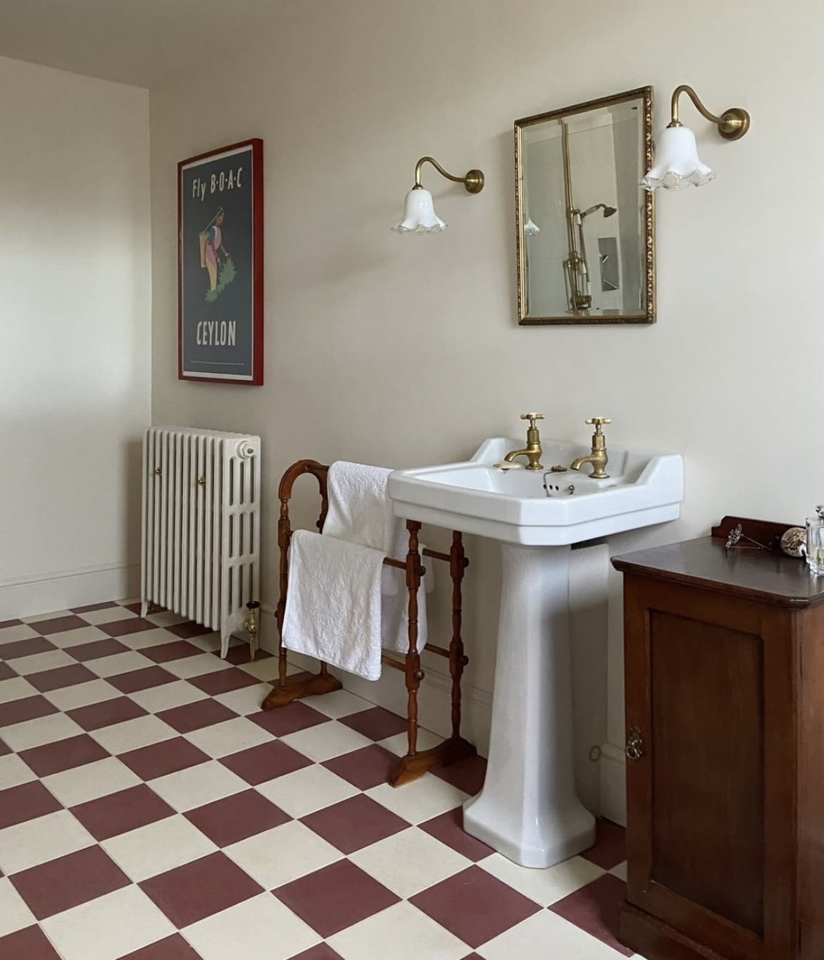
6. Mouse’s Back
Brown paint colours continue to be on the rise, bringing rich depth, decadence and a cosy base for bedrooms and living rooms.
If you have a particularly dark or north facing room, you may also want to lean into the darkness, this creates a much cosier, more intimate feel. Ideal for cinema rooms, nooks and living rooms.
Pair with warmer, lighter neutrals to create a layered scheme throughout. You may also choose the paint the ceiling in a lighter off-white to create a soft balance between the two.
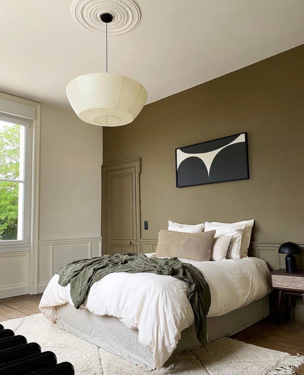
7. Elephant’s Breath
The pre 2020’s were very much about grey washing interiors, and grey interiors have since become very dated. But Farrow and Ball have a tendency to create timeless neutrals that work well regardless to whether you’re painting the walls today, or in 2 years time.
Elephant’s Breath is one of those that’s stood the test of time. I tend to only lean into grey shades in very sunny rooms which receive a lot of light, cooler tones help to temper the intensity of the sun creating a much more comfortable and subtle finished colour scheme.
To breathe some more colour into your room, lean into a few bolder pops of accent colour on furniture or textiles to create a warmer scheme.
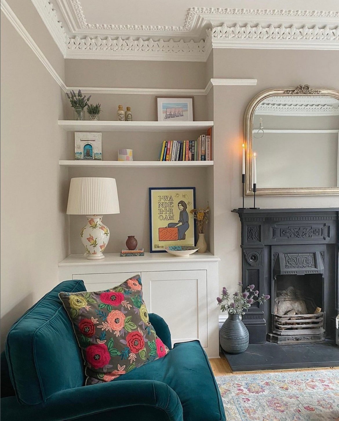
8. French Gray
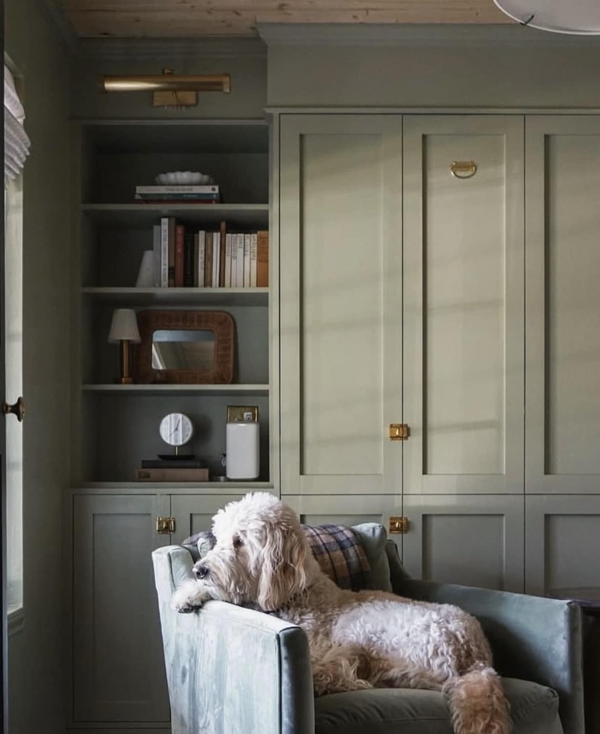
Not really a green but also not really a grey, this light adapting colour is a really unique and special one.
Actually perfect for both dark and light rooms, I love the concept of colour drenching with this earthy neutral. Saturate the entire room in it for a more intimate, cocooning feel – this includes the walls, ceiling, woodwork and even radiators!
The beauty of a comfortable green such as French Gray is it literally works with any colour, but it’s a great basis for an earthy interior which feels good to be around.
9. Slipper Satin
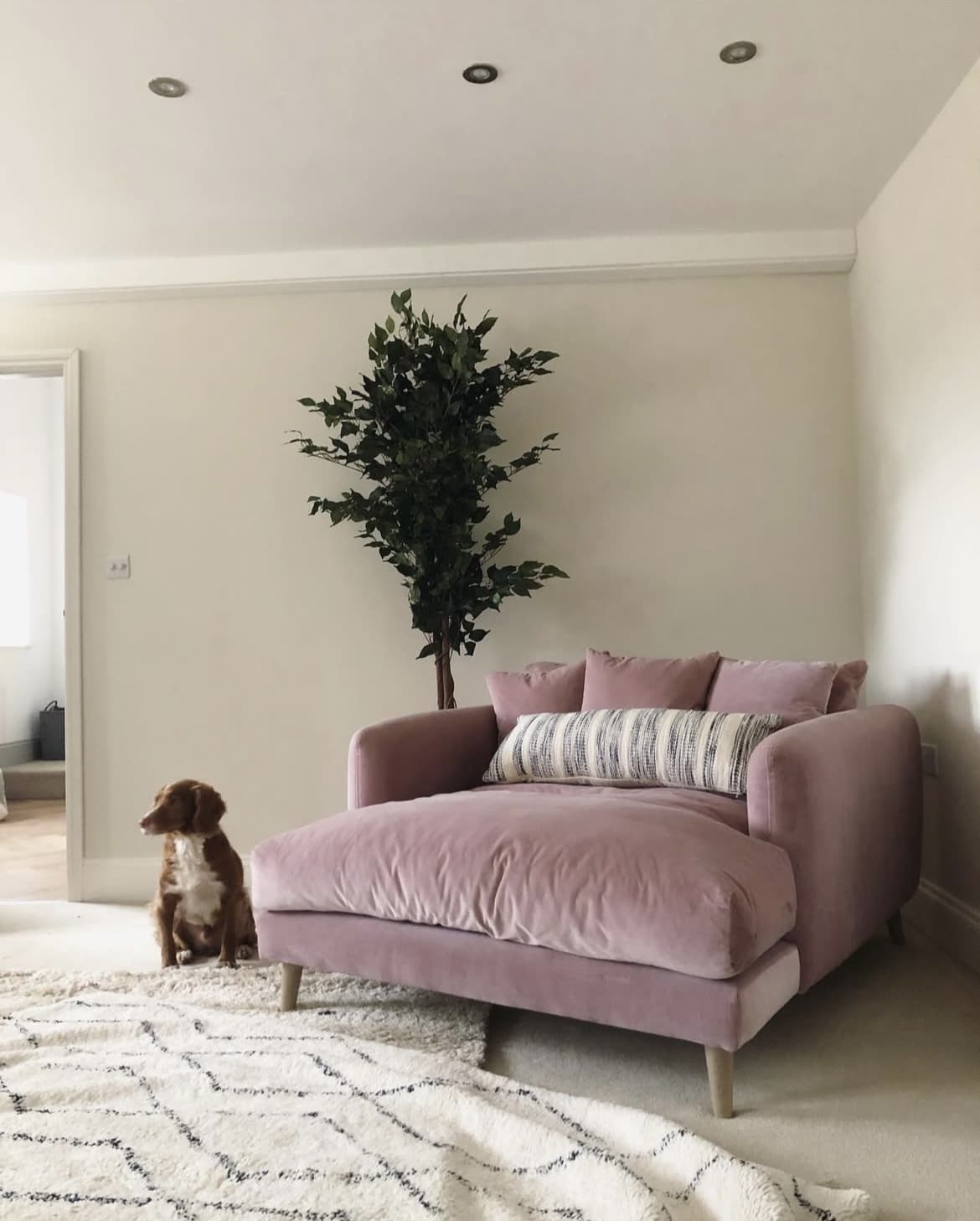
This chalky off-white is subtle, understated and completely elevated. Forget a bog standard beige, this is the trendy way to start off a neutral colour scheme that works in any room.
Choose to stick with an all neutral colour palette, or opt for statement making shades as an accent colour. Considered pink? Take a look at how gorgeous this pink velvet chair looks in the living room space below.
Particularly effective in a colour drenched approach, or think about using a slightly darker shade on the woodwork such as old-white for a really defined colour scheme to build on.
10. Dimity
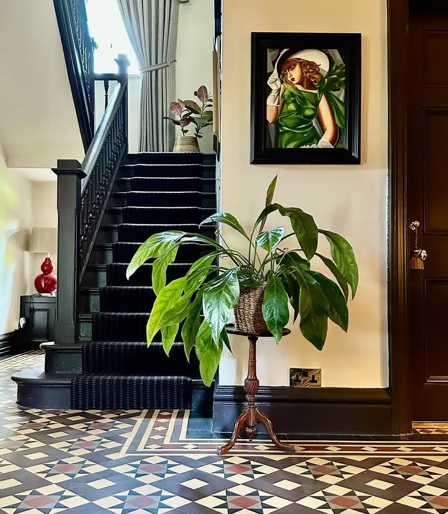
Another warm neutral which has a slight yellow pigment to it, this is a wonderful shade to lean into if you have a very dark hallway with limited natural light as it will counteract any of the blueness associated with the cold light the space receives.
Instead of teaming with a black, consider using a shade such as Tanner’s Brown which has been used in this hallway. It brings a lovely definition, is traditional, yet not as overpowering as using black throughout as an accent colour.
11. Joa’s White
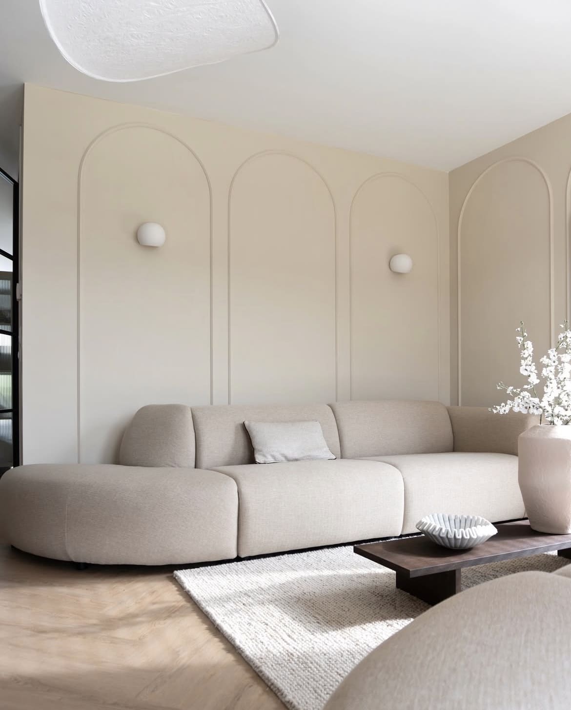
A light and clean taupe shade with just a smidge of a black pigment to ground the colour. It’s uplifting, fresh and a lighter alternative to Oxford Stone which is part of the same colour family.
There’s so many options for how you wish to integrate this colour into your scheme, keep things feeling contemporary by positioning with whites and understated neutrals, or pivot by using bolder shades to bring character and impact into the overall look.
12. Cord
Yellow neutrals have had a bit of a moment this year as ‘butter yellow’ started trending from spring onwards, a soft, subtle and uplifting neutral that really does pair well with any colour.
Cord is a lovely choice, it’s soft and buttery without feeling like a bog standard Magnolia shade. Make it feel even fresher by pairing with All White on the ceiling and woodwork.
For a traditional feel, introduce some vintage, wooden furniture and accessories which will naturally ground this colour scheme.
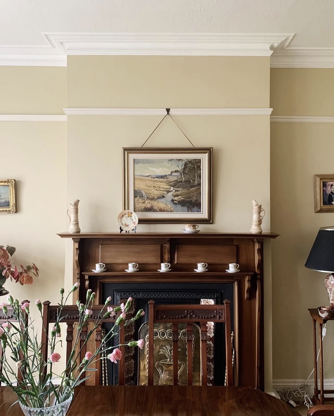
13. Dead Salmon
This might be one of my favourite pinks in Farrow and Ball’s collection. It has a magical quality to it, appearing like a warm mushroom and pink, depending on the light it’s perceived in.
There’s a bit of a misconception that pinks can be difficult to work with, but quite the contrary as they will fit perfectly into almost any colour scheme.
Greens, yellows, creams, whites, greys and even blues work in harmony with a pink like Dead Salmon. It’s got a slightly darker, earthier hue to it than the much beloved shade, Setting Plaster.
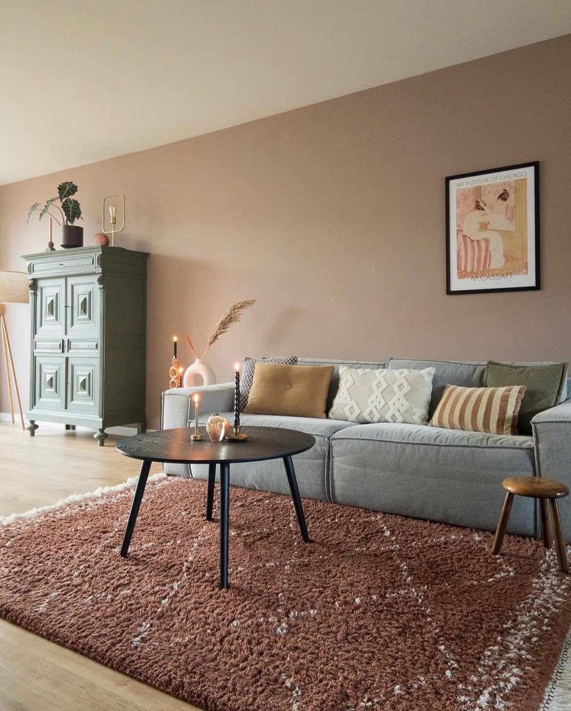
14. Old White
A darker neutral than Lime White, but still carrying those green undertones without feeling cool. This really is a timeless classic that acts beautifully as a cabinetry colour, wall colour or even just for use on woodwork with a slightly cooler off-white on the walls.
Earthy interior design has been one of the hottest trends of this year, and there’s no signs of it easing off. It’s a colour palette that feels good to be within.
Pair Old White with other colours that we can draw from nature, this includes greens, creams, browns, reds, and even blues for more of a coastal influence.

15. Ammonite
This understated grey is subtle without feeling too cool, although more suited to warmer spaces, it can still be versatile enough to be used in a north facing room.
For a fresher, almost coastal inspired look, use a bright white such as All White on the ceiling and woodwork to lift the rest of the room.
The living room below has been beautifully styled by Jade, introduce warmer neutrals, wooden elements and black accents to ground the scheme.
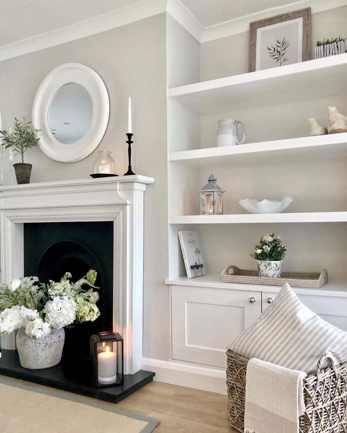
16. Stony Ground
A classic stone colour, this warm neutral is beautiful in cottage style interiors, traditional homes or even contemporary spaces that are looking for an elevated beige.
There’s nothing boring about a beige such as this, but just be mindful of the types of shades that you pair with it to enhance its natural colour.
More darker, defined neutrals look best to avoid a scheme feeling wishy washy,
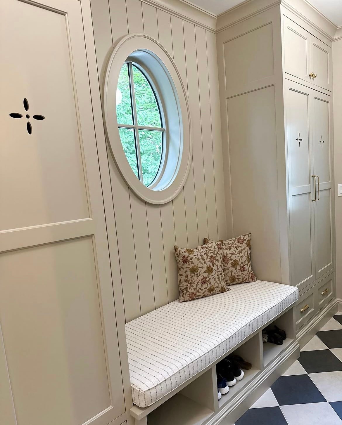
17. Eddy
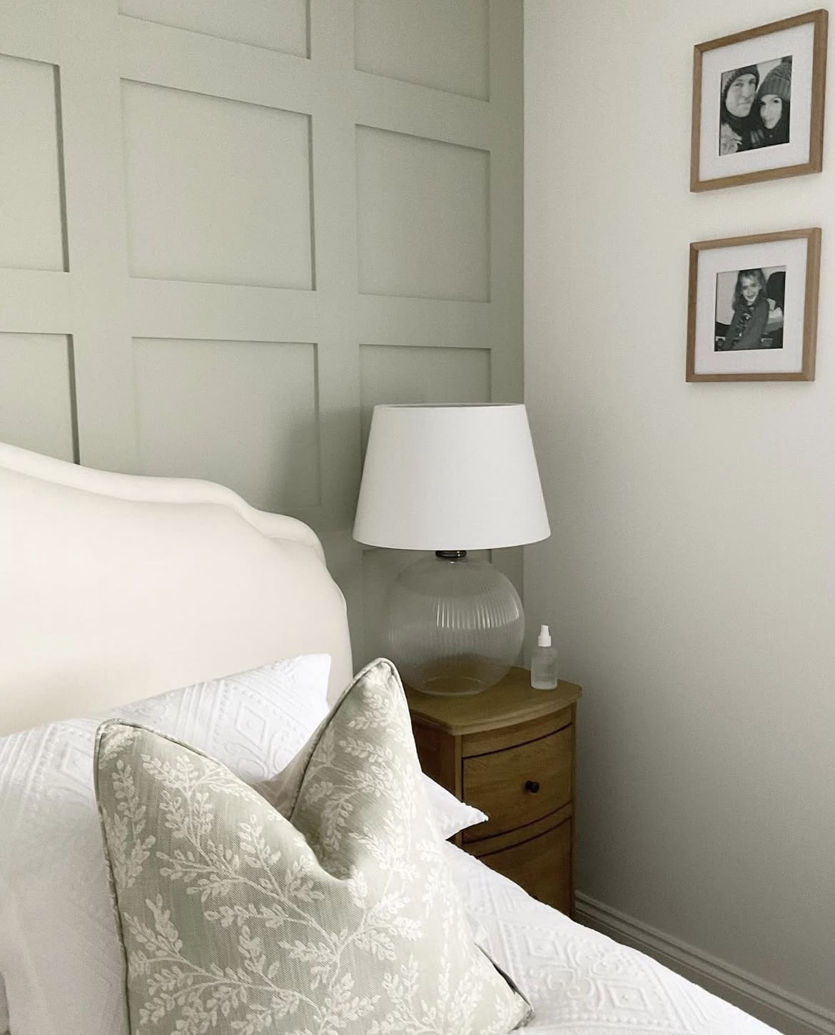
The right shade of green is versatile enough to be classed as a neutral. Eddy is one of the softest, muted shades of green and sitting slap bang in the middle of the colour spectrum, it makes it one of the easiest on the eyes.
Use as an accent wall or use it all across your walls for a soothing, cocooning feel. This green works virtually well in any type of room, it’s neither too warm or too cool, and a great alternative to a standard beige shade that is uplifting and fresh.
18. Matchstick
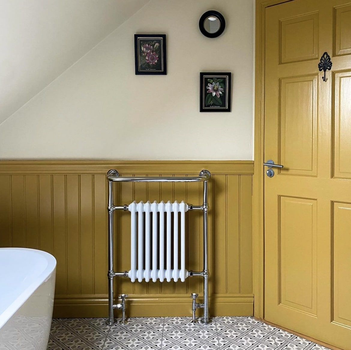
Matchstick is another yellow toned off-white that is warm enough on its own in a dark room, or take it one step further and pair with a bolder shade of yellow such as Babouche for a really fun colour scheme.
Pairing with another yellow tone will make Matchstick appear more yellow in tone. Try Farrow’s Cream if you prefer something a little bit softer.
19. Purbeck Stone
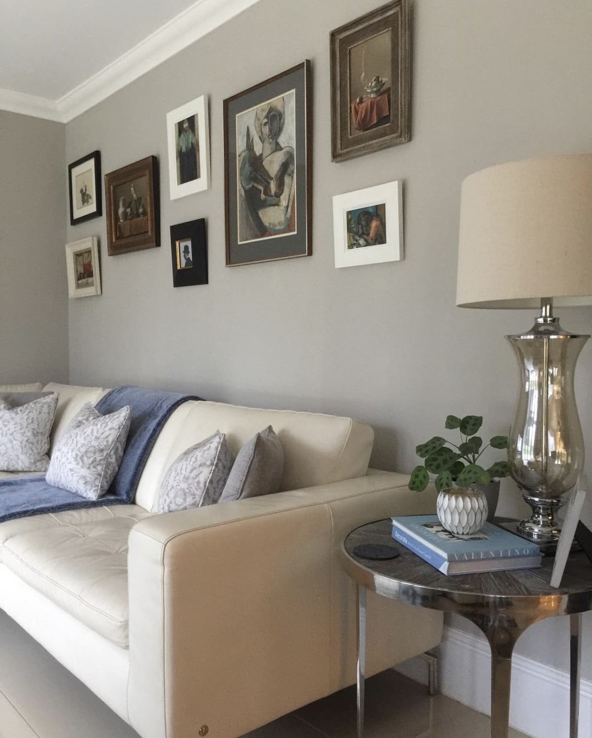
Another popular grey shade is Purbeck Stone, an understated and relaxed paint colour that is easy to live with no matter the direction of light the room receives.
It works in harmony with pretty much any colour which is what makes it both so lovable, and fun to work with in any room.
If you’ve got any questions about pairing particular shades or are looking for any more advice, please leave me a comment below!
@sleekchicinteriors 5 of my favourite @Farrow & Ball neutral paint colours that will suit any room, no matter the orientation! Scallop paint images via @vincent_the_house beautiful home ✨ #farrowandball #neutralpaintcolors #neutralpaint #paintcolours ♬ original sound – Nicole | Interior Design

Hi Nicole,
I’ve been reading your comments about F&B neutral colours and would really appreciate your advice.
I’m due to have my hall, stairs and landing painted in a few weeks’ time. I’ve been trying to decide on a colour, but have become very indecisive and, borderline manic about what colour to choose!
I live in a semi detached late 1920s house. The hallway faces east and doesn’t get much light as the day progresses (particularly at the end of the hallway).
The stairs continue up to a loft conversion.
It hasn’t been painted for 10 years and I think I used Dulux Natural Wicker on the walls and white on the woodwork.
The rest of the house is painted in F&B Joa’s White & Dimity in the kitchen/dining area, Dulux Egyptian Cotton in the living room and bedrooms.
I would like a change from Egyptian Cotton and I’m considering using Joa’s White again, Slipper Satin or Dimity.
There’s a dado rail on the walls in the hall that also continues up the stairs.
We’re having a new floor in the hallway, but we’re keeping the carpet going up the stairs, this is a sandy colour.
I would prefer the woodwork to be white.
Do you think the colours I like would look ok? I do like Slipper Satin, but wonder if it will show up marks as I’ve got teenagers and a dog!
Any advice would be greatly appreciated. If you have any other colours I could try that would also be great.
Many thanks
Sarah
Hi Sarah, thanks for your comment! Dimity and Skimming Stone are both gorgeous, without seeing the light in your space, I would personally say Dimity because it’s just that tiny bit warmer with its red based undertone, whereas skimming stone has a grey/green complex. It’s slightly more expensive, but it’s worth leaning into eggshell on walls in a space like this (from a dog owner!) as easy to clean off and most importantly won’t take the paint with it. I’d paint the dado rail in your wall colour if you’re only using one colour on the walls or else you’ll create a floating band of colour in the middle, leaning into white woodwork would be fine though. My other suggestion, would be to go for 2 colours – one on the dado rail and down onto the skirting, and another up and across the ceiling. Such as Joa’s White on dado rail and down and dimity on the upper half. Just an idea! If you can, grab a tester and paint A4 sheets of paper with them so you can move around the room and see how they look in the darkest areas too. Hope that helps! Nicole x