
Ever swooned over an interior on Instagram, frantically found the name of the paint shade, bought it and then wondered why it looks completely different in your home?
Not only do paint colours look vastly different online and in photos, but the way we perceive them in our home does too, all because of the lighting at play.
I share tons of resources on choosing paint colours based on the orientation of your room for this very reason. Whilst natural light can play havoc with paint colours, so can artificial light, and it’s one that can easily be overlooked.
From bulb colour temperatures to the orientation of spaces, I dispel all myths surrounding lights impact on colour, along with some expert insights from paint brand Tikkurila.
How Lighting Affects Paint Colours – And How to Choose With Confidence
Both artificial lighting and natural lighting should be considered at the time of choosing a paint colour, and this is why I always recommend allowing yourself to sample the paint on an A4 sheet of paper, being able to move it around the space throughout the course of a day so you get a true depiction of how it feels in different lighting conditions.
PLUS, repeating it on both a rainy, dark day and a sunny day as colours will again be perceived in a completely different way.
Natural Lighting
But, perhaps, natural lighting is the most important element at play as it’s something you can’t change as easily as a light bulb.
Tikkurila added, “The primary source of light in any space generally is natural daylight. It behaves quite dynamically depending on the direction the room is facing and is an important consideration when creating a balanced colour scheme“.
You can easily check the orientation of a room by using the compass app on your phone and facing your phone in the direction of the window in that room to get an accurate read. This is the first thing I recommend doing, or ask for when designing a space, because it all comes down to natural light and finding the right type of colours that are going to do your room justice.
South Facing Rooms
Having a south facing room is a good problem to have as virtually any colour works here. However, where sunlight can be very intense at certain times of the day, a cooler toned paint shade will help to create a more calming, soothing space to be within.
Look for paint colours that have blue, grey or green undertones. You can also lean into moodier, more sultry shades depending on the desired ambience you’re looking for, have a look at my Sulking Room Pink downstairs toilet makeover which faces south for an example of this.
“South-facing spaces are bathed in a warmer, bright light throughout the day. Contrasting cooler tones can work wonders, balancing out the warmer light”, added Tikkurila.
A few off white paint shades that tick all the boxes here are Tikkurila Winter V503, Farrow and Ball Wevet and COAT Safe Play.
North Facing Rooms
On the flip side we have north facing rooms which receive very little light, and any light they do receive is typically cold or blue in nature. “Opting for warmer hues in a north-facing space will help counteract the cooler light and offer a cosier vibe“, said Tikkurila.
Choosing the right colour in a north facing room will make the world of difference to how the room feels. Warm undertones are best, so lean into off-whites or colours with a yellow, red or pink undertone. Green undertones can sometimes work well, depending on the type of light the room gets. This is the one orientation of room you simply can’t skip testing paint in!
North facing rooms can feel damp and dreary, so warm welcoming colours will really help here. However, if the role of the room doesn’t require your presence in it throughout the day, such as a cinema room or a living room nook, taking inspiration from darker, moodier colours can also pay dividends. Think sultry pinks, earthy reds, indulgent browns and navy blues.
Tikkurila pointed out that a room’s size and the amount of natural and artificial light it receives fundamentally impact how colours read. “It is vital to consider this, as darker hues, which require ample light to reveal their depth, can otherwise make a poorly lit or smaller space feel closed-in and less inviting”.
The same theory applies to what approach you’re taking with the paint too. Colour drenching a small box room in a warm welcoming colour can create a cosier, more intimate feel, but in a very large room it can end up feeling flat and monotonous.
East & West Facing Rooms
So, what about East and West facing rooms? Whilst it could be said that these rooms get the best of both worlds, the difference in lighting conditions from the morning through to the evening can be troublesome.
But, you can take the lead from what the rooms are used for to help decide the best approach. “East and west-facing rooms experience fleeting warm light during mornings or evenings, making the room’s primary use time a key factor”, said Tikkurila.
If you use the room throughout the entire day, selecting a warmer neutral which has a balance of both warm and cool undertones will help it to be adaptable to lighting conditions throughout the day. We are starting to see much more of a trend of these paint colours coming onto the market now, rather than colours that sit with one primary undertone. Amateur Ceramics by COAT is a beautiful example of this, balancing both red and grey notes for an adaptable shade throughout the day.
Another example could be a west facing living room that’s primarily only used in the evening. Intense sunlight that streams in whilst you’re tuning in to Netflix isn’t ideal, so pairing your room with a cooler undertone or a moodier shade will help to balance the intensity of the sun, and make the room feel more comfortable to sit in.
Artificial Lighting
Leaning into natural lighting is super important but varying temperatures and qualities of light aren’t limited to natural sources.
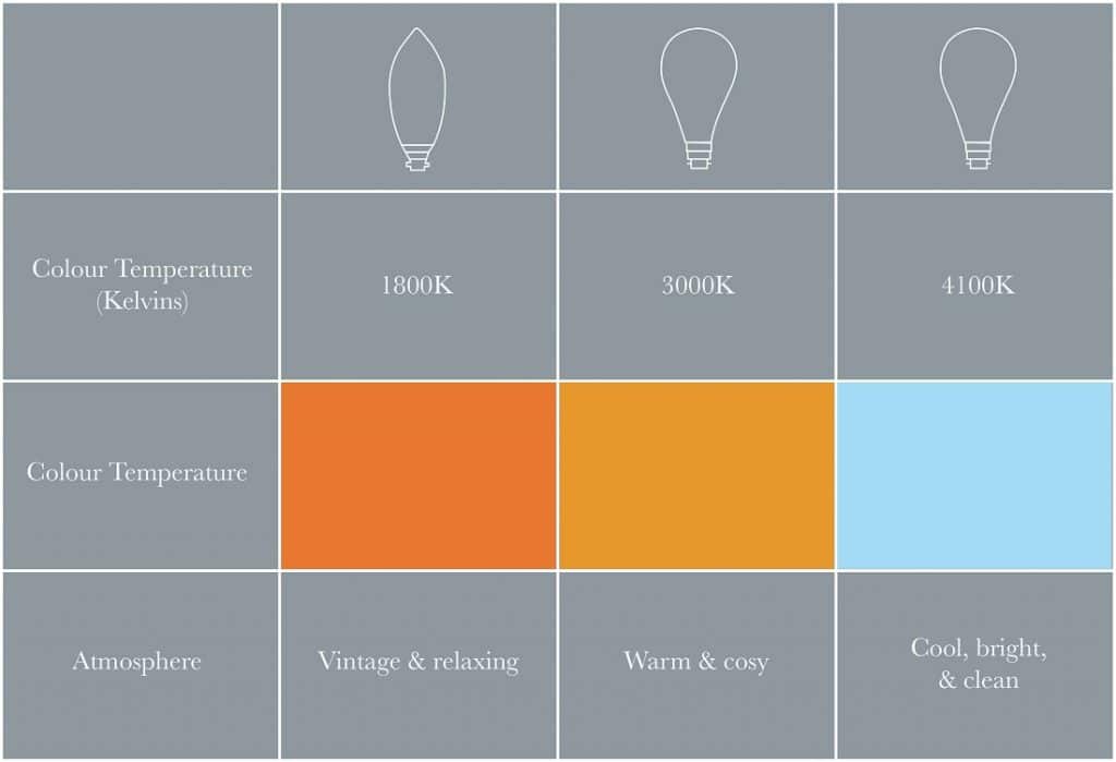
Tikkurila shared how important it is to understand what type of artificial light your’re using to see how this affects the paint colours in your interior. “Artificial lighting also comes in many forms. Common examples include warm white bulbs, which cast a cosy, yellowish light, and daylight bulbs, designed to mimic cooler, neutral natural light. You’ll want to take this into account when selecting your paint colours”.
To get an accurate read on how the paint colours look, be sure to test them and move them around the room when your artificial light is switched on of an evening, or a morning, when it’s required.
The below table is a handy reference guide for choosing the colour temperature of bulbs, just remember they can easily be swapped if you don’t get it right for your space.
Typically higher colour temperatures such as 4000K plus are best for rooms which need precision lighting, such as in home offices or garages.
Actionable Tips For Choosing Paint Colours Based On Lighting
Hopefully you should feel more confident with understanding how light influences paint colour, and which undertones to look for to make your interior feel warm and welcoming, no matter what type of natural light it receives.
Here are some actionable tips to use every time you’re looking, and testing out new paint colours;
- Assess your lighting before choosing potential colours for the room – before committing to paint colours think about the level and direction of natural light it receives, types of artificial light you are using, and size of the space.
- Consider the rooms purpose and mood – Colours are powerful. They can promote relaxation, energise, or even define the entire feeling of a space. Keep this in mind when selecting paint colours. Your intended use and desired atmosphere for a room should heavily influence your choice.
- ALWAYS get a tester pot first! It might sound self explanatory, but so many don’t test paints beforehand and are still surprised when the colour looks different.
- Peel-able paint samples are great as they allow you to easily move them around the space. For conventional tester pots, sample the colour on an A4 sheet of paper instead so you can move it around the room throughout the day as the light changes.
- Give it time! It is important to ensure you are leaving paint samples on your wall for a few days at a time so you really get a feel for them. OR, even longer if you’re waiting for a sunny, or dark and rainy day. Trust me on this one!

If you have any other questions about choosing paint colours for different lighting conditions, please leave me a comment below and I’ll come straight back.
Here are even more paint resources from Sleek-chic Interiors that you might find helpful when choosing paint colours for your interior, happy painting!