There’s nothing quite like the power of paint in transforming an interior, but where to start when there’s 100s of different colours to choose from?
From selecting the right colours that will complement the lighting in your home, to choosing colours that make you feel good, this bumper Dulux post shares over 30 of their most popular paint colours in real homes to give you an idea of how they can look and feel.
Nothing will seal the deal like using a tester in your own home though, but use this post as your first step to nailing down the types of colours you would love to use in your next project!
35 Dulux Paint Colours In Real Homes
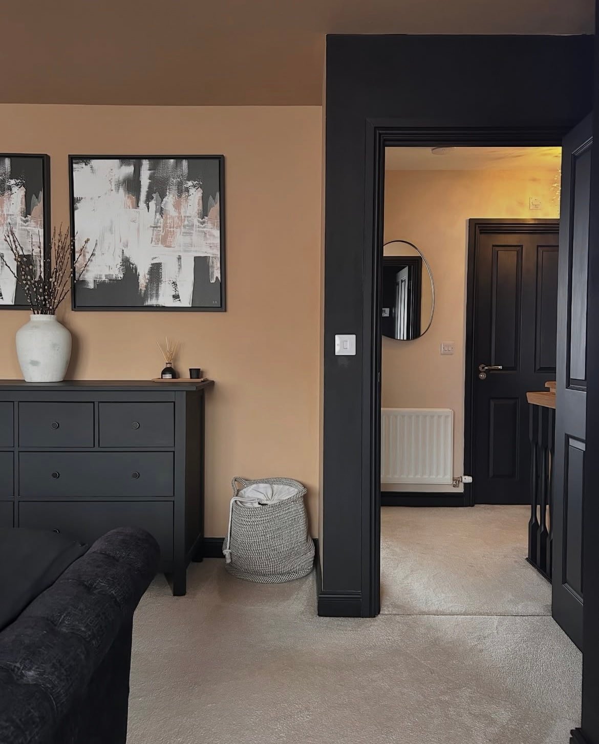
1.Egyptian Cotton
This neutral Dulux shade might just be the most popular neutral colour they’ve ever had. With a yellow undertone, this warm neutral is the perfect antidote to a dark north facing space, but equally works just as well in a sunny, south facing room.
It’s pretty much the perfect colour for any room if you’re looking for something with more warmth and character than a bright white, but you still want to deliver a calm, minimal look to your interior.
I have loads more Egyptian Cotton ideas in living rooms on this post that I would recommend heading over to next for more inspiration.
2. Pressed Petal
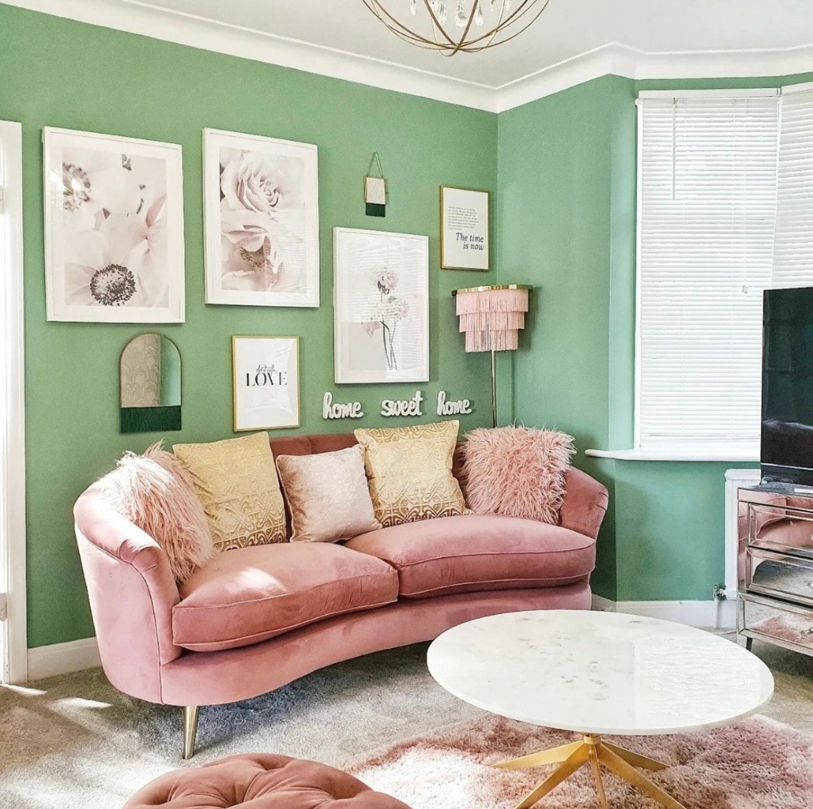
This pretty and pink shade from Dulux is a great dupe for Farrow and Ball Sulking Room Pink. It carries a lovely sultry, moody quality to it which makes it well suited to particularly sunny rooms as it tempers the intensity of the sun, delivering a beautiful balance.
Why not go all in and colour drench the entire room in it as shown below for a high impact look. Not sure what colours to pair with it? Green is always a fab complementary colour for pink as it sits opposite it on the colour wheel.
3. Timeless
A neutral that is slightly less yellow toned that Egyptian Cotton is Timeless. This is such a great all rounder off-white and works well in most lighting conditions.
See how subtle it looks next to the bright white on the skirting boards. If you want something with a little more definition, I recommend leaning into a shade such as Pebble Shore on the woodwork against Timeless on the walls which will ground the room, and bring some lovely definition to the space.
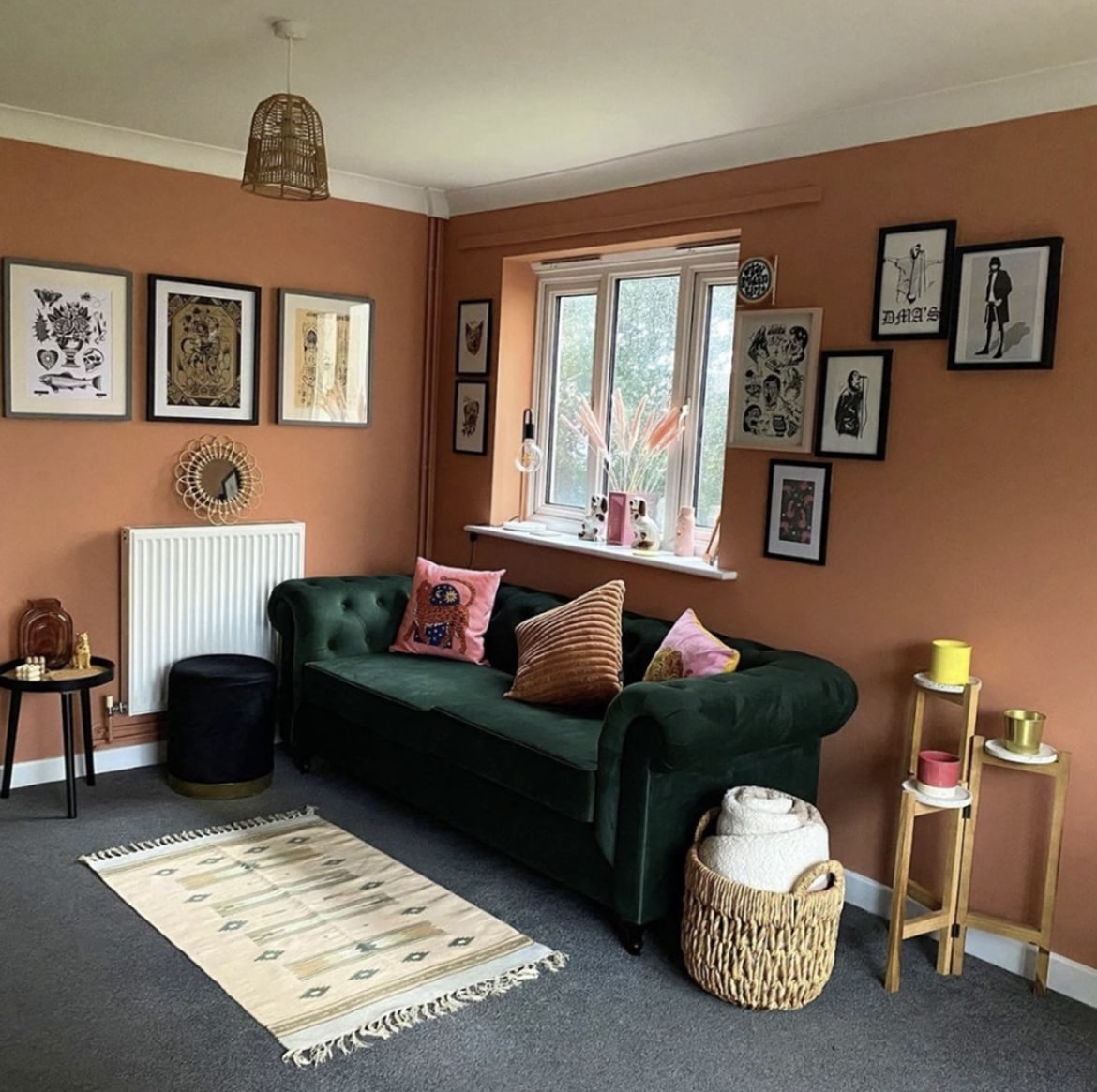
4. Copper Blush
2026 paint trends all embrace earthier, more grounding colours, and where better to start than with a feel good terracotta.
Copper Blush is bold, but grounding in the most perfect way. Surprisingly, it pairs well with literally any colour. But taking inspiration from the nature around us is the best way to see what colours will pair with a terracotta like this. Think browns, greens, creams, whites, reds and of course, natural accents such as wood and rattan.
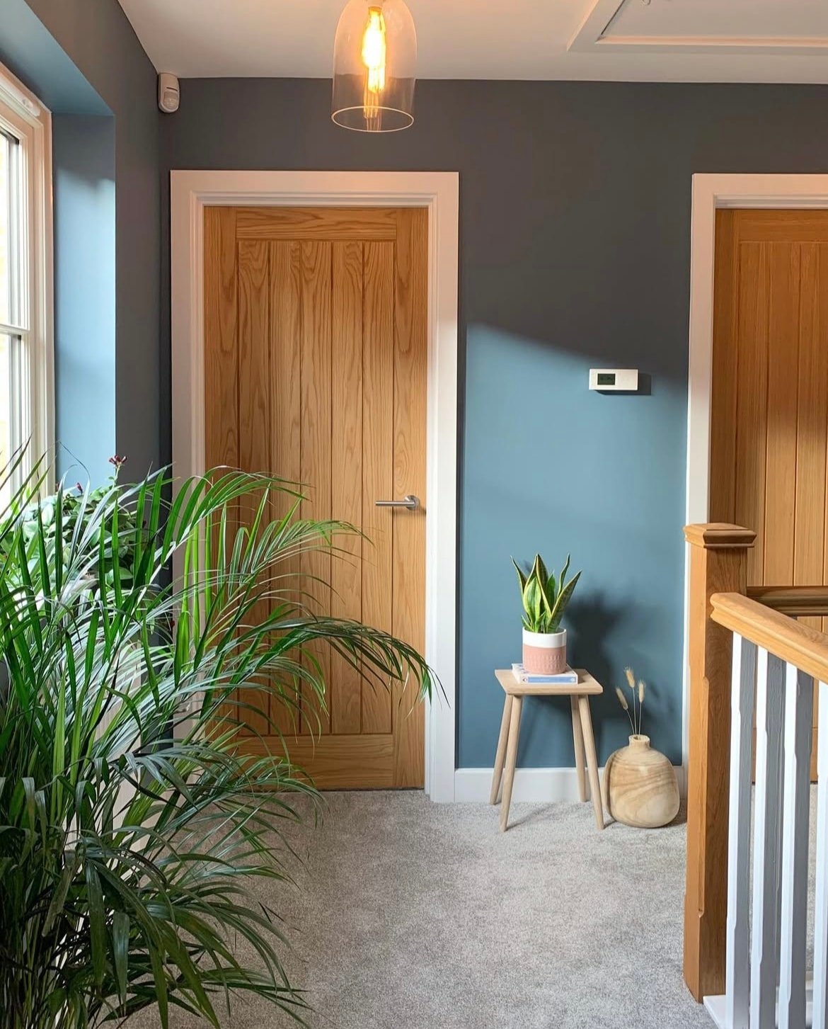
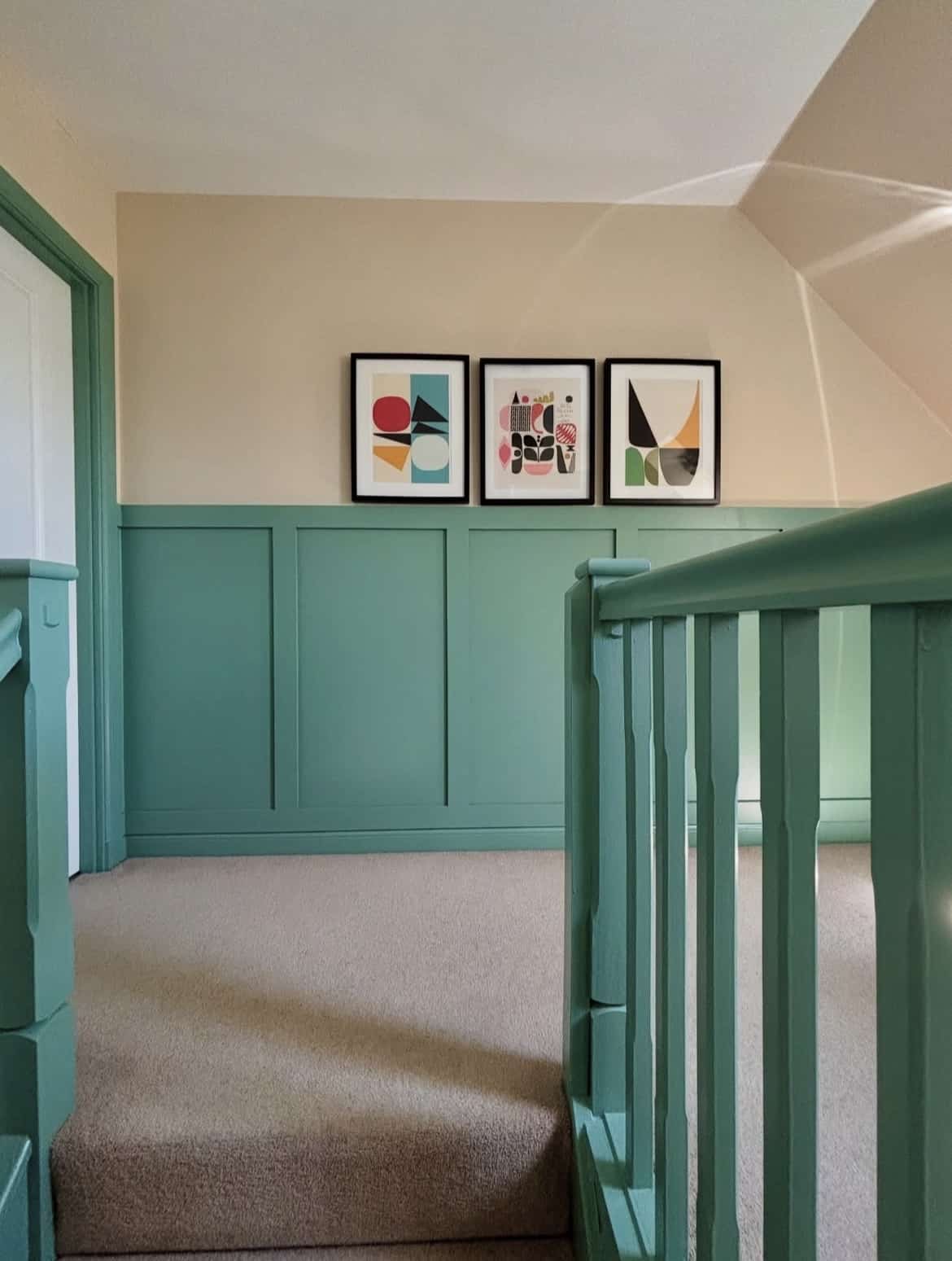
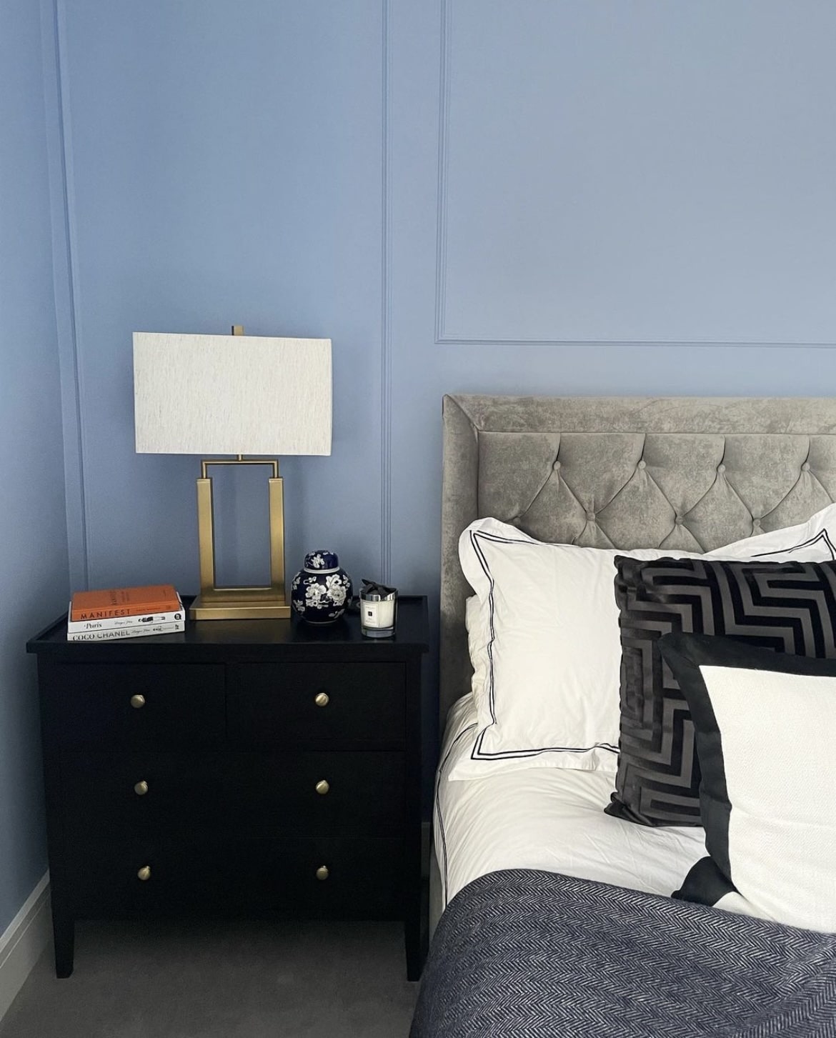
5. Faded Indigo
Blues have started to become trendy again over the last year as they just feel good to be around! There’s long been a taboo around blue shades that they can make a room feel cold, but the right shade can feel uplifting, and in fact help to balance the intensity of the sun in spaces that receive a lot of natural daylight.
Faded Indigo feels very similar to De Nimes by Farrow and Ball, it’s richly pigmented, and look how good it looks in the landing space below?
Pair with a subtle off-white on the ceiling for a softer approach than pairing with a bog standard bright white, Timeless off-white pairing for it.
6. Overtly Olive
Nothing is quite as timeless as a green in an interior. It’s virtually one of the easiest colours on the eye, and Overtly Olive is one of Dulux’ most favourable greens.
It’s not too soft and it’s not too dark, it’s the ideal sage green that works in virtually any room. Like a terracotta shade, green is versatile enough to pair with most colours.
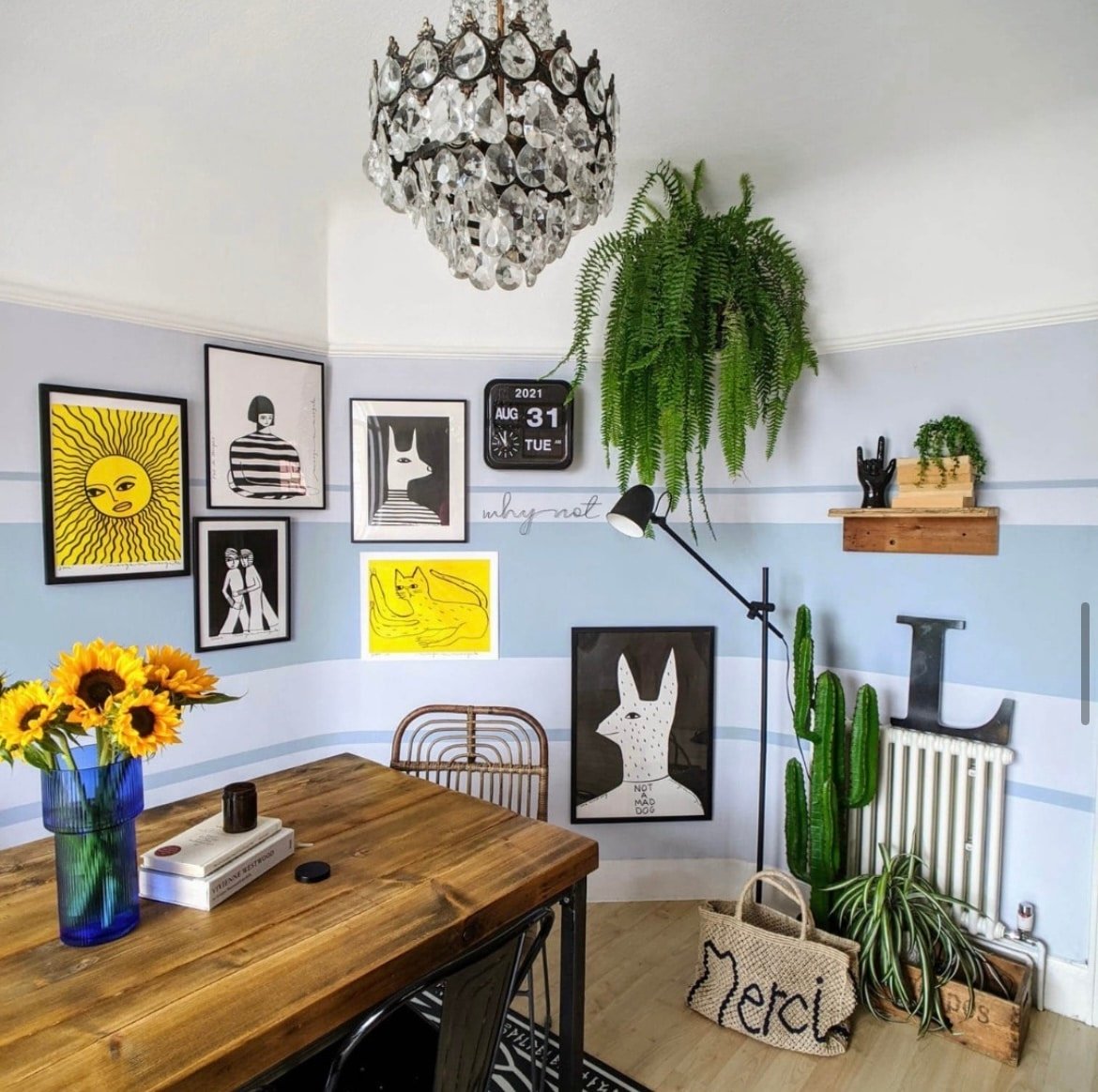
7. Denim Drift
Blue is such a soothing colour for a living room, bedroom or beyond and Denim Drift is the perfect bridge between a light and dark shade of blue, sitting somewhere in the middle for a well balanced blue.
Team with a soft off-white for a lovely bit of lightness that will uplift the room, of perhaps colour drench an entire room in it to really lean into the darkness for a cosy feel.
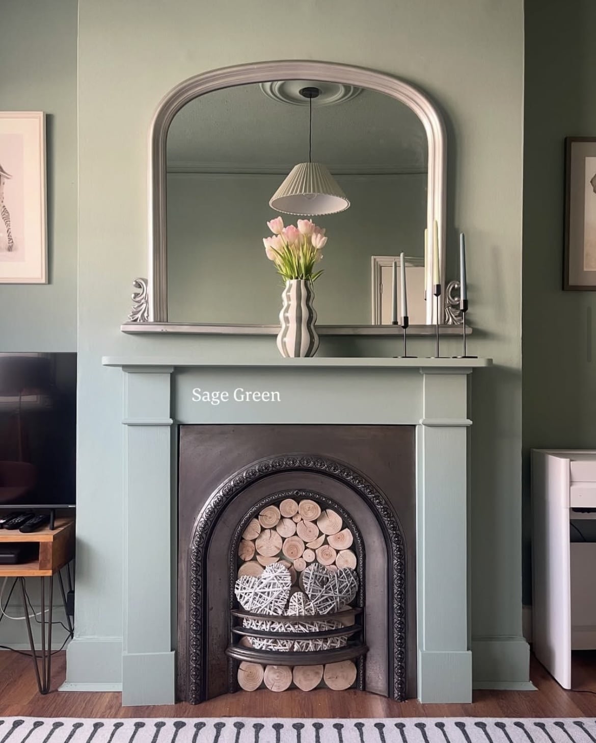
8. Sage Green – Dulux Heritage
This is one of Dulux Heritage’s most popular greens. Sage green just isn’t going anywhere anytime soon! If you’re wanting to pick a timeless shade that will stand the test of time, look no further.
This mid tone, blue based green is ridiculously easy on the eye, and a soothing, comfortable green to sit with. Use it in a living room, home office, bedroom or somewhere that needs a dose of calm.
9. Rock Salt
Bright white paint shades are clinical and can make an interior feel uncomfortable. Leaning into soft off-whites are much better alternatives. They can be chosen based on the lighting conditions in your space.
For very sunny south facing rooms, or those that share it with an East or West orientation, choosing whites with grey, blue or green undertones will help to temper the intensity of the sun, delivering a much softer feel in the room.
Rock Salt has a slight grey undertone to it which makes it an ideal choice for spaces like this, keeping a room well balanced during the height of the sun.
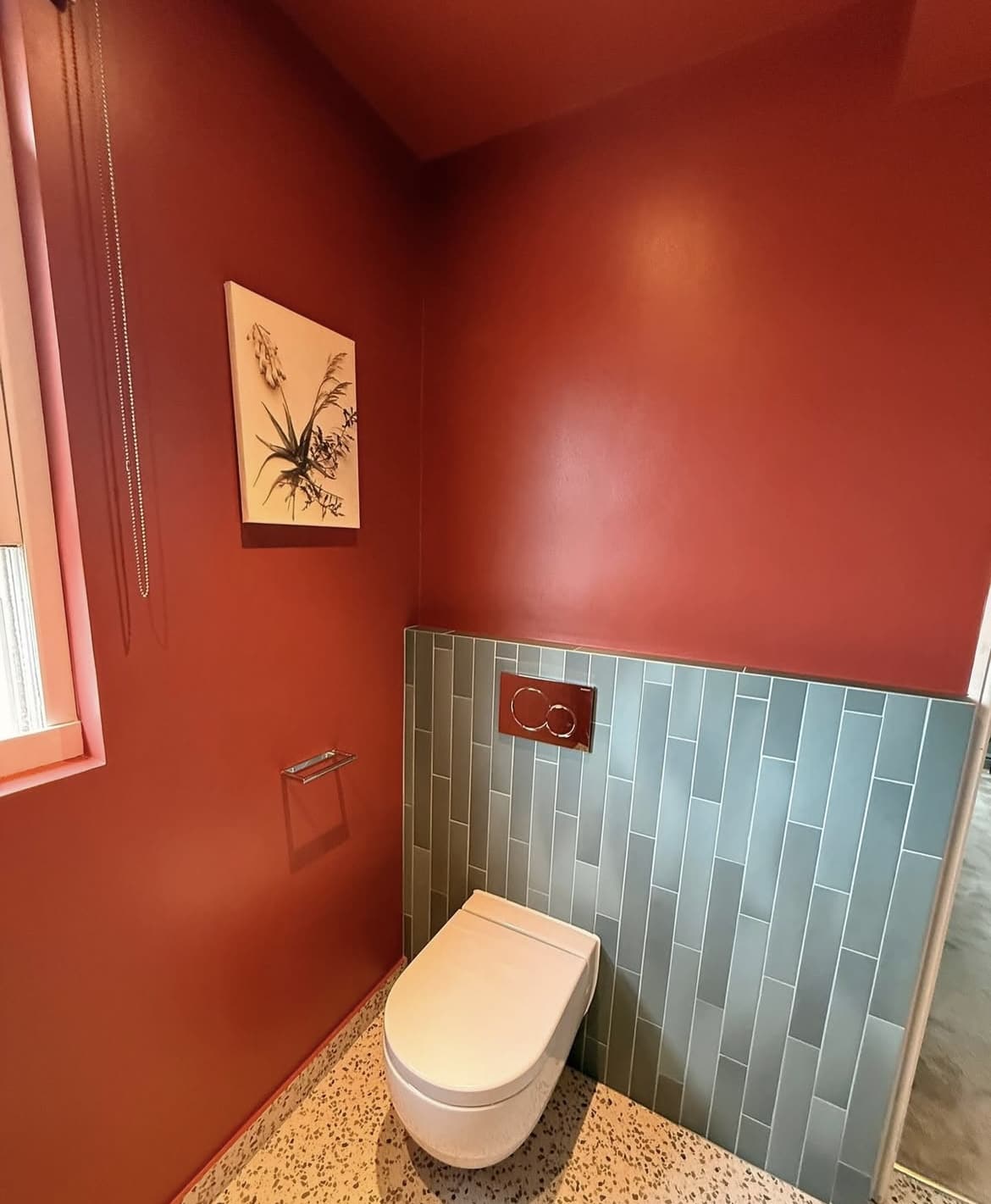
10. Cherry Chocolate
Deep red and plum based shades are trending for the year ahead, and how good does Cherry Chocolate look in this colour drenched approach in a downstairs toilet?
In small or windowless spaces such as a downstairs toilet you can have fun with colour! This deep, sultry shade creates a high impact look. Pair with brass accents for beautiful, natural warmth against this shade.
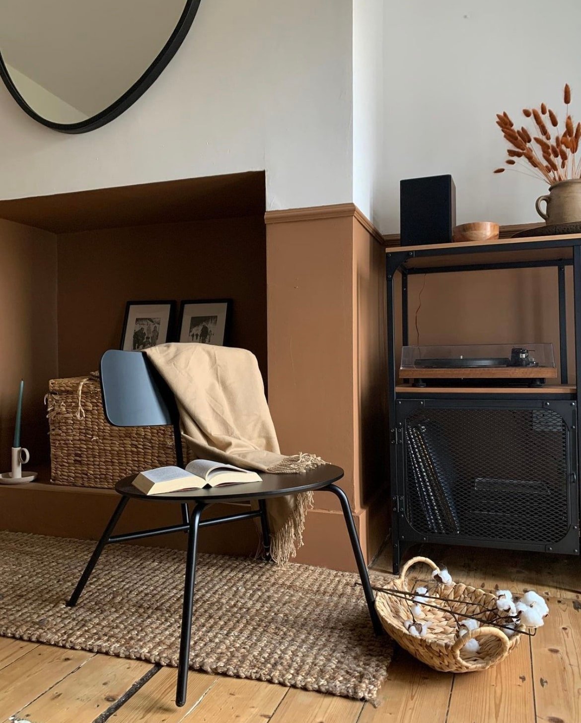
11. Brave Ground
Earthy, deep browns are becoming a top paint colour for 2026 and beyond, a more comfortable alternative to black hues that feel good to be around, because of their inherent link to nature.
Brave Ground is a mid level brown that will help you to get that signature earthy interior design look, add to lower panelling to ground the room and pair with a complementary off-white on the upper walls and ceiling to avoid it overpowering the room.
12. Village Maze
Not quite a sage green, neither a forest green, Village Maze is punchy, trendy and a room pleaser.
This bold shade is the perfect way to make a statement, adopt it on your woodwork and panelling in a hallway for a fun first impression. Something I always say is that it’s hard to feel bad when surrounded by a good green, and this is one of the best!
13. Soft Truffle
Like the idea of Brave Ground, but want something a little softer? Soft Truffle is an enduringly popular neutral from Dulux, it’s understated, earthy and will form a beautiful base in an earthy or minimal interior design scheme.
I tend to lean towards shades like this in bedrooms and living rooms where you want to create a cosy, enveloping space. Layer with tonal shades of brown and cream for the cosiest, tactile room.
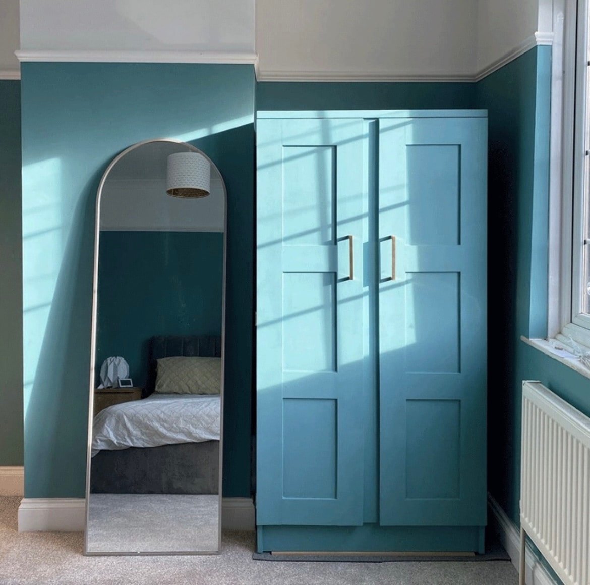
14. Midnight Teal
Teal is a wild card entrant for 2026, and a bold shade that we can expect to see a lot more of over the coming years. This shade is actually from the Dulux Heritage collection, so it’s super pigmented and feels luxurious.
For a high contrast, pair with a red or orange in your interior scheme. It’s the most complementary colour and works so well as an accent colour on textiles and bedding.
15. Mellow Flow
Dulux announced their trio of blues for their colours of 2026 which included this mid range blue, Mellow Flow.
I’ve been saying for quite some time that a light blue is versatile enough to be a neutral as it can feel uplifting, and soothing to be around. I adore this semi drenched approached, taking it down onto the skirting boards for a more seamless look.
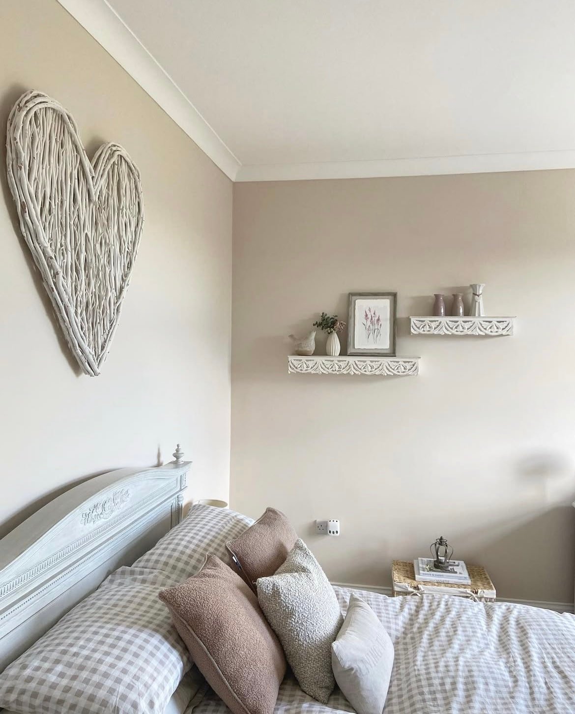
16. Perfectly Taupe
A beautiful mix of grey and brown, a warm neutral that is a beautiful alternative to a standard grey or brown shade. It delivers an elegant feel in a bedroom, as shown below, and pairs well with both neutrals and bolder shades.
Pair with cobalt blue for a high statement contrast, and use pink as an accent colour for a soft balance between these colours in your interior.
17. Emerald Glade
Jewel like tones such as teal and emerald are edging their way into the spotlight, rather than adopting these as an accent colour, go all in on your walls, or colour drench to properly commit to their intensity.
Pairing a shade such as Emerald Glade with other jewel like tones will help to create a luxurious and well layered interior scheme.
18. Roman Stone 3
If you’re tackling a north facing room, you’re going to want to use colours with red, pink or yellow based undertones which will help to counteract any coolness associated with the blue light these rooms receive.
Roman Stone 3 has warm red undertones, a brown based neutral that is warm, cosy and sets the perfect backdrop for a living room or bedroom. Team with black accents on your decor to define the scheme, and add a touch of modernity.
19. Blood Orange
Red based colours have been thrust into the spotlight over the last couple of years, thanks to the viral ‘unexpected red theory‘. The theory which suggests that a pop of red will focus the eye in an interior scheme, and pull the finished look together.
Drenching a full room in this with a shade such as Blood Orange will seal the deal on the unexpected red theory, and it looks amazing in small spaces for a high impact look.
20. Fresh Sage
Uplifting with a natural feel, Fresh Sage is a less spoken about shade from Dulux which is invigorating, no matter the room.
This shade is a true crowd pleaser as it will suit both rooms with minimal, and a lot of natural light. Pair with pink as shown below for a high contrast accent colour that works.
21. Bright Skies
A soft blue that feels as good as a neutral, it can be uplifting in north facing spaces, as well as it working in tempering the intensity in a south facing room.
Team with a soft white such as Rock Salt. As it has complementary undertones, it will avoid a room feeling uncomfortable with a bog standard bright white.
22. Caramel Blush 5
Honey, caramel coloured paint shades are the ultimate paint shades for cold, north facing rooms. This Dulux shade is a close match to Weekender by COAT paints.
Warm and uplifting, colour drenching with it creates a flawless look that draws the eye up, and will help to make those dark days feel a little bit warmer, and cosier.
23. Warm Sycamore
If you’re planning on decorating with earthy interior design in mind, take note of the below shade!
Warm sycamore is a deep chestnut brown with some orange tones to it, I love how it grounds this living room below with a soft white on the upper walls to create a soft balance.
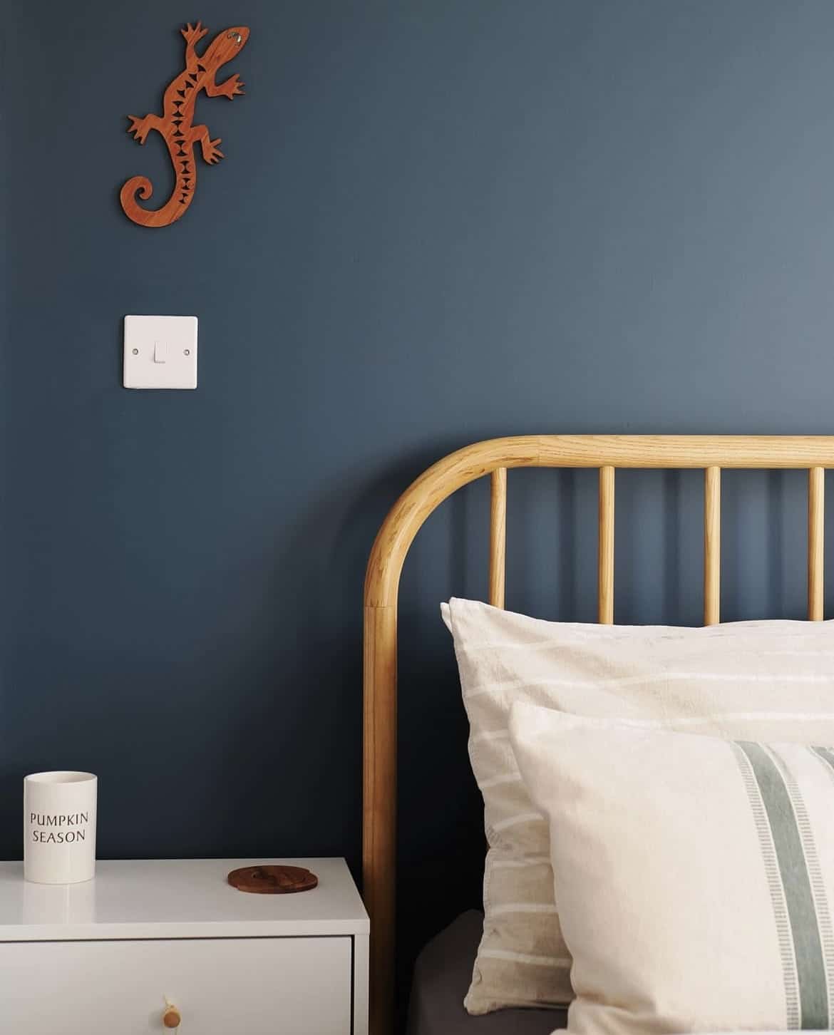
24. Cobalt Night
A deep and impressive shade such as Cobalt Night will deliver gravitas and depth to any interior colour scheme.
I love this shade in traditional, period properties or those that are wishing to lean into the darkness. It can feel counterintuitive to use a dark shade like this in a dark room, but by embracing it it can help to envelope the room and make the space feel even cosier, and intimate.
25. Everglade Forest
This rich dark green really sets the tone for an earthy or jungle inspired interior scheme. I always recommend testing paint samples before committing as dark corners will suck the light out of a dark shade even more. Unless you want to lean into the darkness, this shade is better suited to sunnier south facing spaces which receive plenty of natural light.
Pair with bolder shades such as blue, orange and pink for a stand out interior scheme.
26. Tranquil Dawn
Tranquil Dawn is a muted, soft green that has grey tones for a really subdued but stylish colour. A welcome alternative to warm beiges, but just as versatile as a standard neutral shade.
Greens are the easiest on the eye and aren’t stimulating, so this shade is perfect for bedrooms, kids rooms and beyond.
27. Sea Urchin 2
A feel good blue from Dulux which looks incredible in this bedroom below, with a soft off white above the picture rail and up across the ceiling.
Saturate all the walls, woodwork and ceiling in it for a fully drenched look.
28. Acai Berry
It’s all about those berry tones as we head into 2026, grounding, earthy and feel good.
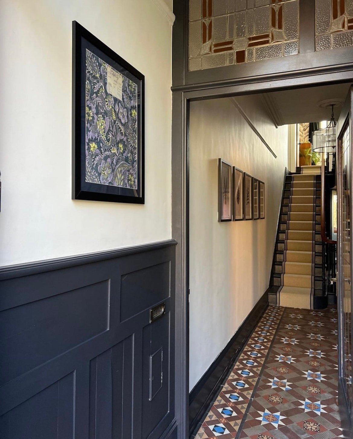
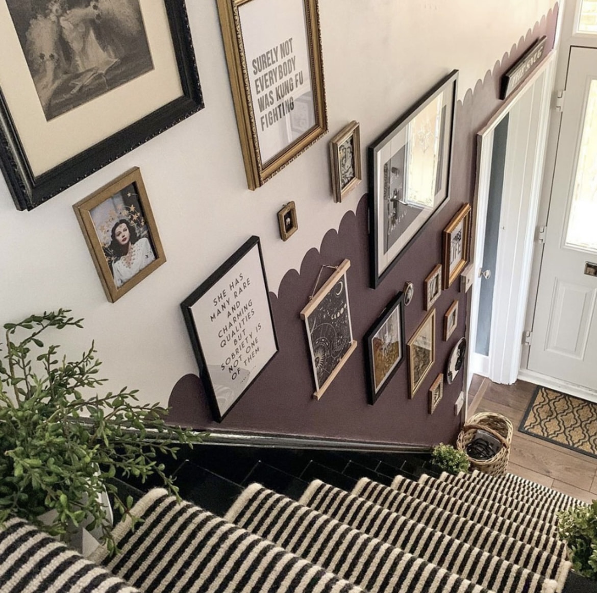
You don’t need to go all in on your walls to appreciate this shade, have a look at how this colour is accented in the below hallway for a fun first impression which is beautifully balanced against the white.
29. Rich Black
Leaning into black woodwork is such a gorgeous way to deliver definition and ground any interior scheme. Take inspiration from the below space using Rich Black on the woodwork with Slice of Brioche by Valspar on the walls here.
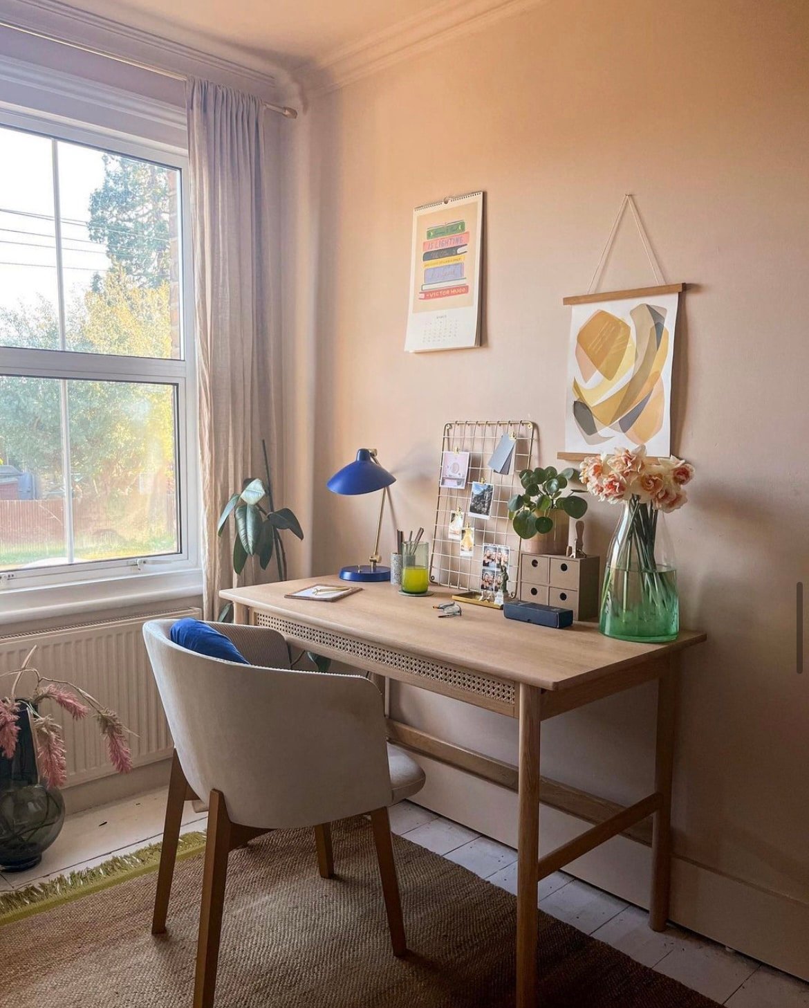
30. Natural Hessian
This is a fine contender for Egyptian Cotton if you’ve still not decided on the perfect warm neutral for your room. This flexible, pale warm neutral has a slight yellow undertone to it which makes it practical for north facing spaces.
For a tactile, layered look, introduce other tonal shades through textiles and decor for the cosiest look.
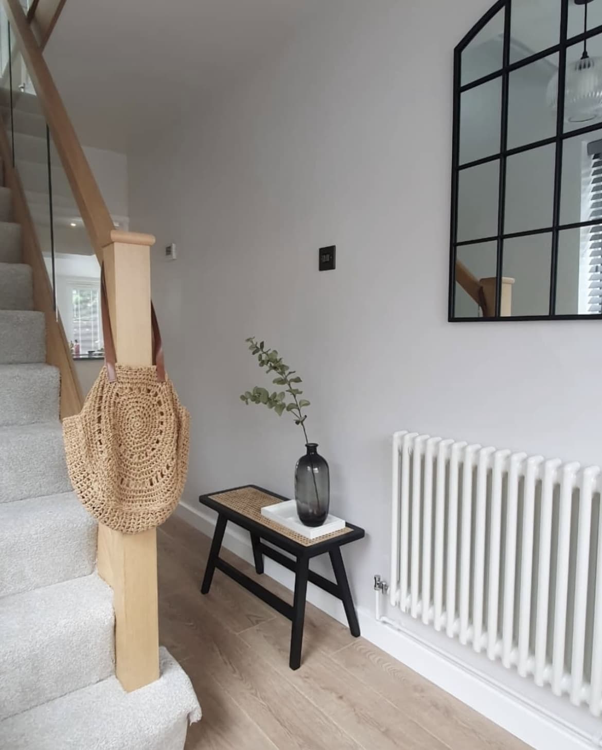
31. White Mist
This ultra pale grey has a similar look to Blackened by Farrow and Ball. It has a sophisticated air to it and is a practical choice in transitional spaces like hallways.
Introduce some black accents for a minimal look that will ground your interior scheme. Needless to say, pretty much any colours pair well with White Mist.
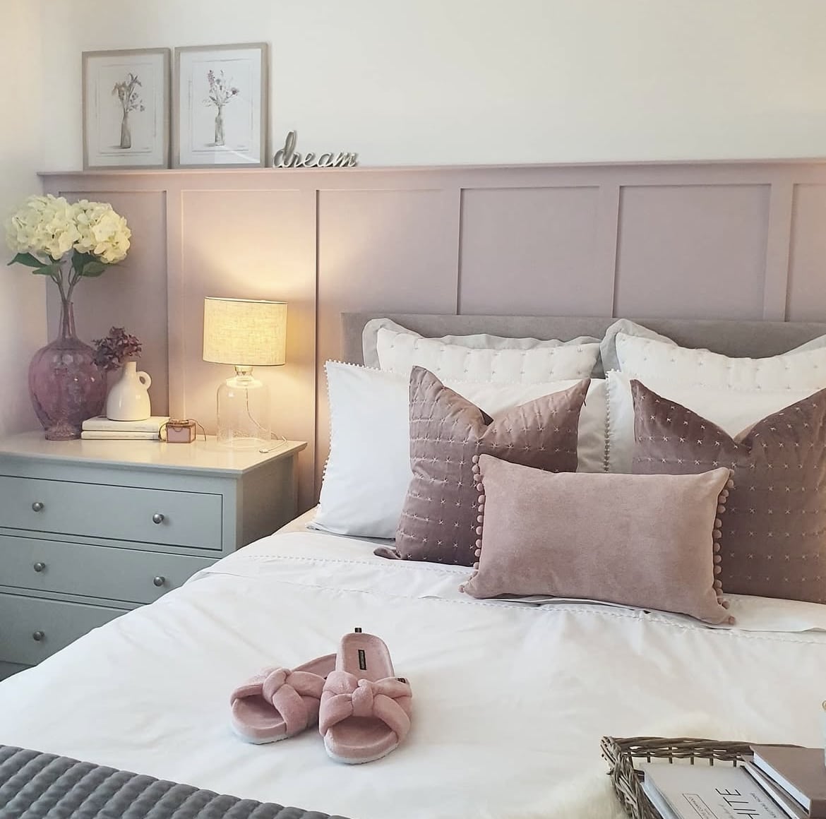
32. Dusted Fondant
This heathery mid-tone is the ultimate soft colour that just makes you feel at ease! I particularly like this in a bedroom as shown below as it’s not a stimulating colour.
Pair with like shades for a cosy look, or lean into warm neutrals for a lovely soft balance.
33. Light Cobalt – Dulux Heritage
A mid floral blue with a slight violet undertone is what makes it versatile enough for both north and south facing rooms.
Lean into the cooler side of this shade by positioning with other cool colours such as white, black and grey. For a warmer, uplifting feel, pair with warmer shades such as oranges and reds.
34. Red Ochre – Dulux Heritage
This earthy red feels natural and has a strong link to the outside world, if you’re looking for a colour to make a statement, this is the one!
I love it in windowless spaces or downstairs toilets, high impact and fun. Pair with brass accents for natural warmth and other earthy colours for a seamless colour scheme.
35. Flint Arrow
Described as a dusty grey with green tones, this is one of my favourite off-green colours which would also look sensational as a woodwork colour with a slightly lighter shade on the walls, such as Spun Mohair.
An earthy shade that would work in pretty much any room that you have in mind.
If you have any questions about these Dulux paint shades or want any more colour advice, please leave me a comment below!