
Trying to find the perfect neutral can feel like an endless challenge, and I always think you’re better off leaning into light adapting neutrals that share both warm and cool undertones so they’re well suited to generally most rooms, no matter the orientation and the amount of light the room receives.
Drop Cloth by Farrow and Ball is a prime example of this as it shares both yellow and grey undertones without leaning too much into one or the other.
Keep on reading as I share some of the best colour pairings to use with Drop Cloth which are ideal for any room that’s looking for an elevated neutral.
The Best Drop Cloth Farrow and Ball Colour Schemes For Any Room
1. Earthy Inspired
Earthy interior design is a leading design trend right now that feels good to be around. It involves using a colour palette with shades that have been derived from nature, with Drop Cloth fitting perfectly into this as a base colour that looks and feels good.
Natural elements should be included such as wood, rattan, seagrass and stone. Finish with some black accents, like shown below which will add definition and ground the room.
2. Drop Cloth & Shaded White
When choosing colours for walls vs woodwork/skirting, one of the most stylish ways to do it is by leaning into a paint shade that is 1-2 shades darker and using this on woodwork or panelling to define a room, with the lighter shade on top, drawing the eye up and giving the illusion of a bigger space.
Shaded White is one shade lighter, sharing the exact same undertones as Drop Cloth, making it such a flawless combination. You could also lean into this colour palette with Drop Cloth on walls and Shaded White on woodwork such as skirting, architraves and doors.
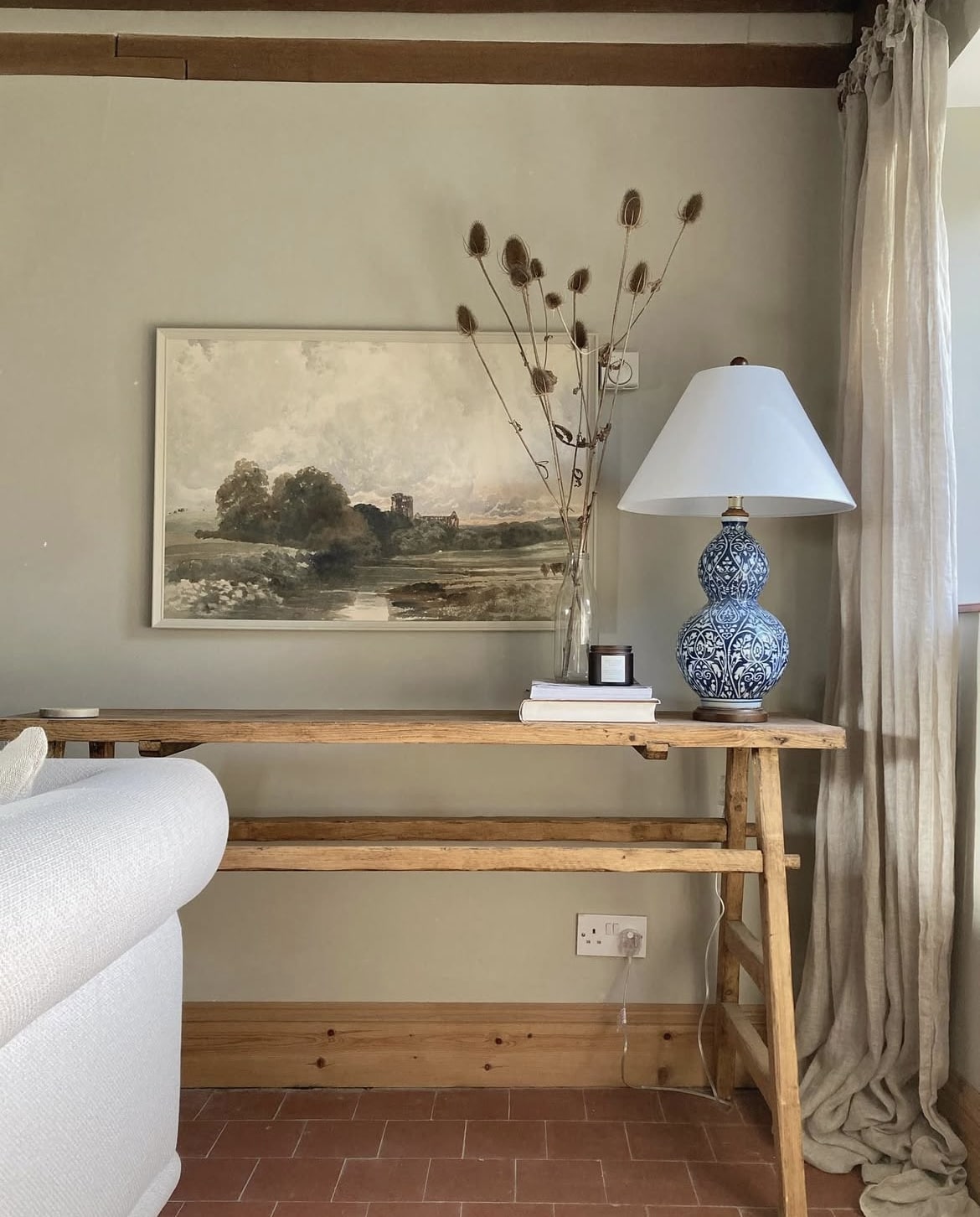
3. Wooden Elements
You can’t go wrong with introducing wooden elements to a colour palette, as styled beautifully in the below. It introduces some natural warmth and can easily be done with furniture and decor accents.
Drop Cloth is also the perfect catalyst for using a pop of bold colour in an accent area, such as on a lamp base.
4. Black Accents
Another example of how beautiful black accents can bring a colour scheme together. We hear a lot about the ‘unexpected red theory’ and how a single pop of red focuses the eye in a room, but the same applies to black too!
It brings much needed definition to a neutral scheme, and a touch of modernity too.
5. Lichen Accent
Greens look absolutely beautiful against Drop Cloth and it will make the colour read in a different way again. Leaning into a green shade such as Lichen on woodwork is a refreshing alternative to using a Bright White, and it helps to create a beautifully earthy scheme.
You could lean into a soft off-white on coving and the ceiling like shown in the living space below to lift the room, a shade such as School House White would work well here.
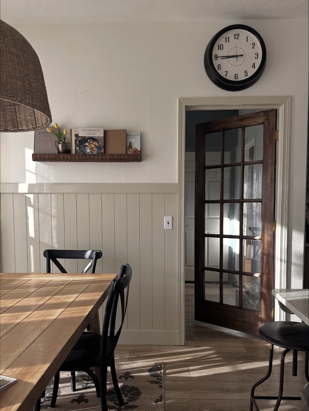
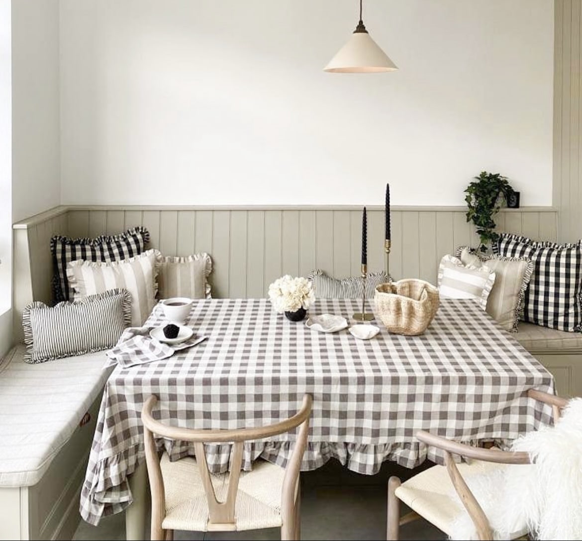
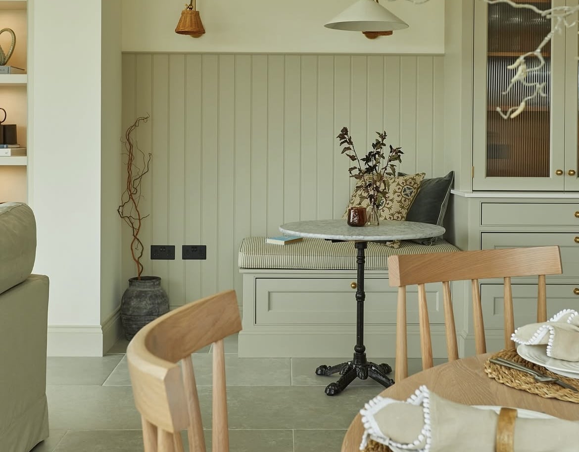
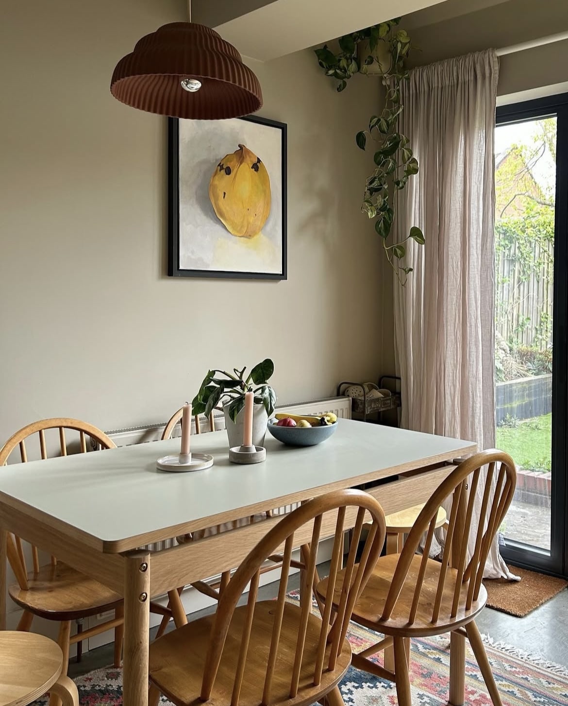
6. Layer With Neutrals
This dining nook area looks so cosy and comfortable to be around, and I adore how Drop Cloth has been used on the panelling wrap around here to really define and set a zone in the space.
It’s the perfect backdrop for working in warmer neutrals for a really tactile and well lived in area. Textiles are a fantastic way to layer a look, think table cloths, cushions, throws and window treatments.
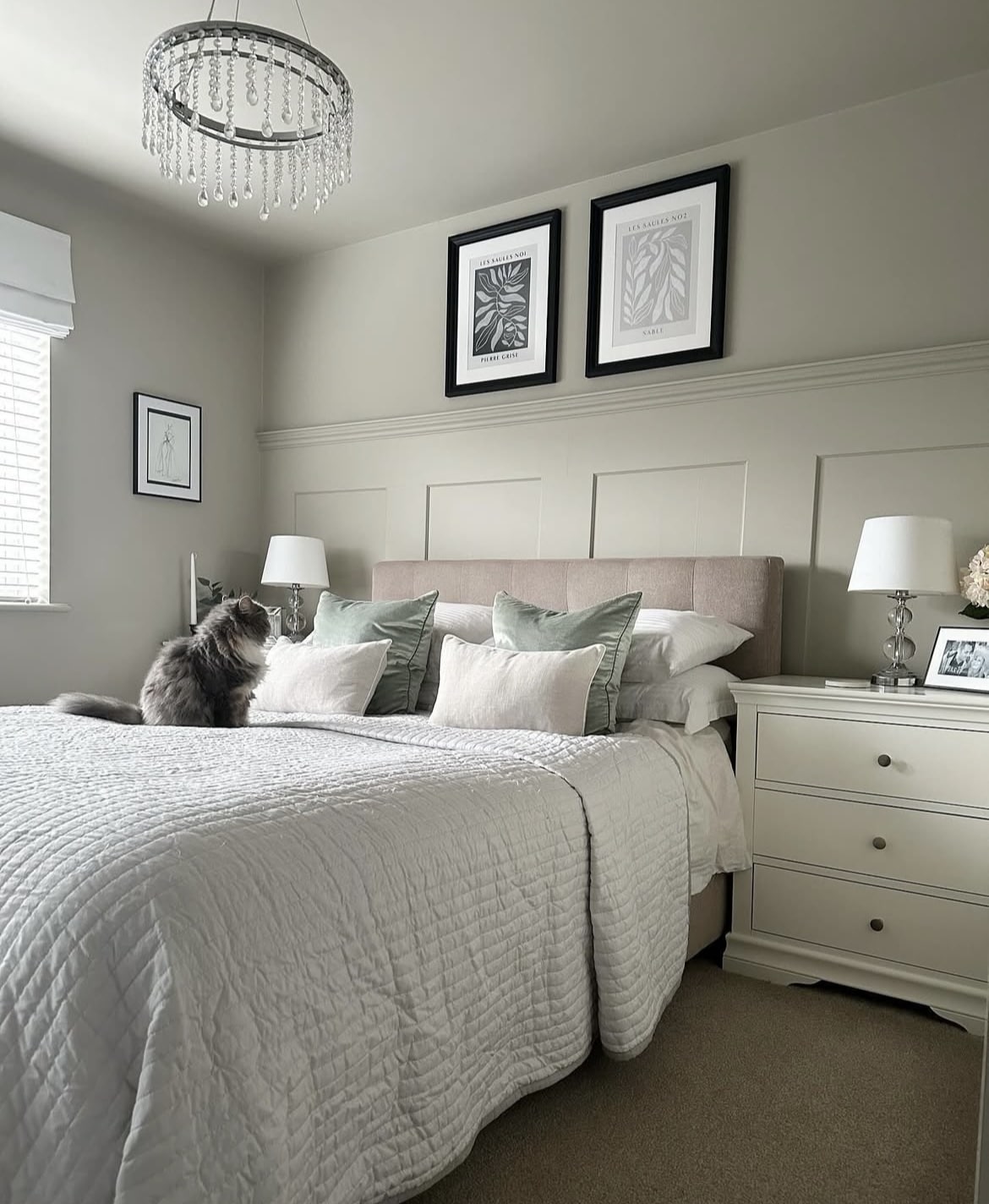
7. Soft Muted Tones
Considering colour drenching? Take inspiration from the below! Especially in a bedroom it is one of the best decorating approaches, creating a fully encompassing and cosy space that feels inviting.
Using soft, muted colours with Drop Cloth will create a soothing, serene space. Consider using a similar colour palette with soft greens, taupes, greys, creams and white.
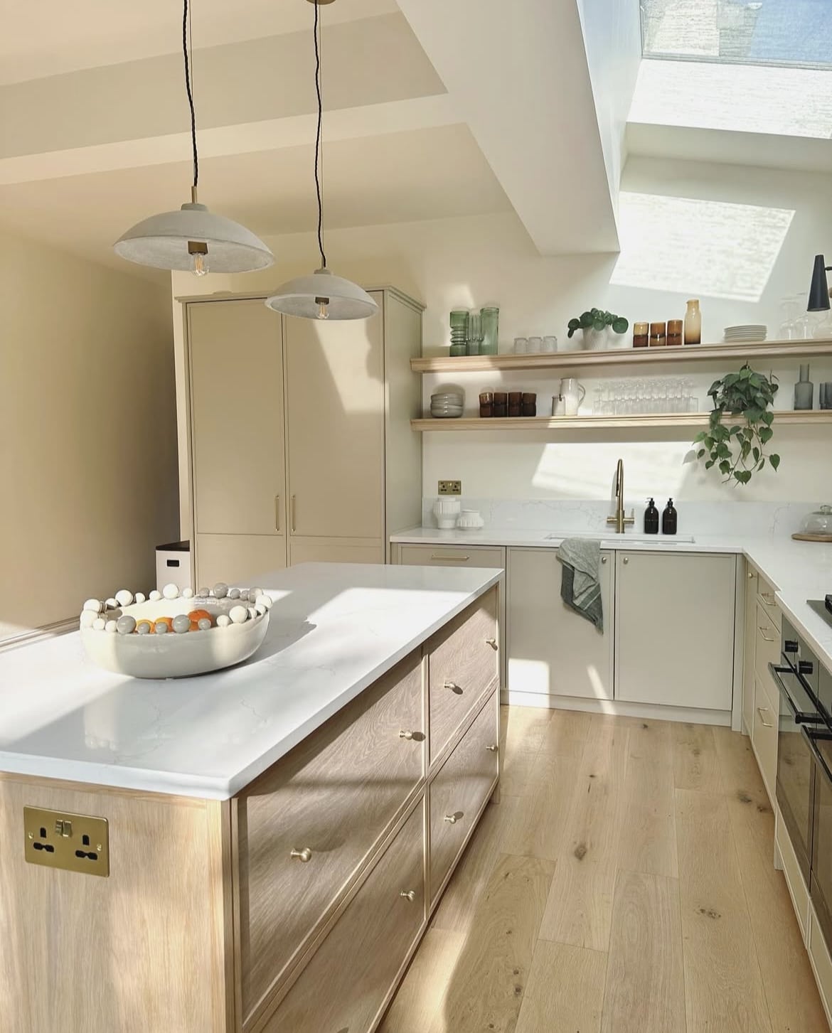
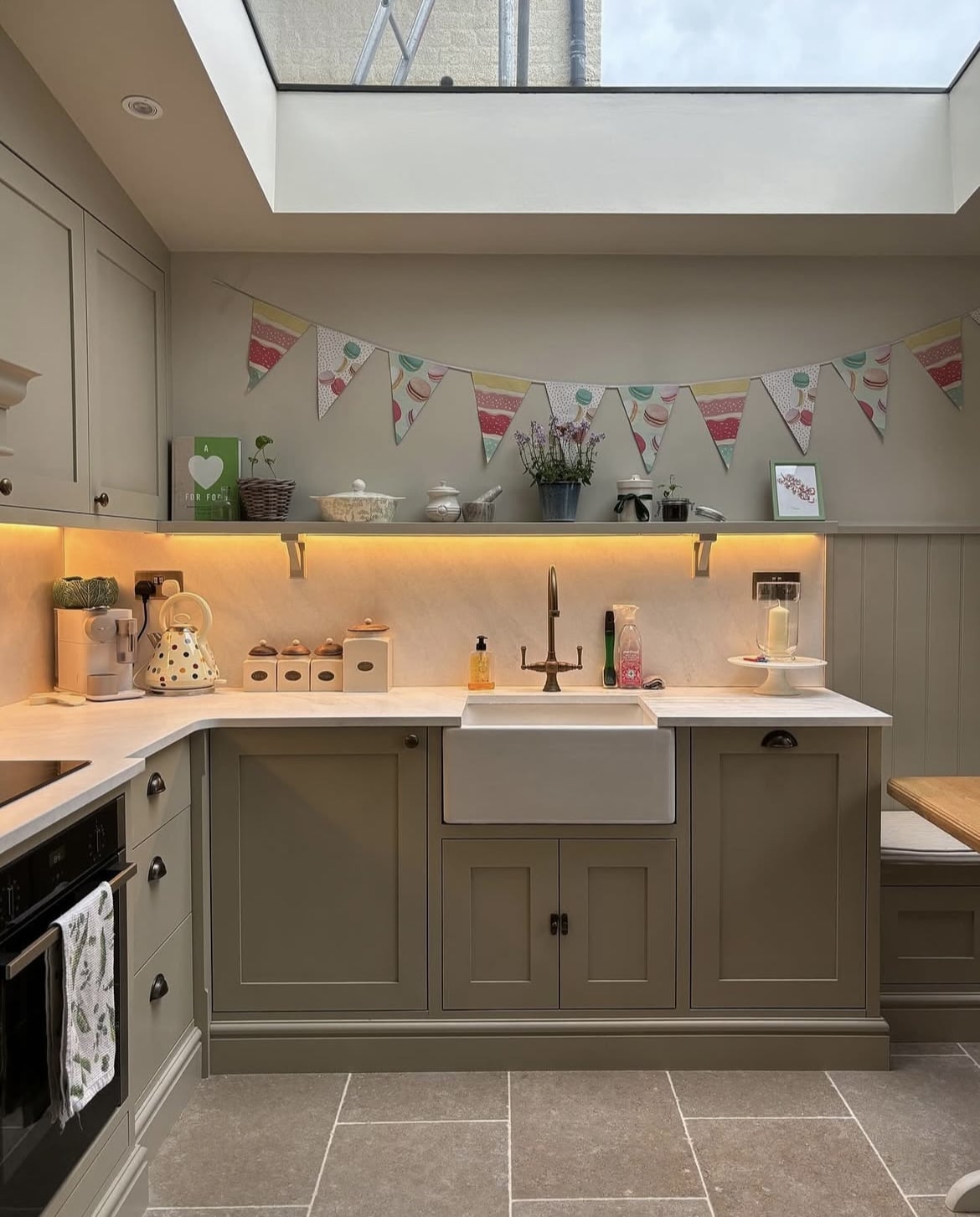
8. Ground With Wood
The wonderful thing about Drop Cloth is that it can be used in pretty much any interior design style. This contemporary kitchen uses Drop Cloth on the cabinetry with a wooden kitchen island that creates the most beautiful balance.
It’s light, airy, yet feels characterful. Create a continuation of the wood by introducing other elements such as shelving or small decor accents.
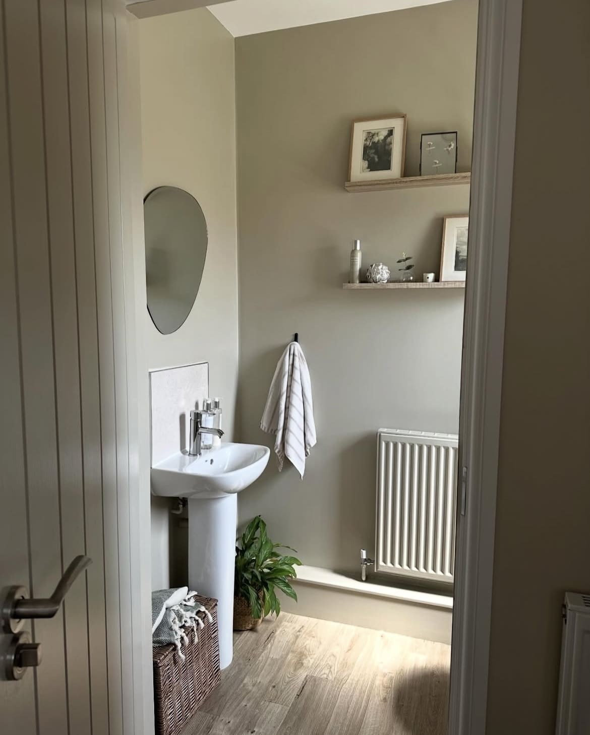
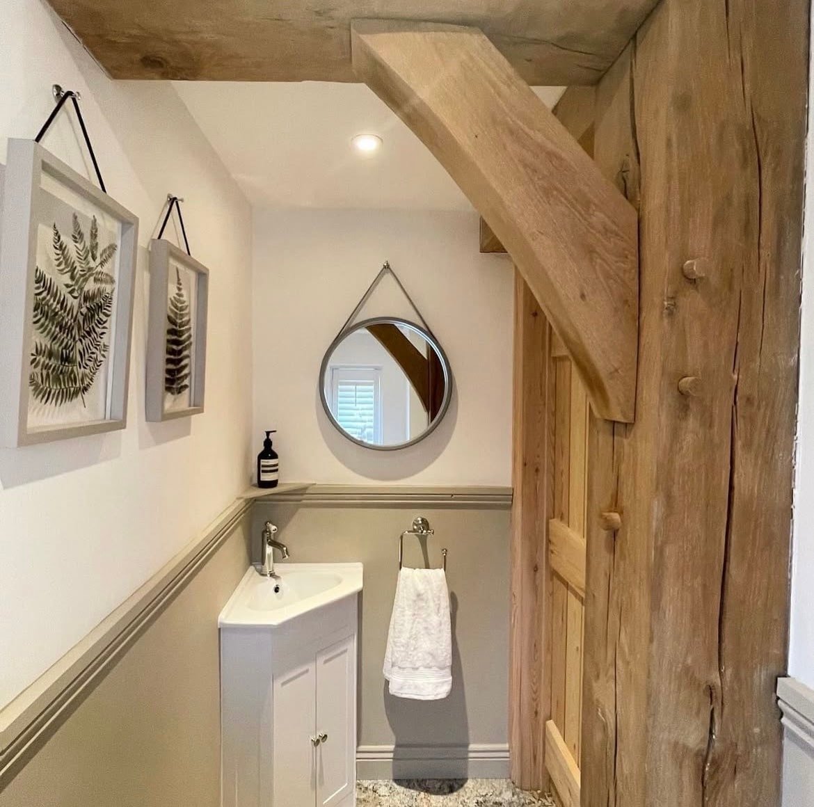
9. Japandi Inspired
This sweet downstairs toilet has a Japandi inspired theme to it, with Drop Cloth being an incredibly fitting paint shade. Japandi design is the perfect amalgamation of both Japanese and Scandinavian design, bringing the best of both design principles to life.
Do introduce some kind of greenery, whether with a real house plant or a piece of decor. Finishing with some black accents for definition and modernity.
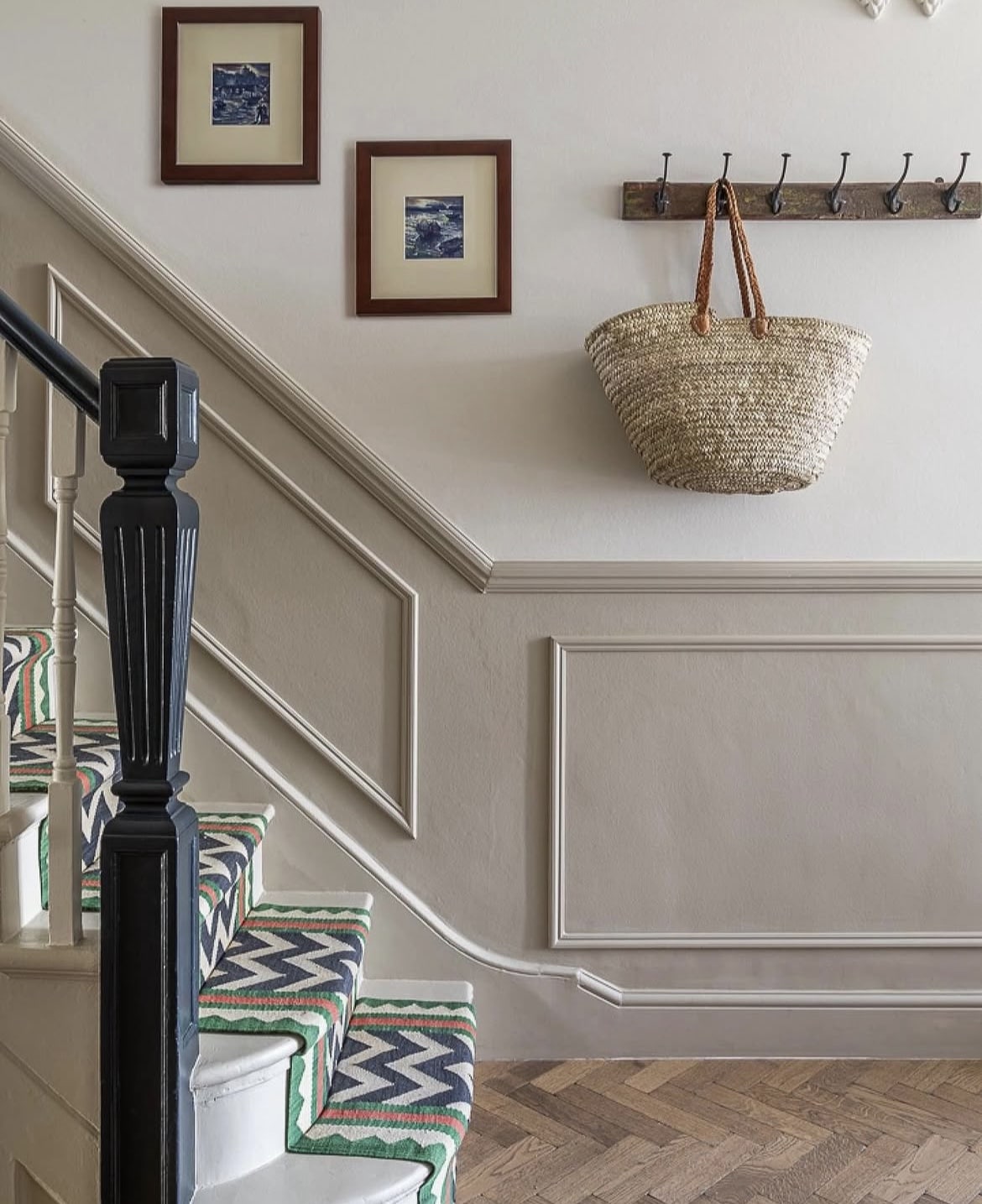
10. Audacious Stair Runner
Take note from the below hallway space using Drop Cloth on the panelling, and can we talk about the fabulously audacious stair runner?!
Bold colours just look incredible positioned next to Drop Cloth, specifically greens, blues and reds. Use them in any denomination through styling in other rooms to make the most of this beautiful combination.
11. Keep It Tonal
You don’t have to lean into bold colours to make the most of Drop Cloth. Use tonally relevant colours throughout, muted but with a slight variation for a tactile look.
Shaded White has been used here again on the walls which gives you another idea of how these two F&B paint shades look like side by side.
12. Lean Into Period Features
If you have a period property, really lean into those design details and make them the star of the show! Exposed beams? Tick.
Drop Cloth is one of their timeless neutrals, but it brings a traditional look with it which makes it ideal for use in period properties, no matter the age.
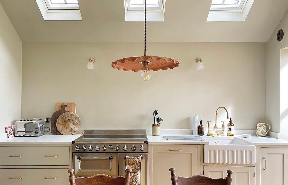
13. Colour Drench It!
Colour drenching with Drop Cloth is always a good idea, and even more so if you have a sloped ceiling like the below kitchen does. When you paint a sloped ceiling like this in a different colour it has a habit of making a feature out of it instead, but for the wrong reason.
By drenching it in the same shade the eye flows and it creates a much cosier feel. This is also effective in low ceilinged rooms, and large rooms where you want the space to feel more intimate, and inviting.
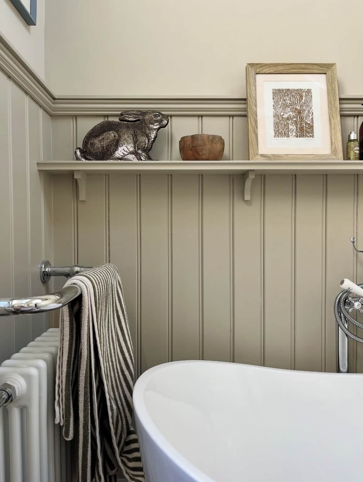
14. Add Definition With Brown
I’m a firm believer when it comes to design that you should use at least one colour accent to add definition to a room. Black accents, whilst effective can sometimes feel a little too stark in certain designs.
Brown is a wonderful alternative which is generally softer, and grounding as it has that inherent link to nature. Even wood accents and rattan are a wonderful way to achieve this.
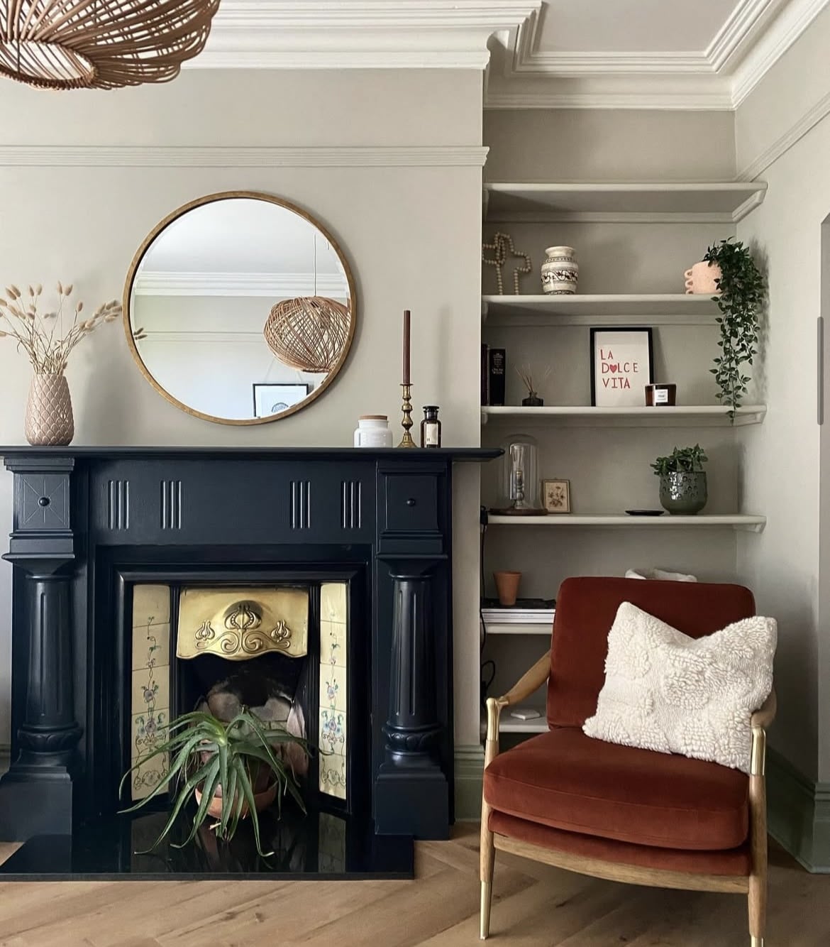
15. Drop Cloth & Pitch Black
There’s so much about this living room colour below that I love. The unexpected pop of red on the chair instantly focuses my eye, but equally the black fireplace and hearth creates a traditional feel that pays homage to the age of this property.
Pitch Black has been used on the fire surround here which is as pure as a black as you can get, and it does a wonderful job of grounding the Drop Cloth colour scheme.
16. Cottagecore
Cottage inspired interiors are hugely lovable, and they really come into their own in a kitchen space like the below. Pairing with porcelain tiles is a natural pairing which is enduringly timeless.
When thinking about hardware, natural brass is a lovely option as it introduces natural warmth. Unlaquered brass will also deliver a rich patina over time which further adds to that lived in feel in cottagecore interiors.
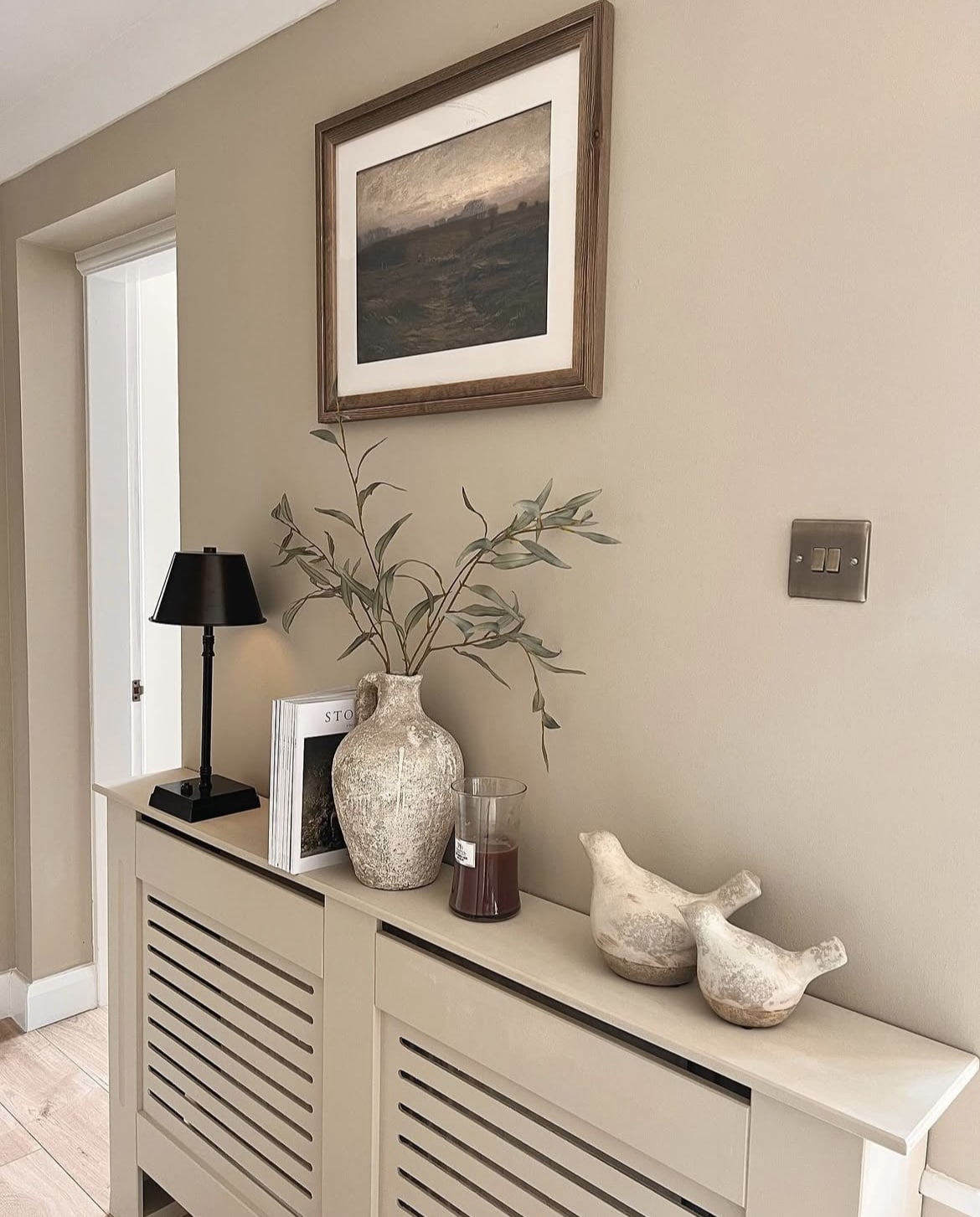
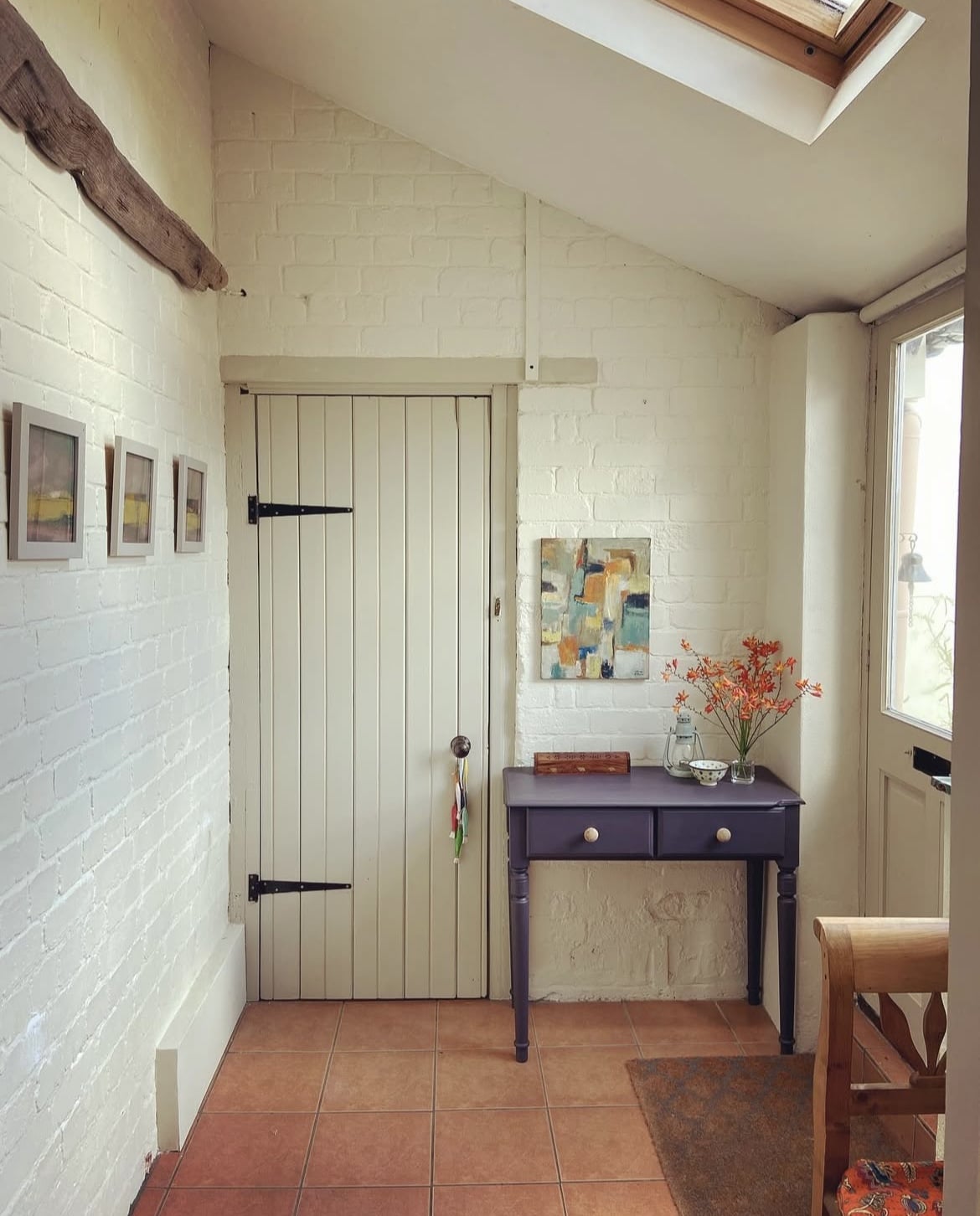
17. Drop Cloth & School House White
The perfect off-white that’s warm and uplifting that goes with Drop Cloth is School House White. They share the same undertones and it’s an ideal white whether you have a cold dark facing room, or one that receives plenty of natural sun light throughout the day.
Paean Black has been used on the console table which I think you’ll agree, finishes off this entryway beautifully!
There are so many gorgeous colours that pair with Drop Cloth, and virtually anything goes here. Reds, blues, greens and other neutrals are my favourite though!
If you have any other questions about using Drop Cloth in your own home, please leave me a comment below and I’ll come straight back with my advice and recommendations.
I have painted my hall with drop cloth on the panels and school house white on the walls and doors. I want to buy a door curtain for my front door and I just cannot find a colour to tone in with these colours. Can you help me please?
Good morning, I’ll play devils advocate here and I’d go for something punchy against these neutral tones such as an earthy green which will work with its subtle undertones. If you did want something tonal instead, you might want to look at a mid range grey toned colour for your curtains.
Hello. How would Drop Cloth pair with Brazilian cherry flooring? Also, would it look good against a piece of painted furniture that is Beverly green?
Thanks