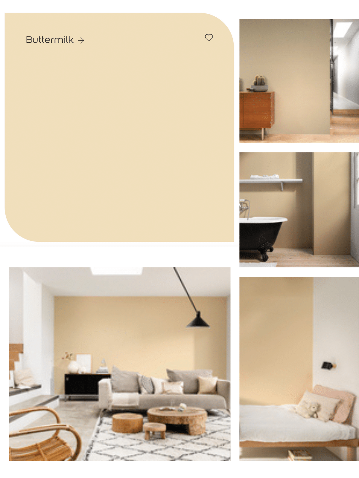
Whether you’re looking to create a cosy living room, a tranquil bedroom, or a welcoming kitchen, Dulux Buttermilk is a neutral, and versatile choice.
Its warm, golden undertones complement a wide range of other colours and textures, making it an ideal base for any interior design scheme. It’s golden undertones also make it perfect for combating the cold, blue light associated with North facing rooms.
So, let’s explore Dulux Buttermilk and look at what colours go well with this golden hue, and how best you can incorporate it into your home.
What Colour Is Dulux Buttermilk?
Dulux Buttermilk is a warm, creamy, and inviting shade that has yellow and gold undertones. It is a light, pale shade that exudes comfort and elegance and is a popular choice for walls and ceiling in many homes. Its yellow undertones make it a popular choice for North facing rooms too.
Always try a tester pot before purchasing and paint a swatch in your chosen room so you can see how the colour looks at different times of the day.
Check Prices For Dulux Buttermilk.

What Colours Go With Dulux Buttermilk?
Tonal Combinations
When pairing paint shades and planning the rest of your interior, it’s really important to choose the right colour combinations to create a harmonious and balanced look.
One of the best ways to do this is to pair Dulux Buttermilk with tonal shades that complement its warm, golden undertones. This creates a cohesive and inviting colour scheme that feels both timeless and contemporary.
Dulux recommend pairing Buttermilk with shades like Golden Cookie and Citrus Zing, both of which share similar warm, yellow-gold tones that enhance Buttermilk’s natural beauty. These shades create a relaxed and comfortable atmosphere that’s perfect for creating a cosy and welcoming home.

Neutral Combinations
It’s also worth considering pairing Buttermilk with neutral combinations for a relaxed and cohesive feel. By pairing Buttermilk with shades like Rope Swing and Rich Earth, you can create a natural and calming atmosphere that’s perfect for unwinding after a long day.
These neutrals provide a subtle contrast to Buttermilk’s warm tones, creating a sense of depth and balance in the room.
Introduce colours like this through paint shades, or by layering with textiles such as cushions, throws and furnishings for a really cosy, and warm ambience.

Designer’s Choice Combinations
For those who are looking to make a bold statement with their home decor, pairing Dulux Buttermilk with the designer’s choice of colours can create a strong visual impact.
Dulux’s designers have recommended pairing Buttermilk with shades like Dusted Fondant or Heather Climb, both of which are bold and striking purple shades.
These colour combinations can create a sense of drama and sophistication in the room, while still maintaining the warm and inviting feel of Buttermilk.

Buttermilk & White
Buttermilk is a great off-white shade for walls that won’t leave that feeling of flatness like a bright white can. However, using a stark white in contrast to buttermilk can create an illusion of more space, and a brighter feel if used correctly.
Use bright white on a ceiling, creating a clean, crisp contrast against Buttermilk whilst drawing the eye up to the ceiling as you enter the room, giving the illusion of higher ceilings.
Buttermilk & Black
If you’re looking to create a modern interior, using a black accent is a seamless way to add some definition in the space. You’ll just want to use black in a few well placed areas to avoid it overpowering the room.
Focus on subtle black accents such as chair legs, side tables and interior hardware fittings such as sockets and switches, door handles and photo frames.
Buttermilk & Sage Green
With its golden tones, Dulux Buttermilk pairs beautifully with an earthy neutral such as sage green for a really soft, yet ultra relaxed look.
Use Sage Green as an accent colour on furniture, textiles such as cushions, throws, curtains or on a few well placed decor accessories like candles, photo frames and ornaments.
Buttermilk & Purple
As previously mentioned, pairing Buttermilk with bold statement shades like purple can create a dramatic and elegant effect. It will bring a defining edge to a room without it being as harsh as a black accent.
In fact, Buttermilk with its yellow undertones is the perfect pairing for lilac – the hottest new colour combination on the block. This seemingly sweet pairing of colours brings a soft and feminine aesthetic to a space.
