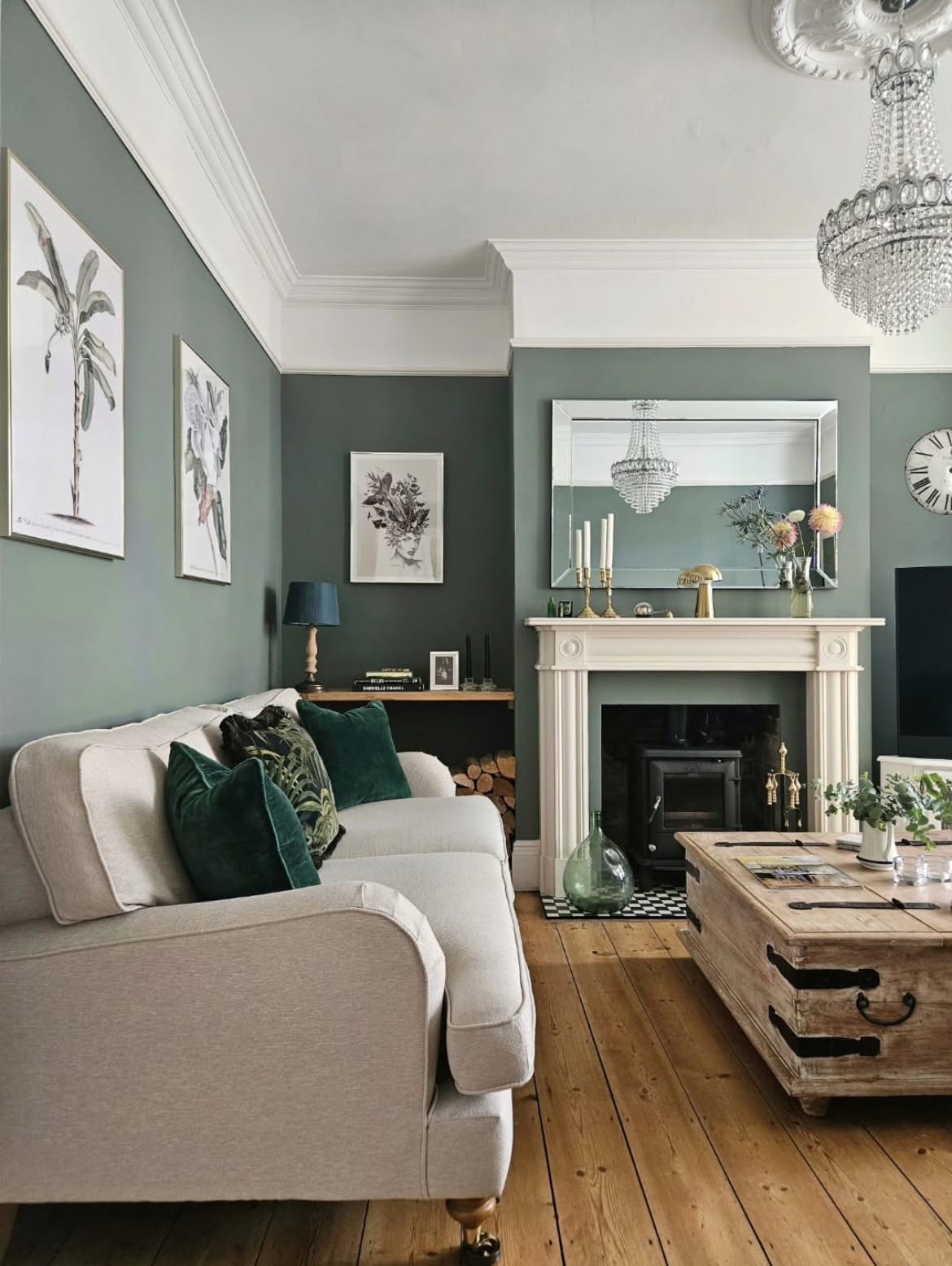
Farrow and Ball do some of the most pigmented, comfortable greens, and Green Smoke might be one of their most popular mid range greens that’s undeniably earthy and grounding in any room.
If you’re redecorating and looking for something that’s not going to need to be updated in a years time, a green is a great choice as it’s timeless, inspired by nature, and has the ability to make us feel cocooned and good when in its company.
I’ve pulled together 15 of the best colour pairings with Green Smoke to give you inspiration for your next project with this F&B shade of green.
What Colours Go With Green Smoke Farrow and Ball? 15 Top Colour Schemes To Try
1.A Pop of The Unexpected Red Theory
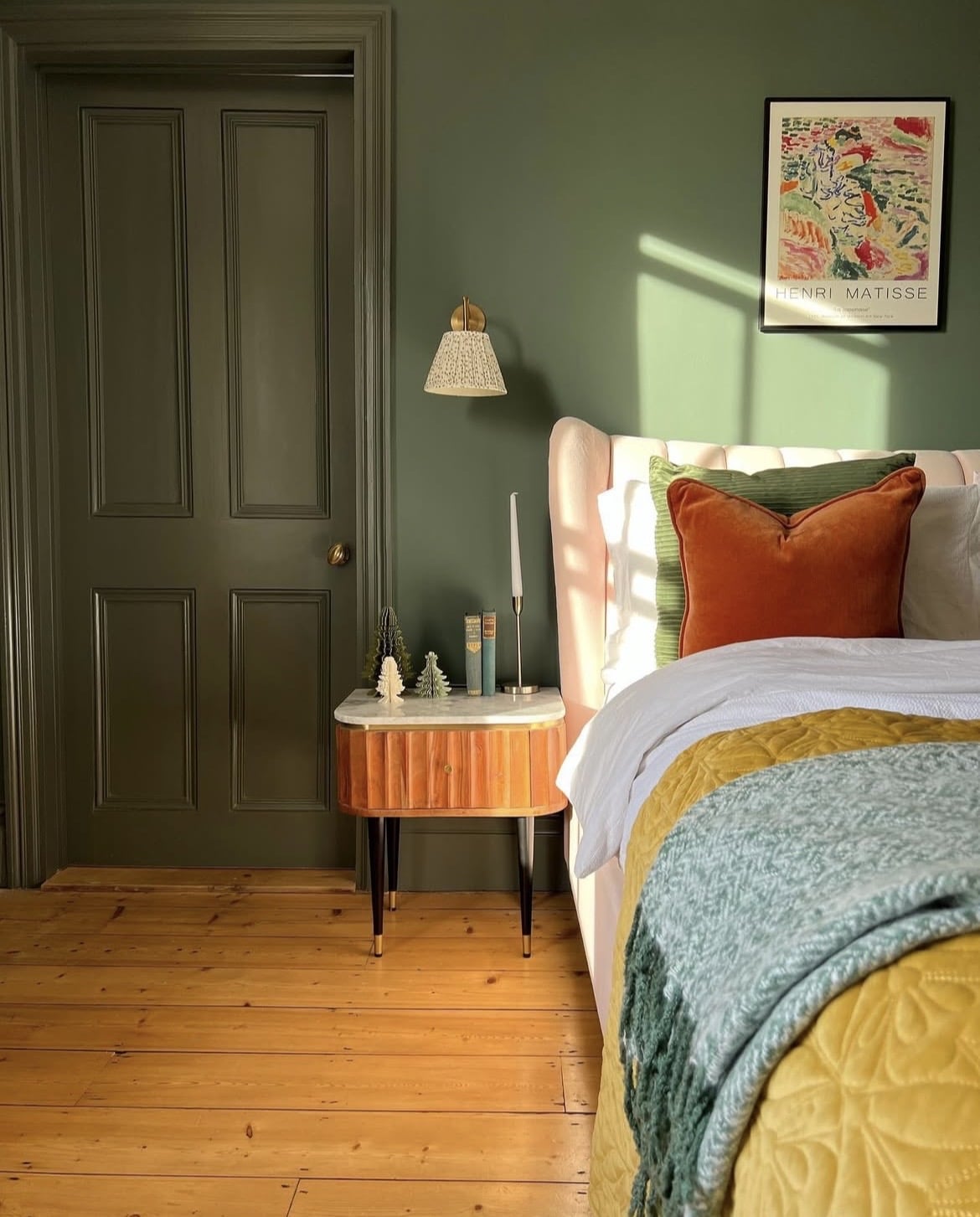
In 2026, the unexpected red theory is still working its way into interiors, but with rustier, earthier shades. If you’re not familiar with this theory, it suggests that adding a single pop of red to an interior is the magic finishing touch to draw the eye in, and pull together the colour scheme.
Whilst red works surprisingly well with most colours in small doses, it’s a match made in heaven against Green Smoke. Due to their opposite position on the colour wheel, this is what creates that high contrast, workable look.
Be it a piece of furniture, a red photo frame or a side table, layering with a red in this way will keep your interior feeling grounded, and connected to nature.
2. Harmonious Colour Scheme
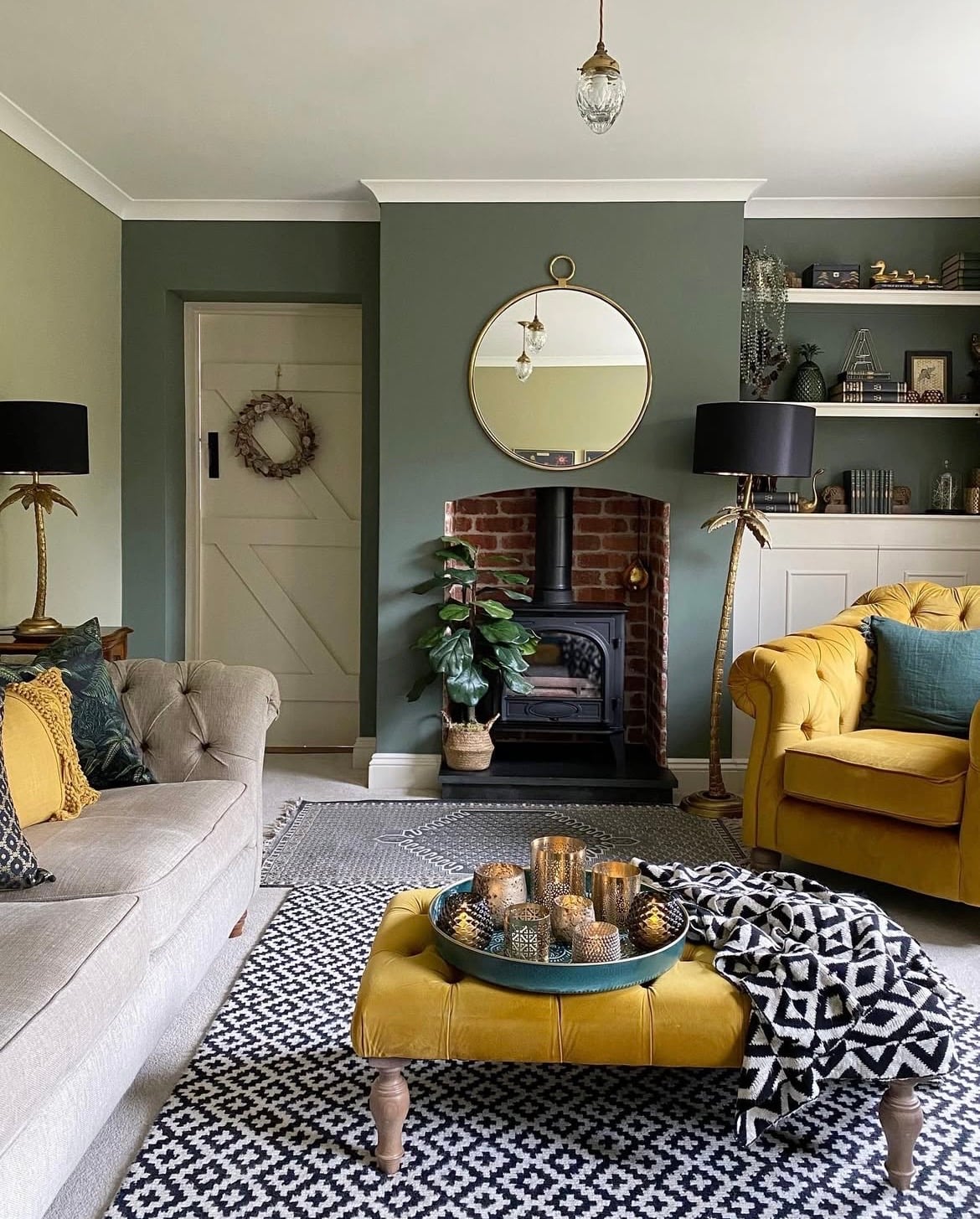
Create a colour scheme a little more familiar, by using a harmonious colour scheme. Green and yellow neighbour one another on the colour wheel, this delivers a harmonious flow which feels comfortable to be around.
With a shade such as Green Smoke, you’ll want to consider heritage or mustard yellow shades, as shown in the living room below to give a suitable enough contrast against the green.
3. Colour Drench
There’s plenty of different ways that you can decorate with paint colour these days, and one that isn’t showing any signs of slowing down in our homes is colour drenching.
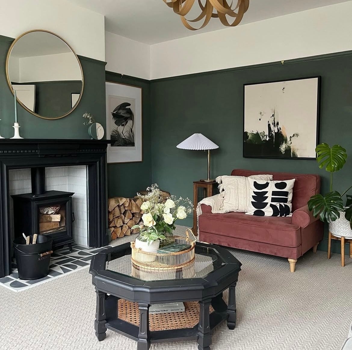
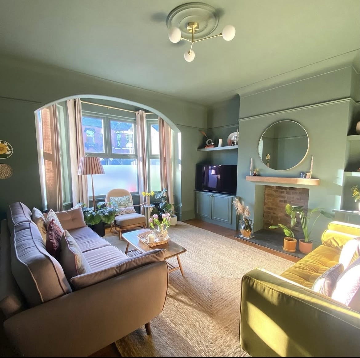
Be inspired by the below living room which has saturated the entire space in this earthy green. The result is one of high impact that makes a larger space look even more intimate, and cosier.
If you have a sunny south facing room, this can be a beautiful approach as it tempers the intensity of the sun, and stops it feeling overly harsh and bright during the height of the sun.
4. Two Tone Wall
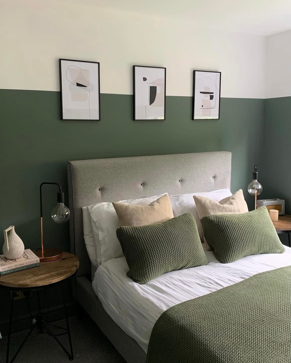
Feature walls aren’t so much of an interior trend right now, but adopting a two tone colour approach in a bedroom like shown below can be a great way to introduce some colour without overpowering the space.
Pairing with a tonal off-white on the upper half and ceiling will draw the eye up and create a welcome balance against the green.
Perfect for giving dark rooms some breathing space, yet not shying away from colour completely. A couple of off-whites that complement this green are Shaded White and School House White.
5. Grounded By Nature
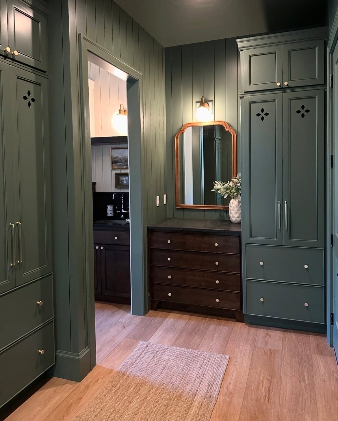
Green might be by far the easiest colour to dress in an interior because it’s naturally an earthy colour. Green generally pairs well with most colours, but pairing with natural elements and other colours derived by nature can help keep you on track with colour decisions.
It goes without saying that because of this, wood is one of the best accents you can pull into a scheme. Be it wooden flooring or vintage wooden furniture for that natural, transitional feel.
6. Natural Materials
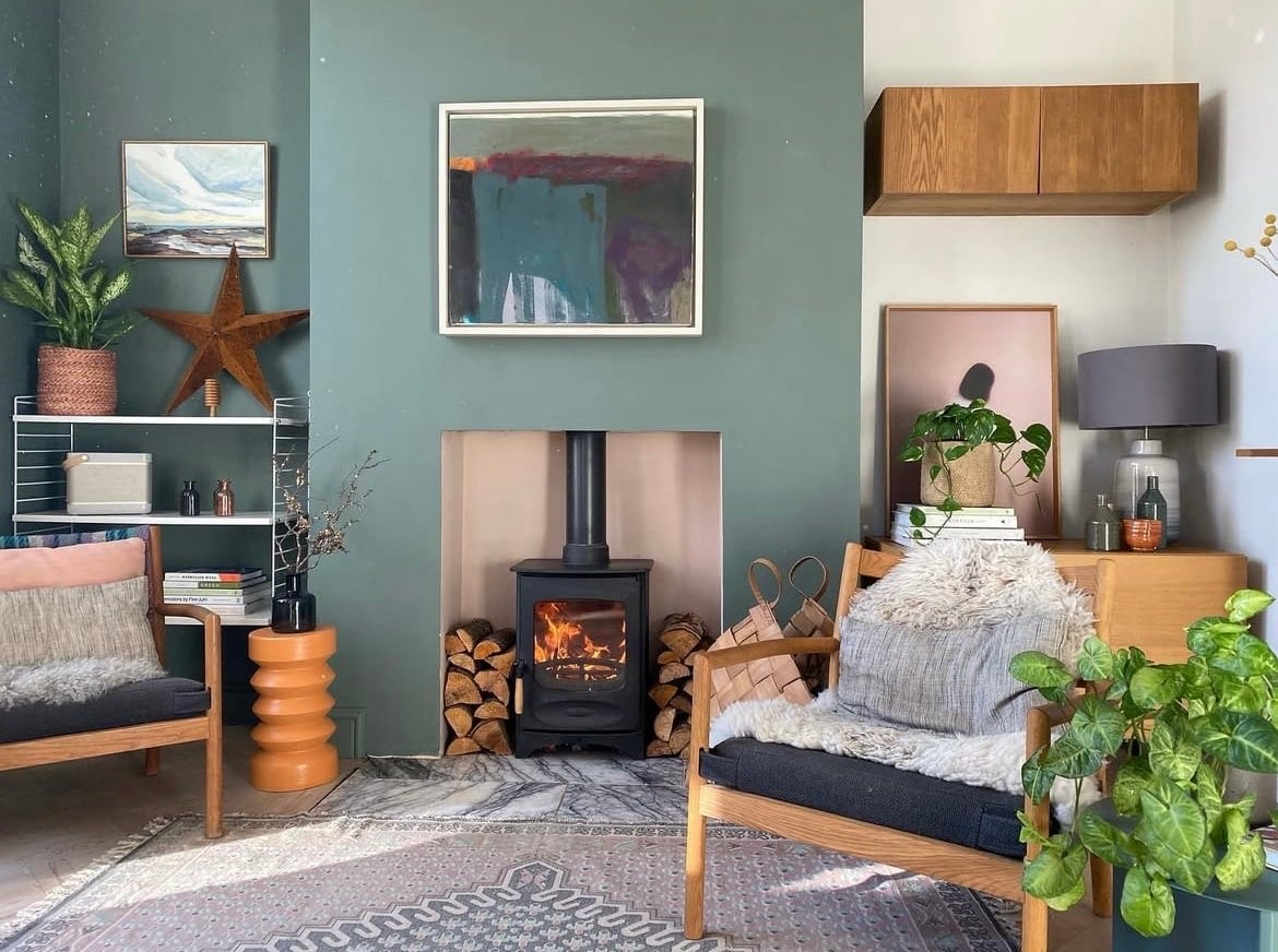
As an extension of that, take note of the below space which heavily leans into using natural materials for warmth, and that intrinsic link to nature.
Wooden furniture, wooden logs, seagrass, rattan, linen and glass are just a few examples of materials that you could consider layering into your scheme with Green Smoke.
7. Opposites Attract
This colour drenched bedroom comprises of everything you absolutely must try with Green Smoke! Opposites attract with a small pop of red on the bedding, with wooden furniture to ground the room and some harmonious tones of yellow to soften against the red.
You can really have some fun with a green, and it doesn’t solely have to be an earthy inspired interior scheme.

8. High Contrast
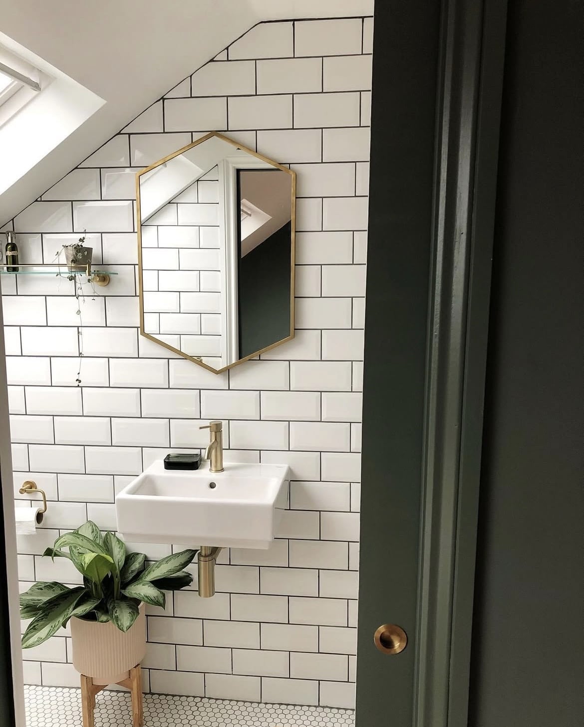
Green Smoke looks ridiculously good when served up as a woodwork colour in an interior scheme. Create a punchy and crisp contrast in a similar bathroom setting.
Use white tiles as your foundation, with green adding definition and modernity. It allows a touch of punchiness to be included in even dark spaces, yet become unnoticeable when balanced with a bright and airy white.
9. Lift The Eye
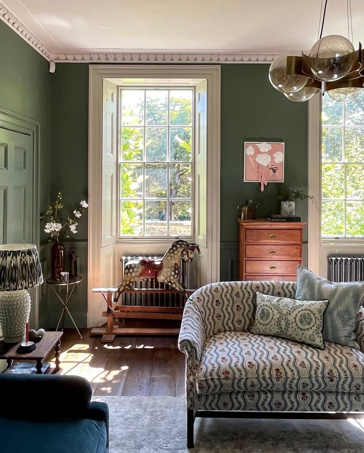
Keep things traditional and lift the eye in a colour scheme by opting for an off-white on the ceiling. Try and steer clear from a bog standard bright white, and instead use an off white such as James White which has a slight green undertone to it.
If you have coving, bring this white down onto the coving which will enhance these architectural details even more as they will pop against the green.
10. The Perfect Colour Pairing
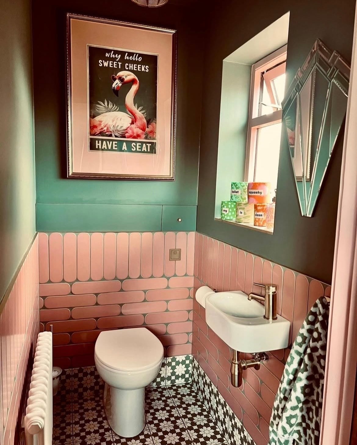
Another high contrast colour pairing with a green is of course, pink! Those deep green tones are well balanced by a pink, being neither too masculine or feminine in a scheme.
A lovely way to do this is by using half wall tiles in a downstairs toilet or bathroom, creating visual interest and endearment. If you want to create something similar with a shade of pink, look no further than Pink Ground or Setting Plaster.
11. Engage The Fifth Wall
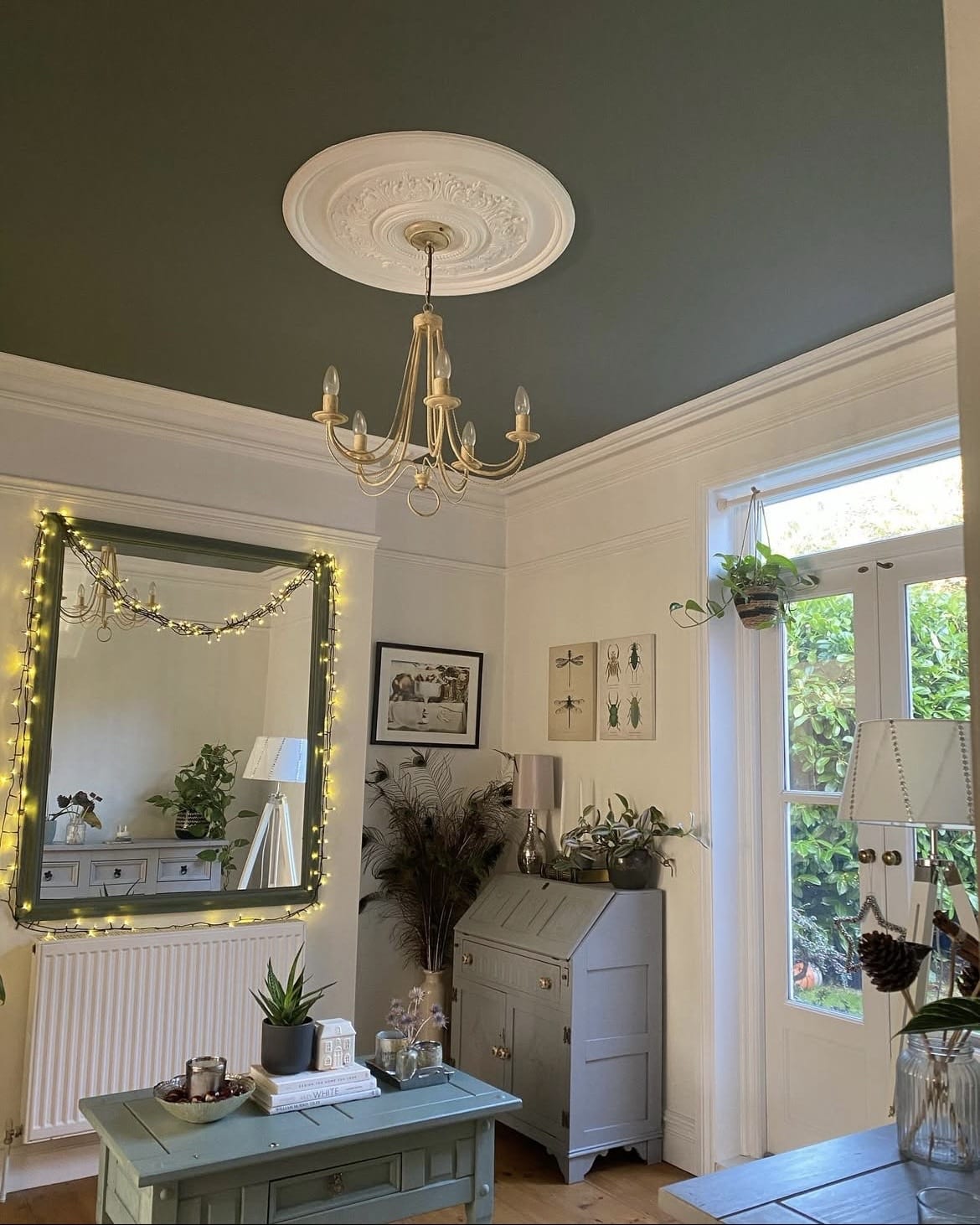
Engaging the ceiling in design plans isn’t a new concept, but it’s something we’re seeing more often in design now as people get braver with colour choices.
Instead of other approaches, switch the colours around. Use a soft, complementary off-white on the walls such as James White, bringing intense drama to the ceiling with the green. This illusion can make the ceiling feel closer than it actually is, so a decorating style that’s much more suited to high ceilinged properties.
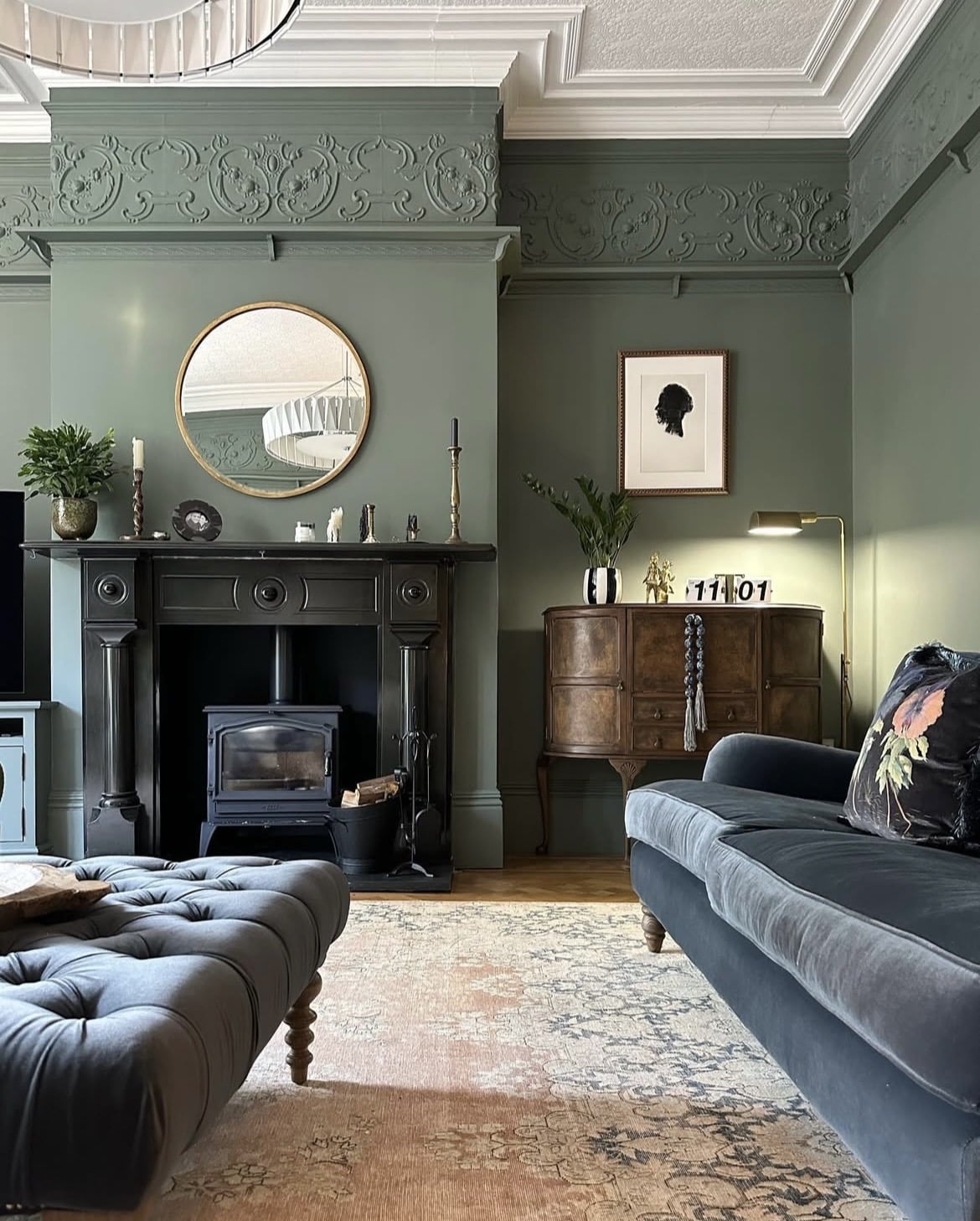
12. Don’t Be Afraid To Pair With Blue
There’s no such thing as green not pairing well with blue. These two colours set next to one another on the colour wheel is what makes them a harmonious pairing.
You’ve just got to be mindful of the tones you use. With Green Smoke in mind, you want to introduce deeper, luxurious shades of blue as shown below which will add natural definition, and create a cosy feel.
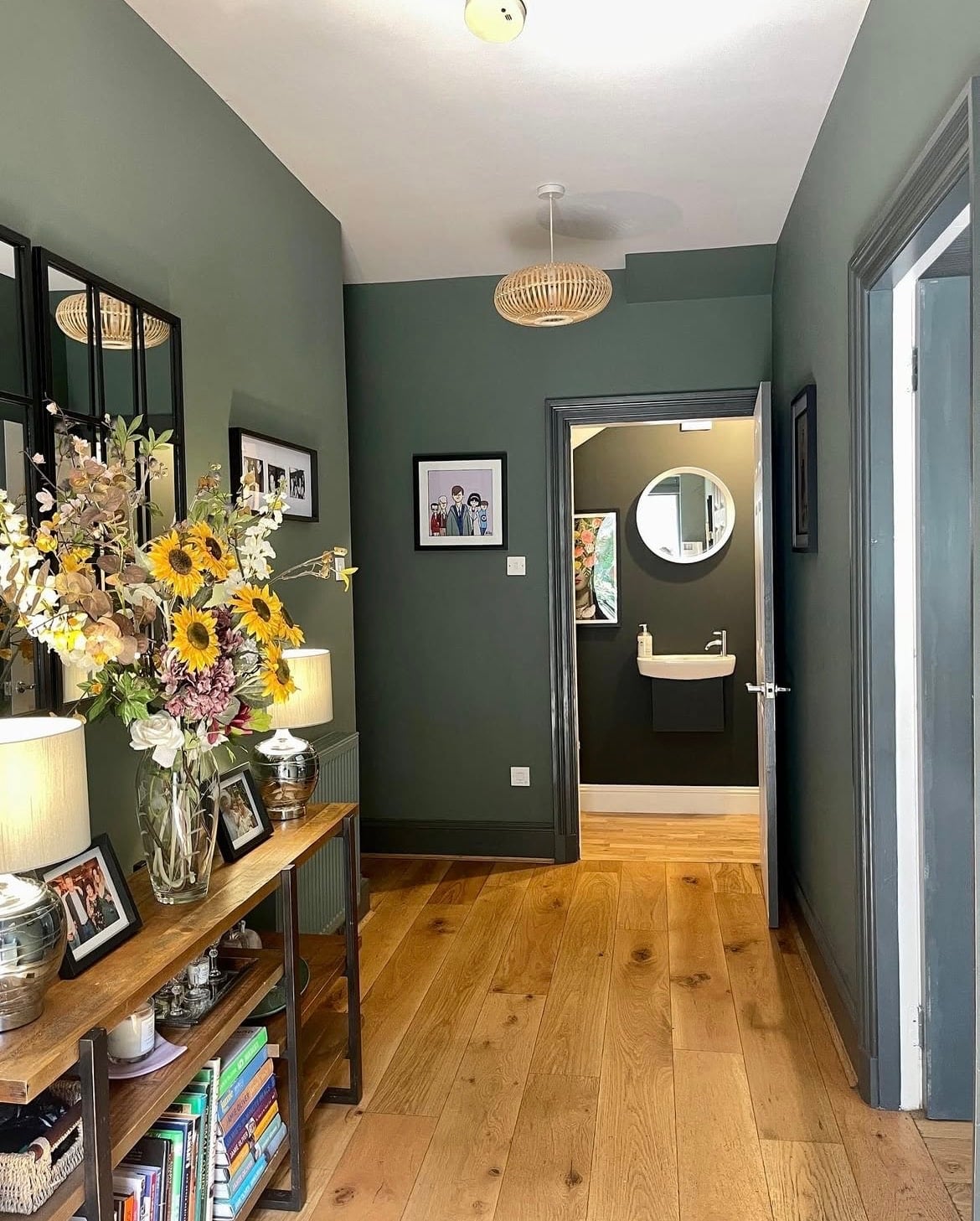
13. Choose A Darker Shade For Woodwork
When choosing a woodwork colour, try and not have a knee jerk reaction to choosing a white. I personally love to lean into a shade that is a couple of shades darker than my wall colour as it adds definition and style.
To take a similar approach to that with Green Smoke, consider using Beverly which is a couple of shades darker.
14. Subtle Off White
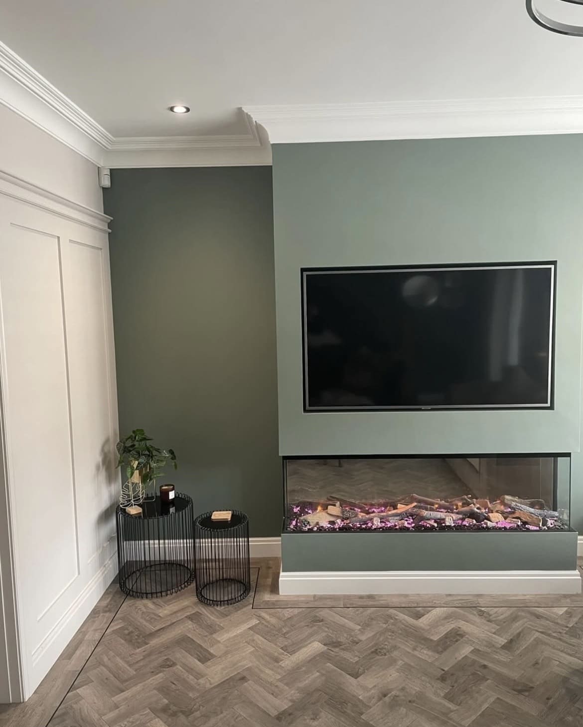
Take note of the below living room which uses Green Smoke as an accent wall on the chimney breast/TV wall. Pair with a subtle off-white/warm neutral that’s in keeping with the same tones.
Shaded White has green undertones, and is a lovely warm neutral that pairs beautifully with it.
15. Layer With Tonally Relevant Colours
A tonal colour scheme is one that’s easy to replicate, it’s cosy and looks great. Using Green Smoke as your base, consider layering with other shades of green through textiles, decor such as lamp shades and artwork.
This creates a much more interesting and well executed look. If you love a good green and how it’s company makes you feel in an interior, this approach works every time!
If you have any other questions about using Green Smoke in your interior, or are looking for other paint recommendations, please leave me a comment below!
