You can’t go wrong with picking a comfortable green for a living room, it’s grounding, connects us to nature and well, it’s hard to feel bad when surrounded by a lovely green. Card Room Green from Farrow and Ball ticks all of the boxes for a comfortable green that’s not too dark and oppressive.
Green is one of those shades that works so well with most colours, so there’s plenty of beautiful Card Room Green colour schemes to explore for your own space.
Here are 15 ideas shown in real living rooms, with ideas and best styling tricks to recreate in your own home!
15 Farrow and Ball Card Room Green Living Room Ideas To Try
1.Tasteful Wallpaper Pairing
Pairing an accent wall with wallpaper on your adjoining walls is such a playful way to introduce more character and visual appeal to a living room.
When picking a wallpaper, try to tie in one of the colours to match Card Room Green, it will create a much more cohesive, and comfortable scheme. You can recreate this look with the classic, and popular Willow Boughs wallpaper by William and Morris.
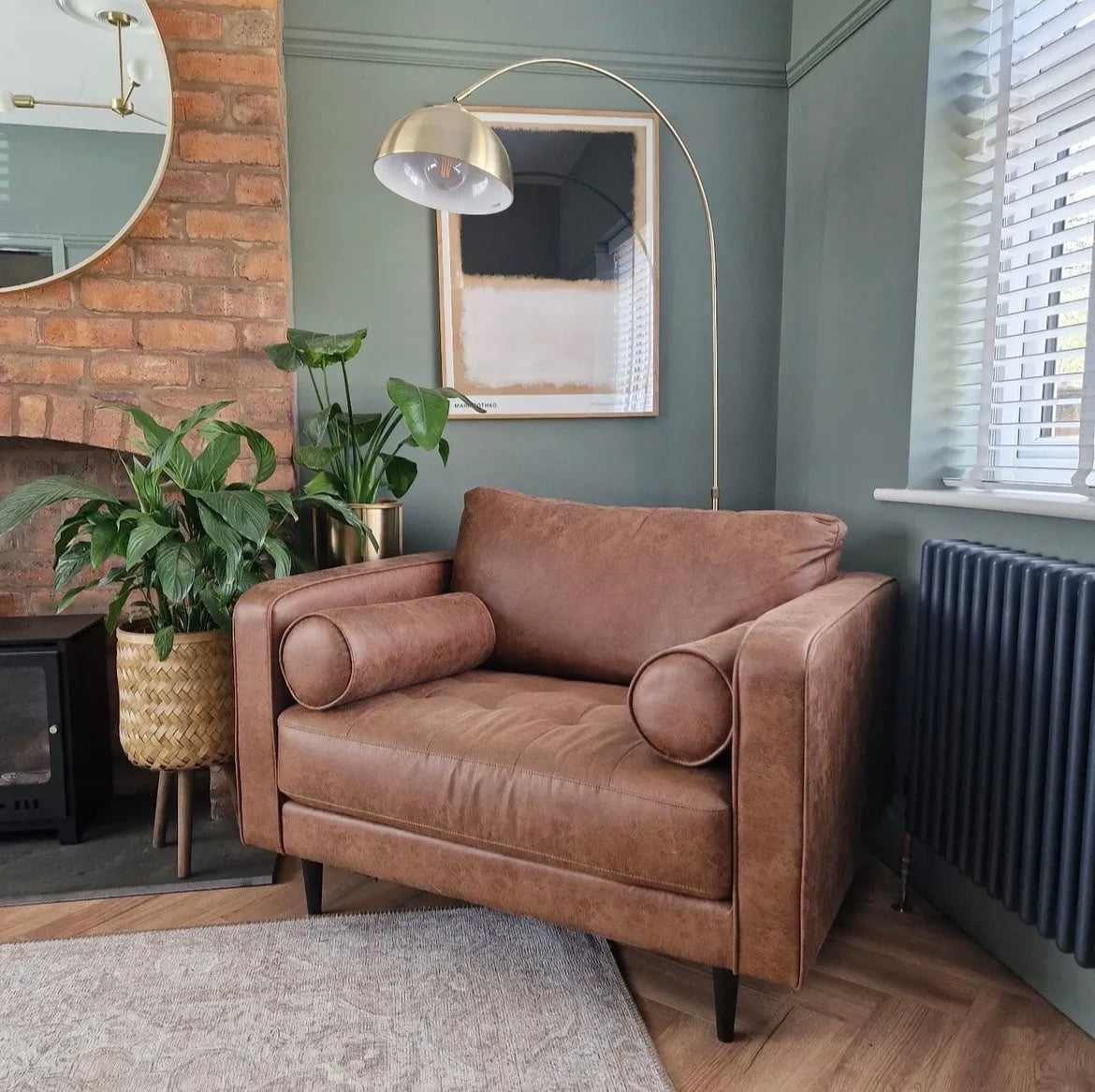
2. Cool Things Down With Marble
Green is a great balancing colour in an interior as it’s neither cool or warm, this makes it a true room pleaser as it looks great in both cold, north facing rooms, and sunny south aspect rooms.
Pair colours with it to create a desired effect, for warmth, you might choose to lean into gold or brass accents. If you want to cool the space down, consider using a marble fireplace, or even marble accessories that will add a subtle softness to the green.
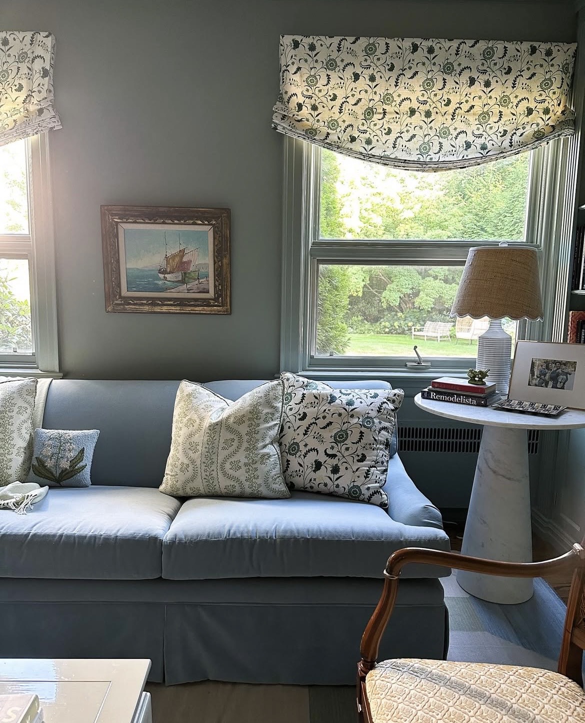
3. Green & Blue – The Colour Combo You Need To Know About
Pairing blue with green has always been a very mistaken combo in the interior, and fashion world. But do you know what? They’re one of my favourite combinations, as shown beautifully in the living room below.
Using Card Room Green as the main colour, you only want to introduce blue as a subtle accent colour, consider 1-2 pieces max, especially if you introduce a large piece of furniture in a blue shade such as a sofa. You may choose to tie in the blue to another detail such as roman blinds for a really intentional use of the colour.
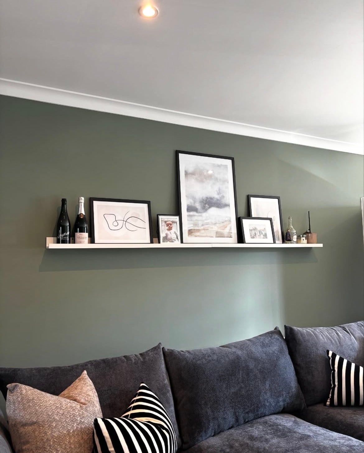
4. Lift The Eye With White
If you have a picture rail, painting above this and the ceiling in an off-white is still a popular approach that can give the illusion of a taller, and lighter space.
But, steer clear of a bright white paint! By contrast it can feel clinical and uncomfortable to sit with. Instead, lean into a soft off-white shade with a green undertone. School House White is a recommended white for this green and it delivers such a soft, subtle finish.
5. Lean Into An Accent Wall
Ready to dip yourself into using colour in a home but still don’t feel ready for a full approach? Try it on an accent wall! Chimney breast walls are generally a great bet to try this on as it focuses the eye as you enter the room.
I’m personally not a huge fan of accent walls unless they tie in well with the adjacent walls as it can end up feeling like you cut the room off by a band of colour. But, an accent wall is also a good starting point to see how you may feel with it on all of your walls. It’s hard to resist when you get a taste for colour in your interior!
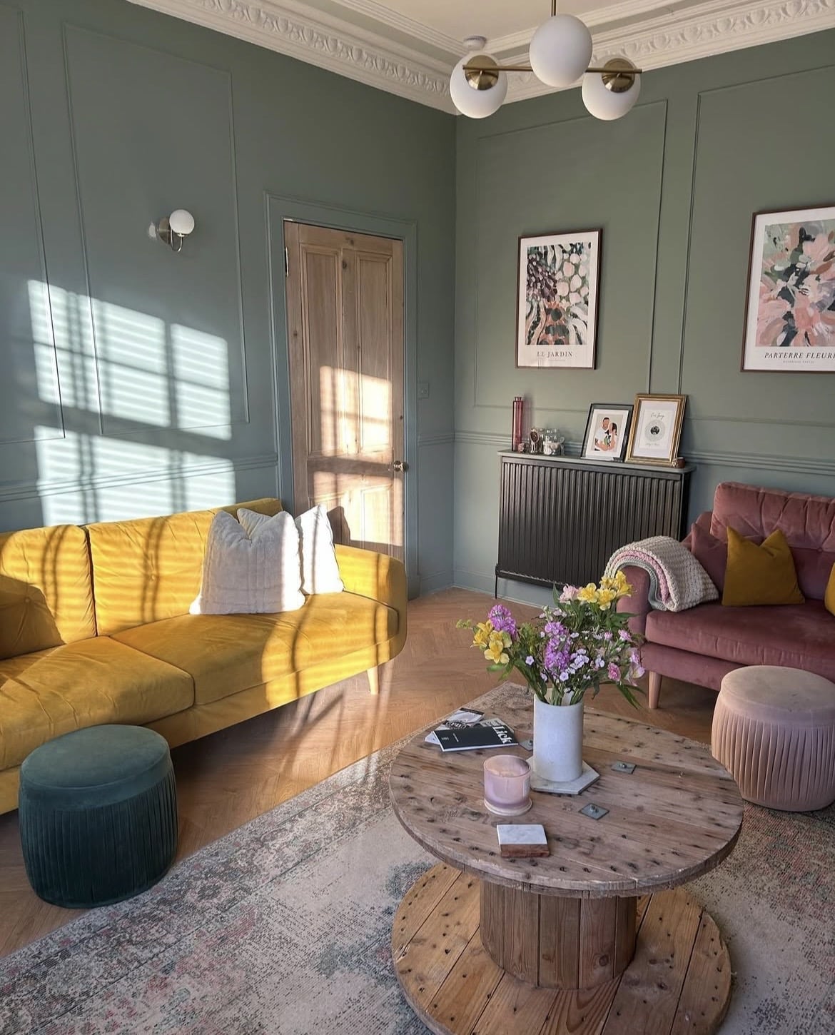
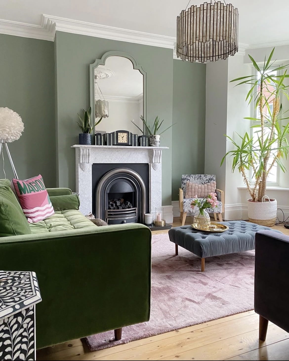
6. Opposites Attract
It’s definitely true when it comes to colours in an interior, green and pink remain one of the most high contrast colour pairings as they sit opposite one another on the colour wheel.
If in doubt, pink makes for a beautiful colour scheme with Green Smoke, bringing warmth and a touch of femininity. I love the punchy introduction of yellow here which sits side by side with green for a really relaxed and stylish look.
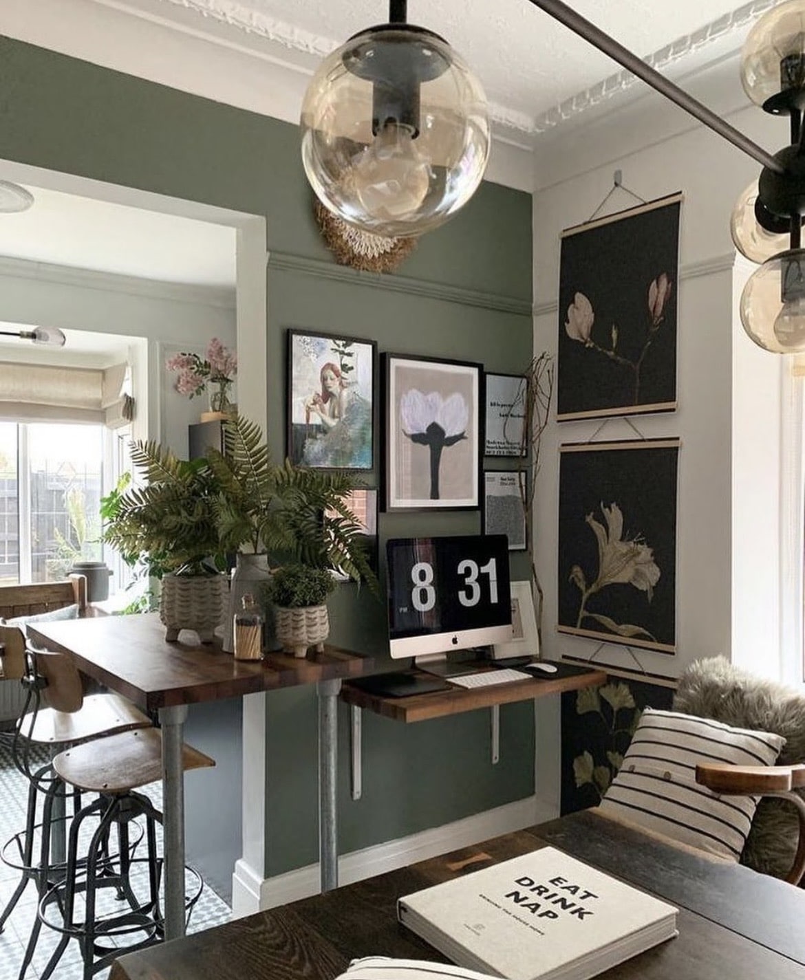
7. Half Wall Panelling
This type of panelling sure stands the test of time and one of my favourite ways to add some instant character and colour to a living room without overpowering the space.
Stick Card Room Green on the lower half as this will serve the purpose of defining your colour scheme, carry the colour around your skirting, architrave and door for the best result.
Carry an off-white up on and over the ceiling for an uplifting look, Wimborne White has been used in the below living room which brings natural warmth thanks to its soft yellow undertones.
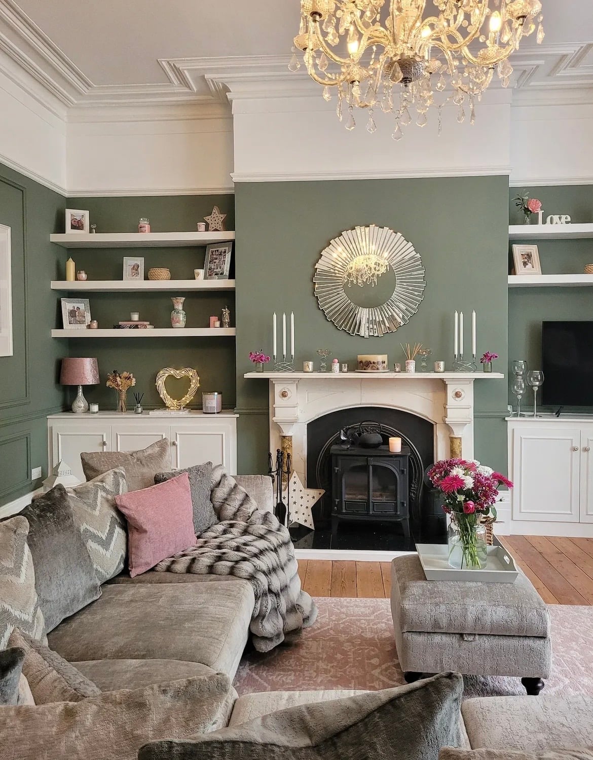
8. A Trio of Colours
When choosing a colour scheme, a trio of colours always works well, in the right doses there’s not enough to fight each other for attention, but enough to bring visual interest to the interior.
Pink and grey are natural, and very popular colour pairings for green. If you want something a little earthier and more rustic, lean into browns, creams and reds.
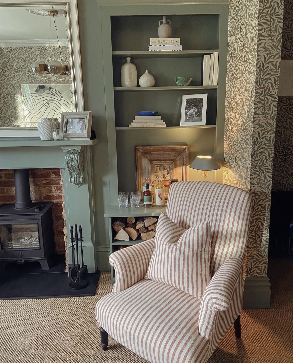
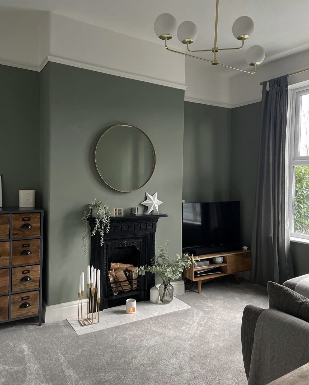
9. Ground The Room With Charcoal Hues
To bring more definition to a Card Room Green scheme, charcoal grey is a great choice that’s not as oppressive as black, yet still feels edgy and stylish.
Introducing it with a large piece of furniture such as a sofa or armchair will create the desired look, plus, it’s a fabulous colour for not showing dirt if you have a busy household!
10. Earthy Inspired Design
What’s not slowing down in the home this year is earthy inspired design, it’s grounding, soothing and a green makes for the perfect foundational colour.
For a colour scheme, you’ll want to introduce both natural finishes and colours that can be derived by nature, such as browns, reds, greys and red. Leather is such a great choice, it adds natural warmth and is utterly timeless in a living room.
11. Layer With Green
Create a tonal feel by layering with differing shades of green for a cosy look. Lean into darker or lighter shades than Card Room Green so you get that depth of colour in the room and further visual interest.
House plants are another fabulous way to introduce that natural element and comforting feel.
12. Transitional Elements
I’m a huge lover of mixing both old and new elements in an interior scheme for a look that’s grounded in nature, and history.
Take inspiration from the below with the pieces of vintage furniture, rug and artwork. Facebook marketplace and antique stores often pull up the goods, just allow the time it takes to find that perfect piece.
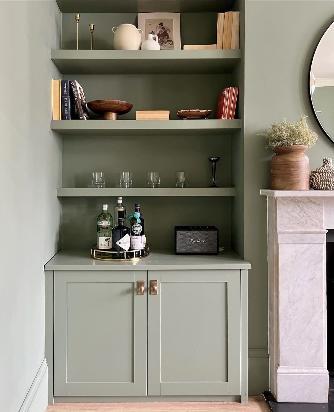
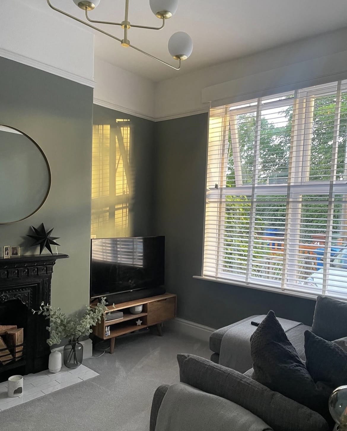
13. Warmth With Brass Accents
Brass, bronze and copper are perfect accent metals against a green as they’re naturally warm and contrast beautifully against the cooler tones of a green.
If you’re looking for even more interest, use non lacquered brass metals which will age and patina over time, I’m personally a huge fan of this natural ageing process that constantly delivers interest and a different look as the years go by.
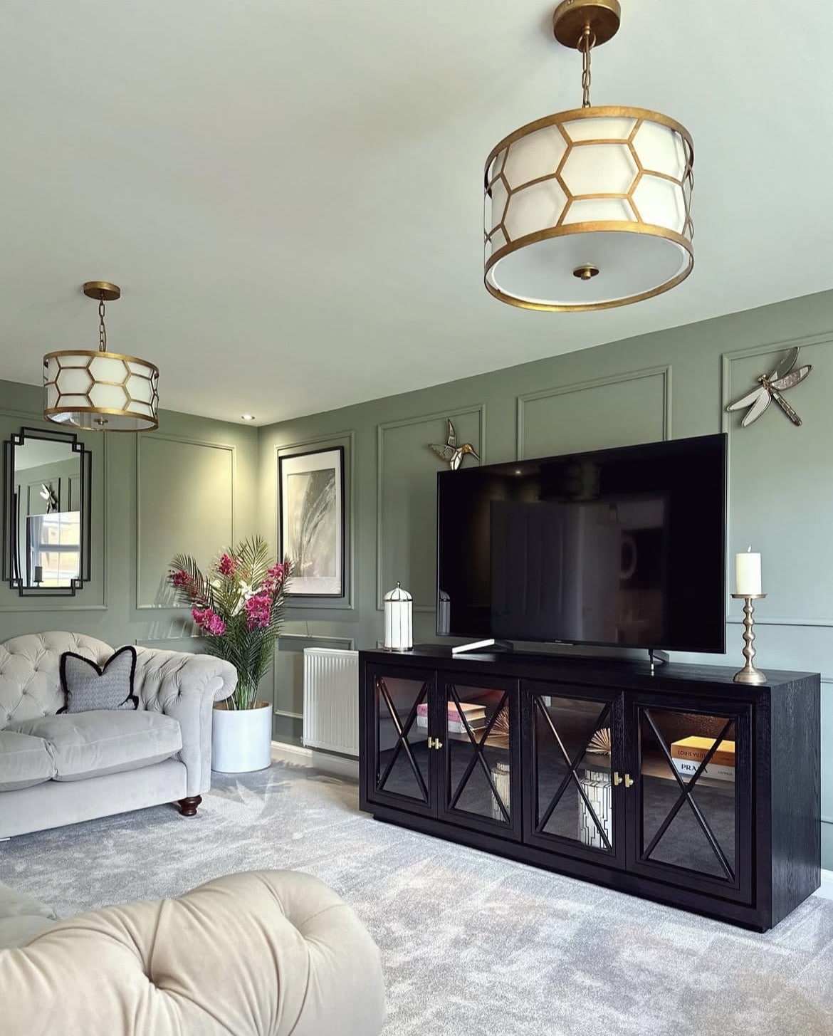
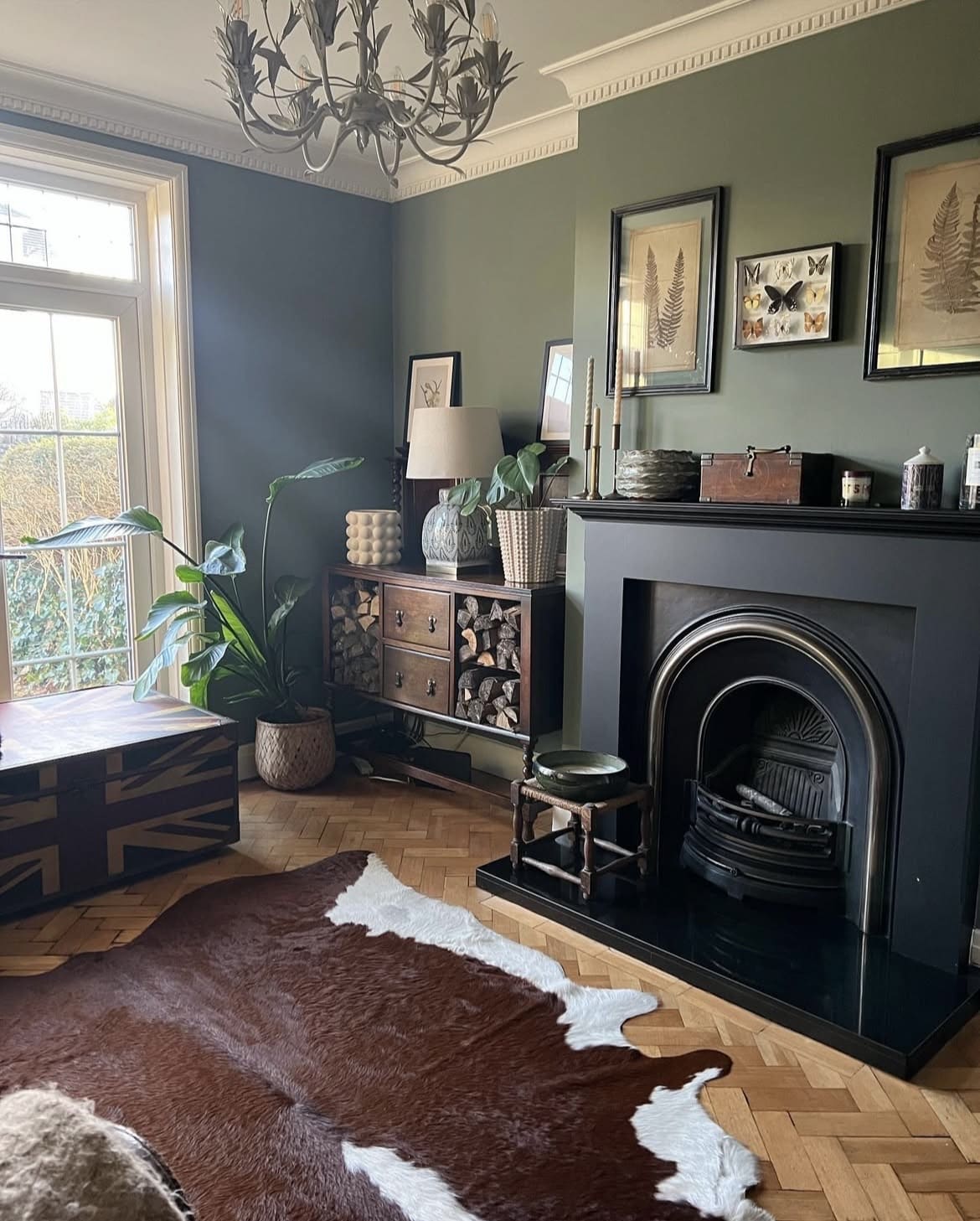
14. Defining Black Accents
Black is always a good idea if you’re looking for a fail safe colour to pull a colour scheme together. It will define the room and focus the eye as you step into the living room.
Fireplaces, frames, chair legs and even TV’s are natural ways to include this colour in your room without it looking oppressive in a colour scheme.
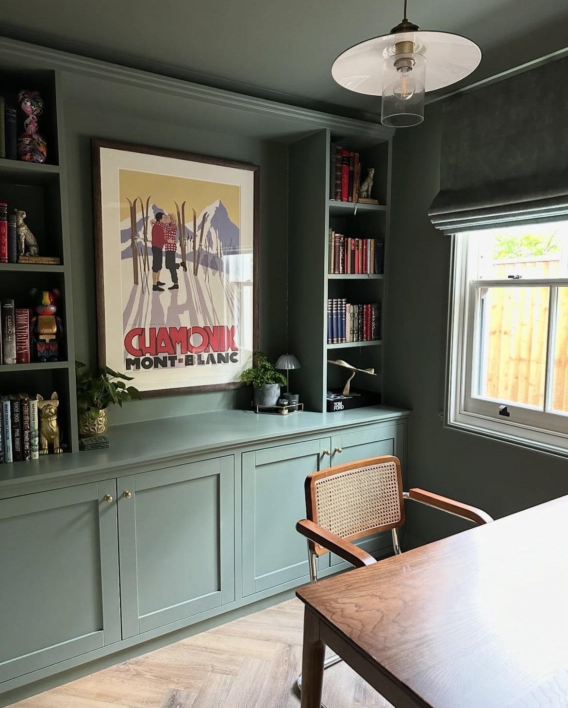
15. Colour Drench With It!
If you really want to lean into the darkness and feel connected to nature, colour drench the entire room with this green paint colour! That includes saturating the walls, ceiling, woodwork and even radiators in it for a true, drenched look.
The result is a cosier, more intimate space but it actually suits both large and small living rooms. The key to bringing this type of scheme to life is by introducing colour through decor, furniture and lighting.
Considering using Green Smoke in your home and not sure the difference? I’ve got plenty of Green Smoke colour ideas situated in real homes to get inspired from too! Have any other questions about using Card Room Green in your home? Let me know in the comments below and I’ll come straight back with my recommendations!