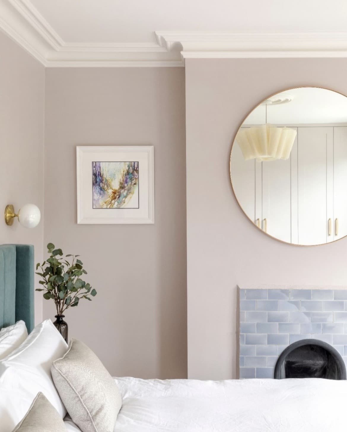
Peignoir is one of the lesser talked about pinks from Farrow and Ball, but one of the softest that’s perfect for creating a muted, un-stimulating colour scheme in a bedroom.
Described as a romantic pink grey, it sits between Great White and Calamine, and is the perfect bridge between being a warm neutral and a pink.
I’ve written about the best types of paint colours for a bedroom before, and a soft pink like this fits the bill for both adults and kids rooms as it’s soft, not stimulating on the eyes, and is a migraine friendly colour.
Being both a neutral and a pink, there’s so many gorgeous colour schemes to explore with it!
15 Peignoir Farrow and Ball Bedroom Colour Scheme Ideas
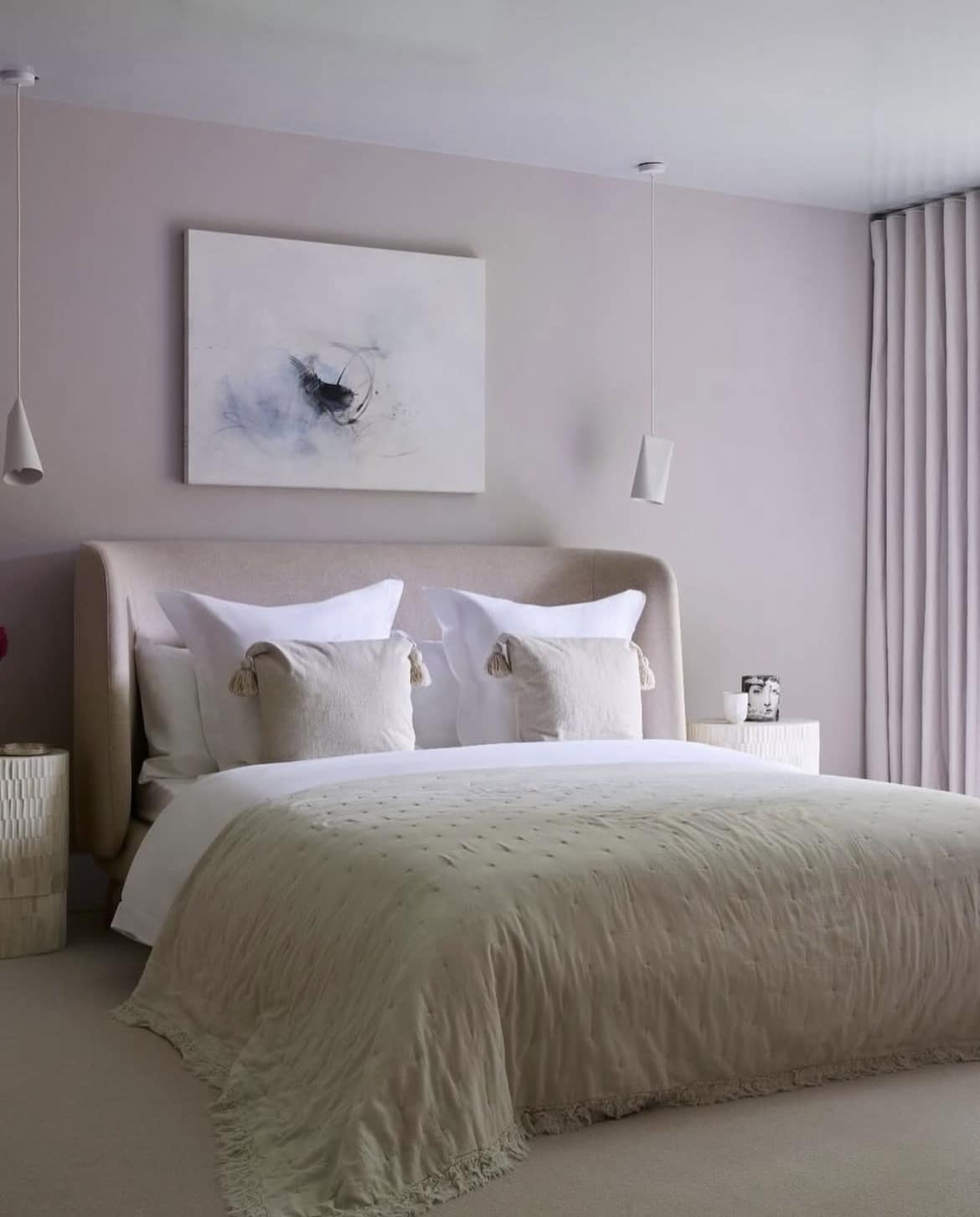
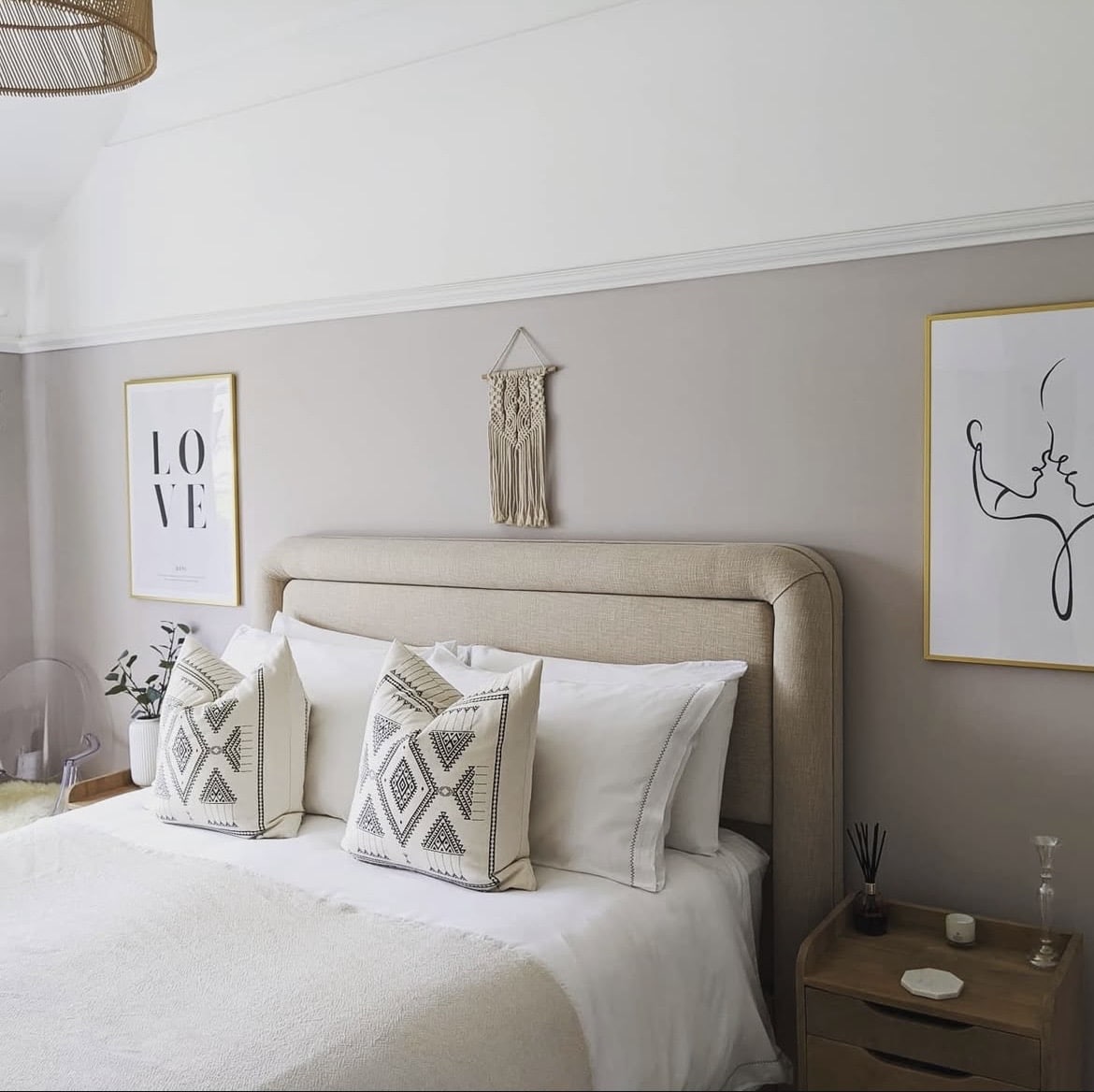
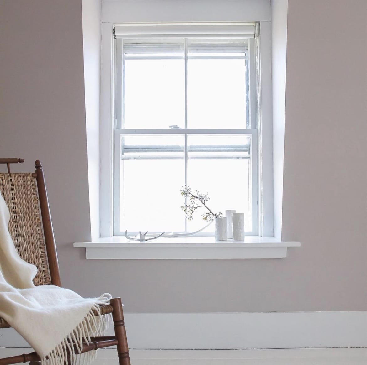
1. The Softest Colour Scheme
Lean into the softness of Peignoir and layer with tonally relevant colours to create a muted, comfortable scheme in your bedroom.
This softest pink by Farrow and Ball contains a big dose of grey, so introducing some soft grey tones on bedding, a tiled hearth or curtains is a lovely way to create an intentional look.
If you want to bring an off-white onto the ceiling or woodwork, stay away from bog standard bright white paint and instead choose something such as Great White which is the softest, most complementary white to Pegnoir.
2. Soft Butter Yellow
Butter yellow was the trending colour of the year in both fashion and interiors, it’s uplifting, soft and a harmonious colour pairing with a pink like Peignoir.
Use butter yellow as a secondary accent colour in your bedroom scheme, one that is ridiculously easy to pull off with bedding, throws, cushions or other textiles such as curtains.
3. Romantic Touches of Red
Create more of a playful, romantic scheme by adding in a pop of red to bedding, whilst also tapping into the viral ‘unexpected red theory’ – the theory that adding a single pop of red to an interior scheme focuses the eye, and pulls the interior scheme together effortlessly.
Adding a red as demonstrated below adds some definition against this romantic, soft pink without having to rely on black, or a darker shade of grey.
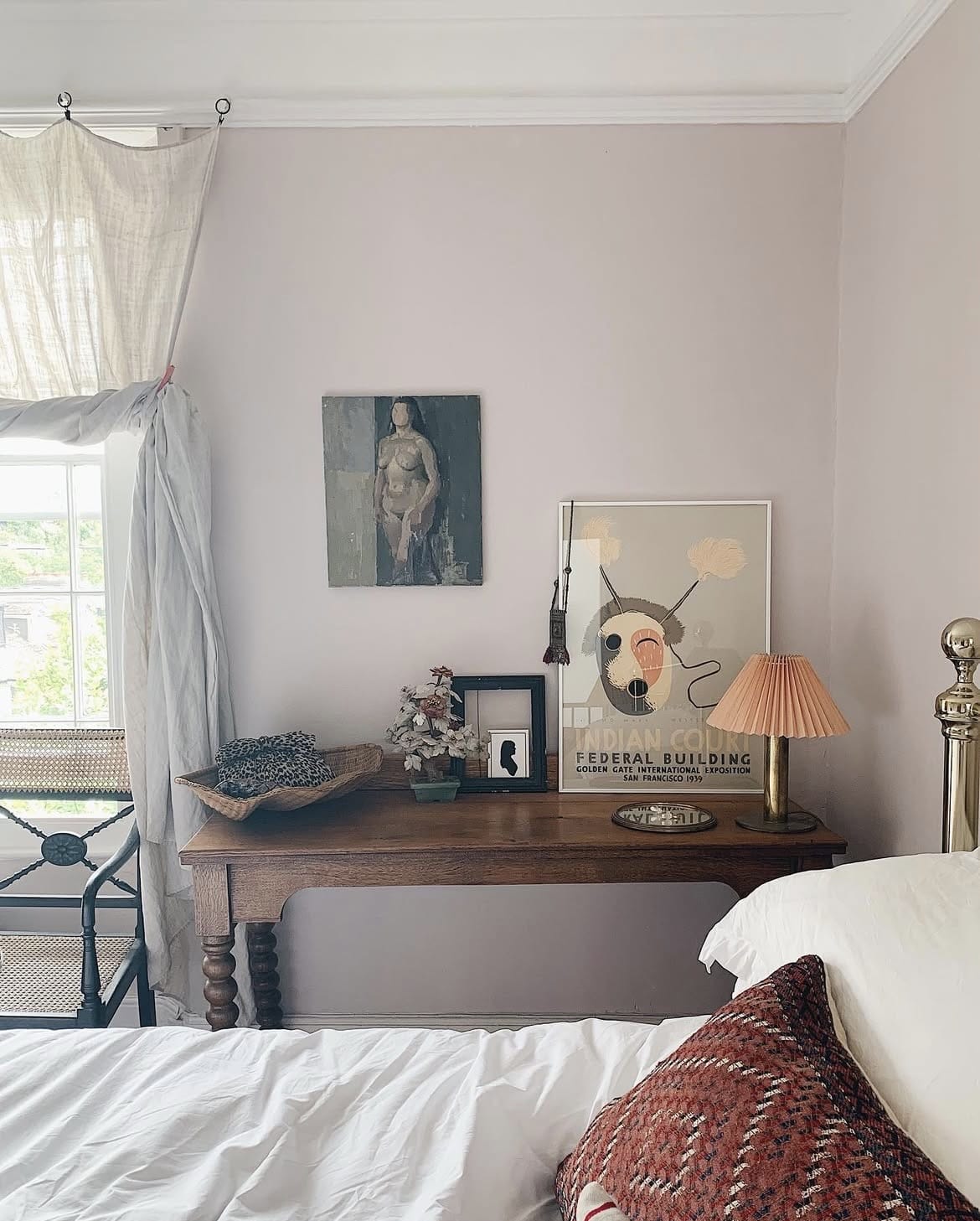
4. Neutral, Boho Style Scheme
It also fits into a bohemian inspired bedroom scheme well. If you’re looking for a warm neutral that’s not a beige or cream, this soft pink is a great alternative which isn’t overly feminine.
Pair with sandier neutrals across your lighting, decor and bedding textiles to bring more of the grey tones out of this pink.
Wevet is another lovely off-white to use with Peignoir which also carries a soft grey undertone, creating the most subtle understated white.
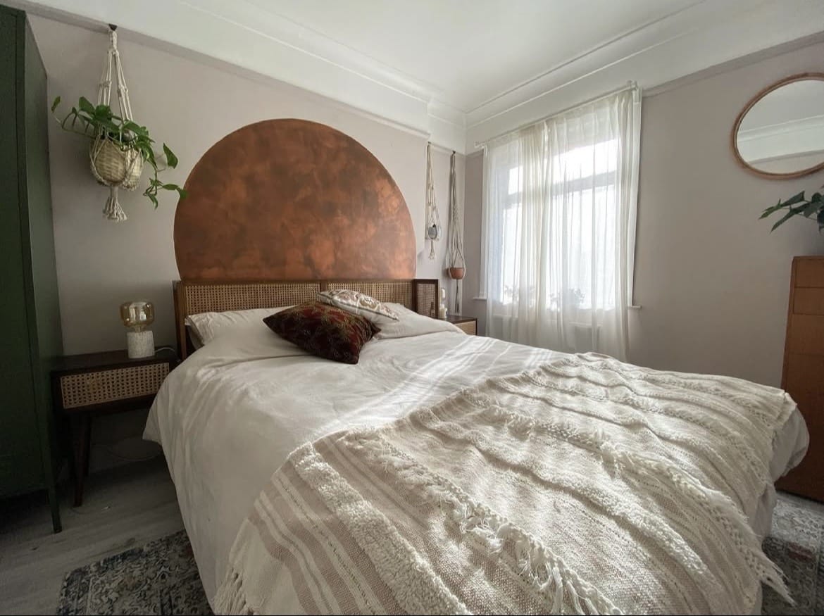
5. Warmth of Copper
Bed frames are generally one of the best ways to create a stand out focal feature in a bedroom as it draws the eye in and sets the tone for the rest of the room.
For something a little bit different, look at this extension from the bed frame using copper. It brings natural warmth, interest and a lovely definition against Peignoir.
You might choose to weave some like colours of brown, or even rusty orange into the bedding scheme for that intrinsic link.
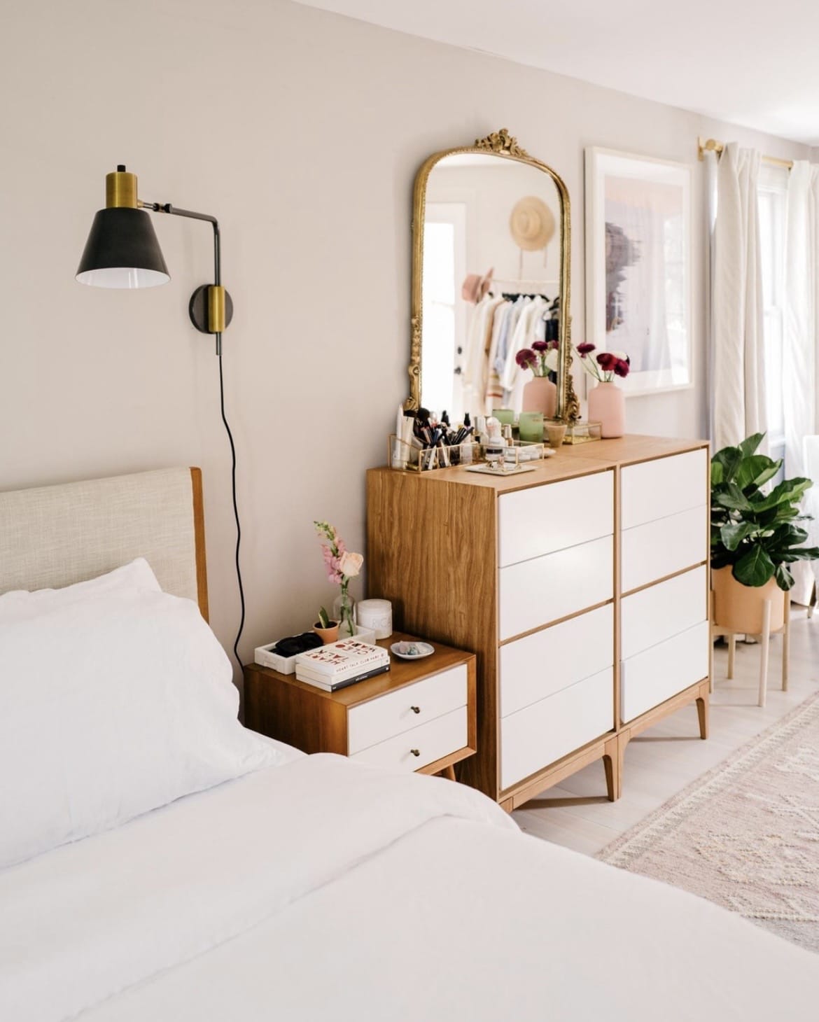
6. Mid Century Style
Whilst Mid Century style generally focuses on whites and bolder shades of orange and blue, Peignoir actually works as a beautiful base, and adds a little more interest than a standard white.
Pair with that tell tale Mid Century style teak furniture to ground the rooms scheme. Both brass and black accents will help to complete the bedroom scheme, drawing in the eye and adding natural definition.
7. Complementary Off White
Instead of using Peignoir across all of your walls, use it as an accent colour to zone a space, or to paint any woodwork, bedroom cabinetry for a fun pop of colour.
There’s plenty of complementary off-whites that go well with this pink including Wevet, Strong White and Great White. If you want something a little bit more neutral in tone, consider a shade such as Dimity which carries a warm red based undertone.
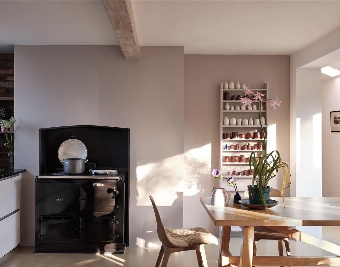
8. Natural Elements
Earthy inspired design is topping the trends for 2026, and as this pink has a generous dose of grey as an undertone, it can work really well in an earthy scheme.
Consider pairing natural elements with it to ground the space and tap into that intrinsic link with nature that makes us feel good!
Think a wooden bed frame or chair, rattan baskets, a seagrass pendant light and decor elements that have been derived from nature.
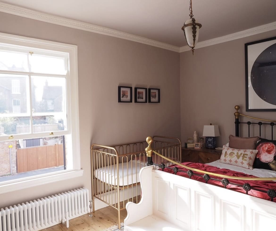
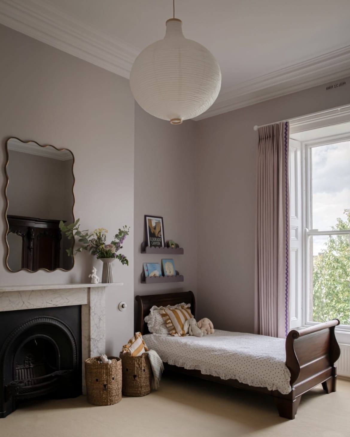
9. Vintage Feel
The beauty of this pink is that it works in both old and new homes, and in vintage/traditional style interior schemes, it’s what you pair it with that will dictate it.
This bedroom below uses some beuatiful vintage furniture and decor elements to create a lived in, and interesting bedroom scheme.
10. Pink & Green Always Deserve To Be Seen Together
If you’re ever stuck on what to pair with a pink, go for green! These shades sit completely opposite on the colour wheel which creates an energising colour clash that works together, every time.
I absolutely love the sofa bed setup in a gorgeous emerald green colour, it pops against the pink and the complementary cushions in an array of soft green and pinks creates a layered, cosy scheme.
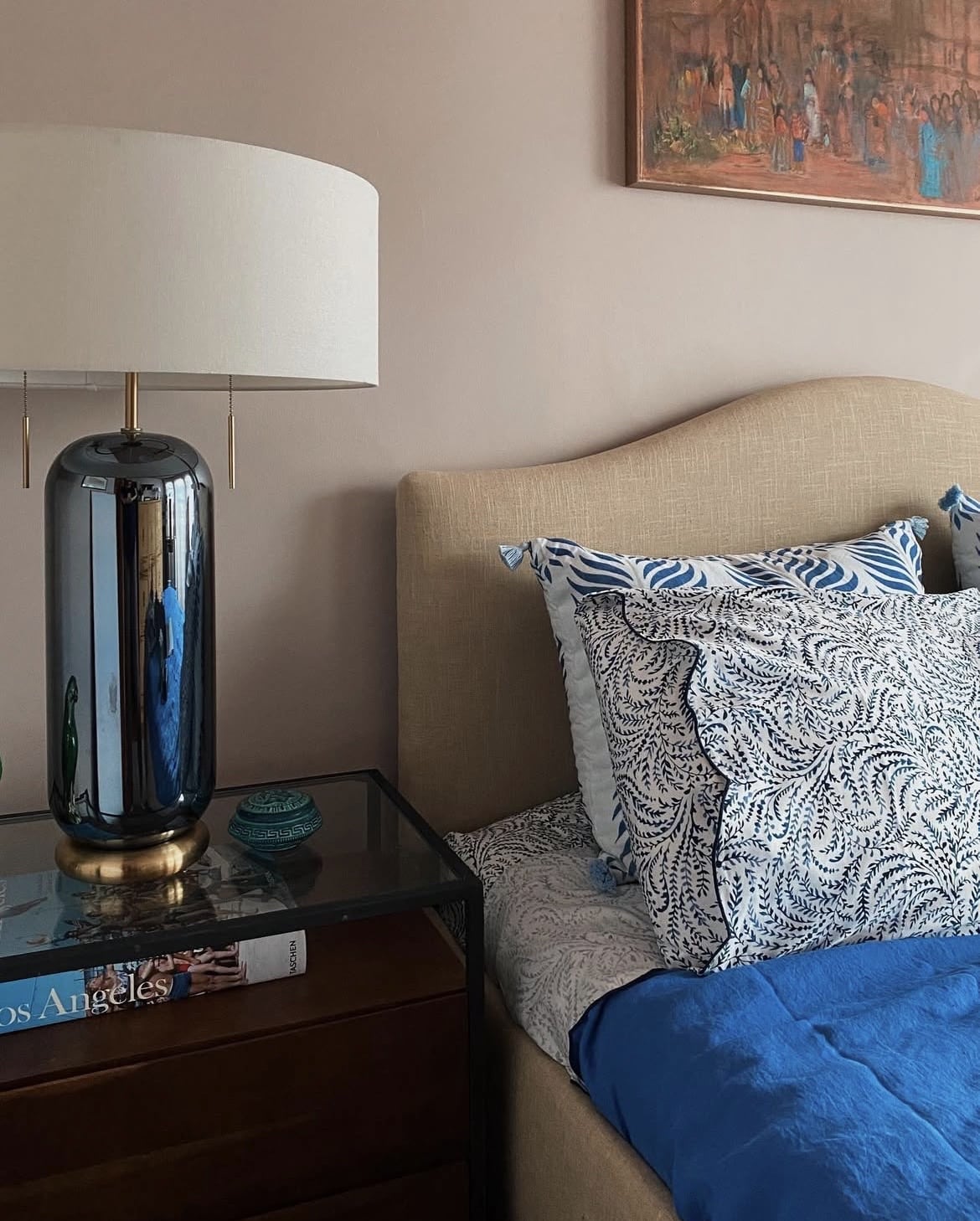
11. Cool Things Down With Blue
Pink and blue are another highly contrasting colour scheme that works. Those cobalt blue shades in the bedding add definition without overpowering the scheme, just a few small doses does the trick.
As Peignoir is a lovely muted shade, try not to use any like shades of blue, instead opting for something a little darker, or bolder to avoid the scheme feeling washed out.
12. Lean Into Those Grey Tones
If you position grey tones against Peignoir, it will bring out those grey tones even more in this lovable pink.
Grey furniture, bedding or other textiles is a lovely way to do this in a bedroom. Alternatively, if you’re looking to introduce a grey to an accent wall or a ceiling, Charleston Gray is one of my favourite grey matches as it carries such gorgeous definition without being a basic grey as it carries those unique brown undertones with it.

13. Layer With Darker Tones
Use Peignoir as your inspiration and create a tonal bedroom scheme by using light and dark tones of Peignoir in your bedding, textiles or decor.
This creates an incredibly simple and soothing scheme as there are no competing or clashing colours to take note of. It’s uncomplicated and comfortable to sit within, so ideal for kids bedroom schemes.
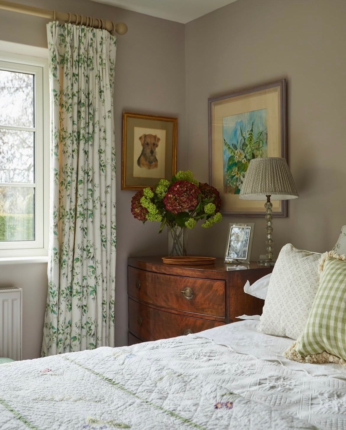
14. Cottagecore Style
Simply be inspired by how Peignoir fits beautifully into this Cottagecore inspired bedroom. I adore the floral curtains with pops of green for that contrasting look.
Ground with natural wooden bedside tables and add interest with differing frames and art work for that personalised look in your bedroom.
15. Define Things With Black
You can never go too far wrong by introducing a dose of black to a bedroom colour scheme. Black will ground any colour scheme, focus the eye and bring a touch of modernity.
You only need to feature it in a few small accent areas to make the most of this colour and it will work with Peignoir, rather than fighting agaisnt it.
If you have any other questions or need some advice using this paint colour in your bedroom, please leave me a comment below!