Dead Salmon is one of those perfect shades of pink which is neither too feminine nor oppressive, this aged pink is wonderfully characterful and is such a beautiful shade to adorn the walls in any room.
Like many of Farrow and Ball’s shades it carries a unique metamorphic quality, reading like a mushroom or a warm neutral, depending on the time of the day, and the light it is perceived in.
Whilst it is a pink, it pairs well with virtually any colour, and if it’s a paint on your wishlist, here are some of the most beautiful, and trendy colour schemes to try in your own home with it.
A Designer’s Guide To Stylish Farrow and Ball Dead Salmon Colour Schemes
1. Balance With Cool Neutrals
This aged shade brings depth and warmth to a room, and a beautiful way to style it out is to balance it with cooler neutrals for a well balanced room.
Consider using soft greys, whites, charcoal and black tones to define and ground the colour scheme. If you’re looking for the perfect off-white to pair with Dead Salmon that isn’t a bright white, use Pointing. This subtle off-white is red based so it’s a wonderful match for this pink, creating a much softer, warmer feel.
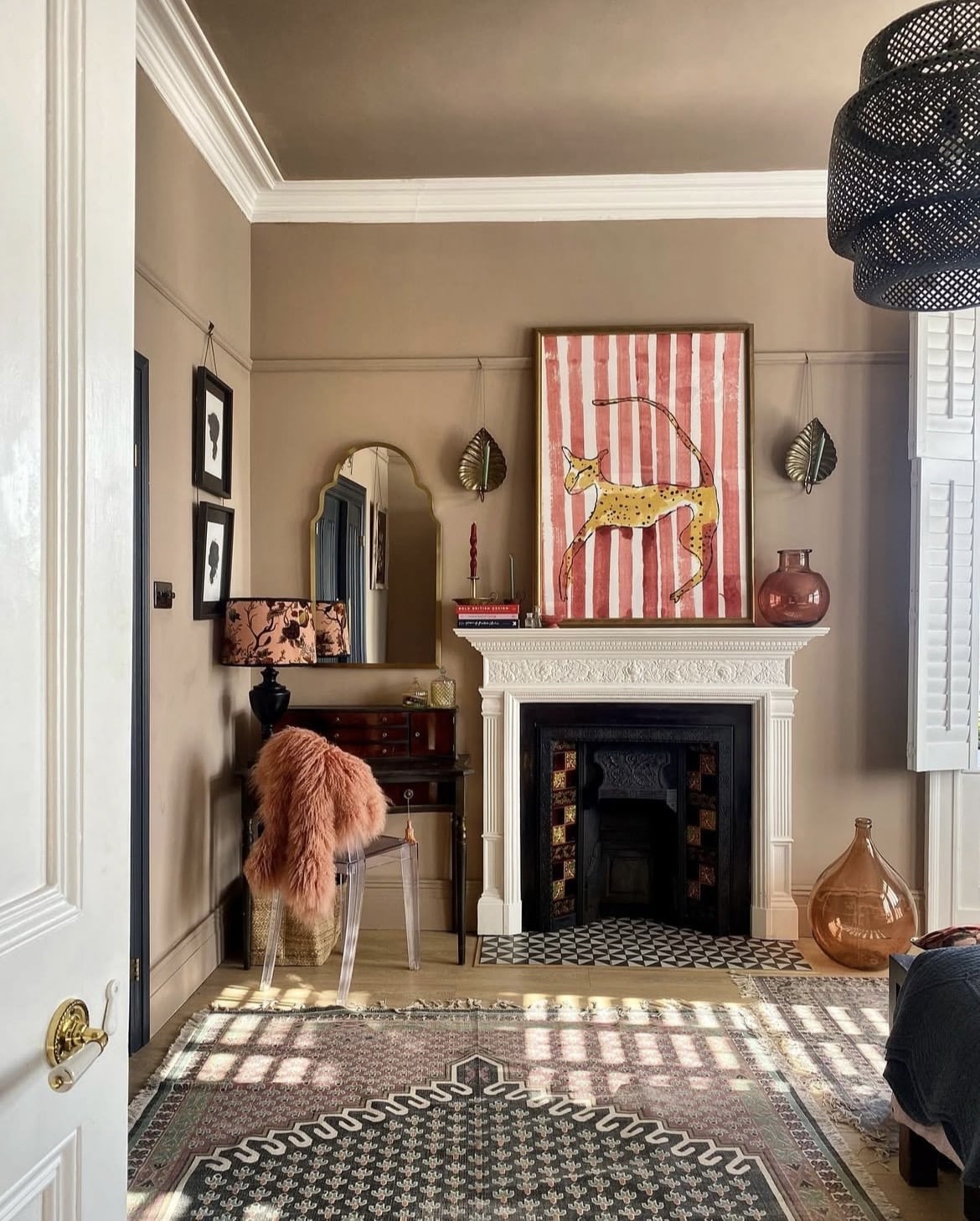
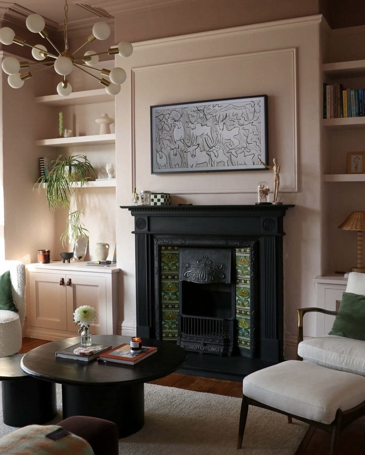
2. Add A Crisp Contrast With White
There’s no denying that there’s always a place for a crisp white in a scheme if this is your desired look. Instead of a knee jerk reaction and painting the ceiling white, why not consider adorning the fifth wall in the same pink shade for added depth in the room?
Finishing with a white on woodwork details creates a stark, crisp contrast, I particularly love it on the detail of the fireplace as it really stands out. Recreate this look by using All White on your woodwork.
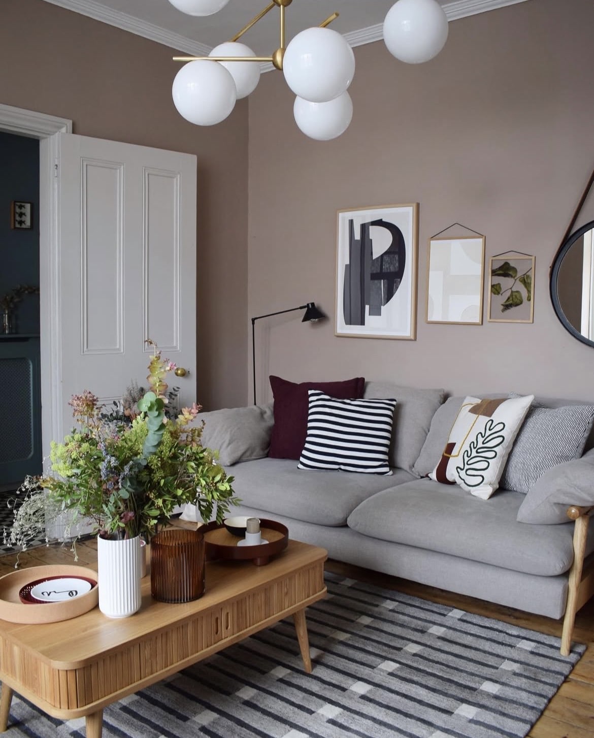
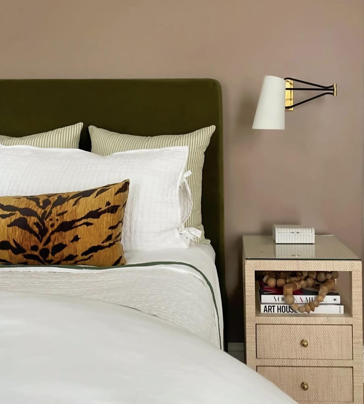
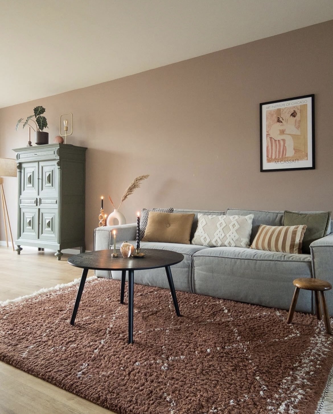
3. Green & Pink Creates The Highest Complementary Contrast
The most aesthetically pleasing and comfortable colour combination with Dead Salmon is green. These two shades sit opposite each other on the colour wheel, creating the most high contrast look.
The best bit? Virtually any shade of green works well. Or, make like the below and create a more layered look by incorporating both lighter hues of green, and something a little bit darker, such as on a bed frame or large piece of furniture to ground the colour scheme.
This is one of my favourite colour schemes as you just can’t feel bad when surrounded by a good shade of green. Vert De Terre is a lovely F&B shade to pair with this pink.
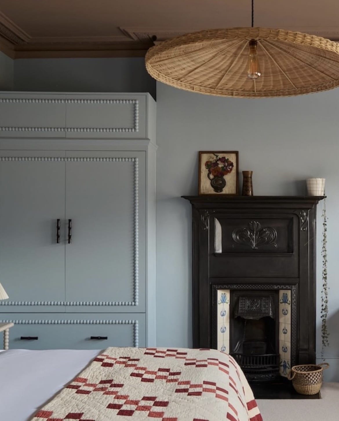
4. The Unexpected Red Theory
The inclusion of red in our interiors hasn’t been a fleeting one, and in 2026 we are still very much abiding by the ‘unexpected red theory’. This interior theory suggests that adding a single pop of red to an interior scheme is enough to focus the eye and pull the rest of the space together.
In practice? It really works.
Pink and red are both similar warm based, analogous tones so they work perfectly together. Just take inspiration from the below bedroom, using a soft white on the upper coving and ceiling to create some level of balance between these intense shades, it helps to soften the overall finished look.
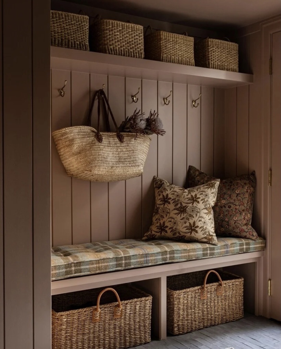
5. Natural Elements
Grounding, earthy design is trending as a design style right now, and whilst pink isn’t necessarily associated with being an earthy colour, the depth this colour carries can be the perfect catalyst for it.
There’s so many benefits of using natural elements as a warm accent in a scheme with Dead Salmon, and it’s one of the easiest, most stylish combinations to pull off. Rattan or seagrass baskets are one of most versatile items that look equally as good in an entryway to a bedroom.
Complement with thoughtful fabrics and consider using natural unlaquered brass on hardware finishes so you can enjoy the tactile patina as it ages.
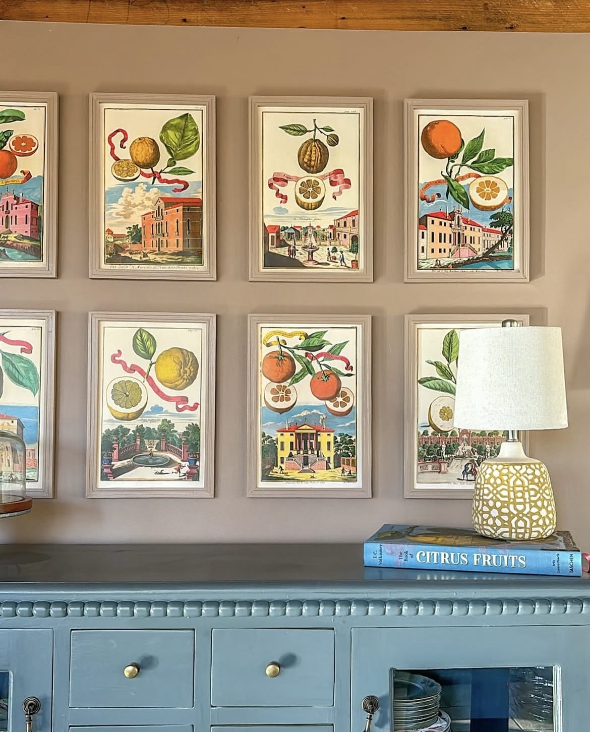
6. Pink & Blue – Analogous Colour Pairing
Whilst not at opposing ends of the colour wheel, another pleasing colour combination is pink and blue, and perhaps the perfect balance between warm and cool, and feminine and masculine tones.
The space below uses Down Pipe on the buffet unit with India Yellow on the lamp. A zesty, trendy and super trio of colours that work beautifully together. This has been carried through to the artwork for an intentional feeling of colour with each of the frames drenched in the same Dead Salmon for a flawless look.
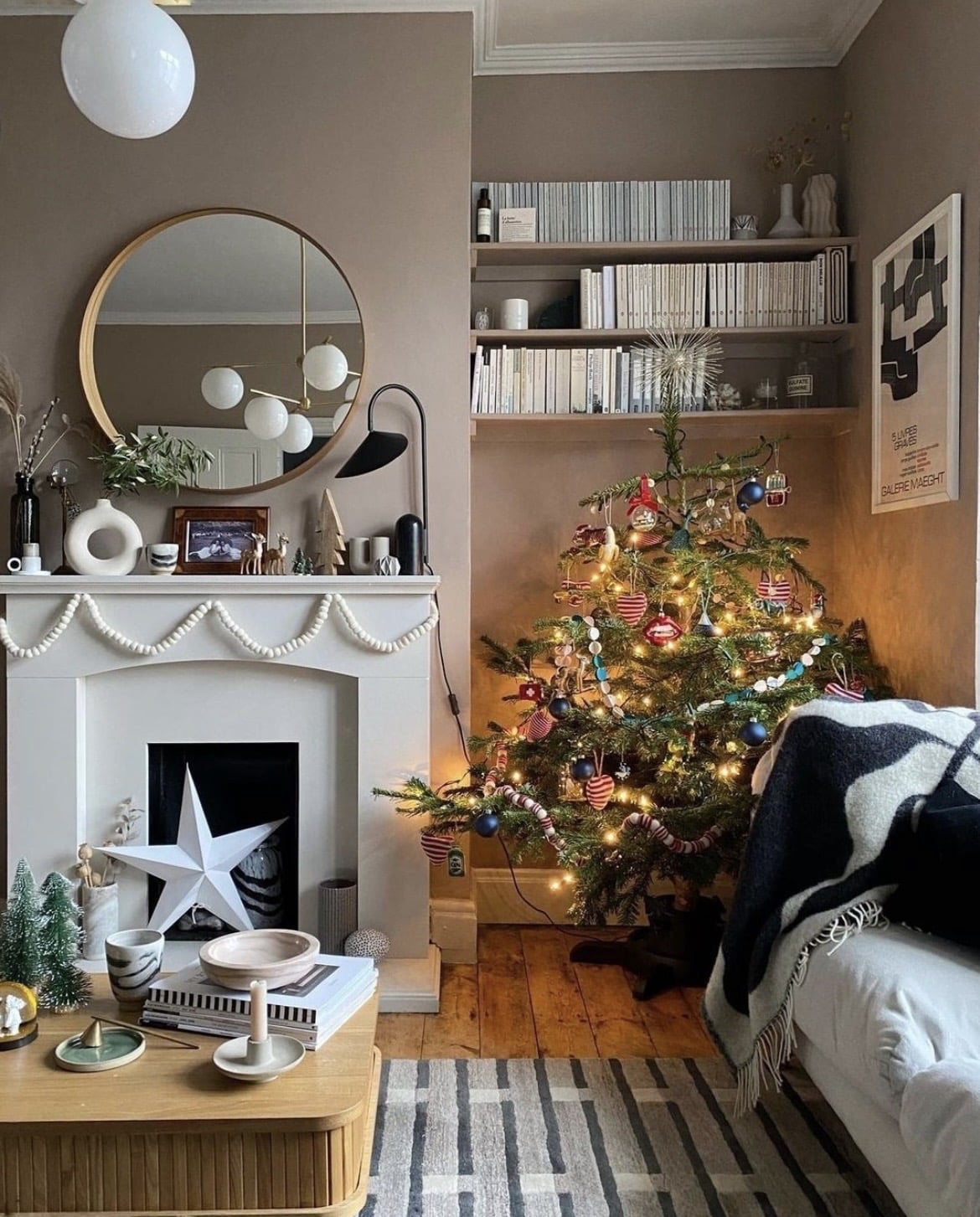
7. Engage The Fifth Wall In Your Design Plans
Ceilings are no longer an afterthought in design, and well, white is becoming an outdated way to decorate your ceiling with now.
It’s all about the celebration of colour and I adore the combination of Parma Gray on the walls in the bedroom below, and Dead Salmon on the ceiling. This creates a beautiful focal feature in the room, and it instantly draws the eye up.
8. Colour Capping
Colour drenching has been the hottest decorating trend over the last couple of years, but now? It’s all about colour capping. Rather than saturating the walls in one colour, colour capping involves using 2-3 tonally relevant shades to create a visually interesting space with depth of colour.
The best way to pick colours is to use a Farrow and Ball colour chart, identifting either the slightly lighter, or darker shade. Shown below is Dead Salmon on the ceiling and above the picture rail with lighter shade, Calamine taken down onto the walls and skirting.
It creates a much more heightened look than colour drenching in my opinion, and a fail safe way to get that designer look.
9. Bohemian Inspired
There’s something so versatile about Dead Salmon and it just fits into most types of interior styles with ease. Let it be the star of the show in a bohemian inspired interior scheme. Introduce greys, yellow, red and black to tap into that key colour scheme that’s synonymous with bohemian design.
Whether you lean into this type or style or not, finishing a room with a few well placed black accents will ground the design, and bring a touch of modernity to the forefront of the room.
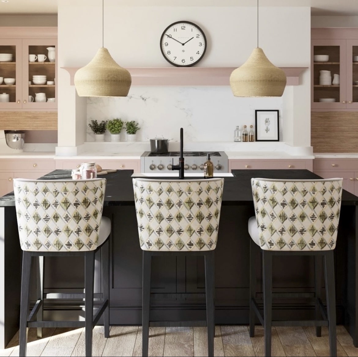
10. High Contrast With Black
Talking of black, you can really position it as a key colour in your scheme and watch it payoff in the below kitchen.
Off-black by Farrow and Ball has been used on the kitchen island for the most gorgeous depth of colour against Dead Salmon. I love two tonal kitchen spaces like this as they bring so much more added interest than one run of colour throughout.
Note those natural elements brought in through the pendant lights, a lovely softness against the intensity of the black.
11. Soften With Cream
There’s something about a bright white paint shade that can feel uncomfortable and almost clinical, especially in south facing or bright rooms.
Drop the intensity and instead lean into a soft cream shade, your interior will thank you for it and it delivers a much softer, less stimulating look.
Pull tones of cream through your decor, textiles, rugs and even through small accessories such as books on a shelf.
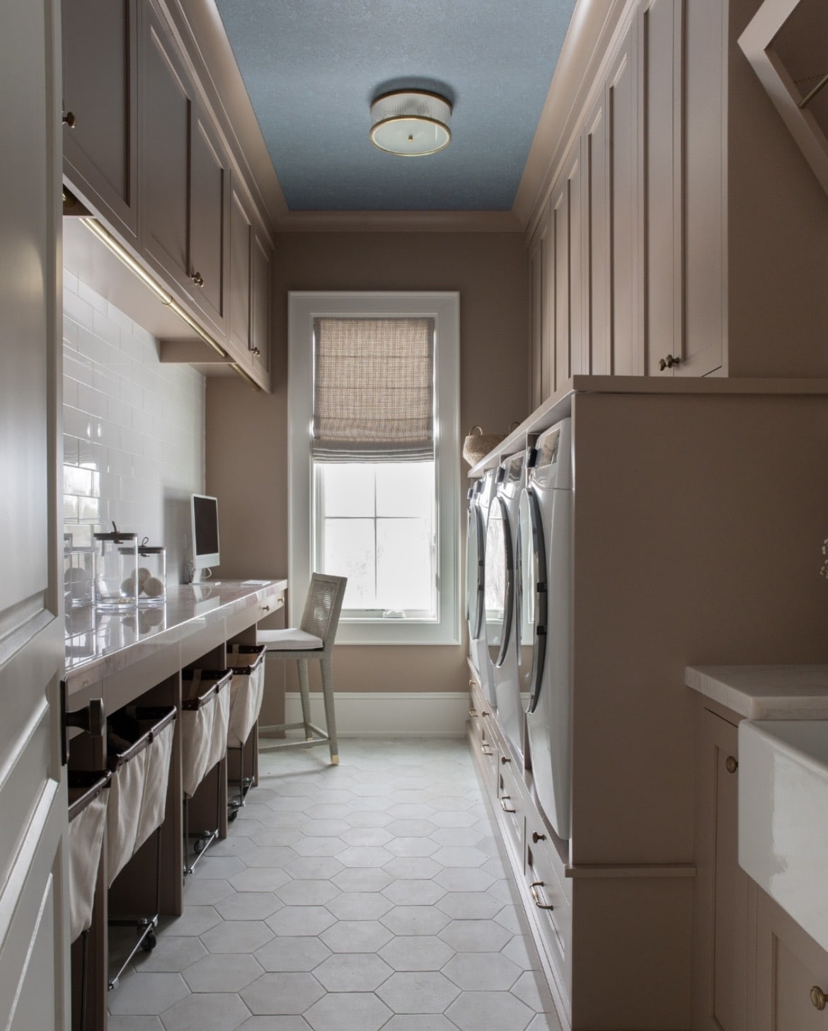
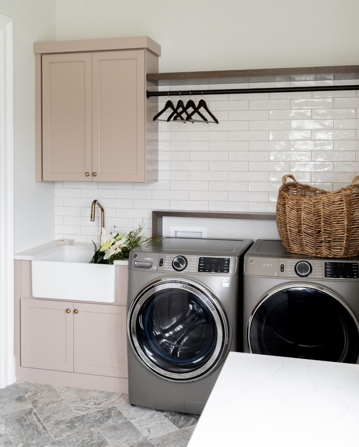
12. Combine White With Grey & Pink
Pink, white and grey is that very millennial combination which was super popular in 2017. Whilst it’s not so much of a popular look now, this trio of colours works invariably well together.
The below utility room nails this look with grounding grey tiles to centre the room, and pink and white hues lifting the eyes and brightening the space.
13. Draw The Eye Up
The uniqueness of this shade is that it performs differently in different lights, and I adore the moodiness of this shade below, carried all the way up to the coving for a flawless look.
Draw the eye up even more by swapping a colour drenched approach or a white ceiling for a wallpapered one. Leaning into a darker colour such as this blue defines the space and sets the tone.
So many beautiful colour schemes and ways to incorporate Dead Salmon into your own interior. Just remember to always test shades first as lighting conditions can greatly influence how the colours end up reading in your space.
If you have any questions about your own space or would like more paint recommendations, please leave me a comment below!