Refreshing a bathroom with a fresh lick of paint is honestly one of the best ways to upgrade a bathroom on a budget, whilst it can actually make the biggest difference to how a space feels.
In recent years, we’re seeing a bit of a return to blue tones in a bathroom, known for their soothing, relaxing qualities, as well as earthy and grounding tones such as green and warm neutrals that are utterly timeless.
Sick of keeping up with the trends? Here are 19 different bathrooms using paint colours from Benjamin Moore that are all colours which aren’t ‘trending’, but will still feel stylish in years to come.
Benjamin Moore Bathroom Colours That Never Go Out of Style
1.Etruscan AF 355
Elevated, warm neutrals have us in a hold this year, a beautiful way to add warmth to a bathroom. Etruscan is described as a golden caramel which comes alight when suns comes into the space.
This is a beautiful colour to lean into in both north and south aspect rooms, and a great base colour if you’re a fan of earthy interior design.
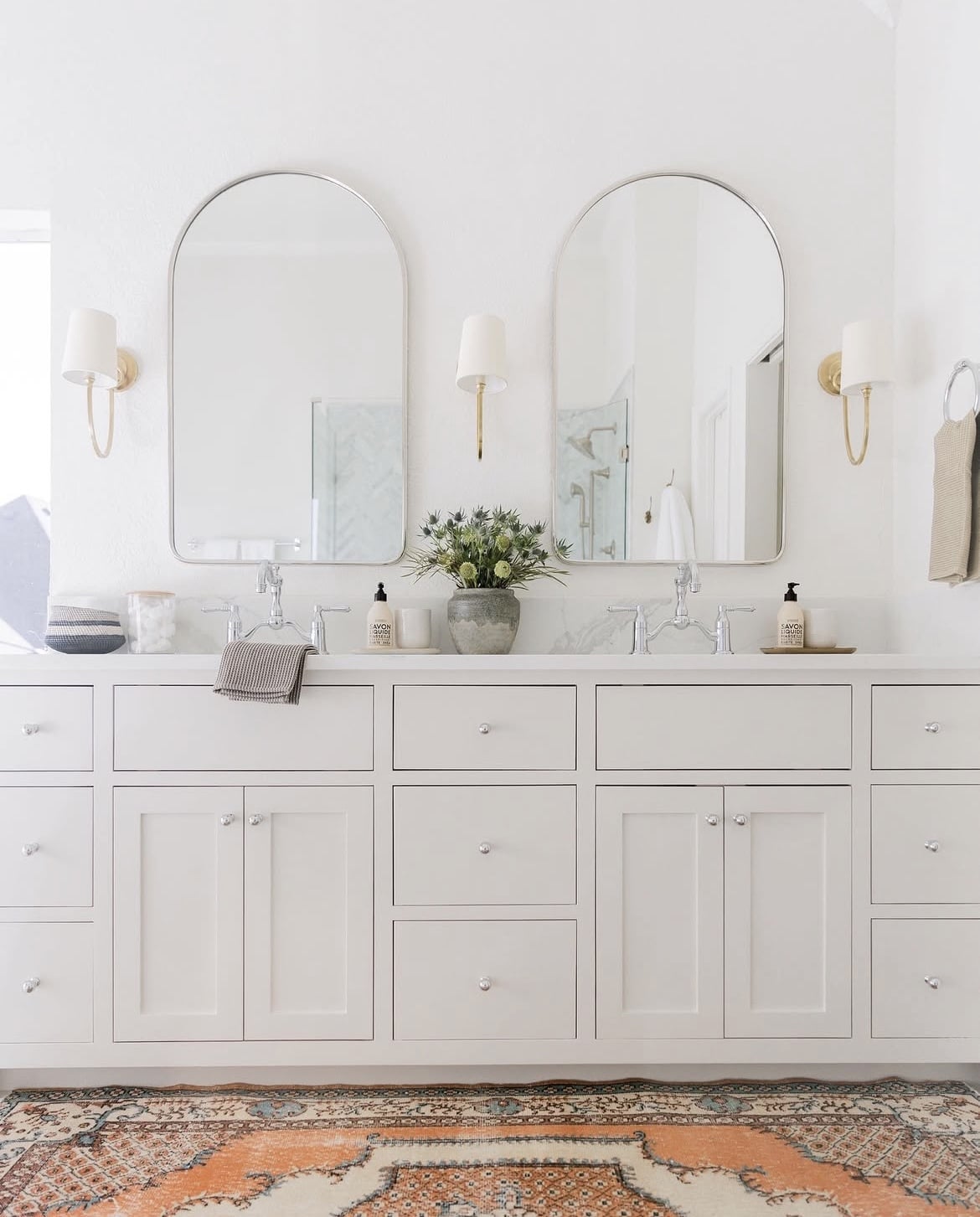
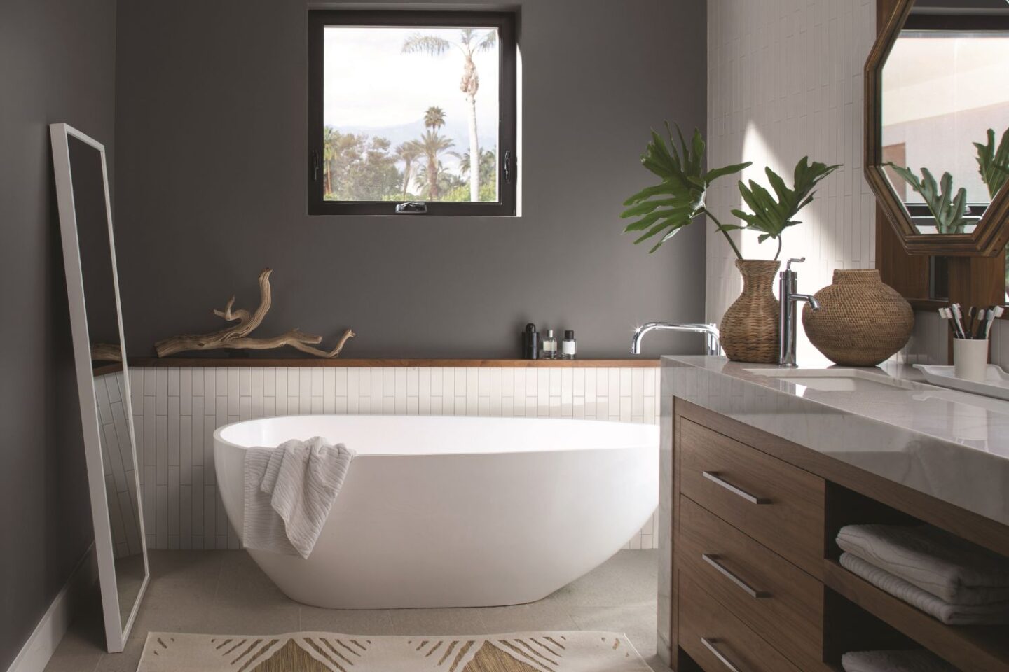
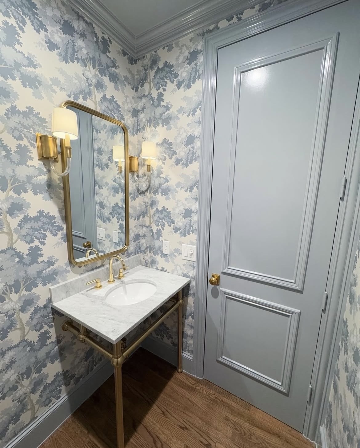
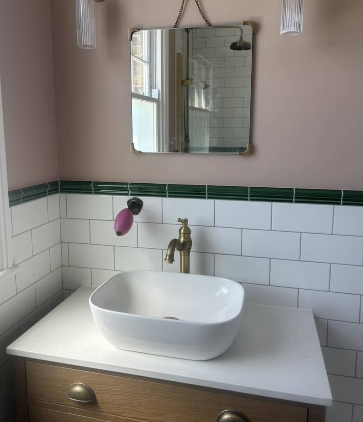
2. Oil Cloth
Another lovely way of elevating a bathroom is by repainting your vanity unit. Oil Cloth reads as a grey or green, depending on the light the room is receiving and it’s such a defining, grounding colour that looks fab in the bathroom below.
It’s cool in tone, so pairing with brass accents creates a lovely balancing act against it.
3. Breath Of Fresh Air 806
It’s long been ingrained in us that blue is a cold colour, but over the last year bright breezy blues have become just as versatile as neutrals in colour schemes, and paired with a warm white, they can be ideal for brightening up darker, north facing bathrooms too.
There’s something about a soft blue that’s instantly soothing and relaxing to be around, and it’s a colour that’s always been timeless in a bathroom setting, whether you lean into a coastal design scheme or not. Plus, blue virtually goes with any colour!
4. Charcoal Slate HC 178
There’s always a time and a place for a good grey, and Charcoal Slate is defining and handsome, with subtle indigo undertones which delivers a metamorphic quality to it.
This would be a beautiful colour to lean into in a particularly sunny bathroom, balancing the intensity of the sun for a moody, sultry overall finish.
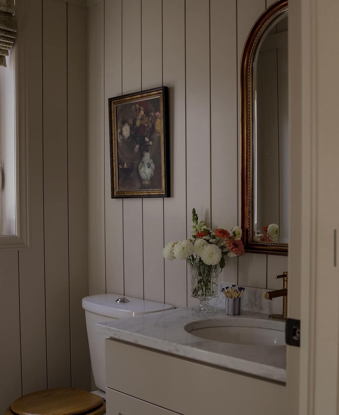
5. Smokey Taupe
This warm and elevated neutral is a total classic. A warm taupe like this has a pink undertone which can be a refreshing alternative to a yellow based neutral if you’re not overly a fan of yellow.
I adore it in this bathroom below, the tongue and groove panelling adds so much more character, and teamed with this taupe it feels like such a traditional, but elevated scheme.
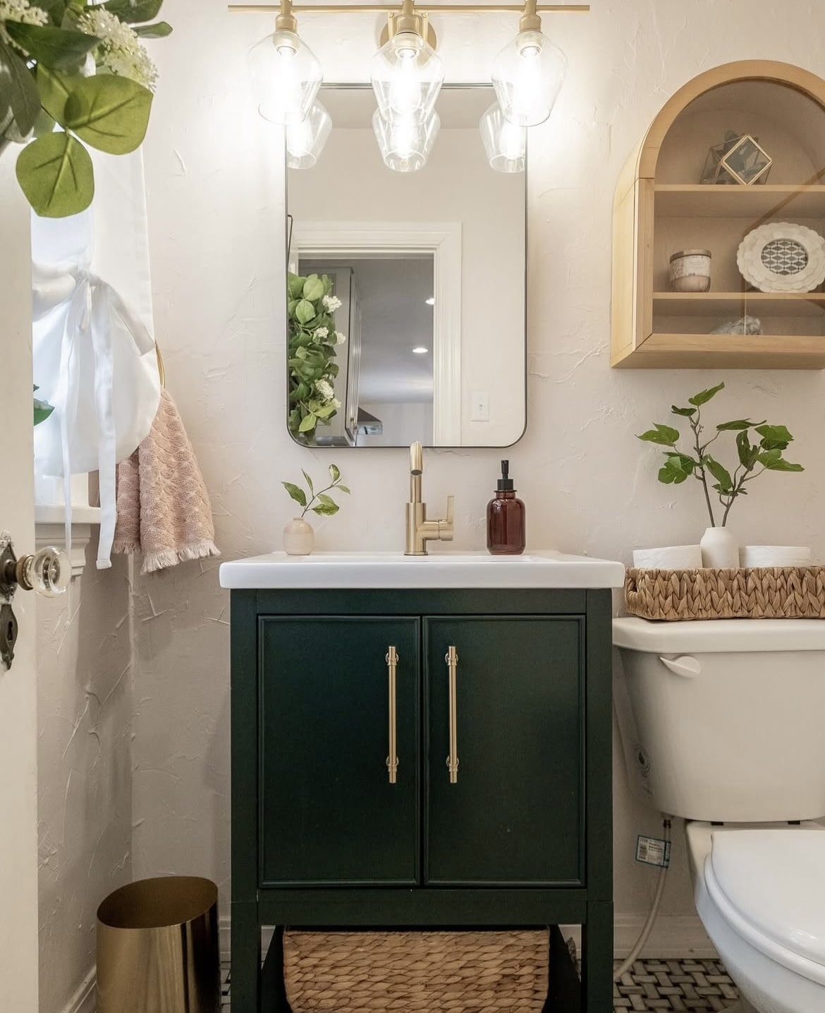
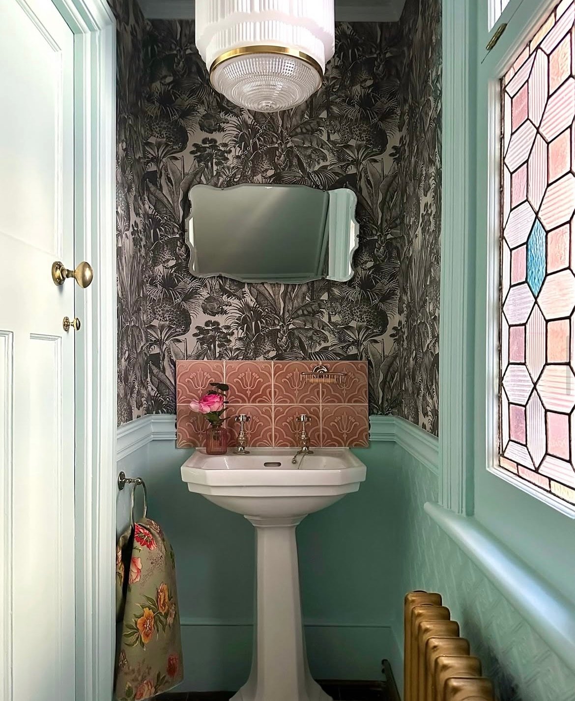
6. Chrome Green
It’s no surprise that green is good for the soul. It has an inherent link to nature, and is actually one of the easiest colours on the eyes which makes it super fitting for a bathroom.
Chrome Green is a rich ivy green, it brings definition to a space and is a fab alternative to using a black which can sometimes overpower a space.
7. Gray Mirage 2142 50
Soft and subtle, Gray Mirage is a well rounded neutral that whilst on the cool side, could still complement a darker bathroom when paired with a warm off-white.
Using a darker green on the door in the bathroom below adds further definition to the overall bathroom. When choosing a woodwork colour, you can’t go wrong if you lean into a shade which is around 1-2 shades darker than your wall colour.
8. Annapolis Green
The freshest, mintiest colour with the slightest trace of green. Described as an icy grey blue, this really is a mystery colour, appearing as slightly different shades, depending on the light the colour is perceived in.
This colour has been semi drenched in here, including the ceiling for a fun, cheerful colour splash against the darker wallpaper.
9. Seapearl OC 19
You don’t have to reinvent the wheel when it comes to choosing bathroom colours, off-whites still remain the most popular, achieving a subtle and sophisticated colour scheme.
The only exception to the rule is a bright white which can feel clinical and uncomfortable. Seapearl has a warm undertone to it so it’s ideal for both dark and light bathrooms.
10. Somerville Red
How about something a little punchier? You can get away with bold colour drenching in intimate spaces like a powder room, it’s a high impact look that creates gorgeous depth of colour between other rooms.
This audacious red feels traditional and uplifting, plus, it taps into the unexpected red theory perfectly!
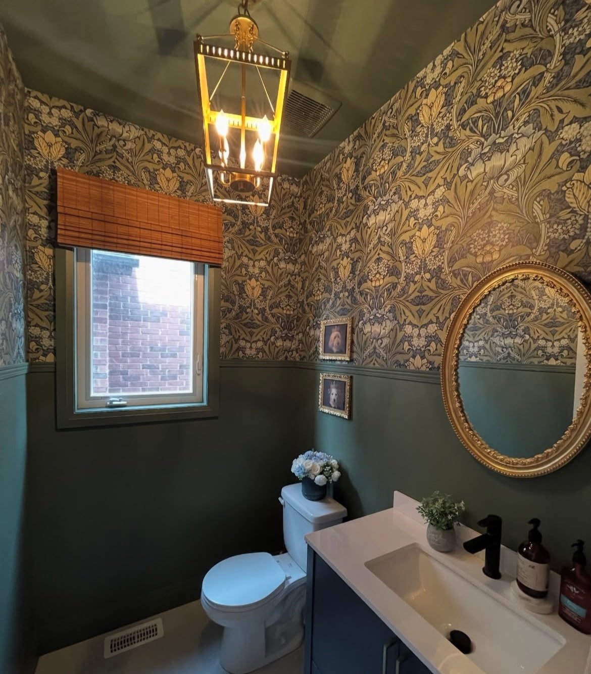
11. In The Garden
Drop things down a notch and lean into the darkness in a bathroom for the cosiest, most intimate feel.
This is another example of using half wall colour, wallpaper and then drenching the ceiling in the same colour for an intentional feel. It’s hard to feel bad around a comfortable green like this, and it pairs tonally with this wallpaper so well!
12. Colour Match
Instead of a specific Benjamin Moore colour in mind, take your chosen wallpaper to your local decorators centre to get them to colour match one of the tones for a custom made paint colour, the results speak for themselves.
This blue totally envelopes the room as it is carried around on the skirting for a cohesive pull. I do love a blue for a bathroom because it’s so soothing and calming.
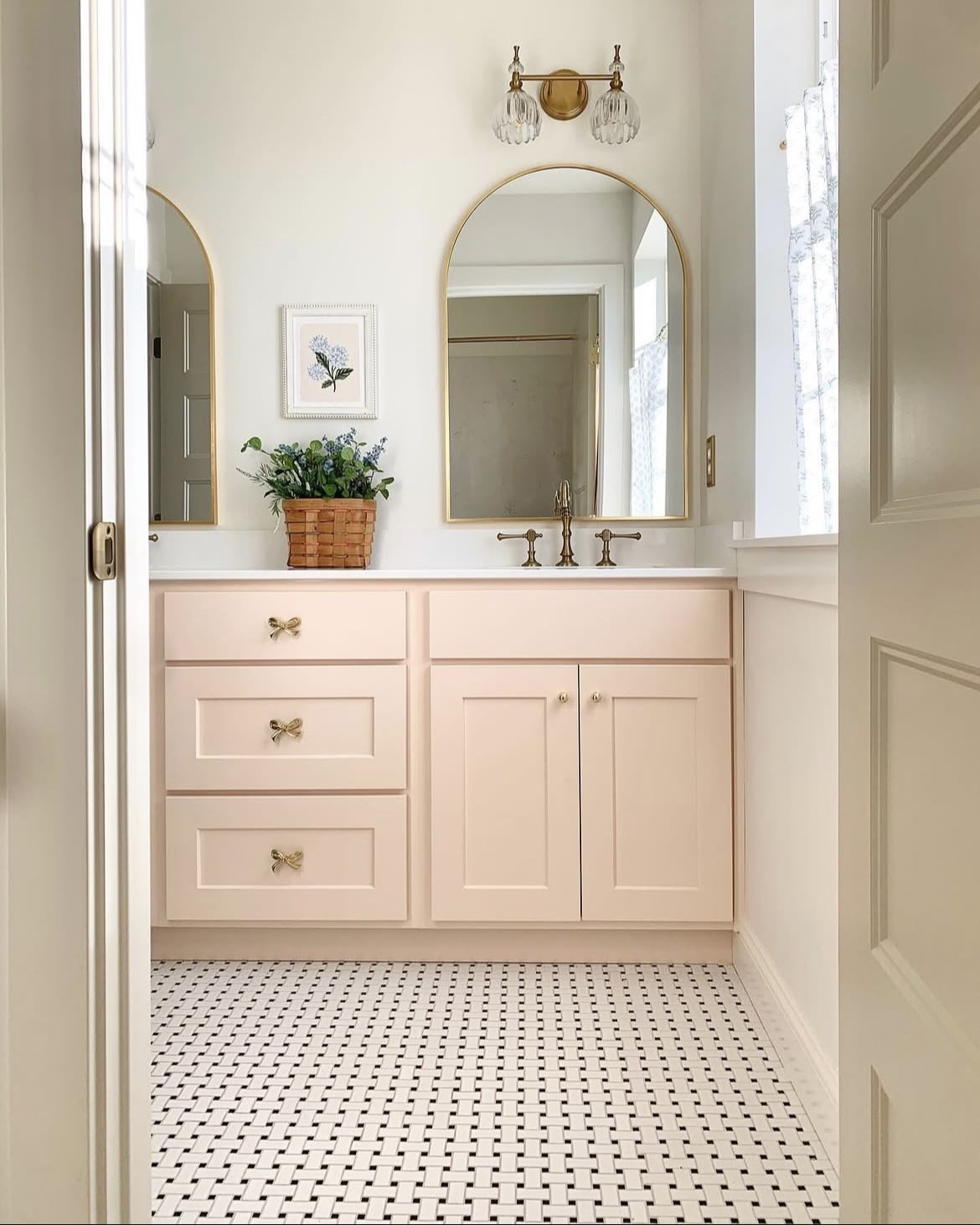
13. Pink Moire
I will always have time for a pink in a bathroom, it’s uplifting, dainty and is a perfect match for a warm off-white as shown in the bathroom below.
Vanities are a great way to experiment more with colour as an accent, it allows the walls to breathe, but brings instant character to your setup.
14. High Park
A feel good green because you can never have enough choices of green to lean into!
High Park is a mid to dark range green which feels like a breath of fresh air. For an earthy inspired bathroom you’ll want to include plenty of natural elements and colours such as creams, browns, rusty reds and browns.
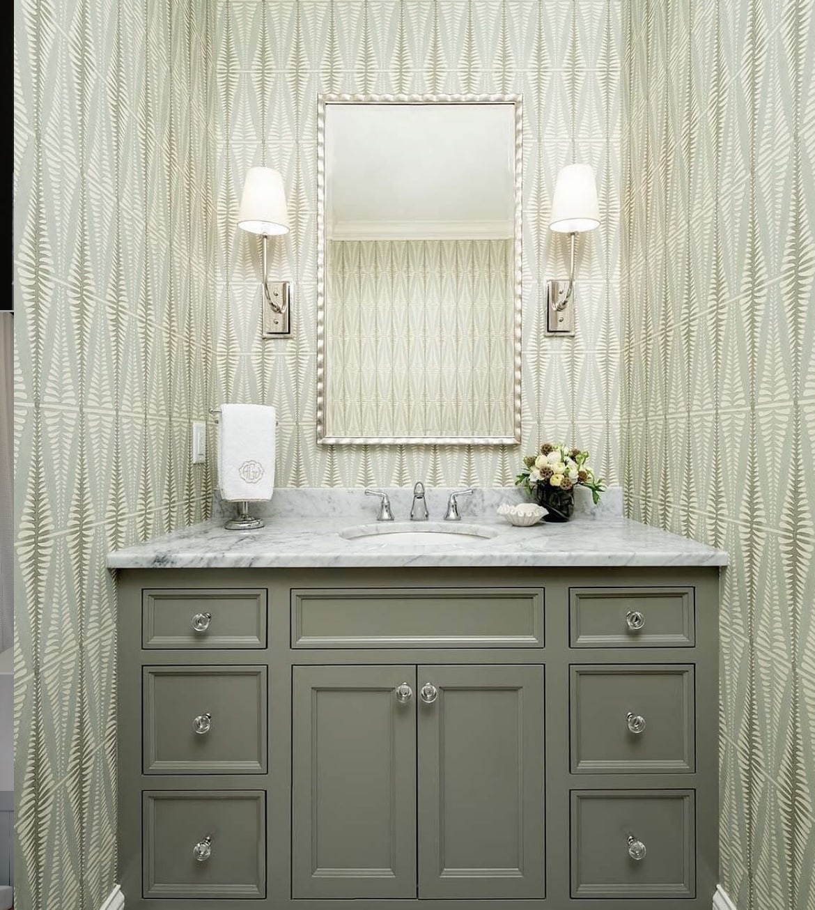
15. Revere Pewter
This is one of Benjamin Moore’s most popular neutrals, and it has been for some time. A soft grey which virtually pairs well with any colour. It’s a beautiful base in a boho inspired, earthy or contemporary designed bathrooms.
Pair with a few black accents like the below to really tie the bathroom colour scheme together.
16. Cashmere Wrap
Pink and green always deserve to be seen together, as perfectly demonstrated in the bathroom below.
This warm pink is uplifting without being sugary sweet, I find pairing it with a green such as this just helps to balance the two colours perfectly. Why does it work so well? Pink and green are opposite each other on the colour wheel so they are virtually the best, high impact pairing of colours.
17. Philipsburg Blue
I have a lot of love for this bathroom design, combining two gorgeous Benjamin Moore colours. We have Philipsburg Blue on the vanity to ground the room, a greyish blue which helps to balance the warmth of Lenox Tan on the panelling.
A highly flattering backdrop which is further uplifted by the white which comes up and across the ceiling in the bathroom.
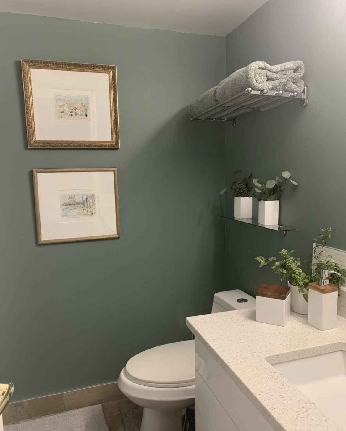
18. October Mist
You don’t get anymore timeless like a green such as October Mist. This gentle sage green is soothing and un-stimulating which will anchor and uplift a bathroom. I think this is why it’s so effective when on a vanity unit like the below.
A small dose as an accent colour serves so well in this bathroom.
19. Balboa Mist
Not sure how to decide on a vanity colour? A really easy way is to lean into a shade a couple of shades darker (with the same undertone) on the vanity. The result is an incredibly stylish and timeless colour combination.
Balboa Mist is a soft shade of pale grey with a slightly warm cast which truly makes this a versatile grey that you could pair with any colour.