Neutral colours have the wonderful ability to instantly make you feel at home. Walk into a room painted in soft oat or gentle greige, and something just clicks. Your shoulders relax, and the space feels right.
But here’s where many people go wrong with neutrals. They choose one beige paint and call it a day, then wonder why their room feels flat and lifeless.
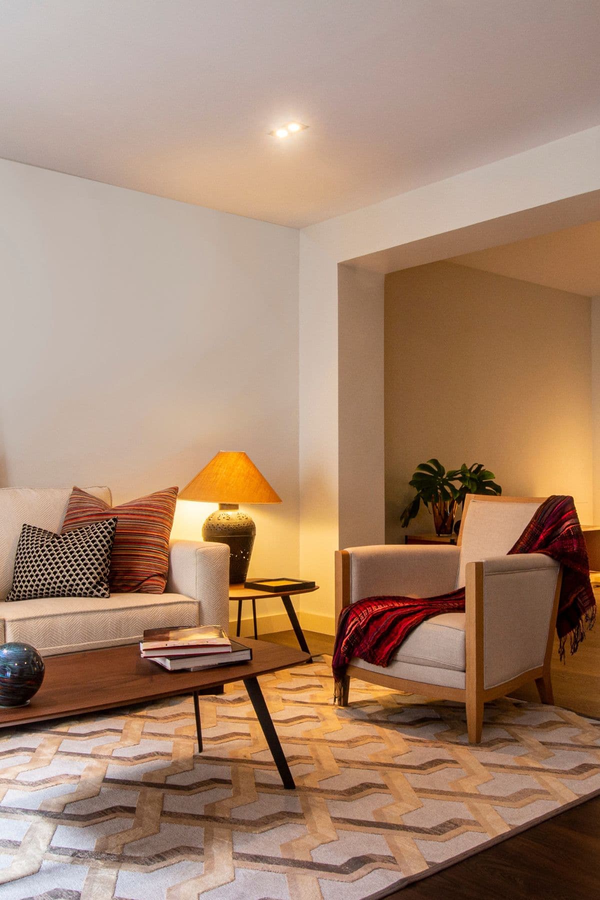
The magic happens when you layer different neutral tones together, creating depth and personality whilst keeping that serene feel.
Here’s everything you need to know about how to successfully layer neutrals, and what tones to use to help create a warm and welcoming home.
How to Layer Neutrals Successfully
Bland neutral rooms happen when everything matches too closely. The solution? Create contrast within your neutral family.
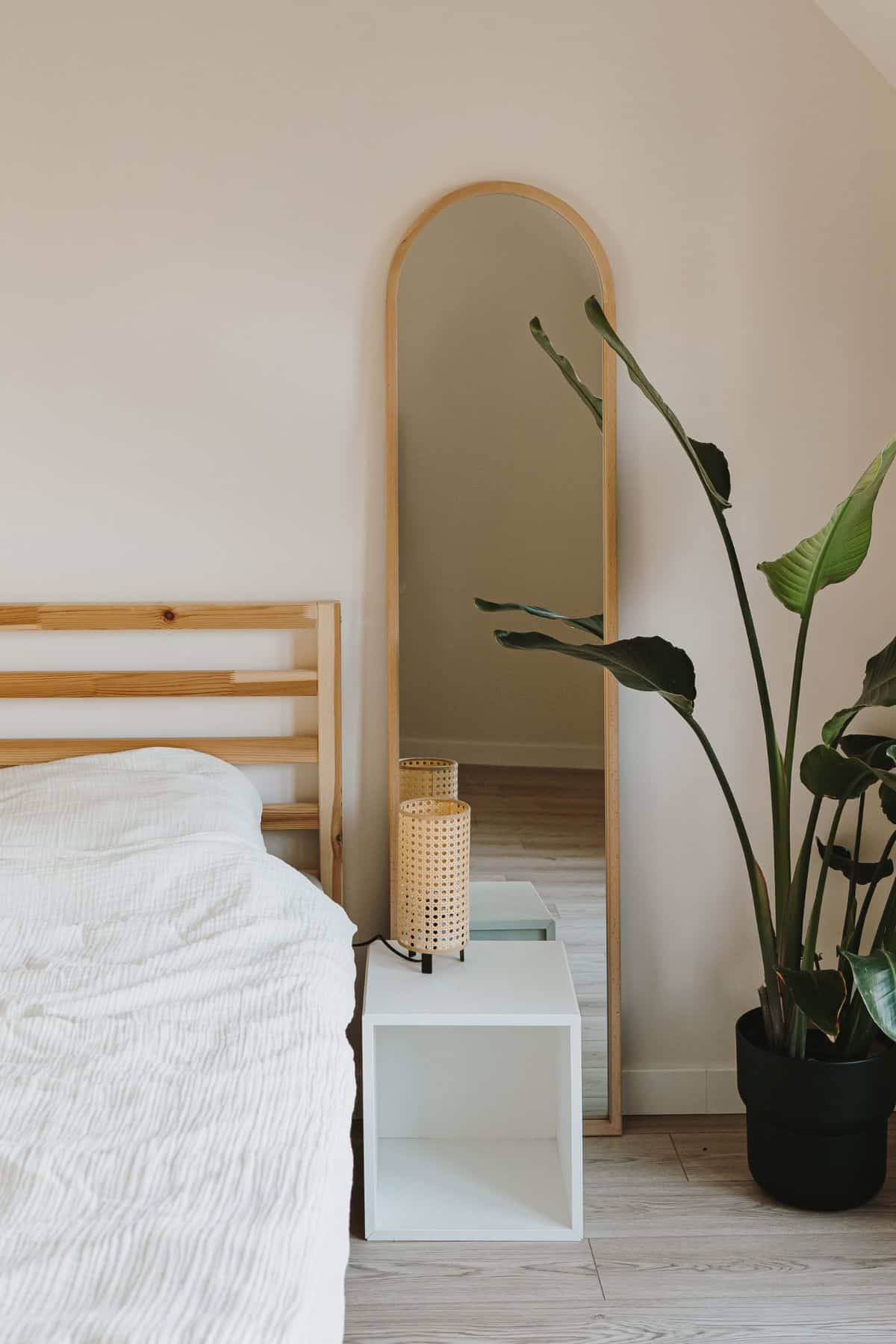
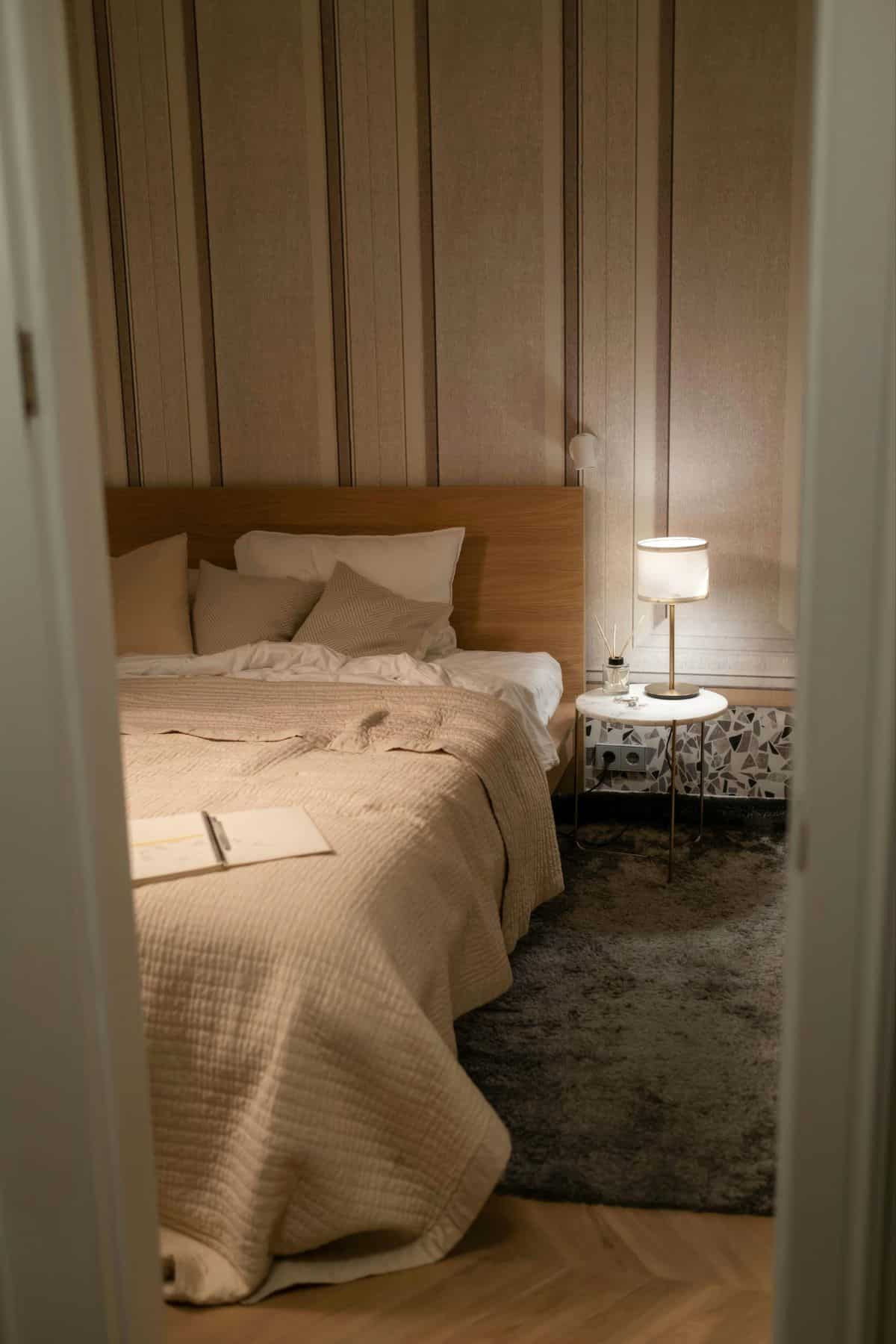
Start with three core tones. Choose a pale shade for the walls, soft cream or mushroom grey. Your larger furniture pieces get the medium tone, oatmeal sofa or taupe dining table. Add depth with darker accents in cushions and artwork. The 60-30-10 rule works brilliantly here. 60% of your room gets your lightest neutral, 30% takes the medium tone, and 10% showcases your deepest neutral in accessories.
Texture becomes your secret weapon. Mix linen curtains with wool rugs, add rattan baskets, and introduce reclaimed wood. Each material catches light differently, creating subtle variations that engage the eye.
Choosing Neutrals for Different Rooms
Hallways need warm neutrals to combat limited light. For example, cream with peachy, red or pink undertones or pale café au lait bounce available light whilst creating that welcoming first impression. Farrow and Ball Joa’s White is a beautiful example of this.
Living rooms benefit from slightly deeper tones. Think of mushroom greys, soft putty, or warm stone shades to create cosiness without darkness. These colours look sophisticated whether you’re entertaining or relaxing with Netflix.
Sunny, south facing bedrooms work best with cooler undertones that naturally calm the mind. Pale greys with blue or green hints promote better sleep, but keep warmer neutrals for bedding and throws. For cold, north facing rooms, lean into neutrals with red, pink, yellow or green undertones, they’ll help to counteract any blue light that these rooms receive.
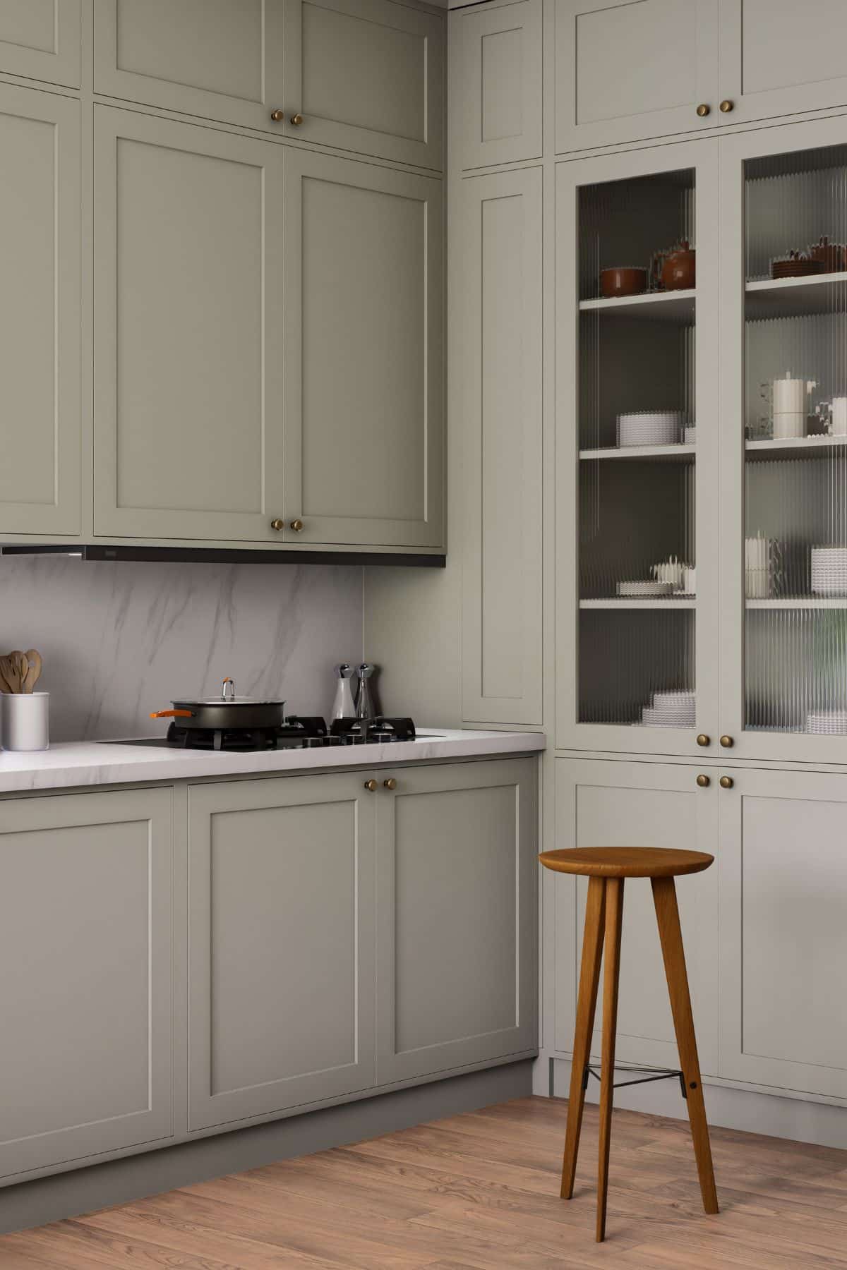
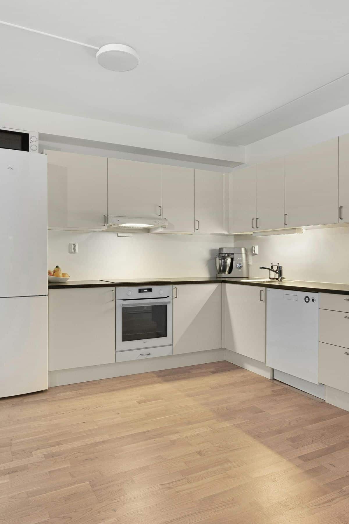
Kitchens need fresh but not clinical colours. As such, consider soft whites with grey undertones or pale sage green to maintain hygiene while feeling warm enough for family meals. If possible, avoid beige here as it dates quickly, and you’ll likely get the itch to decorate again!
Why Flooring Sets Your Room’s Foundation
Your floors influence every other colour choice. Light neutral floors work magic in smaller spaces – pale oak, bleached ash, or creamy stone effects reflect light upward, making everything feel larger and brighter.
The undertone matching rule applies here, too. Grey floors with cool undertones make warm beige walls look muddy; similarly, honey-toned wood clashes with cool grey paint colours.
Modern laminate flooring has revolutionised neutral options. Quality laminate mimics natural materials convincingly whilst surviving family life, pet accidents, and spilled wine. Hand-scraped or textured finishes hide imperfections whilst adding character.
Coordinating Walls, Skirting, and Flooring
Never match the skirting exactly to the walls; it creates flatness, (the only exception to this is if you want to colour drench the space for a high impact look). Choose skirting two shades lighter or use crisp white with medium-toned walls. This frames rooms beautifully while maintaining flow.
Paint testing becomes non-negotiable with neutrals. Apply A4-sized patches and live with them for a week, checking different lighting conditions. North-facing rooms need warmer neutrals to compensate for cooler light, while south-facing spaces handle cooler tones without feeling cold.
Undertones matter more than colour names. For example, a “grey” floor might have blue, purple, or brown undertones that completely change how it works with wall colours. Always view flooring and paint samples together.
Practical Flooring for Busy Households
Quality matters enormously with laminate. Cheap options look fake and wear poorly. Invest in good-quality neutral laminate for floors that have maintained their appearance for decades and provide decorating flexibility.
Light neutral laminates work well in open-plan areas, creating seamless flow between kitchen, dining, and living spaces. This unified approach makes homes feel larger and more sophisticated.
Consider cleaning preferences when choosing shades. Very light neutrals create stunning spaces but show every mark. Medium-toned options hide daily wear whilst providing that fresh, spacious feeling.
Local suppliers often provide the best service. Many homeowners find searching for “laminate flooring near me” helps identify retailers, like Urmston Carpets, who understand regional preferences, source matching accessories, and offer professional installation. Plus, seeing samples in person prevents expensive online mistakes.
Building a Lasting Neutral Scheme
The best neutral schemes feel effortless, as though homes naturally evolved into calm, sophisticated spaces rather than being deliberately designed.
Quality paint makes a massive difference to longevity. Premium neutral paints maintain colour and finish years longer than budget alternatives. When covering large wall areas, this investment pays dividends.
Build your palette around expensive, permanent fixtures. Kitchen units, bathroom suites, and flooring should influence neutral choices rather than the other way around. These costly elements dictate scheme success more than any paint colour.
Adding Seasonal Interest
Seasonal flexibility keeps neutral schemes interesting year-round. Your foundation accommodates autumn’s burnt oranges, winter’s deep blues, or spring’s fresh greens through cushions, throws, and artwork. Rooms transform without major redecorating.
Document successful combinations. Take photos and note specific paint colours, suppliers, and product names, as it will help you create your personal style bible for future projects.
Allow schemes to develop gradually rather than rushing for completion. Start with walls and floors, then add layers through furniture and accessories over months, as this prevents costly mistakes whilst creating natural, lived-in appearances.
Ultimately, keep in mind that the goal isn’t perfection; it’s about creating comfortable, beautiful homes that reflect personality whilst maintaining broad appeal. Neutral schemes achieve this balance beautifully when planned thoughtfully and executed with quality materials.