Gray interiors are timeless. It’s a versatile color that never seems to go out of fashion and for good reason!
Gray can be paired with lots of different colors to establish whatever vibe or aesthetic you’re wanting to create. ‘Agreeable Gray’ by Sherwin Williams is one of the most popular paint shades and we’ve come up with some of the best ideas to inspire your next decorating project.
The Best Accent Colors For Agreeable Gray
Keep Things Minimal With Bright White
Pairing Agreeable Gray with bright white is a fail safe option. It’s a clean and classic combination that’s going to stand the test of time.
Keep your ceiling white to uplift the entire room and keep it feeling light and bright.

Ground The Room With A Darker Gray
What’s so great about the color gray is that it can have lots of different undertones. Agreeable Gray is a mid-toned neutral that looks fabulous paired with a darker gray.
If you’re planning on using Agreeable Gray in a bedroom, consider investing in a dark gray bed to make this the focal point of the room.

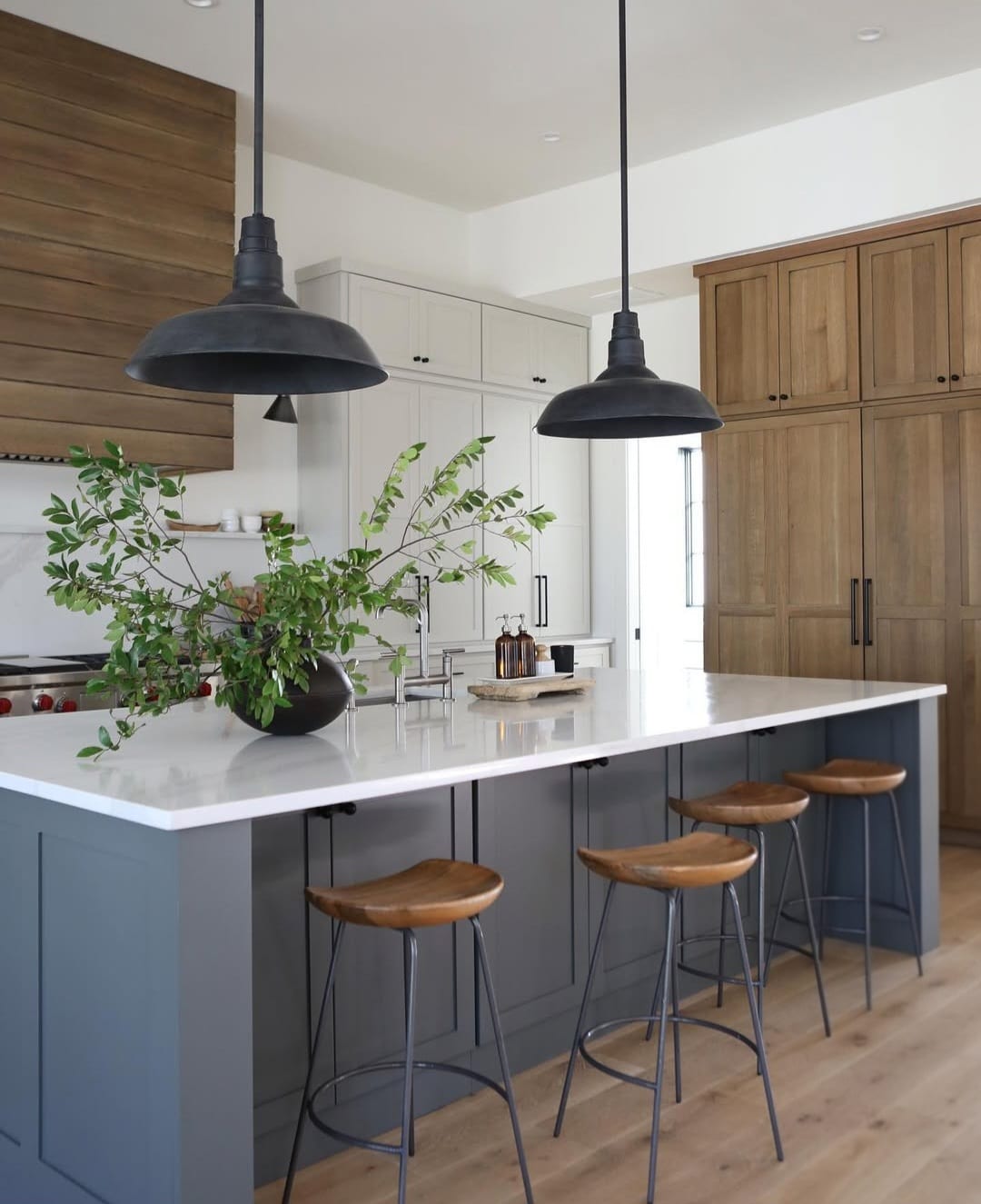
Create A Farmhouse Feel With Dark Wooden Tones
Just because gray is known to be a typically cooler color, this doesn’t mean you can’t warm it up with your choice of accents and finishings.
Darker wood transforms a contemporary gray room into a more traditionally inspired space.

Create A Layered Scheme With Creams & Light Grays
Gray doesn’t have to just sit alongside other gray tones. It can be complemented by other neutral shades, too.
Cream and light gray are a match made in heaven and feel effortlessly chic.

Combine Blues & Soft Terracottas
Want to add a pop of color to a gray living room? Consider using muted blue tones and soft terracottas to balance out the space.
These shades are perfect for adding depth without being too in your face.

Define Your Color Scheme With Black
Black accents are perfect for a contemporary home. They give a soft and neutral space a harder edge that feels bang on trend.
Invest in Crittall-style black doors or perhaps consider painting your door frames black for an affordable update.

Make It On-trend With Brown
Brown is definitely having a moment right now and we totally understand why! It makes any bedroom or living room feel cozy without it feeling too dark.
Agreeable Gray is the ideal companion for a chocolate brown as they balance each other out beautifully.

Add An Earthy Feel With Olive Green
Another color that can be used with Agreeably Gray without feeling too overwhelming is olive green.
It naturally feels quite sophisticated and will tie in your interiors with your outdoor space.

Introduce Unexpected Color With Purple
Perhaps there’s a color that you really love, like purple, that you want to somehow incorporate into your home.
Agreeable Gray acts as the perfect backdrop to let more vibrant colors sing. What’s great about purple is that it is also cool toned, so it fits seamlessly next to gray.

Add A Touch of Terracotta
Transform a plain gray space into a room filled with color and personality. Bright terracotta is a wonderfully uplifting shade that will definitely put a smile on your face.
An affordable way of introducing this color is to buy new bedding or soft furnishings to adorn your bed.

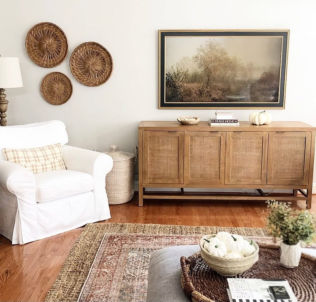
Add Warmth With Natural Materials
Layering natural materials is a fantastic way of adding personality and visual interest to your home.
Everything from exposed brick walls to rattan baskets, any material that is derived from a natural source can make a space feel more grounded.

Draw The Eye In With A Black Accent Wall
If you’re looking to go bold then consider painting a dark feature wall. There’s nothing quite as elegant as a pitch black accent wall in a formal dining area.
Leave the other three walls gray to make sure the space doesn’t feel too oppressive.

Pull Your Color Scheme Together With Dark Charcoal Accents
Black can sometimes feel a little too bold. If this is the case, then consider using charcoal accents instead.
Rather than painting an entire wall, introduce some charcoal colored accessories to test out if you really like the shade and to see if it fits well within your space.

Earthy Inspired Scheme
Earthy interiors are everywhere right now and this gray is the ideal foundational colour to build out from. Introduce natural materials such as wood, rattan, linen and brass for natural warmth, and they’ll ground any scheme.
Greens, reds, browns and creams are perfect colours to introduce with this gray that will work seamlessly together.
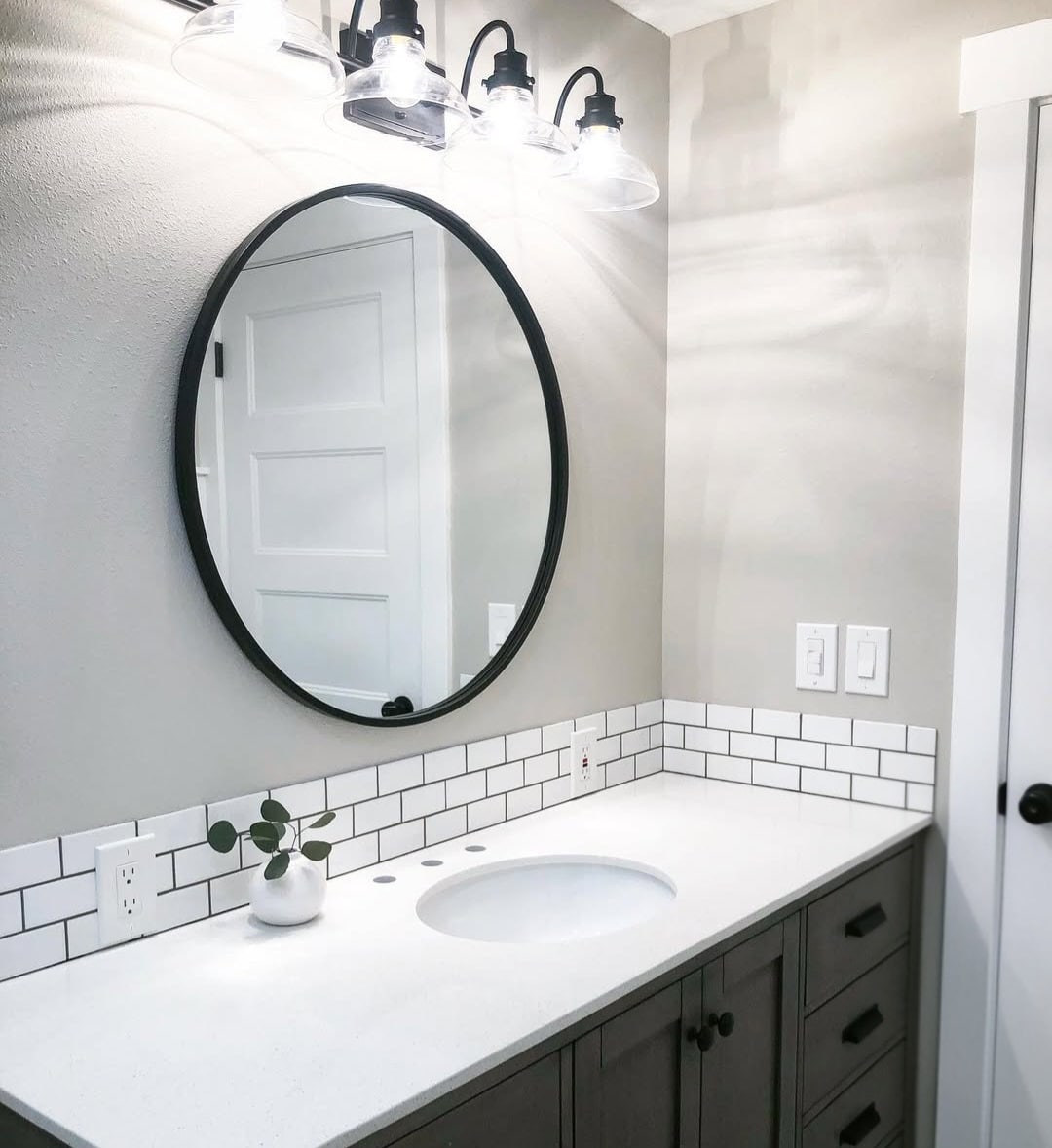
Cool Bathroom Color
Admittedly gray isn’t for everyone, but in a sunny south facing bathroom, it delivers the right amount of coolness you need to balance the intensity of the team.
Teaming with white and black accents will ground the room, whilst creating as timeless scheme.
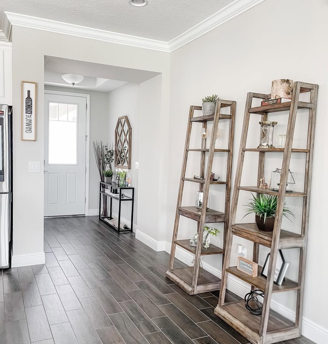
Natural Wooden Elements
Agreeable Gray just pairs so well with natural wooden elements, it grounds the room without being as oppressive as a black accents.
Wooden floors are a natural place to start and they’ll deliver both longevity and style.
Two Shades Lighter
If you’re looking for a classic colour combination that’s subtle yet timeless, I always recommend pairing with an accent color that is two shades darker or lighter, but part of the same colour family (undertone).
Take note of the below which uses Agreeable Gray on the cabinetry with a lighter white on the walls. It’s so subtle but just looks effortlessly stylish.