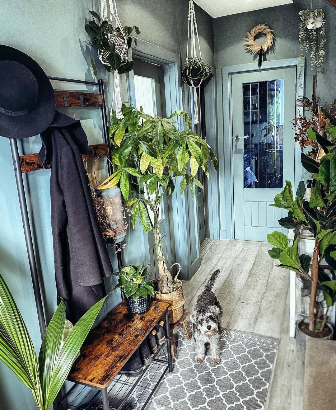
I promise you that these bold blue hallway ideas will completely change your opinion about blue in an interior.
We are often led to believe that ‘blue’ can only be considered as a cold colour in an interior, and certainly not one for a dark narrow hallway.
Whilst you do need to be more mindful about colour choices in very tight spaces, blue can be an incredible colour for a hallway.
From baby blues to defining cobalt blue shades, depending on the shade you pick it can deliver a decadent, sumptuous or even tranquil look to a hallway.
And that, is the power of blue in a space! Ready to feel inspired? These bold blue hallway ideas demonstrate how blue really can be the perfect colour to create an inviting hallway.
19 Bold Blue Hallway Ideas For A Tranquil Look
1. Contrasting Blue Tiles
Dare to be different in your blue hallway by combining two totally different types of blue tiles on the floor and walls.
Tiles on walls are a less than traditional route in a hallway these days, however, they lend a really durable finish to a high traffic hallway.
The gloss finish of the wall tiles continues to add interest whichever way you look at them, whilst the matte floor tiles ground the floor and contrast beautifully against the cobalt blue wall tiles.
It’s no surprise brass features heavily in this hallway too, it’s one of the best high contrast metals for blue tones.

2. Half Wall Panelling With Blue Floral Wallpaper
Nothing adds impact to a hallway like half wall paneling with stand out wallpaper above it.
The muted blue shade grounds the bottom half of the hallway, with the blue ditsy floral wallpaper lifting and elongating the walls. The blue and white pattern gives a bit of breathing space from the blue.
Introduce some warm brass shades to contrast with the coolness that the blue delivers in the space.

3. Navy Blue Country Style Panelling
Add instant depth and character to your hallway with navy blue country style panelling.
This type of panelling is perfect for traditional types of interiors and it adds serious impact to a space. Contrast with a white bannister and ceiling to draw the eye up, and break up the monotony of this dark, defining shade.

4. Soft Tones of Baby Blue
Baby blue is one of the most misunderstood colours in an interior, it can deliver such a calming, restorative finish and it looks incredible in most settings throughout the home if styled correctly.
This simple addition above a white dado rail draws the eye up, it’s proof that muted tones of blue don’t have to be cold, in fact quite the opposite, it makes the light and airy and relaxing.
5. A Trio of Pastel Tones
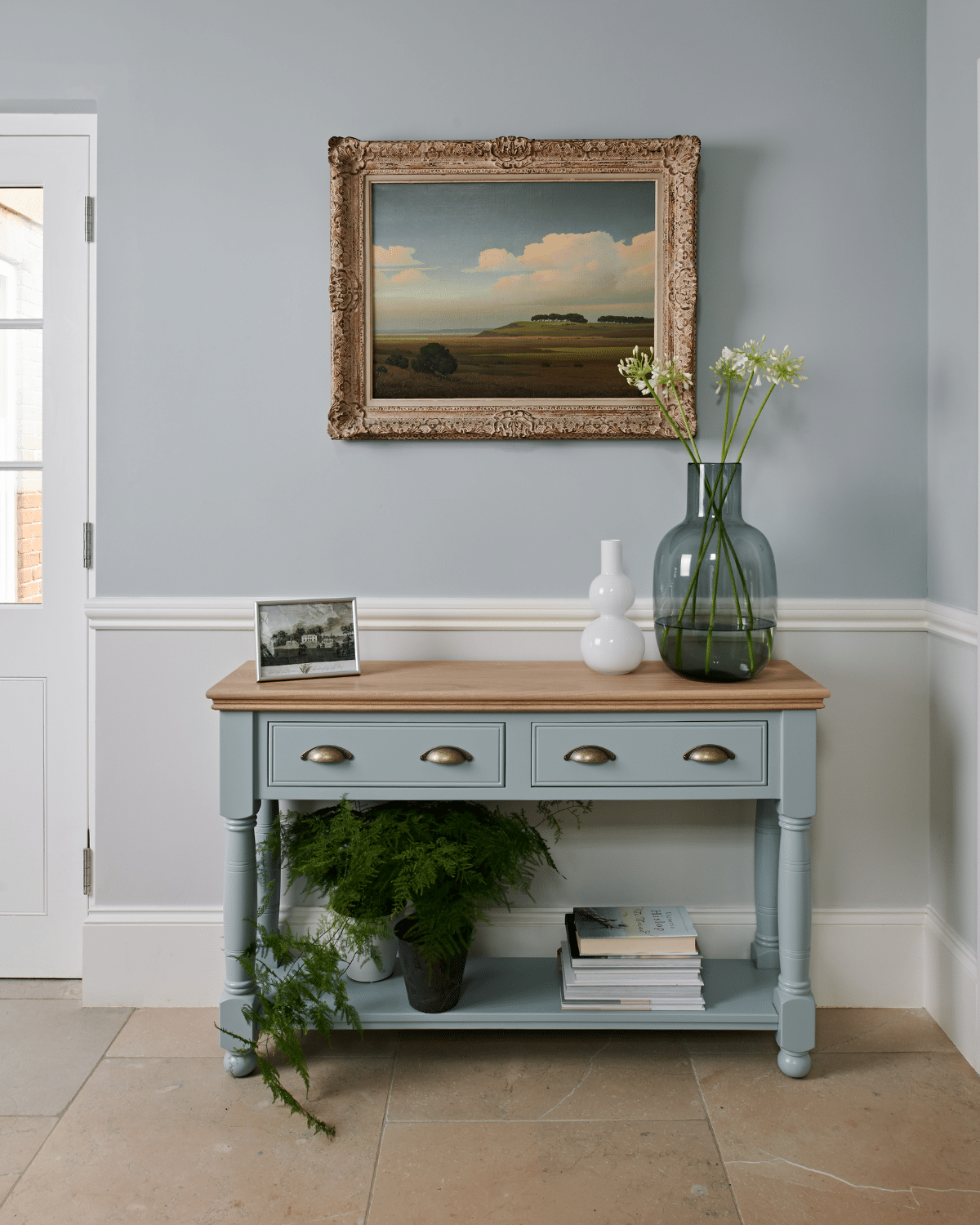
Perhaps one of my favourite blue hallway ideas. If you like pastel hues, you’re going to love this hallway.
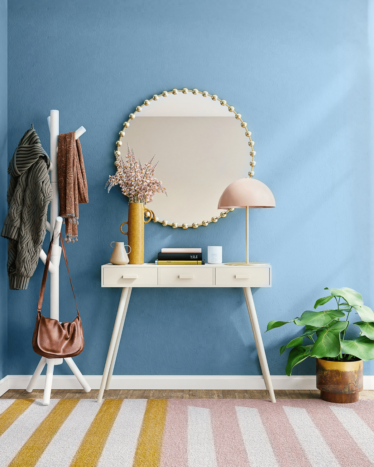
Use blue as the dominant, anchor colour in the space and introduce up to two pastel accent colours for a cohesive, warm look.
Dusty pink and yellow are great choices, they make the space feel playful without it feeling childish. You only need a couple of well placed accents to avoid the space feeling overwhelmed with colour.
6. Funky, Bold Wallpaper Choices
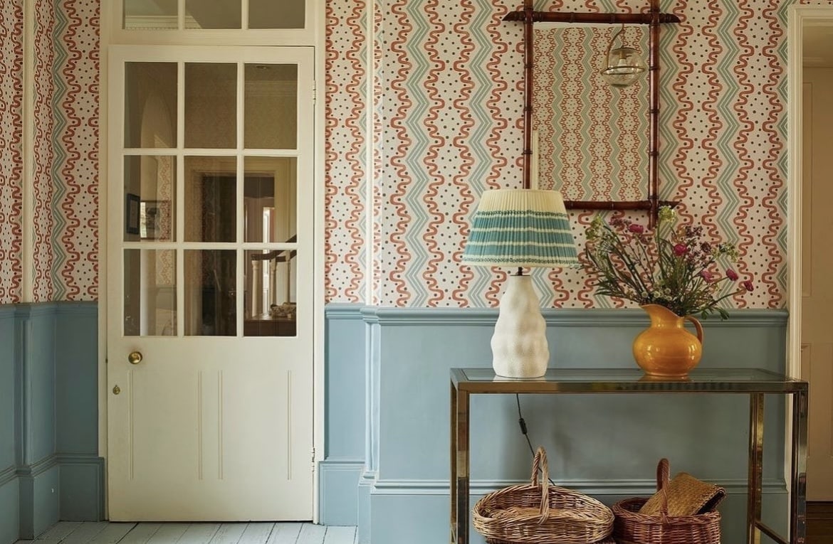
In a transitional space you can afford to go a little bit bolder with your choices to create impact and interest as you step through the door.
I adore the use of the blue lower half panelling and whilst the wallpaper makes a funky addition, it has the same blue tone running throughout which gives it such a cohesive feel.
There’s no secret to creating a perfect colour palette in a room, if you are working with one big pattern like this, it’s just about drawing out the colours from within it and using them sparingly throughout.
This well considered space even features the same blue tones on the lampshade, they’ve nailed it!
7. Electric Blue With Stand Out Monochrome Floor Tiles
Ignore everything you know about fashion – navy blue and black can work seamlessly together in an interior setting.
This electric blue wall perfectly contrasts with the black and white monochrome floor tiles for strong visual interest.

8. Colour Blocking With White & Navy Blue
You don’t need to employ full scale panelling to enjoy colour blocking in a hall stairs and landing space. This clever contrast of white and navy blue creates an impactful and statement making space.
When you are working with perfect line breaks like this, after taping the section always paint some white onto the edge of the tape first before applying the next colour as it will give you a much crisper, cleaner line.

9. Bold, Blue Floor Tiles
You can embrace blue in your hallway without using it on your walls. By adding some bold blue floor tiles you’ll ground the space, bringing visual interest, yet white walls will instantly draw the eye up, making the room feel bigger than it is.
Introduce some artwork with blue tones and other decor accessories to tie the blue together in the room.

10. Envelope The Space With Blue
Carry wall panelling and colour up over the walls and ceiling for an enveloped, cosy space.
This type of look is more effective with curved or sloping ceilings as it avoids harsh changes in colour. I love this muted tone of blue, contrasting beautifully with these black and white floor tiles.

11. Blue & Black & White Hallway
Blue is a perfect pairing for black and white patterns and colour play.
The addition of a monochromatic striped carpet runner with mustard border instantly attracts the eye, whilst the blue walls provide a soft, balancing colour to avoid the space feeling busy and claustrophobic.

12. Add Presence With A Blue Front Door
First impressions count, and a bold blue front door is a perfect way to inject some nautical colour into your hallway.
Draw the eye in with an equally impressive blue light fixture, this colour play of differing shades of blue breaks up the monotony of the all white walls, and well, it looks incredible in this grand hallway.

13. Layering With Blue
One of my favourite ways to use colour in interior design is through layering.
By taking one shade of blue and introducing differing shades of blue tones through walls, bannisters, artwork and decor accessories you end up creating a stylish space with depth and plenty of visual interest to boot.

14. Strike A High Contrast With Blue & Red
Make like the colour queen Sophie Robinson and don’t be afraid to play with bold colour. This cobalt blue hallway is paired with highly complementary colour, red for a bold statement making space.
Pairing bold colours like this together work so well as they are opposite on the colour wheel, although they’re best for use in transitional spaces like hallways as they are not overly restful on the eyes.

15. Mix Pattern For Visual Interest
From the walls to the floors, don’t be afraid to play and mix differing patterns for depth and strong visual interest.
I adore this blue and white Grecian style wallpaper, and the bolder material used on the bench. Just remember when mixing pattern to mix larger scale and smaller scale patterns to avoid the space clashing.

16. Accent Wall & Woodwork
Create the unexpected in a hallway, and instead of just leaning into a dark blue on woodwork, take this all the way up on one wall for an accent feature.
This can be a clever trick in particularly large hallways where you want to draw the eye in and create a more intimate feel.
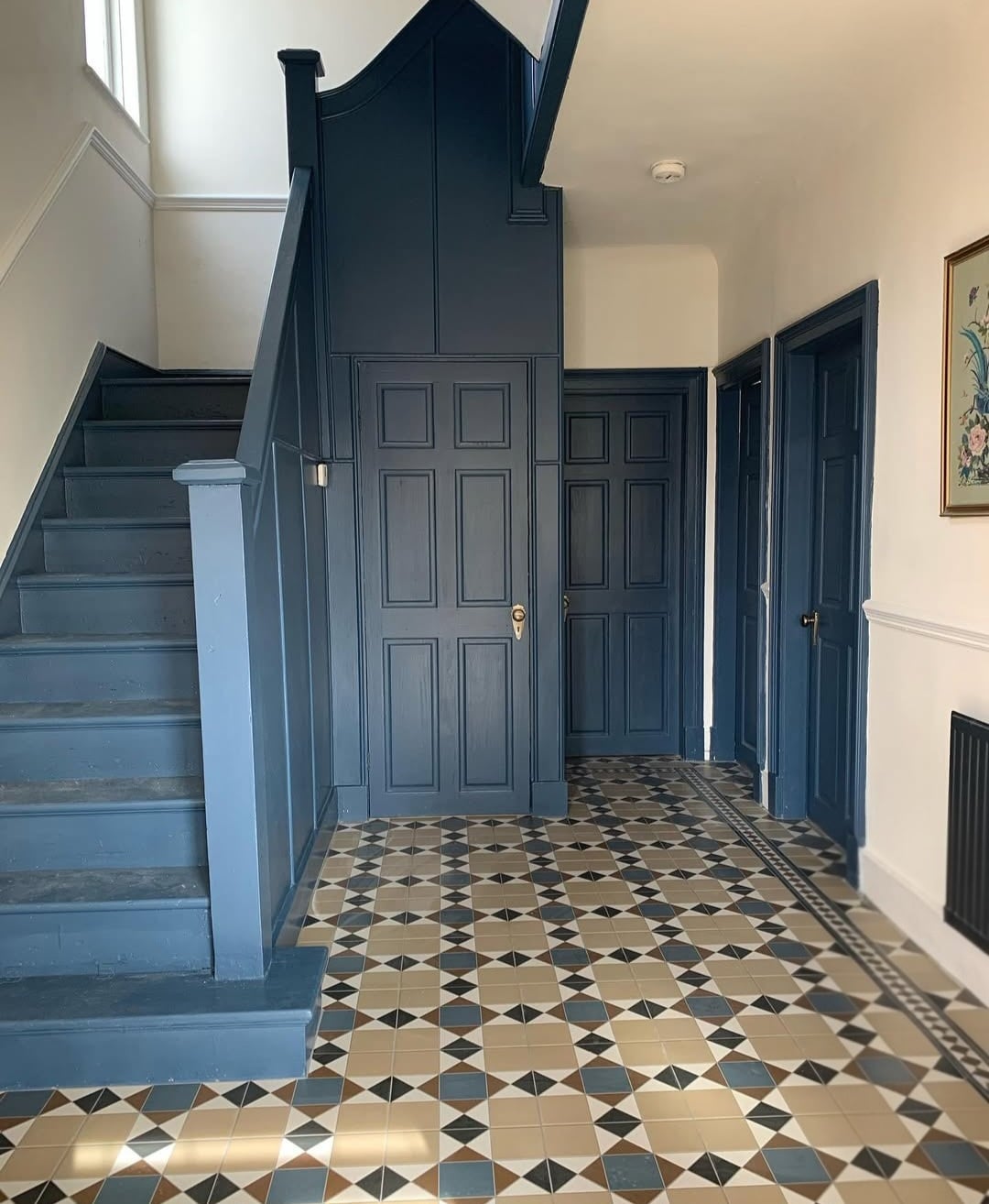
17. Blue Green
Combine tones of blue and green in a paint colour for the most relaxing, soothing shade. Just look how good it feels in the below hallway!
Green is one of the easiest colours on the eye and teamed with blue undertones it creates such a serene shade.
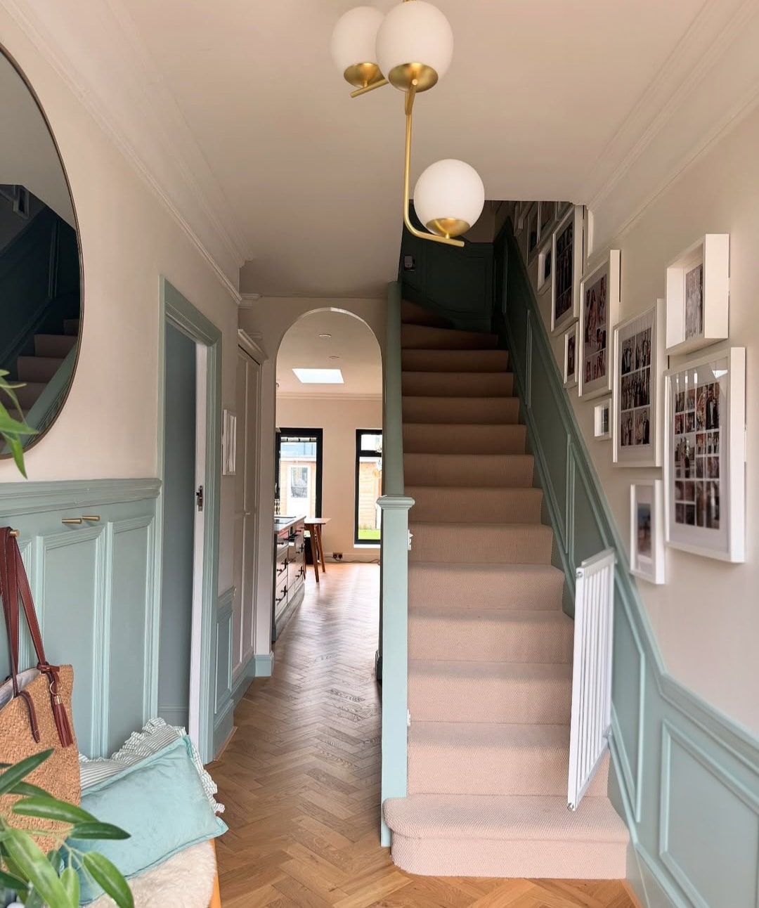
18. Blue & Pink Is Always A Good Idea!
These two colours are another combination that always works together. Lean into a blue on the walls for a playful feel, layering with pink accents on areas such as the stairs, in wall art and decor features.
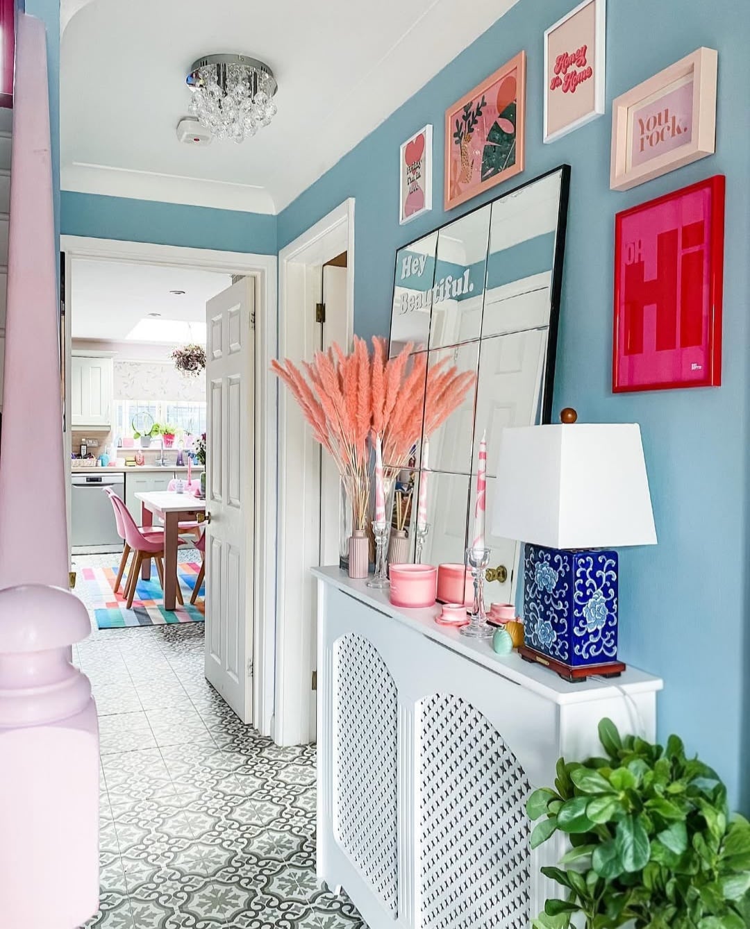
19. Soft Green/Blue
Another example of a soft green blue shade in a hallway that just feels good to be around! Introduce plenty of house plants for a fresh, biophillic feel in the space.
Which of these bold blue hallway ideas is your favourite? If you’re looking for extra interiors advice, colour inspiration or have a burning question about using pattern, please drop me a comment below and I’ll get back to you!
