


Most shaker kitchens are chosen on colour. It is the decision everyone enjoys making, and it is the one that fills Pinterest boards. But two shaker kitchens painted in exactly the same shade can feel completely different from one another, and the reasons have almost nothing to do with the paint.
The character of a shaker kitchen lives in a handful of small specification choices that rarely get discussed until it is too late to change them. Here is what they are and what each one does to the room.
Frame width
This is the single most influential detail on a shaker door and the one most often left to chance.
A traditional shaker has a generous frame around the recessed centre panel. It reads as classic, slightly rustic, and it suits older properties and larger rooms where it has space to breathe.
A slim shaker keeps the same recessed shape but narrows the frame considerably. The result is crisper, quieter and noticeably more contemporary, and it tends to work better in smaller rooms where a wide frame can start to feel bulky.
Same style, same colour, entirely different room. If you are choosing a shaker kitchen and nobody has asked you about frame width, ask them.
The edge profile
Look closely at where the frame meets the centre panel. Some shaker doors have a sharp square edge, others have a softened or slightly chamfered one.
A square edge is clean and modern. A softer profile catches light more gently and feels warmer and more traditional. It is a detail you will never consciously notice in a finished kitchen, but it quietly sets the tone.
Sheen level
Colour gets all the attention while finish does most of the work. A dead matte paint absorbs light and makes a colour look deeper, dustier and more sophisticated, which is why so many of the green and blue kitchens you admire online are matte.
A satin or eggshell finish reflects more light, lifts the colour, and is a little more forgiving of fingerprints and cleaning. It is the sensible choice in a busy family kitchen, but it will read as slightly brighter and less moody than the same colour in matte.
Ask for samples in the actual sheen you are ordering, not just the colour.
Handle choice
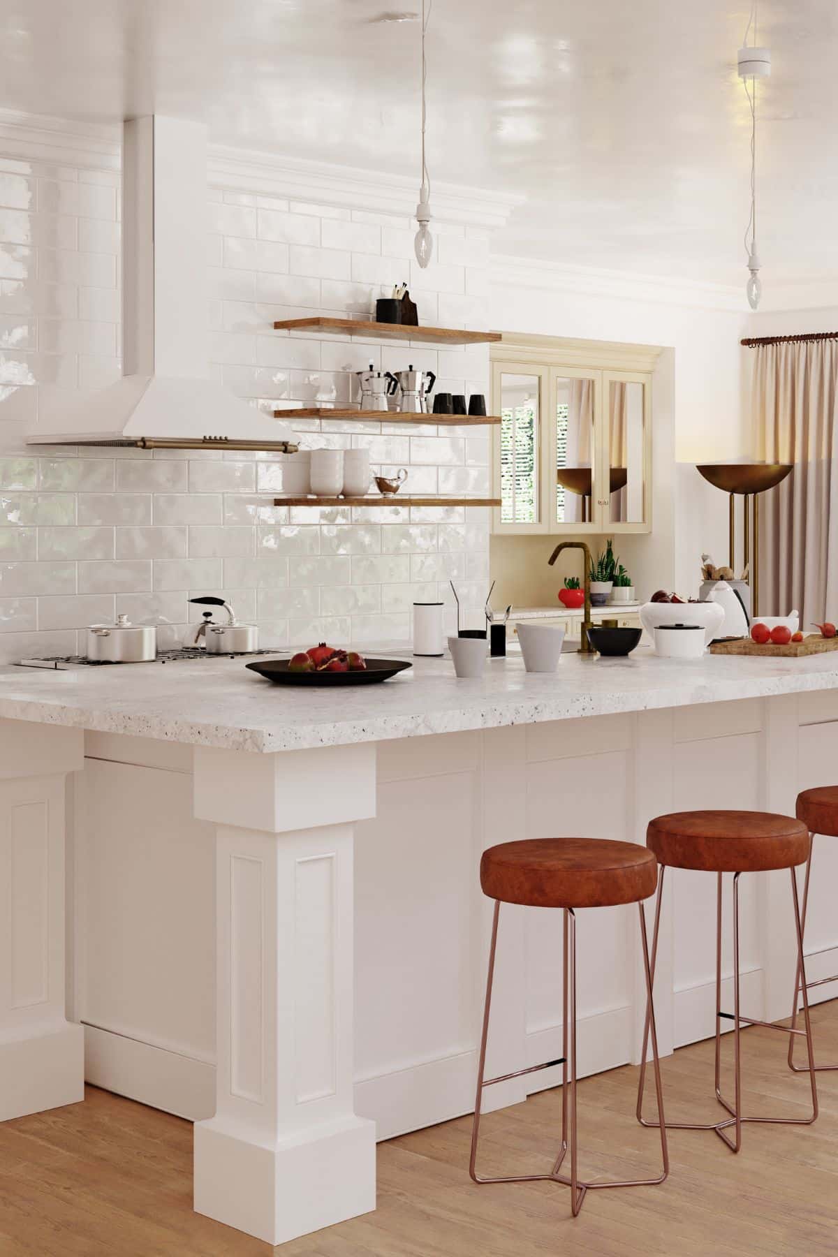
Handles change the decade of a shaker kitchen faster than anything else.
Knobs and cup handles in aged brass or pewter push it firmly traditional. Long slim bars in matte black or brushed steel pull it contemporary. Small round knobs in a matching painted finish make it almost disappear into the cabinetry.
The other decision is placement. Vertical bars on tall units and horizontal ones on drawers is the conventional arrangement, but running everything in one direction creates a stronger, more deliberate rhythm across a long run.
Worktop thickness
A thick worktop, around 30mm or more, gives a shaker kitchen presence and weight. It suits traditional frames and larger rooms.
A slim worktop of 20mm or less looks lighter and more contemporary and pairs naturally with a slim shaker frame. Get the pairing wrong, a chunky worktop on a delicate slim shaker for instance, and the kitchen looks subtly unbalanced without anyone being able to say why.
The colour of the interiors
Open a shaker cabinet in most kitchens and you will find white melamine, regardless of how considered the outside is. It is a small thing, but on a kitchen with any open shelving, glazed doors or frequently opened drawers, the interior colour is visible far more often than people expect.
Matching the carcass to the door, or choosing a warm timber interior against a painted exterior, is a detail that costs relatively little and quietly lifts the whole kitchen.
Where the cabinetry stops
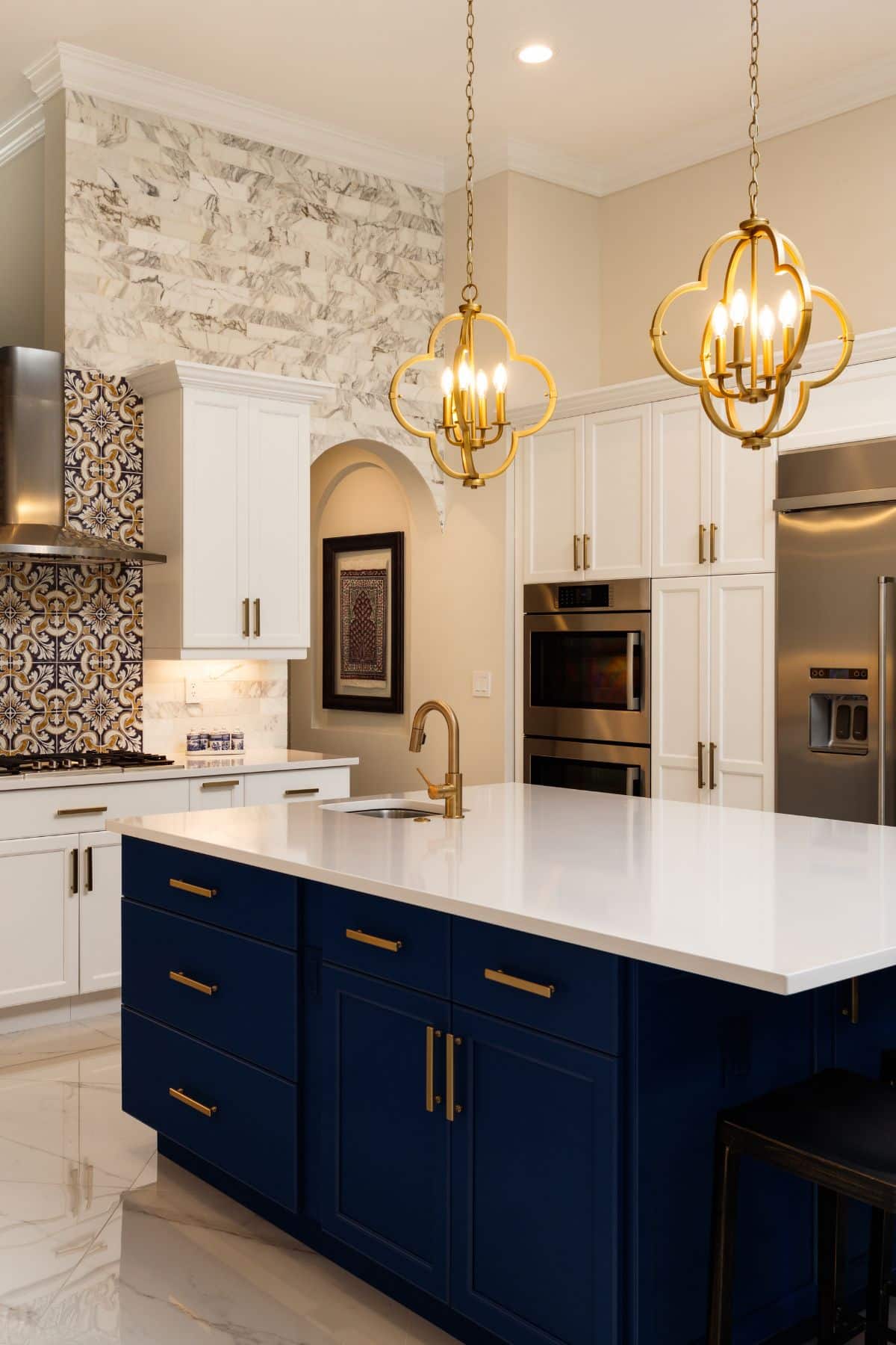
The gap between the top of the wall units and the ceiling is the fastest way to date a kitchen. Taking shaker cabinetry to full height with a slim cornice looks considered and buys real storage. Leaving a small dusty band above the units does the opposite.
If the ceiling is too high to take cabinetry all the way up, make the gap deliberate with a run of shelving or a continuous tiled band rather than leaving it as an accident.
Cornice and pelmet, or neither
The trim at the top and bottom of the wall units does more to date a kitchen than almost any other component. A deep, moulded cornice reads as traditional and can look heavy in a modern room. A slim, square cornice reads as contemporary. Leaving both off entirely, with the units running flush to the ceiling, is the cleanest option of all.
The pelmet underneath the wall units is worth a thought too, since it conceals under-cabinet lighting. A slim shadow gap does the job far more elegantly than a moulded strip.
Plinth detail
The last few inches at floor level are almost never discussed and quietly affect how grounded the kitchen looks. A recessed plinth creates a shadow gap and makes the units appear to float slightly. A flush plinth in the same colour as the doors makes the run feel solid and built in.
Neither is wrong. They just produce very different rooms.
Seeing the differences side by side
These details are far easier to judge in finished kitchens than in isolation, and it is worth comparing a traditional frame against a slim one before committing. Smile Kitchens show both across their shaker ranges here: https://www.smilekitchens.com/shaker/
The Vård shaker range in Eden, showing how a matte finish deepens a mid-tone green.
Ask about these before you choose a colour
Colour is the easy part and, frankly, the part you can change later with a respray. Frame width, edge profile, sheen, worktop thickness and plinth detail are all decided at order stage and stay with the kitchen for its whole life.
Smile Kitchens and any other designer worth speaking to will happily talk through all of them. The kitchens that look properly resolved are almost always the ones where somebody asked these questions early.
