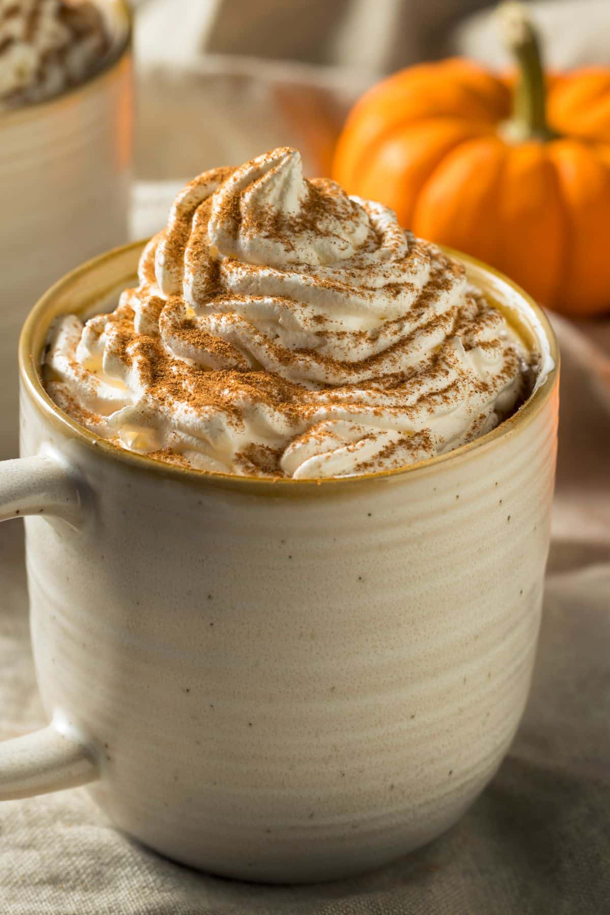
Let’s face it, our transformation to autumn isn’t complete without getting that first fix of a PSL, even if you hate it. But if you’ve been waiting for the weather to patiently drop below 20 degrees and cover every surface of your home in pumpkins, you can now take it one step further.
Valspar Paint have been inspired by this cult classic drink from Starbucks and have officially launched a pumpkin spice paint range.
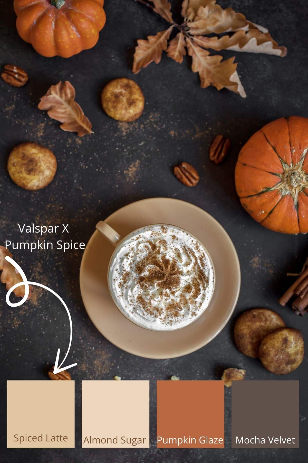
Yes, really. PSL fans can rejoice! Available only at B&Q, Valspar’s latest collection brings four autumn-inspired paint shades to life. These shades celebrate the viral pumpkin spice, with other paint shades that join the lineup to capture the cosy essence of the season.
As richer, warmer colours have very much been on the design cards for 2025, these delicious new colours are worth getting to know this autumn.
Why Pumpkin Spice Inspired Paint Shades?
Whilst neutrals still reign in interiors this year, there has been this drive towards richer, warmer neutrals that are comforting, but move away from the realms of very light beiges. They bring more drama, definition and more of an intense feel to an interior. These colours are also very organic and ones that could be drawn from nature around us, there’s a reason why we feel good when surrounded by colours like this.
This Pumpkin Spice inspired range is not only bang on-trend with the season, but it taps into that earthy colour palette that will last a lot longer than just Autumn.
Lucy Steele, from Valspar Paint, said: “We are seeing a huge rising trend in people opting for warmer colours in the home, with tones such as ‘Toffee Coffee’ and ‘Mocha Velvet’ increasing in popularity. With such a natural love for these beverage-inspired tones, it made sense to create a whole new range dedicated to the best Autumnal hot drinks, of course, including Pumpkin Spice.”
Meet The Pumpkin Spice Paint Range
This new Valspar collection comprises of four autumnal paints, and whether a PSL is your go-to or you’re more into the realms of something soft and sugary, these light to mid range neutrals really are crowd pleasers.
Starting at just £30 for a 2.5L tin, Valspar’s autumn palette is available now at all B&Q stores. Simply head to the Valspar desk to pick your favourite shade, or try a tester pot for £4.25 (236ml) before you commit.
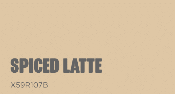
Spiced Latte
Inspired by a caramel pumpkin spiced latte, this warm butterscotch shade is one of their mid tone colours in the range and the most beautiful colour to use as a base in layering a scheme.
Neutrals with a warm undertone remain so popular as they generally work well in all rooms no matter the orientation. For some intense drama in the space, team with Mocha Velvet on cabinetry, shelving or a piece of furniture to really add some seasonal definition to your interior.
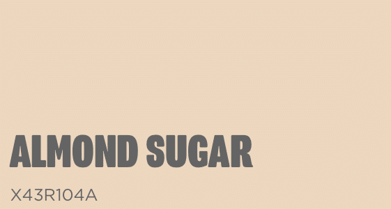
Almond Sugar
The sweetest but fairest shade in this new collection is Almond Sugar. It feels dainty, warm and has that sweet sugar-spun appearance to it.
If you’re looking for an on-trend neutral that will stand the test of time in your interior, this is a perfect choice. What I love about this collection is how beautifully the colours complement one another.
Build the darker, more defining shades with a layered approach, either through paint, textiles or decor accessories for the cosiest look.
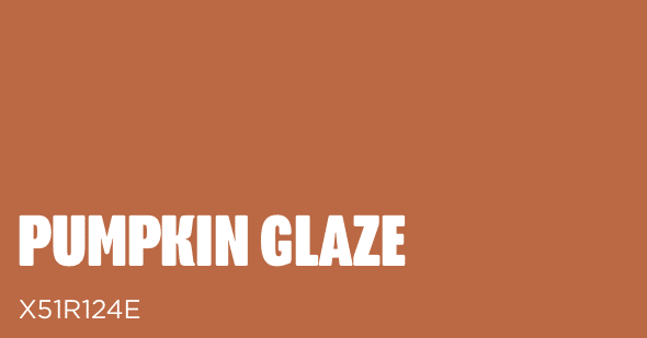
Pumpkin Glaze
It all begins with the original Pumpkin Glaze which has been inspired by the fall favourite drink, the PSL. This earthy, terracotta shade exudes warmth, with a rustiness that whilst derived from a pumpkin spice late, could also be referenced from rich, earthy soil. A shade which is very much on trend for earthy inspired interiors.
Colour drench with a shade such as this for a dramatic look in a room, this involves saturating the room in one singular paint colour.
To truly lean into the fall season, pair with Mocha Velvet on woodwork to ground the interior.
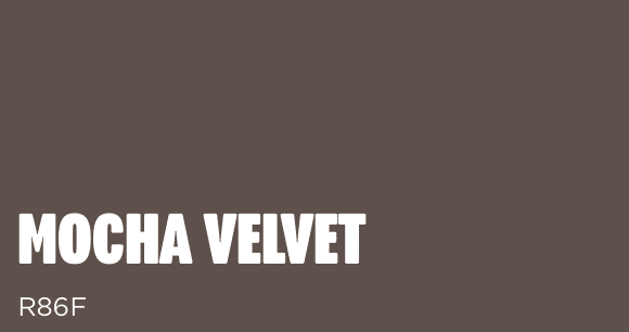
Mocha Velvet
The darkest, most defining shade of them all is Mocha Velvet, a truly indulgent and decadent shade.
If you like your coffee darker, you might like your interior even darker. If you have a dark, north facing room to tackle, why not lean into the darkness with a shade such as this to create a cosy, intimate space.
If you’re decorating a cinema room or a living room, this dark shade is a refreshing alternative to a navy blue or a black, and it feels far more energising and uplifting with its grounding brown roots.
Valspar also offer a very clever colour matching tool, so whether it’s PSL related or another autumnal colour you’ve spotted on your nightly scroll of Pinterest, you can upload it to their colour matcher tool that will tell you which of their 2000 pre-selected Valspar colours is the closest match.
I gave it a go with a fabric swatch that I have on an upholstered pouffe in my living room to see what it served up. Not the closest match, but one I like nevertheless (Plus, I think a better image in good lighting helps!).

It’s not often new paint collection releases or collaborations are ones that I can see standing the test of time, but whilst it ties in with the fresh season that awaits us, it’s actually a versatile colour palette that is bang-on-trend in interiors right now.
So, whether it’s a PSL you love or the gentle spice of a chai, there’s a seasonal paint match waiting at Valspar.