
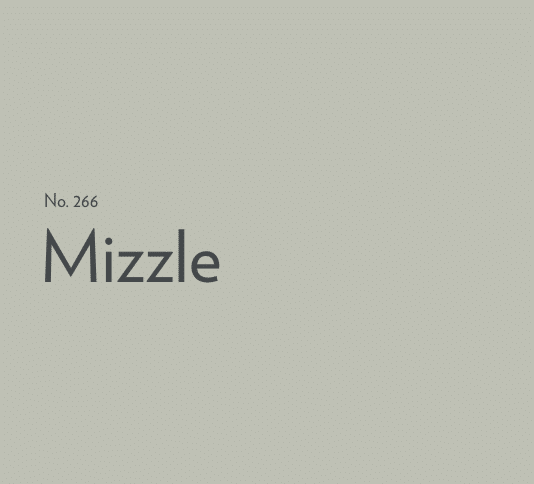
Farrow and Ball Mizzle is one of the most popular green shades in their range. There’s something really calming and soothing about this shade which makes it such an inviting colour for most rooms in a home.
It can be described as a sage green or green-blue shade which works with a range of neutral, tonal and bold statement shades in an interior. The beauty of a good green like Mizzle is that it virtually goes with any colour, with both warm neutrals and bolder shades complementing it beautifully.
If you’re looking to incorporate Mizzle into your next interior project, I take a look at all of the best colours that go with Farrow and Ball Mizzle, as well as some gorgeous real home examples of this colour in situ.
What Colour Is Farrow and Ball Mizzle? Is Mizzle Blue or Green?
Farrow and Ball Mizzle is described as a blue-green colour. It is a popular colour known for its calming and versatile nature in an interior.
It has a sage green quality to it and lends an overall softness and restorative feel to a room. It’s perfect for use in hallways, bedrooms, living rooms and beyond.
Colours can look very different in different lights, which is why it’s always worth getting a tester pot first and painting a swatch in your chosen room so you can see how the colour looks at different times during the day.
What Colours Go With Farrow and Ball Mizzle?
Sitting in the middle of the colour spectrum, a shade such as Mizzle is easy on the eye and works with virtually any colour.
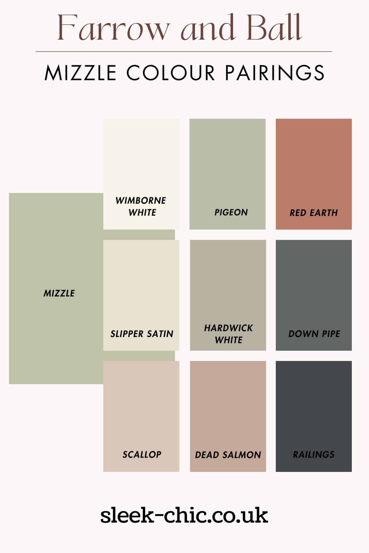
Before getting to some examples of it in real homes, here are some of my favourite Farrow and Ball shades to pair with Mizzle.
Tonal Combinations
When pairing colours with a dominant shade it’s always best to pair with tonal combinations as it will create a cohesive and well balanced interior design scheme.
It has green and blue undertones, so look at pairing with differing shades of green and cool tones of blue, or bolder hues such as navy blue to introduce some much needed definition to the colour scheme.
It will pull the colour scheme together and give a grounding effect to the look.

Whites
For a calming feel in a room, pair Mizzle with soft, creamy whites.
Creamy tones like Farrow and Ball’s Wimborne White or Slipper Satin will blend seamlessly with Mizzle, creating an ethereal and airy feel.
The subtle interplay of these light hues will open up your space, inviting in a sense of serenity and comfort.
You may choose to pair a white like this with Mizzle on areas such as on a ceiling, or above it on a half wall panelling look.
This will create a crisp contrast and immediately draw the eye up as you enter the room, giving the illusion of a bigger space.

Dusty Pinks
As Mizzle carries very soft, almost pastel like tones, it’s perfect for pairing with like shades such as dusty pinks.
The subtle contrast between the coolness of Mizzle and the warmth of pinks, such as Farrow and Ball’s Setting Plaster, or their newest shade Scallop will create a beautiful balance. Pink and grey really is a match made in heaven!
If you’re looking to incorporate pinks into your decorative accessories, consider introducing these shades with cushions, throws and textiles such as curtains.

Black
Whether you pair pinks, navy blues or whites with Farrow and Ball Mizzle, a black accent will go a long way in completing an interior design scheme and pulling the look together beautifully.
Adding a few well placed black accents against Mizzle will bring some much needed definition, tie the room together and add a touch of modernity.
Introduce black in considered areas such as interior hardware like door knobs, black accents on chair legs and decor accessories like photo frames and vases.
If you’re looking for a black paint shade to pair with it, Railings is a great choice as it has a blue undertones for a really soft look.

Grey
Pair Mizzle with light and soft greys, such as Farrow and Ball’s Cornforth White or Ammonite.
These gentle greys will add a touch of understated elegance to your interior while allowing Mizzle’s soft blue-grey tones to shine.
Anchor with grey furniture too like a statement grey sofa, it will contrast beautifully with the soft tones of Mizzle, bringing a touch of definition to the space.
A huge range of grey hues work with Mizzle from pastel greys to more defining, charcoal grey tones.

Blue
As Farrow and Ball Mizzle has a slightly blue undertone to it, pairing with shades of blue will create a cohesive and tonal colour scheme.
If Mizzle is the dominant colour in your scheme, you only want to introduce blue as an accent colour. Introduce it through a beautiful ticker stripe on a sofa like this, on curtains, cushions or throws.
Soft, cool tones of blue work well, as do defining navy blue tones. It can be a nicer alternative to a black, whilst it still brings a touch of warmth and definition to your Mizzle colour scheme.

Brass Details
If you’re looking for the perfect interior finish to pair with Farrow and Ball Mizzle, brass brings warmth, visual interest and a beautiful contrast against the cool tones of Mizzle.
You only need to use brass as a delicate accent in the room to get the benefits of brass. Use on interior hardware such as door knobs, cabinetry hardware, sockets & switches and on decor accessories such as candlestick holders and frames.

The Unexpected Red Theory
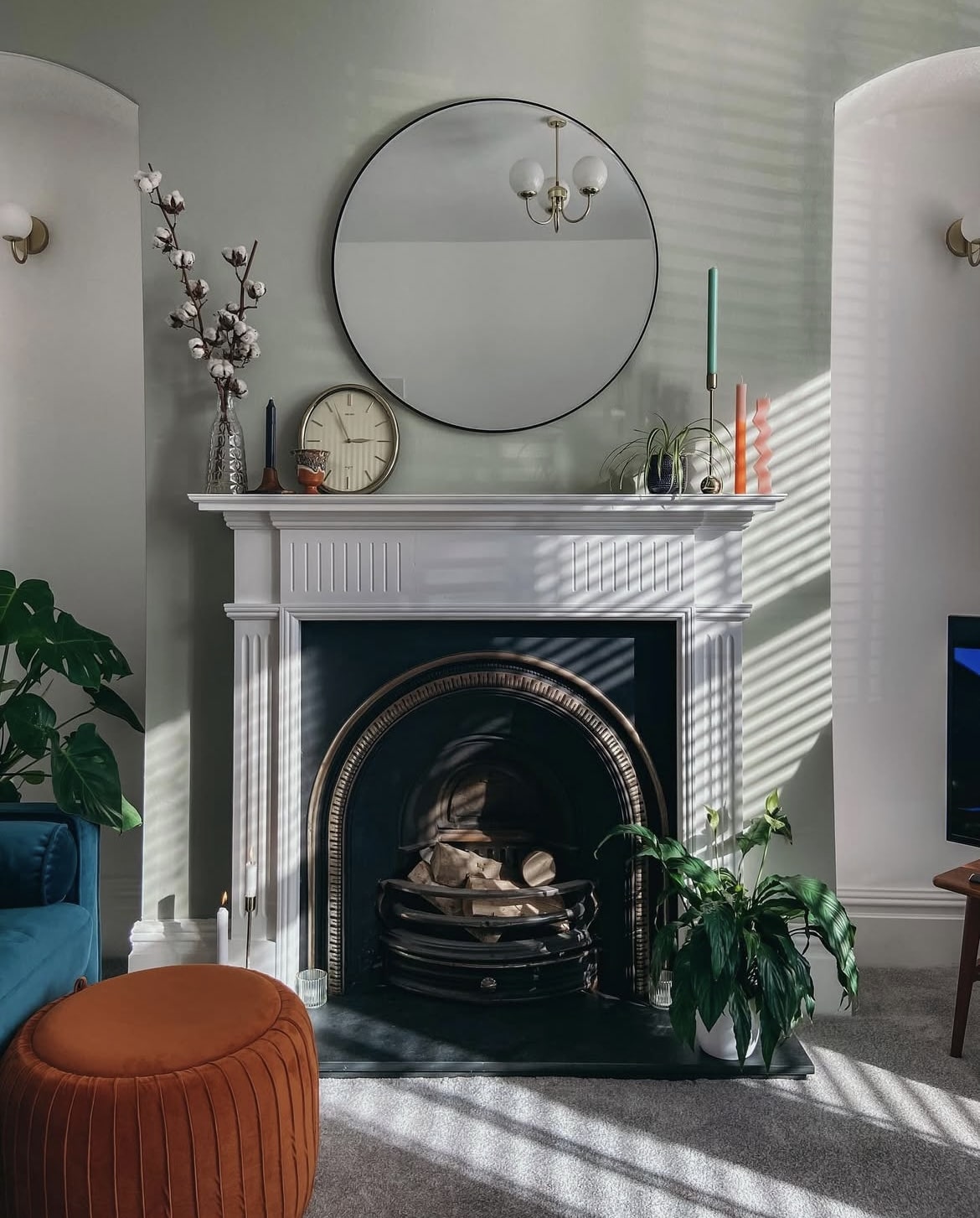
Using Mizzle in an earthy design scheme is just the perfect foundation for it. Reds, rusty reds and terracottas make for an earthy pairing, whilst bringing something a little punchy into the design brief.
It ticks all the boxes for the ‘unexpected red theory’, the use of a singular red item or accessory in a room which is meant to pull any scheme together. The below living room in Mizzle is a perfect example of this using a punchy red pouffe which really does set off the entire scheme.
Which of these colour combinations is your favourite? If you need any further colour inspiration or help with Mizzle, please drop me a comment below and I’ll come right back!
My kitchen cabinets are painted in mizzle green and walls are off white. It is a kitchen cum dining room. What contrast colour should I use on a dresser in the dining room to make it stand out. Thank you.
I’d either go for a defining colour I’d look at railings or Tar – love this on units. If you want something with a bit of colour and to make a statement, go for a warm terracotta something like Red Earth or Fox Red.
The new Marmelo shade would give it character
Love Marmelo, absolutely!
Hi, I have a fairly open plan living room/ dining room . The living room section has much less light than the dining room . I was thinking of Mizzle in the living room with Peignoir in the dining room . Would these colours blend well ?
Hi Francesca, YES! These colours work really well together, I do tend to recommend using the same colour in an open plan space if it’s not divided by a door or wall though because it helps to create a more cohesive pull through the spaces. Alternatively, it’s worth considering a warmer colour that could be used in both spaces, Skimming Stone is a warm modern neutral that works well in most lights. Nicole x