Bright white, magnolia and cream still remain some of the most popular colours for an interior, but they can make a home feel flat, and they are some of the highest maintenance shades, bearing scuffs, scratches and small imperfections.
If you still want to keep things light then a warm neutral such as Dulux Soft Stone is a beautiful choice. It brings warmth and depth to a space, and the neutrality of the shade means that there are many complementary colours that work incredibly well together.
Let’s delve into this warm neutral shade and look at what colours go with Dulux Soft Stone in an interior.
What Colour Is Dulux Soft Stone?
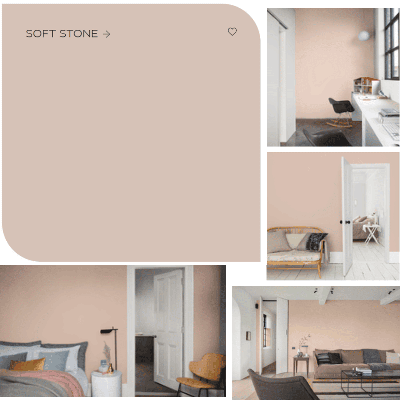
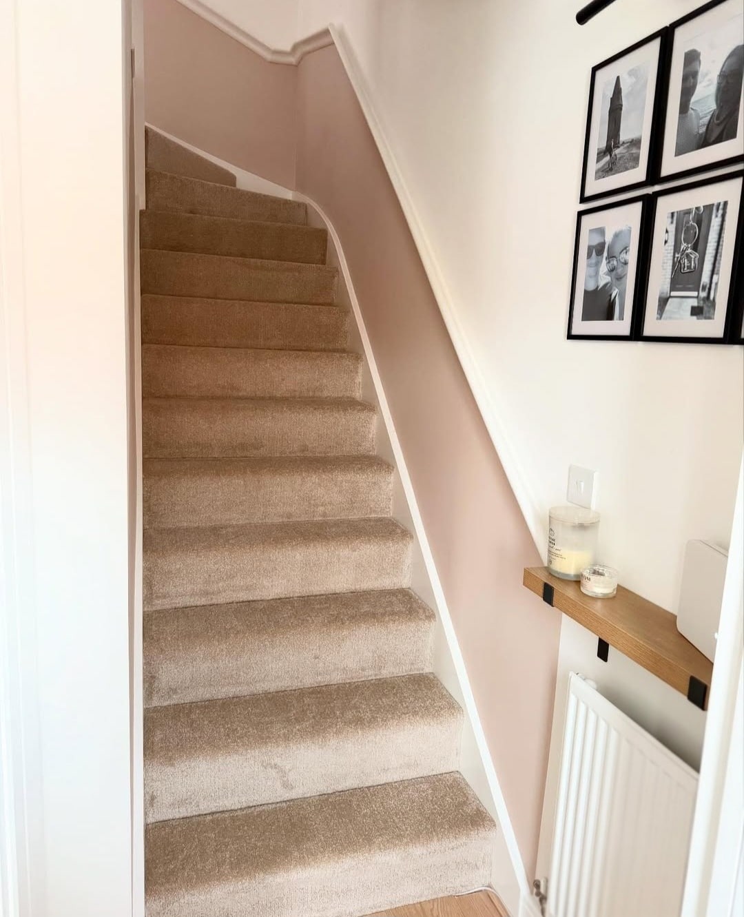
Dulux Soft Stone is a versatile, warm neutral which has orange, beige undertones to it. In some lights this shade can look like a pink or beige colour. A beautiful colour for a hallway, living room or bedroom.
As this shade can look different in different lights and homes, always try it first with a tester pot, paint a patch in the chosen room and look at how it looks and feels in the room during natural daylight, and when using artificial light.
Check Prices For Dulux Soft Stone.

Is Dulux Soft Stone A Warm Colour?
Yes, Dulux Soft Stone is considered a warm, neutral colour. It has warm, orange undertones which can make this shade look beige, and earthy pink, depending on the lighting in the room. This warm shade is perfect for bringing a pop of soft colour, pairing beautiful with other neutral, or statement shades.
What Colours Go With Dulux Soft Stone?
Tonal Combinations
Tonally, Dulux Soft Stone has beautifully warm orange and beige undertones to the shade so matching tonal like colours with it is the best place to start.
Active Orange is a burnt orange shade which exudes warmth and provides a perfect pairing for the muted Soft Stone.
Alternatively, pair with a more caramel type shade with Golden Light. These two provide a fabulous neutral foundation in a room, introduce orange or other neutrals if you want to create a more minimalistic looking space.

Neutral Combinations
I just adore neutral shades in an interior and this little trio of colours is perfection. Soft Stone pairs well with a greige, almost earthy green like Narrow Lane, or a more muted greige such as Just Walnut looks fab too.
Soft Stone creates a warm base when used on the wall, perhaps use a darker grey such as Narrow Lane on doors and architraves to ground the room. Or introduce these additional shades with objects, furnishings and textile accessories such as throws and cushions.

Designer’s Choice Combinations
To make a statement in your interior, bring in a bang for your buck with a complete opposite shade on the colour spectrum such as Open Sky.
This beautiful blue shade would look great in a coastal home decor scheme, whilst Soft Stone stops the space feeling cold.

Soft Stone & Black
If you’re creating a modern looking interior decor scheme, incorporating black is a perfect choice. A black accent is a defining characteristic of modern design, and it provides a defining and grounding accent against the neutrality of Soft Stone.
Black should be used sparingly with interior hardware details such as door handles, small pieces of furniture like console tables or side tables, and as an accent on decor accessories such as prints.
Soft Stone & White
I do believe there’s a time and a place for bright white in an interior, and that’s in small, well placed areas. Bright White as a stand alone colour is high maintenance and shows EVERYTHING!
However, using white as a secondary colour can actually help your interiors work smarter. Want the illusion of taller ceilings? Paint bright white above a picture rail, or on the ceilings to draw the eye up as you enter the room.
Alternatively, use bright white on skirtings and a fireplace mantel for a crisp, clean contrast that looks amazing.

Soft Stone & Earthy Green
Introducing Earthy Green into the equation will ground the room and provides a soft, thoughtful touch to an interior. Introduce it in subtle details such as curtains, cushions and throws.
Think about texture and pattern too, this is a great way to add depth and character to a space.
Soft Stone & Brown
If we’re looking at neutral combinations, a mid-dark brown is a natural pairing to Soft Stone. Brown and beiges continue to be popular colour schemes in home, lending a really bohemian and cosy feel to a space.
If you’re looking at brown paint shades, always get a tester pot and test in your home before committing. You can also easily interweave brown throughout with decor accessories, furnishings and textiles.
Soft Stone & Red
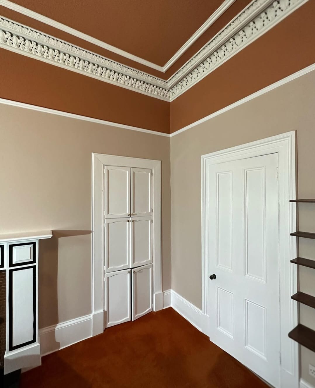
Leaning into an earthy inspired scheme? Set it off with a gorgeous terracotta or rusty red tone.
Take inspiration from the room below which uses Dulux Heritage Red Sand above Soft Stone on the walls. The result is a cosy and cocooning room.

Where To Buy Dulux Soft Stone?
B&Q is one of the best places to pick it up from, but for added convenience a number of retailers also sell it online;
Soft Stone is one of my favourite neutral shades from Dulux. It brings warmth and character to an interior without being overbearing.
It’s the perfect shade for pairing with other neutrals, or injecting bold colour with something which makes more of a statement in an interior. What other colours do you think pair well with Soft Stone?
