


Featured post written by Dan Green, Springbok Properties.
If you’re decorating because you’re about to sell, as strange as it may be to say, there’s a good chance you’re thinking about the wrong room.
Stick with me on this one. It’s normal to start with whatever has being annoying us, such as the tired looking bedroom, the kitchen colour that was fashionable but you never really liked, or the feature wall you promised to repaint last summer.
But a buyer doesn’t see any of that. When they walk through the front door, they’ll start forming an opinion within seconds. Then by the time they reach the room you’ve spent three weekends perfecting to the finest detail, they’ve already decided whether the house is right for them.
So if you are going to paint before selling, here are a few words about paint colours and spending your time where it counts.
Neutral doesn’t mean magnolia
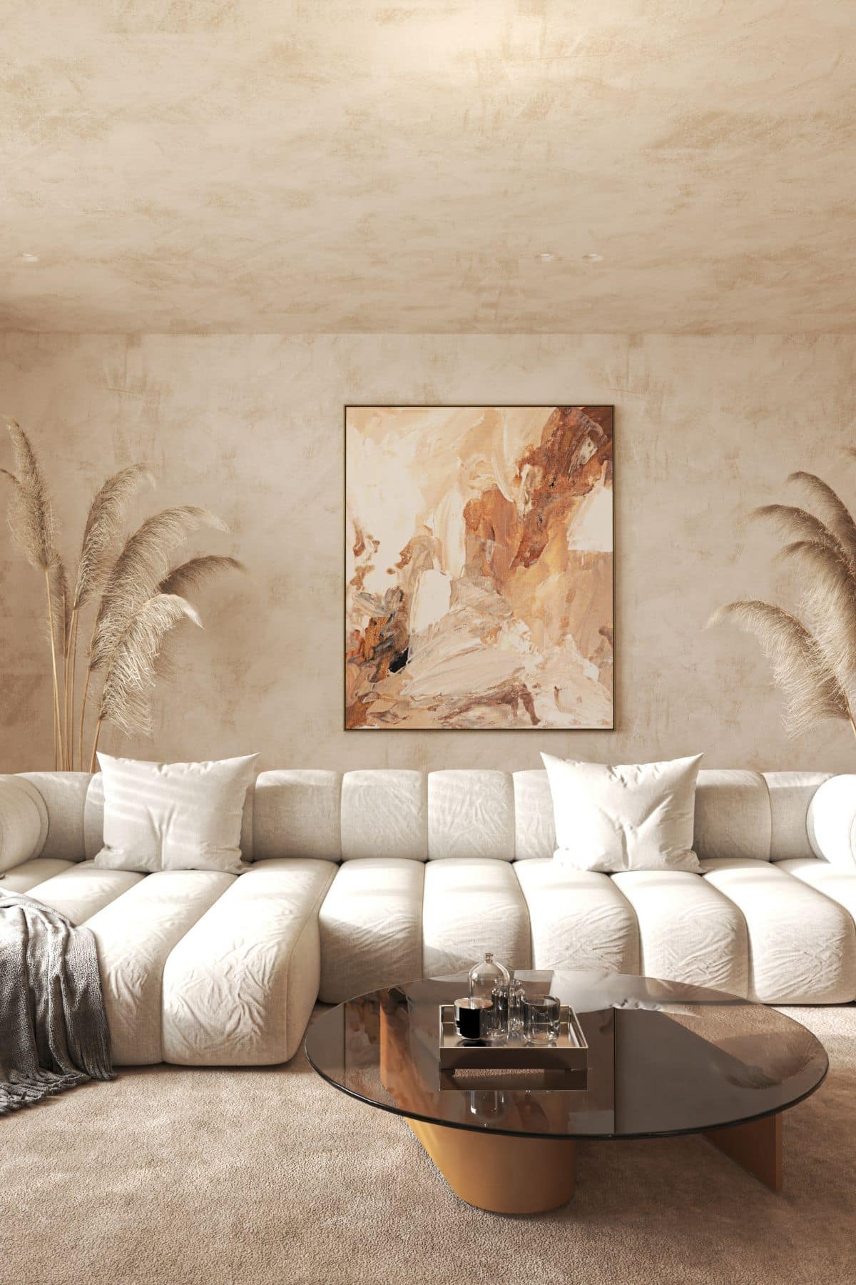
‘Paint it neutral’ doesn’t mean removing every trace of personality. You’re simply trying to create rooms that feel finished and work in different light.And that’s why I’d always choose warm neutrals over cool greys.
Farrow & Ball Setting Plaster is particularly useful in a north-facing room because it has warmth and a pink undertone, but doesn’t scream ‘this is a pink room’.
Skimming Stone is an all-rounder with a soft, warm grey that behaves well in most light without making a room feel cold.
Now, if you’re decorating several rooms, costs can add up quickly, so Dulux Egyptian Cotton is a very safe warm off-white. Or you could go for Dulux Natural Hessian; it’s slightly more beige and forgiving in rooms where the natural light isn’t great. Then there’s Elephant’s Breath, which I’d describe as the grey for someone who doesn’t really want a grey house.
There’s another reason I prefer these shades before a sale, and that’s the photographs. Most potential buyers have a good nosey at your home online before they ever step foot inside it. Cool greys can photograph surprisingly flat, whereas a warm neutral tends to photograph more softly.
If you only paint one area, make it the hall
I’ve often said that hallways get an unfair deal.They’re usually pretty narrow, have very little direct natural light, and have the huge job of giving the first impression for the entire house.
That’s why you need to go lighter than you think. Get yourself a few tester pots from the local DIY store because a colour that looks a bit too pale during the day can look very different in a hallway once it’s seen under artificial light.
Then there’s the woodwork to think about. My three words on this are ‘keep it consistent’. Having slightly different whites meeting around doors and skirting boards make a small hall feel busier than it needs to. And if you’ve got a dado rail, it’s time to make a decision about it. Either highlight it properly, or remove it. Painting everything the same colour in the hope that nobody notices the rail often has the opposite effect.
Where I wouldn’t spend the money
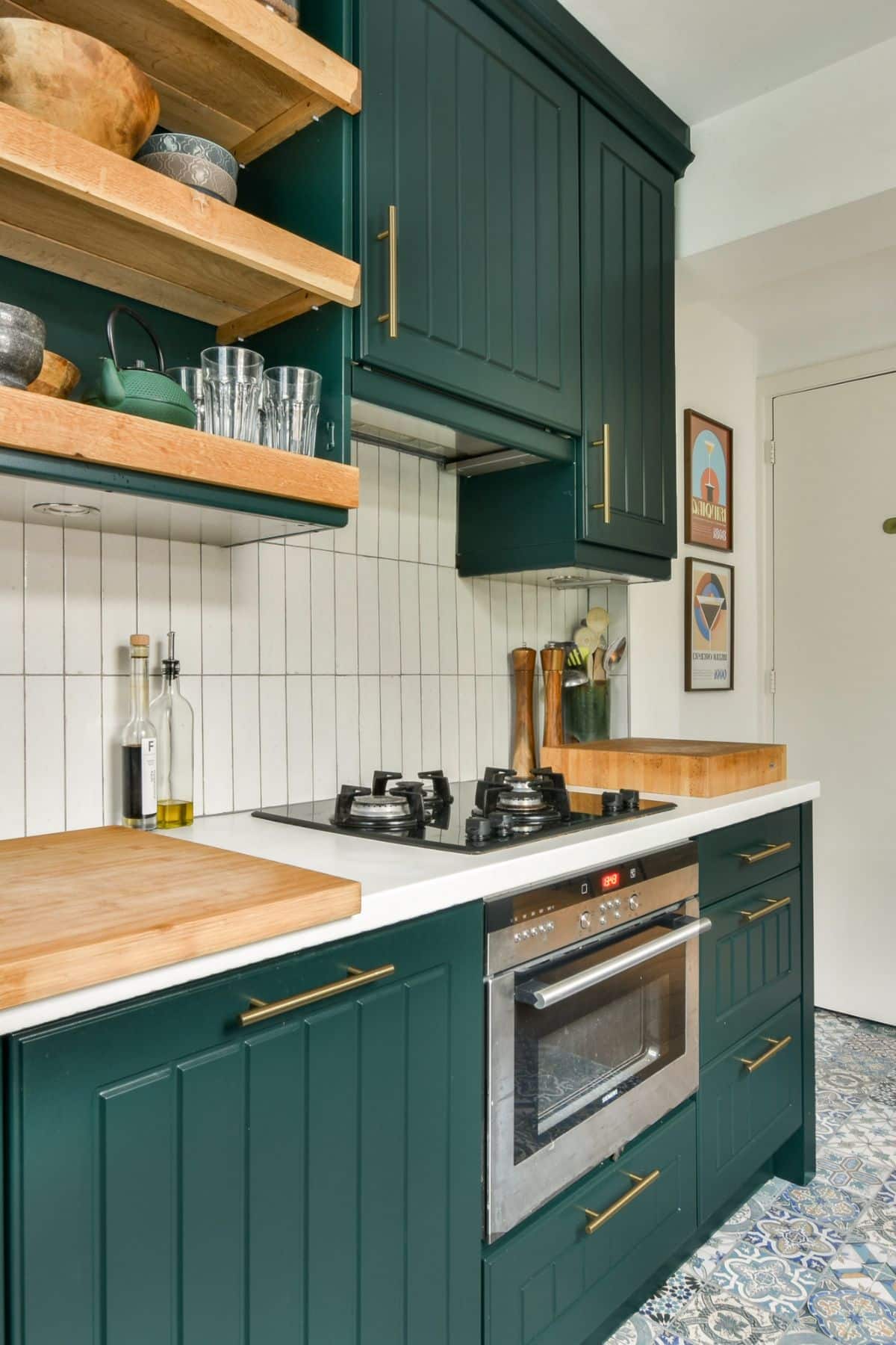
This matters just as much as choosing a colour and making decisions about woodwork. This might feel controversial, but I wouldn’t repaint a kitchen you’re leaving alone. Buyers on a viewing judge kitchens as an entity. The units, worktops, appliances, condition and layout; it’s all bulked in as one. A lick of fresh paint above the worktop isn’t going to disguise a kitchen they already plan to rip out.
And linked to that is the rule to never paint over damp. Although the stain may disappear for the photographs, the underlying problem hasn’t gone away. It’ll come back, and a competent surveyor isn’t going to be distracted by that lovely Farrow & Ball shade you selected.
Oh, and don’t bother spending your only spare Saturday repainting that small strip of wall in an otherwise fully tiled bathroom. Well, not unless it’s really grubby. Nobody is choosing your house over another one based on it having a cleaner eight inches of bathroom wall.
Knowing when to put the roller down and step away is all part of decorating.
The front door is different
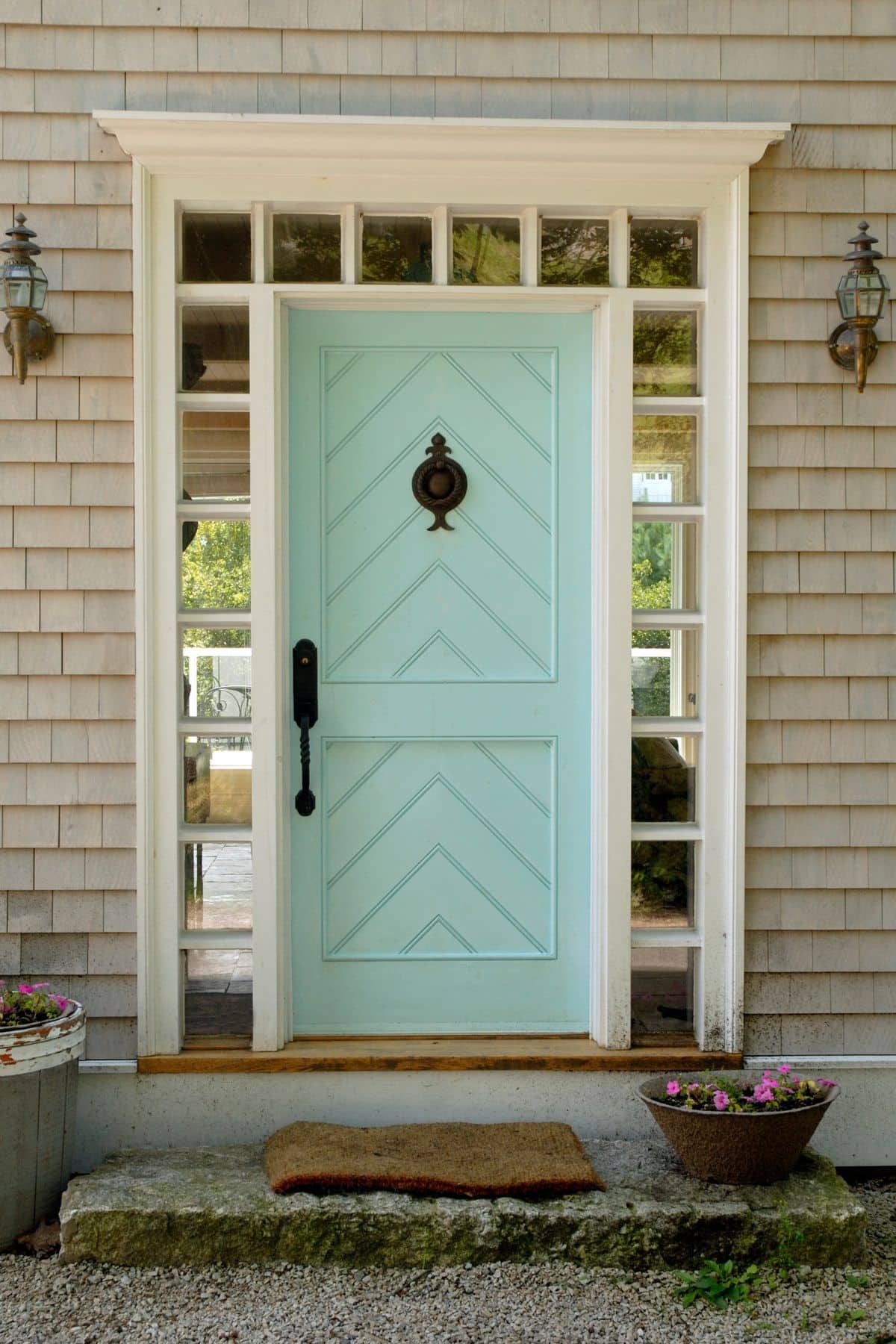
However, I do think the front door is worth your time; assuming it’s not uPVC of course.It’s a relatively small job, but potential buyers spend an oddly long time looking at it while the agent fumbles for the key.
Don’t just choose whatever colour happens to be fashionable; always match the door to the house. For example, a Victorian terrace can carry a deep, saturated shade. A 1930s semi often suits something softer. The aim isn’t to make the door shout ‘look at me’. It should look as though it belongs there.
Sometimes decorating isn’t the problem
Paint can improve a house that’s fundamentally saleable. But if you absolutely need to move by a certain date for work or another reason, and the market isn’t co-operating, another weekend spent choosing between two warm whites is classic displacement activity. It might feel productive, but it isn’t really solving the reason you’re stuck on the market.
There are alternatives for sellers who need to move fast, including selling directly to a cash buyer, but the trade-off needs to be understood; speed and greater certainty generally mean accepting less than you might achieve on the open market. That won’t be the right choice for everyone, so it’s worth weighing up your options.
Paint what matters, then stop
For most houses, I’d keep the pre-sale decorating ‘to-do’ list quite short.Pick a warm neutral where a room genuinely needs repainting, go lighter in a dark hallway, make the woodwork consistent, and give the front door some love if it’s looking tired.Then put the brushes away. After all, you’re decorating a house that you’re about to leave.
