

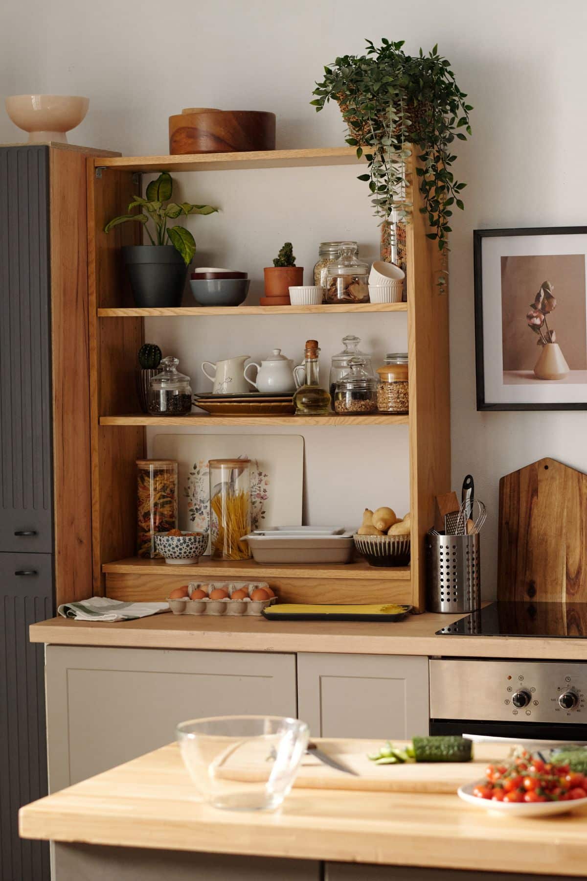
The worktop and the cabinets are the two largest surfaces in most kitchens, so the relationship between them sets the entire mood of the room long before you reach handles, tiles or flooring.
Get the pairing right and everything else falls into place; get it wrong and even beautiful materials can clash. Here are six pairings that work well in UK kitchens. Each covers what the combination does, the atmosphere it creates, and the kind of home it suits.
Two things matter more than any single colour rule. The first is contrast: decide whether the worktop and cabinets should blend into a calm, tonal scheme or contrast for drama.
The second is light. A north-facing kitchen and a bright, south-facing one can make the same worktop look like two different materials. With those in mind, here are the schemes.
It is also worth thinking beyond colour to finish. A polished surface bounces light and feels crisp; a honed or matt finish feels softer and may show reflections, fingerprints and everyday marks differently; and texture changes how a tone reads across a room.
The right finish can make the same pairing feel either sharp and contemporary or calm and tactile, so it is worth deciding alongside the colours rather than as an afterthought.
Six worktop and cabinet combinations to consider
1. Warm white worktop + natural oak — Scandi warmth
A softly warm white surface is the quiet hero of an oak kitchen. Where a stark, cold white can make timber look orange, a warm white keeps the wood feeling honeyed and light, and the whole room reads as relaxed and natural. It is a particularly good choice for north-facing rooms that need lifting, and for busy households that want something forgiving and unfussy.
Pair it with pale flooring and simple hardware to keep the Scandi feel, or add black tapware for a more contemporary edge. Because the surface is doing gentle, background work here, a matt finish often suits it better than a high-gloss polish.
2. Marble-effect surface + deep green cabinets — contemporary elegance
Fine grey veining set against a rich, muted green is one of the most quietly luxurious pairings around. The green adds depth and warmth without tipping the room into darkness, while the veined surface keeps everything feeling fresh and current.
It photographs beautifully, which is part of why it has become a favourite for feature runs and islands. Balance it with brass or brushed-gold accents for warmth, or matt black for something more architectural. The key is restraint elsewhere: let the worktop and the green cabinetry be the story, and keep splashbacks and flooring calm.

3. Cream worktop + brass details — timeless classic
Cream tones with brass handles and taps are the definition of a warm, traditional kitchen. This is the pairing that ages well, and it rarely looks dated because it was never chasing a trend in the first place. It suits period properties, shaker-style units and anyone who wants a kitchen that feels settled and inviting rather than sharp.
Cream works hardest when it is genuinely warm rather than yellow, so check samples against your walls and light. Brass softens as it wears, adding to the lived-in, timeless character rather than detracting from it.
4. Industrial grey + black handleless units — modern minimal
A mid-to-dark grey worktop with handleless black units is the sharpest, most architectural scheme of the six. There is nowhere to hide in a minimal kitchen, so the quality of the surface and the precision of the joins really show, which is exactly why this look rewards good fabrication.
It suits open-plan spaces, urban flats and anyone who likes clean lines and calm, monochrome palettes. Introduce warmth through timber flooring, greenery or a single natural material, so the room feels considered rather than cold.

5. Strong veining + navy island — statement
When you want one clear centrepiece, a boldly veined surface on a navy island delivers it. The island becomes the room’s focal point, and everything else should support it: keep the perimeter worktops and cabinets calmer and more neutral so the eye knows where to land.
This is a scheme for larger kitchens that can carry a strong feature, and for homeowners who want something genuinely one-of-a-kind. Vein positioning matters enormously here: where the pattern falls across the island is the difference between “striking” and “busy”.
6. Natural stone + soft neutral cabinetry — organic calm
Natural stone character paired with muted greige units is the most grounded and liveable of the six. It feels organic and unforced, flatters natural light, and can remain appealing and easy to live with for many years. It suits family homes and anyone drawn to a softer, more tactile palette.
Because natural stone has its own movement and personality, keep the cabinetry and styling simple and let the material lead. Textured or honed finishes often suit this look better than a high shine.
At a glance:
| Scheme | Worktop tone/type | Cabinet and accents | Mood | Best for |
|---|---|---|---|---|
| 1 | Warm white | Natural oak | Relaxed / Scandi | North-facing, family |
| 2 | Marble-effect grey vein | Deep green | Contemporary | Feature runs / islands |
| 3 | Cream | Cream + brass | Timeless | Period / shaker |
| 4 | Mid-dark grey | Black handleless | Modern / minimal | Sharp, urban kitchens |
| 5 | Strong veining | Navy island | Statement | One-of-a-kind centrepiece |
| 6 | Natural stone | Soft greige | Organic / calm | Long-term liveability |
A pairing that looks perfect on two small samples can behave differently at full scale and under your own lighting. From here you can explore Mo’s StoneX surface collections to see these tones in full-slab form, where the real character of a surface becomes clear.
“Cabinet colour, lighting and the slab itself all interact, and we always recommend seeing the pairing at scale before committing.”
— the Mo’s StoneX team
If you are still gathering ideas, the easiest next step is to preview a worktop in your own kitchen. This allows you to test the pairing against your actual cabinets, walls and lighting before anything is ordered.
