Bedrooms carry more weight than we usually admit. They’re expected to handle sleep, storage, getting ready, switching off, and personal space, all within the same four walls. Calm doesn’t tend to come from adding more features or making bolder choices. It usually appears when decisions feel settled, and nothing is asking for attention.
Rooms that feel easy to live in rely on quiet consistency. Colours don’t compete. Finishes work together. The space supports everyday habits without making a point of it. Often, it’s the smaller choices that make the biggest difference.
Where Visual Noise Really Comes From
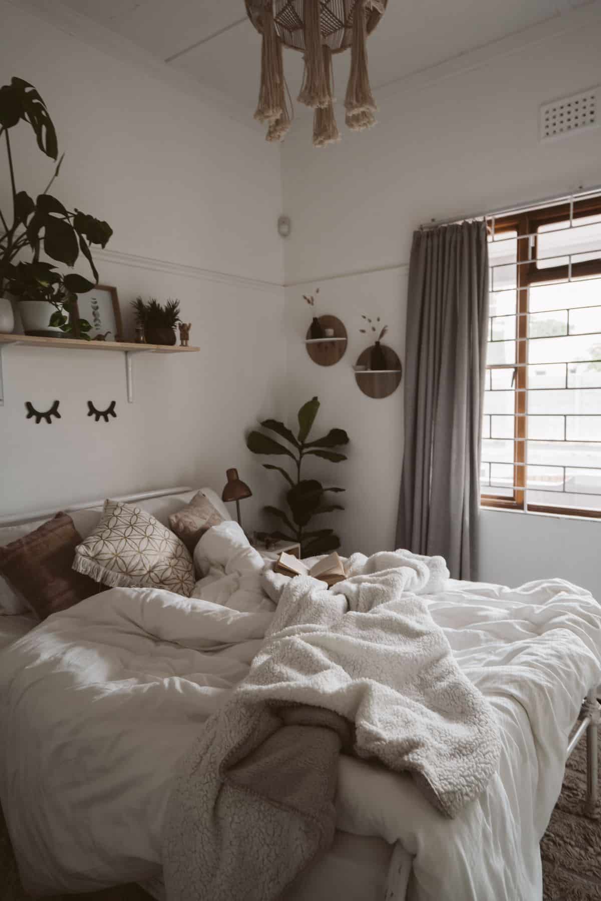
Clutter isn’t always about mess. More often, it comes from things that don’t quite relate to each other. Competing colours, mixed finishes, and sharp contrasts slowly add tension to a room, even when everything looks tidy.
Wall colour sets the tone. Soft, muted shades reduce distraction, especially when they carry through skirting, trims, or built-in elements. Strong contrasts can look striking, but in bedrooms, they often pull focus away from rest.
Furniture finishes matter just as much. Bedrooms feel calmer when wood tones sit within the same warmth range, and painted pieces stay in one colour family. One contrast can work well. Several usually feel unsettled.
Smaller details add up. Visible cables, exposed fixings, and accessories without a clear place all contribute to visual noise. Tidying these away can change how a room feels without changing its character.
Why Repeating Finishes Helps You Relax
Repetition creates order. When colours and materials repeat, the eye has less work to do. That sense of ease matters in a space designed for rest.
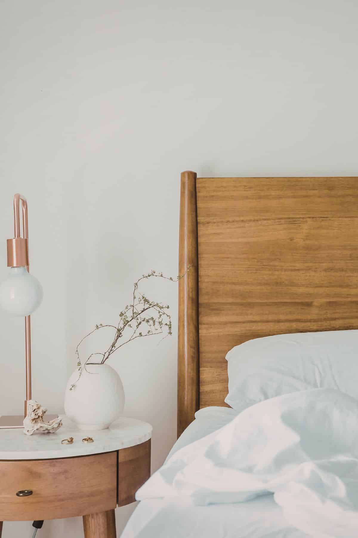
Bedding is a simple example. Similar tones across sheets, cushions, and throws create a calm base. Texture can vary without breaking that feeling, adding interest while keeping things grounded.
The same idea works across the room. Repeating wood finishes between furniture and flooring creates flow. Matching metal tones on handles, lights, and hardware avoids unnecessary visual breaks.
Nothing needs to match perfectly. Slight variation within a narrow range often feels more natural than exact duplication.
Treating Storage as Part of the Room
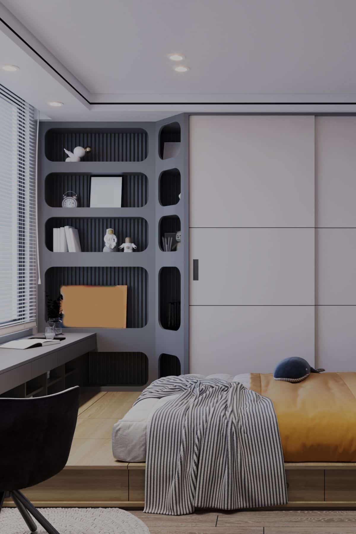
Storage takes up a lot of visual space, even when everything is hidden. When it’s treated as part of the room rather than an add-on, the space feels more balanced.
Fitted storage often covers large sections of wall, so its finish has a strong impact on mood. Flat, low-sheen finishes help it fade into the background. High-gloss surfaces reflect light and can feel busy unless used very carefully.
Continuity matters here. Storage that shares tones with surrounding walls or flooring tends to feel settled rather than dominant. Many people choosing wardrobe doors from Doorfinder focus on neutral finishes that sit quietly within the wider scheme, rather than turning storage into a feature.
Placement plays a role, too. Keeping storage along one main wall often feels calmer than scattering units around the room. Clear floor space improves movement and visual flow.
How Light Changes the Feel of Finishes
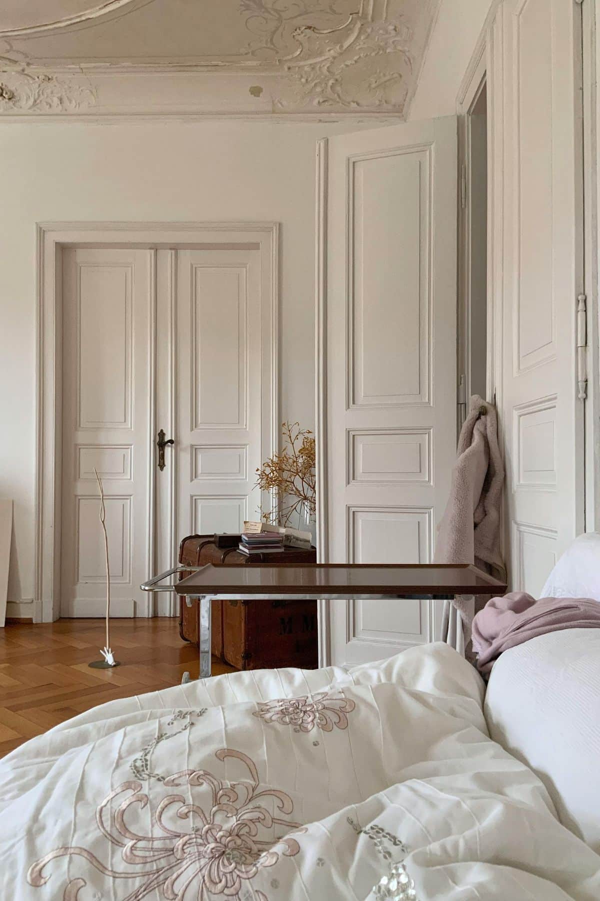
Light affects how every surface behaves throughout the day. Bedrooms benefit from finishes that respond gently as light shifts.
Matte surfaces soften reflections and reduce glare. Paint, furniture, and fitted elements with lower sheen levels usually feel quieter and easier on the eye. High-shine finishes can bounce light sharply, which may feel disruptive early in the morning or late at night.
Natural light direction matters as well. Cooler tones often suit south-facing rooms, while north-facing spaces feel more comfortable with warmer neutrals. Artificial lighting should support these conditions, not fight them.
Layered lighting works best. Bedside lamps, wall lights, and overhead fittings should share similar finishes and colour temperatures. Warm light tends to support rest without making the room feel dull.
Why Fewer Finishes Often Feel Better
Too much choice can make a room feel unsettled. Limiting the number of visible finishes simplifies decisions and supports long-term comfort.
Three main finishes are often enough. One for walls, one for flooring, and one accent material. Extra variation can come through soft furnishings rather than fixed elements.
This approach also helps rooms age well. Trend-led finishes lose appeal quickly, while restrained palettes stay comfortable. Calm rarely depends on bold statements.
A clear visual hierarchy helps. One or two elements can carry interest while everything else stays neutral, as this balance keeps the room from feeling flat without creating clutter.
Calm Rooms Are Easier to Live With
Maintenance has a bigger impact on calm than most people expect. When a room is hard to keep looking good, it quickly stops feeling restful.
Mid-tone colours and matte finishes hide everyday marks better than very light or very dark options. They need less attention to stay presentable.
Using similar materials simplifies cleaning. When surfaces respond well to the same care routine, upkeep feels easier and less tiring.
Good storage layout supports daily habits. Clear internal organisation prevents overflow onto visible surfaces. Bedrooms that stay visually calm during busy weeks tend to feel more comfortable overall.
A Bedroom That Feels Settled
Calm bedrooms don’t rely on effort or decoration. They come from consistent finishes, thoughtful storage, and lighting that supports rest. Each decision shapes how the room feels during ordinary days, not just when it’s freshly styled.
Small updates that work with how the space is already used often make the biggest difference. When surfaces relate, light behaves well, and storage feels intentional, calm follows naturally.